More and more organizations are turning to digital tools to administer auctions. If your organization is still using pens and papers in a silent auction, here are five advantages of mobile bidding that might make you re-consider.
Brave New World: Symphony Orchestras & Online Experiences
Just what is an online audience? How does it differ from an offline audience? How does participating in the arts through electronic media and online channels relate to the attendance of arts events? Moreover, exactly what (and how) are symphony orchestras using these digital technologies to engage with individuals around the world?
Mobile Fundraising Applications: The Apple policy over one year later
 Apple banned fundraising apps for the iPhone, iPad, and iPod over a year ago (to much controversy) just as the first fundraising app hit the market through eBay/MissionFish. The field of software for fundraising as a result of the ban is anemic.
Until this policy is removed it seems unlikely that major fundraising will take place via mobile applications. As the iPhone is the number one smart phone on the market developers have much less incentive to build software for fundraising purposes. It can be extrapolated that once the ban is lifted the fund-raising/development world will be playing catch-up for years.
Here are two notable successes/efforts to do fundraising through mobile apps over the last year:
eBay and Missionfish are on the verge of offering donation capabilities through eBay's mobile application for Android (it was originally intended for the iPhone). These donations should be relatively easy to put through and involves the user downloading the mobile eBay application and then searching for your cause. On the organization's end the donation item has to be set up as well as the account which will interface with paypal.
In the UK a group called Marie Curie Cancer Care managed to get around the ban by setting up an app that allows users to request donations from friends through text messaging. The application itself doesn't collect the funds but is party to gathering them.
If you want to take action, you can sign the current petition to overturn the ban here.
A Visitor's Experience: The Good, the Bad and the Ugly of Smartphone Apps in Art Museums
Having the good fortune of living in Europe for a few years with many of the world’s most beloved fine art institutions in my backyard, I was pleased to test a myriad of their recently launched apps. There is much to be said for the wonderful ways in which mobile devices can enhance the visitor experience. Of course, there are also downfalls attributed to the growing pains associated with mobile. Often I was impressed, entertained, educated, annoyed, and confused – sometimes all simultaneously. Since mobile planning and implementation can be a backend-focused undertaking for museum staff, the following simply offers the perspective of a museum visitor with a smartphone in tow.
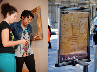 Visitors use a Davis Museum digital art museum guide. Photo credit: Dot Diva.
No cell phone sign at the Louvre. Photo credit: Tom Arthur.
The Good
- BYOD (bring your own device): Mobile devices are increasing all-in-ones for just about everything. Visitors can skip the line for an audio guide because with the same (if not more robust) content available on their own familiar device, they have the distinct advantage of being audio and multimedia guide self-sufficient.
- Deeper connection: With the inclusion of video and other multimedia content, visitors are offered a closer connection to the artists. The Royal Academy of Arts did a wonderful job incorporating video interviews with Academicians in their 2011 Summer Exhibition app. To back it up, a study conducted at the Davis Museum and Cultural Center found that “on average, participants spent about 39 seconds with a work of art when viewing art without the application, and about 3 minutes and 15 seconds viewing art while using the application.”
- Dialogue: Museums are historically notorious for offering one-way authoritative information. Since most museum mobile apps are outfitted with social media tools such as Facebook and Twitter, visitors are afforded a voice to communicate with the museums (and they actually listen).
- Save and share: I still bring my sketchbook with me on museum visits for notes and doodles, but museum apps make archiving and sharing objects of interest easier to come back to when they offer a “favorite this” feature. Other mobile tools such Pinterest and Twitter hashtags also make the impact of a visit more enduring and accessible.
- Off-site relevance: Many museum apps make content valuable off-site as well as during in-person visits. For example, I dashed through Tate Modern’s Miró Exhibition in a rush, but later read about the impact of the Spanish Civil War on Miró’s work via the exhibition app while waiting to board a plane in Pittsburgh. This pared down version of a catalogue is easier to haul around and cheaper.
- “Edutainment”: Why not learn while being entertained? The Andy Warhol Museum’s DIY Pop app is a great example of experiencing both. We have a frustrated museum education staff member to thank for sparking interest in developing a way to digitally educate the public on Warhol’s silkscreen process while replicating it using our own photos.
The Bad and The Ugly
- Connectivity: Yes, a visitor may skip the line for the audio guide, but once in the gallery app download capability may be spotty since many institutions do not offer Wi-Fi (the cost of which can be a prohibitive expense). To make matters worse, the thick walls of many museums can make using a cellular network virtually impossible. If a visitor can access their cellular network, many multimedia rich museums apps can be data gluttons, especially for foreign travelers out of their network area.
- No phone/camera policies: I’ve become a pro at the art of looking like I’m texting someone, when in fact I’m taking prohibited photos and spreading them on Twitter and Facebook. Some museums are finding it difficult to strike a balance between preventing copyright infringement and fully embracing the use of mobile technology. With apps like “Cards,” you can understand the dilemma of wanting to encourage word-of-mouth marketing while not irresponsibly promoting the dissemination of images not in the public domain. But, as a staff member of the Royal Academy of Arts pointed out to me: “If all the 50 people who came through in the last two hours went home to their Facebook and their Flickr, posted photos of this fantastic place with comments, think of the social media publicity. Think of the viral marketing.” Institutions like the RA are well positioned to proactively ask for artists’ permission for visitors to use and spread images of their work online.
- Slow take-up: Tech savvy visitors who would enjoy a mobile option for museum content consumption are likely a little bummed that art museums tend to lag in mobile innovation. It’s hard to blame museums for not leading the way. Shelley Bernstein, chief of technology at the Brooklyn Museum admits on the museum’s blog that: “[W]e don’t have a large audience for our app. In the galleries on any given day...you’ll see very few visitors pulling out smartphones.” There is a significant demographic gap between the typical museum goer and smartphone owner. Yet, since it is predicted that mobile web browsing will outpace Web browsing on desktop computers by 2015, expect to see a jolt of further mobile enthusiasm from museums on the horizon.
Around the Corner
For individuals such as myself, who are certain their value as a human is inextricably tied to the use of a smartphone, 2010–2011 was an especially great time to be wondering the galleries of Tate Britain, Tate Modern, The Royal Academy of Arts, The Louvre, and more. These institutions’ fledgling apps are a solid start to their entree into mobile tech. In the near future, (especially with the help of new culturally focused app developers) I’ll be excited to see the use of image recognition (a copyright nightmare), mobile transactions (e.g. tickets, membership, gift shop purchases), and the further adoption of augmented reality. Am I asking for too much, too soon? After all, I’m about a step away from expecting my iPhone to wash my dishes if I throw it in the sink. Isn’t there an app for that?
Author Bio
Ashley Paulisick completed her master’s degree in Art Business at Sotheby’s Institute of Art in London in 2011. Her dissertation, titled “The Impact of Mobile Technology on Art Institution Visitor Experiences,” took her to some of the world’s most prestigious art museums, including Tate Modern and Pittsburgh’s own Andy Warhol Museum.
Ashley has also worked in arts administration and as a painter under the “pen” name Ashley Cecil. You can read about and see her work at www.ashleycecil.com and find her on Twitter at @ashleycecil.
10 Takeaways From the 2011 Emerging Practice Seminar
CultureLab, a partnership between an informal consortium of arts consultants and the Cultural Policy Center (CPC) at the University of Chicago, recently held an 'Emerging Practice Seminar' in April. The organization was formed to break down the silos of research, policy and practice, and create a new capacity and approach to tackling challenging issues. The topics at this year's seminar were:
- Uses of technology in audience engagement
- Revenue management and dynamic pricing
The seminar's website features all of the speakers' presentations (both videos and slides) and is an extremely helpful resource!
Here were my top 10 takeaways from the 'Use of Technology in Audience Engagement' portion of the seminar.
1. Embrace technological innovation, there's nothing to fear! Tim Roberts of ARTS Australia provided an introduction to the day's topics. Tim's introduction called attention to the unfortunate fact that any arts managers and organizations still view technology as something they are fighting against. He quoted NEA chairmen Rocco Landsman as saying "the arts are battling the technology invasion". Roberts argues that many also believed cable television to be the death of television and photography to be the death of painting and that technical innovation has not caused the death of an artform but has contributed to its spread and created new audiences.
Uses of Technology in Audience Engagement - Tim Roberts from Cultural Policy Center on Vimeo.
2. Engagement is an ongoing process: Technology is least effective when it's not used in a proper context of engagement. This process of engagement often begins prior to the audience coming through the doors. Likewise, the process shouldn't end after the performance or visit ends. Technology can help to provide context to a piece of art or performance, personalize the experience and even augment the experience. There are many options when it comes to sustaining a deeper level of audience engagement.
3. Layered Arts Experiences are cool! This type of technology has been extremely underutilized in the performing arts sector. Layered Arts Experiences offer audiences options for real-time assistance imperative during arts programs. They can come in the form of supertitles for opera and dance performances. The Columbus Symphony Orchestra had a device called the 'Concert Companion' which enabled patrons to read something about the piece they were hearing as they listened to the concert.
4. Museums continue to lead the way when it comes to adapting technology: Another common theme during the seminar was the overwhelming lack of technological innovation in performing arts organizations. Even though there were examples of organizations using layered arts experience tools and mobile interactions, it seemed as though they were few and far between and many had even stopped using these tools.
5. The verdict is still out on Tweet Seats: A 'Tweet Seat' is simply a seat reserved in a theater for Twitter users. Tweet Seats have many benefits, including: encouraging a younger audience demographic to get involved in the performance, having this demographic spread the word about the performance to their Twitter followers, and cutting down on distracting other audience members by blocking off a section for Twitter users. The question, however, remains whether or not people can truly become immersed in a performance if they are multi-tasking with other technological devices.
6. Mobile Interaction isn't just limited to QR Codes in Museums Ron Evans of Group of Minds had some great ideas about ways to engage audiences via mobile devices. Evans suggested placing a QR Code on tickets for previews of the show. Evans also suggested distributing digital keepsakes after shows. He also discussed the importance of using these mobile technologies in the proper context of audience engagement. Unfortunately, most technology has focused on the pre-performance and pre-sale with the sole intention of making the sale and increasing attendance. Engaging audiences should also involve increasing their understanding and appreciation of an artform. The 'during' and 'after' is just as important to leading people to the next experience.
Mobile Interaction: adding content and context - Ron Evans from Cultural Policy Center on Vimeo.
7. Location Based Servies has a long way to go: Devon Smith presented the findings of a research study she conducted on arts organizations using location based services. Location Based Service is simply a service that uses the geographical position of a mobile device (Foursquare, Yelp, Google Maps). Applications like Foursquare can be useful in providing real-time analytics on the demographic of those who are "checking in" to a venue. Smith's study found that only 36% of the 76 nonprofit theatres she tracked, had properly claimed their venues on Foursquare, yet 97% of the venues had a mayor. Even though claimed venues had 3% more activity, the real-time analytic information could be very useful to any organization.
8. Blogging Isn't Dead!: Thomas Wickell of Malmo Opera shared one of the most interesting case studies of the day. Wickell emphasized the importance of viewing the stage from the audience's perspective as opposed to looking out at the audience from the stage. With this key distinction in mind, Wickell and his team found that the audience they wanted to attract was not responsive to traditional channels of advertisement (newspapers, television, etc). Since most of their target audience were highly engaged online, the team created a blog that was centered around the life of a character in an upcoming opera. The blog became so popular, at one point in time, traffic to the blog surpassed that of the company's main website! The staff even invited readers to a ceremony for the character (since she does not survive) and over 100 people came to pay tribute to her life. The blog can still be found here!
9. Technological Innovation Often Requires a Culture Change Within an Organization : Linda Garrison and Thomas Weitz at Steppenwolf Theatre gave an overview of helpful practices for creating video content. An important theme during this presentation was the importance of finding allies when seeking to implement any changes. Whether designing a new video campaign or placing QR codes on marketing material, implementing new technology can often mean a culture change within an organization. Finding out who your champions, advocates and contributors are beforehand can make a world of difference when proposing any sort of change. It's also well worth your time to watch the Steppenwolf videos here.
10. Know Your Target! The Steppenwolf and Malmo case studies highlighted the importance of understanding who the target audience is prior to implementing any of the strategies and tools listed above. Steppenwolf researched and found their audience tended to be highly educated, comfortable with direct marketing and confined to a very specific geographic location. As a result, Steppenwolf decided that an online video campaign could be effective in engaging their audience. The Malmo Opera worked backward and began by envisioning what type of audience they wanted to attract. Either way, this process is extremely effective when the target audience is clearly defined.
Changing Up The Check-in Pt. 2: Recommendation Engines
 A few weeks ago I wrote a post on some of the latest updates to Foursquare's specials. To make the platform worthwhile beyond just a fun game for users, Foursquare has overhauled a lot of their services with version 3.0. This went beyond just specials, the location-based social network wanted to make using their platform a useful way for users to discover new places in their surroundings.
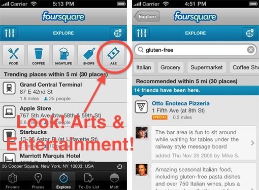
Boom, new algorithms that form a better recommendation engine for you and me. What does that mean for us non-techies? It means the 'Explore' tab, a new service that takes info from your check-ins, your friends check-ins and presents you with search results of nearby venues that are more relevant to your interests.
Hit the explore tab, type in something like 'art' or 'mexican food' and Foursquare will take into account all your and your friends past check-ins to come up with the most relevant venue. So not only will it tell you where a venue is, but why you should want to go there. In addition to searching, there are also buttons along the top focused on common venue types people are looking for. You might already be familiar with how recommendation engines work, it is how music sites like Pandora and Last.fm are able to suggest relevant material for their users.
Image via blog.foursquare.com
So why should arts organizations care? Because this may be the simplest of all ways to participate in the location-based game. Claim your venue, add relevant information and start showing up in search results. Claiming a venue is free, gives you control over your brand, and will improve your search and recommendation results not only with Foursquare, but all of the apps and platforms out there using Foursquare's API (programming language and database) like Gowalla and hundreds of others.
While you're staking your claim with Foursquare, you may want to claim your venue on the two other big location-players - Facebook Places and Google Places. Google has some recommendation engines in the works and while Facebook doesn't offer one, claiming your venue there will still make you more visible to a very large group of users.
Claiming your venue on these three platforms is an easy and free way to take advantage of a fast-growing social media form. It's a simple step that may equal a return for your organization that a lot of other social networks can't offer - foot traffic.
Arts and Technology Round-up: Museums and the Web Edition
Happy Friday everyone! For this arts and technology round-up we decided to try and hone in on a few of the awesome projects that we saw at the Museums and the Web conference last week. Up first are our picks of some of the best and most innovative projects. After that, the winners of the Best of the Web 2011 awards from the conference.
Technology In The Arts Picks
Zooniverse - This group marries together the researching needs of the scientific/historical communities and the power of crowdsourcing. By creating a series of interactive web portals, Zooniverse creates communities of "Citizen Scientists".
PhilaHistory - Philly based GIS firm Azavea worked with the City of Philadelphia to create a platform for linking historical photos of the city to their real world locations using geo-location and augmented reality.
One To One with the Artist: Ai Weiwei - A simple idea with a great effect, this project from the Tate allowed museum visitors to record and upload a video in the gallery and have a video dialogue with the artist Ai Weiwei.
The WALL - The Museum of Copenhagen's giant multi-touch multimedia screen installed in one of the central squares of Copenhagen.
ARTfinder - A new recommendation engine for artwork, this site works very much like Last.fm, taking your current interests and using them to introduce you to new works.
The Collective - Sounding a little bit like a bad 50's sci-fi flick, The Collective is the Denver Art Museum's interactive website/online programming space and a new way of connecting and bringing in the Denver community.
MoMA Learn - An extremely in-depth arts education web portal, the Museum of Modern Art's education department went all out on this one.
ARtours - The Stedelijk Museum's innovative augmented reality program.
The Best of the Web 2011
Education & Best Overall: The ACMI Generator
Mobile: The AB EX NY iPad app
Exhibition: Henri Cartier-Bresson: The Modern Century
Innovative: Nationnaal Historisch Museum / Museum of National History
Museum Professional & People's Choice: Smithsonian Web and New Media Strategy Wiki
Long-Lived: Exploratorium.org
Research/Online Collection: Portable Antiquities Scheme
Audio/Visual/Podcast: Access All Areas podcast
Project by a Small Institution: ASI: Archaeology Scene Investigations in North County Louth
Museums and the Web 2011 - Thomas's Recap
 The 2011 edition of the international Museums and the Web conference wrapped up this past Saturday and was a 4-day whirlwind of presentations and workshops. Presentations covered many of the exciting new technology projects currently in place and coming up from museums around the world. Topics at the conference ran the gamut from mobile technology to augmented reality to ways of creating interactive communities of constituents online.
All of the papers from the conference can be found online at the Museums and the Web’s conference website. Here are just a few of the themes and tidbits that stood out to me from the 4-day conference:
I
Crowdsourcing - Now in 6 delicious flavors!
I attended an unconference session, roundtable talks with topics proposed by conference attendees, that aimed to crowdsource the idea of crowdsourcing. The overall feel I got from the discussion was that many museums are taking crowdsourcing very seriously these days. The talk brought up a lot of cool new projects, ranging from including constituents in collections and archives work to new ways to display crowdsourced material.
Johan Oomen, Head of Research of the Netherlands Institute for Sound and Vision, presented his ideas on how crowdsourcing can now be defined in 6 distinct ways:
Out of the Museum, into the streets - taking advantage of geo-location
Geo-location was a popular theme, using GPS and mapping to take information and media from the museum and attach it to a location. Many presentations touched on how this idea could really help visitors build a strong connection to the history and importance of objects and sites of a community.
Some notable projects included PhilaPlace and the Rock Art Mobile Project.
I
Access, access, and more access
There was a lot of discussion around how to not only get more content on the web, but also make that content easily accessible. The types of content being made available on the web, for free, ranged from things like online collections to projects like online teaching portals. There was a general call to standardize access to this content and data and to use more open systems to encourage data sharing among organizations.
I
Intuitive design - What's the point of building it if no one can figure out how to use it?
The conference featured a variety of opportunities for museum professionals to gain feedback on their projects, one of the most popular being the Mobile Crit Room. A reoccurring theme of these critiques was the emphasis placed on the user experience, how easy was it for someone to use your mobile app/website? The Rock Art Mobile Project led the charge, along with a few others, in insisting that any project's user experience needs to be designed in a way that is both intuitive and immediately easy to use. Building around this concept will ensure that users of all ages and skill levels can take part in a project, not just the tech-savvy ones.
Check out the range of mobile projects from the conference’s Mobile Parade.
IIII
So now you want to build an mobile program? Better be up on some of the new business models.
One of the most informative presentations I attended was the “Getting on (not under) the Mobile 2.0 bus”. This talk featured case studies by MoMA, SFMOMA, Balboa Park and the Smithsonian on the new business models that now exist for developing a mobile program.
Some of the subjects from the presentation included: Digital retail (app/download sales), Donations (e.g. by text message), Sponsorship and ad-supported content, Monetizing data from mobile social media and Using mobile to support membership and other revenue channels. The full paper is available here.
I
The Rise of the Mobile Internet
Kristen Purcell, from the Pew Research Center Internet and American Life Project, gave the opening plenary of the conference. Kristen presented on some of the changes in technology from 2000 to 2011. Some pretty surprising stats were thrown up during the presentation. Among them:
- 1 in 3 adults do not have broadband Internet access.
- 69% of Internet users watch online video content, 14% of Internet users upload/create video content.
- 85% of adults will own a cell phone by 2011, making 2011 really the Year of the Mobile. (Purcell stated respondents had difficulty being able to distinguish between what was and was not a smartphone, so that statistic was not available)
- Mobile usage varied among different ethnic groups, Latinos and African Americans were shown to be in the highest percentage of users actively engaging with mobile content.
- 11% of mobile users use their phones to make charitable donations. (These numbers may be skewed by mobile donation drives for large natural disasters like Hurricane Katrina and the recent earthquakes in Japan)
- 35% of adult mobile users have apps on their phones, but only 24% use them.
- The 90:9:1 rule for understanding the level of engagement on social media. It states that 90% of social media users are lurkers, just observing content and never really interacting or contributing. 9% are regular contributors, the ones who often like, retweet or comment on online content. 1% are the super users - always online, always engaged.
These were just a few highlights, for me, of the conference. Coming up, Molly will do her recap on what she found interesting at Museums & the Web 2011. Definitely go to the Museums & the Web conference site to check out all of the presented papers from the conference.
Mobile Audience Participation with Jonah Bokaer and the Ferst Center
Audience interaction has become a pretty major trend this year and arts organizations around the country are experimenting with different ways to engage their audiences. But how does one go about making their experience a participatory one? Artist Jonah Bokaer and the Ferst Center for the Arts at Georgia Tech decided to approach the issue using mobile technology. Jonah Bokaer is an award-winning choreographer and media artist participating in the Ferst Center's first ever year-long dance residency program, ARTech. Jonah worked closely with students from the Georgia Tech Music Technology Program to develop MassMobile, a smartphone app that acts as an interactive platform for audience members to participate by affecting the stage in different ways. On April 2nd, MassMobile will premier with Jonah's new work FILTER at the Ferst Center.
I had to opportunity to speak with Jonah as well as Stephen Garrett, one of the graduate students on the MassMobile development team, and dancer Adam Weinert, who can be seen in the sneak peek video at the end of this post.
Where did the idea to include the audience in the performance, through a mobile app, come from?
Jonah - Well, in 2004 I made a work called RSVP, which planted 12 cellular devices in the audience. We used those devices and their ringtones to create the music for the piece. And that was engineered from offstage by the composer. But, when doing some initial research down here and planning this production called FILTER, I wanted to put forward the idea or the proposal that there could be interaction or intervention even, with the show. And maybe Stephen can take it from here, but we spoke with Jason Freeman and the Ferst Center and this relationship started.
Stephen – Yeah, and I think Jason’s idea, who is my advising professor on my master’s project, was to create a system that allowed for a rapid deployment of audience interaction devices through peoples’ mobile phones. So the idea came from Jason through some previous mobile development work and with several other projects, to create an iPhone and android application that will allow any type of input that the phones will allow. Whether that be an accelerometer, motion data, text messaging, touch data, drawing…anything that the phone will accept, to try and incorporate that into the performances in some way.
What are some of the direct ways that the audience is affecting the performance through MassMobile? Does it affect the lighting or are there sound elements that change?
Jonah - Well, one thing I just want to clarify is that this production will premier in it’s full form here in Atlanta on April 2nd. So we’ve had a six or seven day production period in Avignon France and we premiered the choreography, but MassMobile and these technological components have not yet been unveiled and actually this week we are holding a workshop with invited public to interact with it further.
So in terms of how the audience affects the performance? We’ve identified four ways for potential interaction. In particular I wrote in one section of the performance which is very much open-ended and is a 9 minute section which can basically be reconfigured a bit. Specifically the lighting is influenced. We worked closely with Aaron Copp, who is my lighting designer, to integrate that into the performance.
Stephen – And certainly MassMobile itself, the way that the app can interact with a piece, is not set in stone. It’s a creative conversation that is always happening. But specifically for this piece, for one of the sections that involves interaction during the pre-show, the audience is quite literally plugged into the lighting board through their app.
The actual technical details of the connection is that the mobile app is connected through a client server relationship to one of our servers here at Georgia Tech. Then there is a laptop that sits in the lighting booth that constantly pulls for information. Based on what items people have selected in the app, the laptop is connected directly to the lighting board and will instantly turn lights on and off. You can change color palettes and things like that pretty much instantly.
Did you build MassMobile specifically for this performance or is this a platform that could be used for other performances/performers?
Jonah – I would almost say that it is still in progress. But, you know, Aaron Copp and I have known each other since 1999 and have been building work together for a long time and often in our creative discussions we would say, “Is there some way to interface or interact?” As opposed to working with just video or with sound, lighting is so integral to these performances that MassMobile seems like a natural fit. I think that for light and choreography I am working in very particular ways. For larger applications of MassMobile I know there are many options.
Stephen – So MassMobile itself is the platform and the app, and is still in pretty active development. Working with Jonah and his FILTER has been a great way to beta-test the app and see it grow to more of its current capacity. My professor Jason Freeman already had the plan to use the application in a live music notation work with saxophone where the audience could directly affect the notes that the performer is seeing onscreen. So there are other uses for MassMobile in the arts imaginable.
Could you speak to the importance, for you, of having participation from the audience?
Jonah – Well, I should say that my degree is not in choreography, it is in media and visual arts. For my thesis I focused on the myth of interactivity and focused on a lot of mid to late video work in the 1980’s and 1990’s. My sense was that there is a certain parallel between what we could call this myth with interactivity with video, but also with performance. Just because it’s time based, it’s not necessarily interactive. This is one area of focus of mine in terms of creating performances.
I guess the impulse to say that an audience could interact, is still pretty much in progress. So far, at least in this stage in the piece, we’ve only had pre-show interaction. It’s kind of an open question.
I think some major conventions of theater are called into question, for example having the phones on during the show, the light of a cellular device on in the theatre. Some artists would consider this distracting, but in this case we are actually inviting it. There are certainly questions of attention and attention span. We’re sort of walking into this project and saying that it is assumed that this will be unusually structured.
So why create such an unconventional performance? Well really, the participation is a part of why we wanted to open this out. Because instead of really disrupting or undermining a performance, we wanted people to be able to engage and help the author.
Stephen – The way we’ve enabled that interaction is a very direct and literal effect the audience can have with the lighting of different parts of the stage. [The pre-show] is an opportunity for people to come in and the curtain is open and they can see the initial set and it gives them a chance to explore. Our hope is that creates a deeper and more meaningful bong throughout the rest of the performance. That [the audience] has really explored the set and can experience it on a different level.
In addition to the interaction between the viewer and the stage, do you think that this program will cause the audience to interact with each other?
Jonah – The way that we piloted MassMobile was to have six mobile devices distributed internally to members of the creative team, producers and close colleagues over the course of a few days. I did note, on a couple of occasions, the social interactions that would occur person to person. Maybe Stephen would like to address any interactivity within the platform itself.
Stephen – We did see people that were using the app that were sitting next to each other sort of communicating in person and coordinating their efforts, but at this moment that’s not something we’re doing. [Interactivity within the platform] is something we are looking at in the future of MassMobile. More specifically looking at how do we enable or make sure that people have their own voice in their interactions with the performance.
From a performer’s perspective, what is it like working with something like MassMobile?
Adam – From a performer’s perspective, I think what excites me most about this kind of initiative is that as a performer we’re always looking for new ways to engage the audience and make each articulation of the performance event unique and special and fresh. I think that MassMobile can be a unique way to do that.
The other thing I really appreciate is how we’re using this mobile technology and multimedia to make more personal the performance. Which I think is rare and hard to accomplish.
If you live in the Atlanta area I highly recommend heading over to the Ferst Center for the premiere of FILTER on April 2nd. You can find more information about performance times and tickets at the Ferst Center's main website here. Until then, he is a sneak peak of dancer Adam Weinert and MassMobile.
MassMobile App Sneak Peak from Ferst Center on Vimeo.
Changing Up The Check-in: Foursquare Updates Specials
Image via foursquare.com
Foursquare, the popular location-based social media platform, decided to shake things up a little at the annual South by Southwest festival last week. Rolling out their new 3.0 version, Foursquare has made some significant changes to their platform in the way it operates, most notably in the way it recommends venues and offers specials.
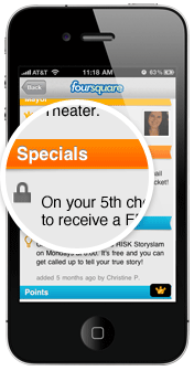
I'll be covering the changes to the recommendation engine in an upcoming post, but today I really want to talk about the new ways arts organizations can offer specials on Foursquare. A "Special" on the platform refers to an incentive that organizations and brands can attach to a venue that is unlocked when a Foursquare user "Checks In" and meets a certain criteria. Up until last week, these specials were limited to either the frequency a user checked in (1st time, 5th time, etc.) or if the user was the "Mayor", a title held by the user that checks in the most frequently at a particular venue.
While a great idea in concept, personally I felt the result was a little lackluster in practice. Becoming the Mayor of a venue is tough, requiring checking in at that venue a large amount of times to temporarily steal the title. While this may be easy to do for somewhere like a local coffeeshop, frequented everyday, it is unrealistic to offer this incentive for an arts organization. Then there is the average check in, some organizations have offered incentives like reduced ticket prices for having a certain amount of check ins, but this is often a one-time special. The hesitation to use a more tantalizing incentive may be the fact that organizations want a little more involvement than having a user hit a button on their cell phone once.
The game has changed with the release of Foursquare 3.0. More types of specials have been added and split up according to whether they are loyalty specials or customer acquisition specials. Plus, nearby specials now appear when a user hits the "Places" tab in Foursquare's mobile platforms, showing users which nearby venues are offering incentives for their foot traffic. Here's a look at how the new specials work:
Customer Aquisition
![]() The Check-in Special - This is the run-of-the-mill, every-time-you-check-in kind of special. It allows organizations to attach an incentive that users can claim with every check-in and is the one most often seen on the platform. Many organizations may still want to take advantage of this by offering cheaper incentives, such as a dollar off admission, to encourage visitors to adopt Foursquare and take advantage of more rewarding specials in the future.
The Check-in Special - This is the run-of-the-mill, every-time-you-check-in kind of special. It allows organizations to attach an incentive that users can claim with every check-in and is the one most often seen on the platform. Many organizations may still want to take advantage of this by offering cheaper incentives, such as a dollar off admission, to encourage visitors to adopt Foursquare and take advantage of more rewarding specials in the future.
![]() The Newbie Special - Most of the new specials say it right in the name and this is no exception, this rewards users only for their first time check-in. Organizations may want to take advantage of this for the same reason as the regular Check-in special, to encourage initial use of the platform.
The Newbie Special - Most of the new specials say it right in the name and this is no exception, this rewards users only for their first time check-in. Organizations may want to take advantage of this for the same reason as the regular Check-in special, to encourage initial use of the platform.
![]() The Flash Special - Now we start to get into some of the more interesting specials. The Flash special works like a flash sale, once a certain number is reached the special expires. It is first come, first serve. For example, say your special events are dragging a little bit for the first few hours, on average. A Flash Special can be used to create some interest in showing up first, such as "First 10 people to check-in unlock a private meet and greet with ______ !".
The Flash Special - Now we start to get into some of the more interesting specials. The Flash special works like a flash sale, once a certain number is reached the special expires. It is first come, first serve. For example, say your special events are dragging a little bit for the first few hours, on average. A Flash Special can be used to create some interest in showing up first, such as "First 10 people to check-in unlock a private meet and greet with ______ !".
![]() The Swarm Special - Swarm specials are all about building a crowd. Swarm specials are only unlocked if a certain number of users, set by the organization, check-in at that organization's venue within a set three hour period. This can be a great way to reward a large crowd with an incentive that would be more attractive for a group event than for an individual. For example, an organization could have a special encore from a performer if that night's swarm special is unlocked.
The Swarm Special - Swarm specials are all about building a crowd. Swarm specials are only unlocked if a certain number of users, set by the organization, check-in at that organization's venue within a set three hour period. This can be a great way to reward a large crowd with an incentive that would be more attractive for a group event than for an individual. For example, an organization could have a special encore from a performer if that night's swarm special is unlocked.
![]() The Friend Special - This is by far my favorite new special. Users can only unlock this special by having a certain number of their foursquare friends, not just users that happen to be at the venue already, check-in alongside them. When paired with a great reward, this can be a great way to incentivize people to bring their friends along to your venue. The number of friends required to unlock the special is completely up to the organization.
The Friend Special - This is by far my favorite new special. Users can only unlock this special by having a certain number of their foursquare friends, not just users that happen to be at the venue already, check-in alongside them. When paired with a great reward, this can be a great way to incentivize people to bring their friends along to your venue. The number of friends required to unlock the special is completely up to the organization.
Rewarding Loyalty
![]() The Mayor Special - Hey now, we can't forget about the Mayor! This special works the same way as the old special, it is unlocked by the current Mayor of the venue. The Mayor is determined by which user checks in the most times in the previous 60 days and the check-ins only count once per day towards mayorship. This is so a user cannot stand in your lobby and just hit the check-in button over and over again until they have the mayorship.
The Mayor Special - Hey now, we can't forget about the Mayor! This special works the same way as the old special, it is unlocked by the current Mayor of the venue. The Mayor is determined by which user checks in the most times in the previous 60 days and the check-ins only count once per day towards mayorship. This is so a user cannot stand in your lobby and just hit the check-in button over and over again until they have the mayorship.
![]() Loyalty Specials - A little bit like the regular check-in special, this special rewards frequent visitors who are regularly checking in. One version of a Loyalty special gives users a goal of total check-ins to unlock a reward. Since you can set the number, organizations may want to pair this with a sweet reward for that user who visits over 100 times. Again, only one check-in counts towards this special per day. Another parameter organizations can set with Loyalty specials is the time that user has to reach the set goal, such as having a goal of 10 check-ins for one month. This type of special could be paired up with a more temporary event like an exhibition or a performance series.
Loyalty Specials - A little bit like the regular check-in special, this special rewards frequent visitors who are regularly checking in. One version of a Loyalty special gives users a goal of total check-ins to unlock a reward. Since you can set the number, organizations may want to pair this with a sweet reward for that user who visits over 100 times. Again, only one check-in counts towards this special per day. Another parameter organizations can set with Loyalty specials is the time that user has to reach the set goal, such as having a goal of 10 check-ins for one month. This type of special could be paired up with a more temporary event like an exhibition or a performance series.
It will be interesting to see if and how arts organizations take advantage of these new specials that Foursquare has launched. The biggest advantage to the service is that it is one of the few social media platforms out there that require users to physically be in the space. Coming up in a future post, I will go into some of the other improvements Foursquare has made to its platform, including the ways their new recommendation engine will help direct users to your organization.
Upcoming Webinar - Engaging Audiences Through the Mobile Web
 Mobilizing the Arts - Engaging Audiences Through the Mobile WebThursday, March 31, 2011
2:00pm - 3:30pm Eastern
Register today for $25
Presenter: David Dombrosky
With the rapid adoption of web-enabled cell phones, smartphones and tablet computers, how are arts organizations adapting to the rise of the mobile Internet? What options are available to arts professionals who want to engage their audiences through mobile devices? What are the cost implications for these new technologies?
In this 90-minute webinar, we will:
- Examine the need for engaging with arts audiences through mobile devices
- Explore options for connecting with audiences via the mobile web
- Discuss what factors may lead you to choose one mobile option over another
- Take a look at the various ways in which arts organizations are using these tools to connect with their audiences
David Dombrosky is the Executive Director of the Center for Arts Management and Technology (CAMT), an applied research center at Carnegie Mellon University investigating ways in which arts organizations can use online technology to more effectively meet their goals. He frequently presents technology and social media workshops and webinars for arts managers – recently for The Association of American Cultures, Performing Arts Exchange, Chorus America, Opera America, College Art Association, and Grantmakers in the Arts.
Instant Encore: Classical Music goes Mobile

- Margo Drakos, co-founder/COO of InstantEncore
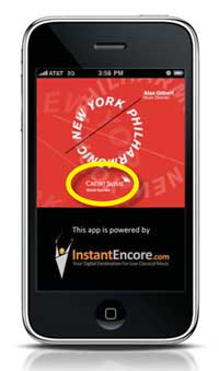
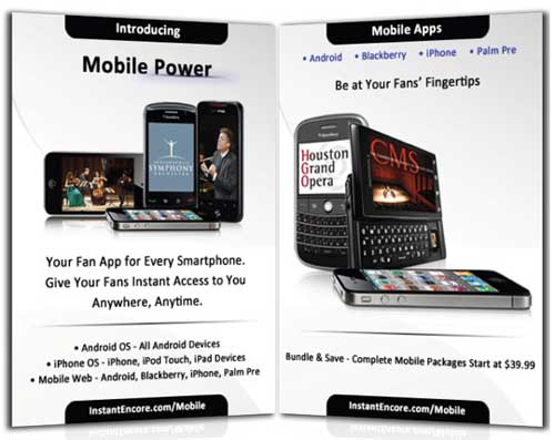
Margo Drakos is a woman on a mission. The co-founder and COO of InstantEncore wants to take classical music directly to its audience via a host of online services, including a digital strategy package for powering custom websites for organizations, a website builder for artists and the development of mobile apps. Recently, the company has been busy building custom mobile apps for Android, iPad, iPhone and all smartphones. InstantEncore’s mobile apps have previously been featured on this blog in Tom’s article 10 Arts and Culture Mobile Apps from 2010.
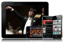 InstantEncore currently powers about 100 iPhone apps and 50 Android as well as hosting mobile web apps, which make an organization's website functional on a mobile phone. Their platform powers the app for the popular YouTube Symphony Orchestra, which, at over 125,000 downloads, and beats both the Taylor Swift and Linkin Park apps by about 90,000. Instant Encore also hosts the apps of notable organizations like the NY Philharmonic, Chamber Music Society of Lincoln Center, Cleveland Institute of Music and Houston Grand Opera.
I talked with Margo recently to catch up on Instant Encore's latest endeavors.
What is InstantEncore? InstantEncore.com is a classical music platform that enables artists and arts organization to harness the power of technology to connect with their fans anywhere, any time. We are the infrastructure! We have created the only classical music-specific digital asset management system that essentially allows our Partners from a broad spectrum of the performing arts world to enter digital content – event listings, ticket selling, audio recordings (streaming, download, public or private), video (live or on-demand), news, blogs, and photos - one time, and have all of their content published in real time to their own website, mobile apps, Facebook or Twitter accounts.
 How did the idea for InstantEncore come about?
Two things happened: I was playing cello for a living and I had sort of grown frustrated with the disconnect between musicians and the audience, where the field was going, and how technology was disrupting the traditional models. I felt passionate about re-personalizing the concert experience without losing artistic integrity.

- An InstantEncore concert card offering a music download.
Meanwhile, I had the pleasure of meeting some wonderful engineers and they had a really powerful search engine specific for classical music that resulted in a high-end jukebox called Maestro. It had originally been created to help catalog vast CD collections, like that of our chairman/CEO. I was talking to them about how sometimes as a performer you would go to a live event and afterwards people would say “I loved the concert. How can I hear it again? How can I get a recording?” And of course I was always trying to sell some unrelated CD. So I talked to these engineers about this predicament that a lot of musicians always find themselves in, and so we actually created this concept of the “Instant Encore”—where you can take a card at the concert, go home, and download the content that you just heard.
How has InstantEncore evolved from the days of concert cards to now? Instant Encore started with a very powerful search engine that had organized and standardized all classical music meta data, and our objective was to build the tools that would enable fans to connect with the music and artists they love, in a personal, immediate way. We wanted to leverage technology to extend and enhance every aspect of the live concert experience. We are committed to providing the 21st century tools that will save organizations time and money by automatically or quickly powering their digital assets to connect with fans and engage sponsors.
How does the Instant Encore component fit in with an organization’s existing social media presences and organizational website? Our goal is to streamline redundancies and save resources. Right now, you have a lot of people that are trying to update their website, spending a great deal of time developing a content management system internally instead of spending development time and resources on the front end. Then there is the mobile space--if an organization does not have a good web-browsing experience from a smartphone, people will close the site. Then organizations are manually pushing content that is often a PR push to Facebook and then to Twitter as well. So there’s a great amount of time and effort in trying to maintain all these very necessary social network platforms.
Obviously details about classical music can be a nightmare to organize or for data entry. We have a very standardized way—unless it’s a world premiere, it’s all in our search engine’s system. For example, if you start to type in “Beethoven Symphony No. 5”, it’s going to have the opus number and the key and all the movements and you just click on that and it’s automatically transferred. So, you’re never entering all that information yourself, which is 1) time-saving and 2) tagged at the most specific level, which allows people that are not looking specifically for you to find you and you that already know you and want to find you to customize their experience.
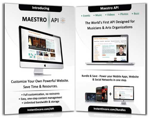
Our system is set up so that you as a Partner can enter an event listing in moments in our secure Control Panel. By that one simple event creation in our content management system, it updates in your website with our webbuilder or more advanced API (Application Programming Interface—see the end of this entry for more information). posts to the partner’s social networks, mobile apps, etc. You can do a host of different things—tag your YouTube channel. You can manually upload music for streaming or download purchase. Or you can create a private download code campaign for donors or concertgoers. One of our most valuable features is this web crawler that goes through hundreds of RSS feeds and finds articles specific to arts organizations and tag any article from newspapers or blog. This can automatically appear in your app or website as the latest news, so you’re not having to physically manage your app or site but your content is current.
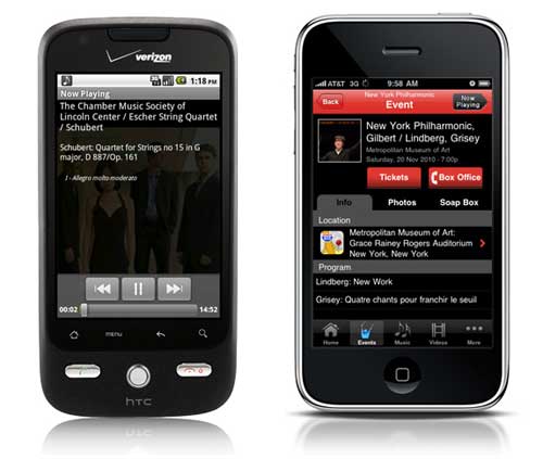 The music player feature on InstantEncore's Android app (left) and the events feature on InstantEncore's iPhone app (right).
So basically it’s just a one-stop shop. It’s a digital asset management system where you come to enter your content in one place and it goes to all the platforms that you’re using. We’re just an aggregator and publisher of that content… Our concept was that it should be something that a two-person organization can use our tools and manage and have a very robust, beautiful integrated social media presence or an organization with a budget over 10 million can use the same tool.
Regardless of all the features you offer, many organizations might have trouble getting the rights to use pieces of music or convincing players that a mobile app is somewhere the music should be. What are some of the arguments you can make to convince them that this is something worth doing? I come from the musician/recording side of things, am a current member of the AFM and as a child was a member of AFTRA and SAG, so I certainly appreciate where the musicians are coming from. What I think is important is that, fortunately or unfortunately (however you want to perceive it) we’re in a new period that is such disruptive change, brought on in part by technology and change is always painful. There are new great opportunities but the existing models and the days of residuals in the way that we used to know it, at least right now, are not there. I think it’s really important to actually be very upfront about this. Artists are highly intelligent people and creative people and have wonderful ideas to bring to the marketing and development side of the business. I think it is so important that everyone be a stakeholder charting this new world together.
I think part of this is taking a holistic approach and saying that there are certainly a group of people that are going to want a physical CD’s and there’s people that are going to want to download content. But there’s a certain group of people know who just want what they want, when they want it. We see from our stats that music or videos are increasingly having a very short shelf life. People will often want to hear a new live recording over and over and then they move on and that is it. I often say to my friends and colleagues that you have to have some faith and work together to try things. Every community and every audience is different, but if you don’t have the tools to even explore or try things, that’s very challenging. I think mobile is so essential. People will be accessing the internet via their mobile devices more than from a computer within the next few years. If you don’t have a good user experience to access your content via mobile or any content in it, in my opinion, I think it will be very, very challenging.
You mentioned that you are focusing your research efforts on return on investment in digital media and how orgs can get sponsorship for their technology initiatives. Can you tell me more? Why should anyone care about social media and an integrated digital strategy? Why should anyone care about having a mobile app? I’m a very “nuts and bolts”, frugal person. When I look at some of the organizations that I work with and see how much they’re spending on print material and yet they don’t want to spend a few thousand on a mobile presence, or want to wait a few years to see where this mobile thing goes, I think it is quite alarming. Showing people the return on investment is critical for them to care.
Many organizations we are working with have packaged a digital or mobile sponsorship package and in many cases, new donors or people who were not previously interested in sponsorship at a significant level, are excited to be part of new technology, sponsoring live video streaming on websites and mobile platforms and much more.
It’s built into our platforms—ways for people to feature sponsors, going through their audience to create new audiences, etc. What I’ve found is that I’ve been pushing organizations to think outside of their printed program with a printed logo and think, how can we think outside of the box and take the old ways that we used to monetize and seek corporate sponsors and take this into the digital space? Some organizations have come up with some fabulous things. Whether it’s embedded streaming announcements featuring sponsors, ad spots with sponsors, getting grants to cover new educational and audience development initiatives—various things. They’ve been able to monetize this in new ways, from new sponsors (not cutting out of other things).
I am very excited that Telstra, the telecom company in Australia, hired us to create a premium custom app for the Sydney Symphony that will include live video streaming of ten concerts in their mobile apps and website. This is a win-win for everyone.
How should arts organizations approach technology? There are so many platforms out there, there is so much information and everything’s changing so rapidly. I remember launching the app with the New York Phil and at that time, apps were still—people thought “what the heck is that?” So, the most important thing is to integrate digital media strategy into organizational strategy—into every aspect of decision-making across all departments. It involves PR, it involves marketing, it involves development, it involves operations, the audio recording department, musicians—absolutely everyone. I think that buy-in is essential. I think one of the most important things is just to start small and get permission to try something. If it doesn’t work, don’t let it validate that “this is never going to work” and if it’s a home-run, that doesn’t mean that it’s going to work the next time. It’s important to look at just getting started but with a clear, integrated strategy approach. And really, actually, there’s a lot of fear sometimes when it comes to technology and I think part of what’s been fun to see is that oftentimes, it’s a lot more fun than people necessarily anticipate and I think that that’s been a really rewarding part of what we’re doing.
When Thomas Hampson made his recital available for download and Performance Today, Minnesota Public Radio, and European Public Broadcasting Union announced it on air. We read the comments from people from around the world—from United Arab Emirates, to Germany to California to Wisconsin—about how that music impacted them and how grateful they were for that. I was very honored and proud that some of our tools could be helping to connect the power of his voice and his artistry globally in a way that’s never happened before. I think that’s really what it’s about and instead of feeling more protectionist, as scary as it feels, to embrace democratized access in this engaged age.
More info on Maestro API:
The State of the Mobile - The 2011 Museum & Mobile Survey
Image via intomobile.com
This past month the results came in for the 2011 Museum & Mobile survey. The survey is part of an ongoing research project focused on the uses and trends of mobile technology in museums.
The survey launched last September and had more than 700 responses, with professions ranging from museum employees to mobile technology vendors and researchers. The effort was international, but the majority of responses (80%) were from the United States, with the United Kingdom (5%) and Canada (4%) as the next largest group of respondents.
The survey points to some interesting trends that are cropping up with mobile development for museums. There is a ton of information in the survey, but here are some of the interesting things I pulled from the presentation:
- Of the 738 survey respondents, 30% already have some form of a mobile program in place and 23% planned to develop one. 36% of institutions had no plans to go mobile and the remaining 11% were responses from vendors and researchers.
- When asked which terms best described their current or planned mobile program, the most common responses were: Some sort of audio tour, free for visitors, and visitors were expected to provide their own hardware (i.e. smartphone, iPod).
- The goals for the mobile programs were most commonly described as providing supplementary information and diversifying the visitors’ experience. Personally, I loved that the next two most common goals were an emphasis on experimentation and creating an interactive experience.
- What was most challenging for museums with mobile programs in place? Encouraging adoption among visitors, producing the content, and keeping that content up to date.
- The largest challenge for those planning to develop a mobile plan? The implementation costs.
- Looking ahead five years, most institutions said that implementing in-house content development was a definite goal.
- And what is least likely to be implemented in the next five years? Institution-wide WIFI, real time location services and augmented reality.
- What I found promising was that respondents to the survey had a strong desire to see more research done, even among those who had no mobile plans at all. The most requested areas of research were: Guidelines for user experience design, methods for conducting visitor evaluations and analysis of different technology systems.
So beyond these points, what are some of the larger takeaways from the survey? Well, for one, the survey goes to show that mobile technology is more than a fad. Mobile programs are becoming more common and less of an anomaly among museums. The survey also provides a snapshot of some of the concerns about development and adoption of a mobile program.
It was a little disappointing to see that among the technology being definitely implemented in the next five years, new tech like RTLS and augmented reality were the bottom two. Personally, I would not underestimate the possibility of this technology becoming an expectation among visitors, even within the next few years.
Also, the survey pointed out that 50-55% of respondents consider having a mobile-friendly website as something that should be definitely implemented in the next five years. An organization’s website will often be the first portal of entry for a mobile user, and having a website that is optimized for mobile platforms should be a higher priority.
Overall, I think the biggest takeaway of the survey is that the future of mobile technology in museums will not be just some flashy app. Throughout the field, serious thought is being put into how these programs can be developed in a way that are both substantial and engaging for the user. It was awesome to see institutions describe the goals of their current or planned mobile programs as experimental and interactive.
There were a lot of interesting results from thus survey, the above points were only a few that jumped out at me. For the more in-depth results of the survey visit Museum & Mobile’s website to view the full presentation.
A Guide to Mobile Marketing, Part One
This is the first in a multi-part series of articles exploring various tools and tactics for promoting and marketing on the mobile web.
From museums and opera companies using QR Codes to festivals using Foursquare to launch a musical scavenger hunt, it's becoming apparent that designing a mobile marketing campaign can be one of the more challenging, creative and rewarding ways to engage customers.
Consider some of these recent findings:
- A Nielsen Company report recently indicated that U.S. smartphone penetration will be over 50% in 2011.
- Diana Pouliot – Director of Mobile Advertising at Google – revealed that one-third of all Google searches via the mobile web pertain to some aspect of the searcher’s local environment
- Mobile campaigns are capturing an increasing level of consumers' attention across key metrics: mobile ad awareness reached 31% in 2010, up from 14% in 2009 and 16% in 2008.
Smartphone Use On the Rise!


As smartphones increase in popularity, users are often utilizing this technology to discover local events and local businesses that may interest them. This has resulted in an increased demand for businesses wanting to implement effective mobile marketing campaigns. In this blog series, I want to examine what tools and strategies arts organizations can use to implement effective campaigns.
Location Based Tools
One of the most popular uses for smartphones is generating directions to and/or information about local businesses. Here are two tools that organizations can use to elevate their visibility to smartphone users.
1. Google Places:
With the recent launch of a Google Places App for both the iPhone and Android platforms as well as a scheduled Google Maps update for the Android smartphone, the importance of having an up-to-date listing in Google Places is extremely relevant for an effective mobile marketing campaign. Below is a screenshot of the Google Places app in action:

To ensure that your organization appears in a Google Places mobile search, you must first make sure that you register with Google Places online. Here's a quick overview of how to get started
- Claim your business by verifying your listing
- Add pictures and videos to make your Place Page more compelling
- Review the Google Places Getting Started Guide for any other questions
- Bonus Tip: If your organization receives a certain amount of positive reviews, Google will mail a window decal with a personalized QR Code. 200,000 businesses have already received these decals.
- Bonus Tip #2: An easy way to boost your rankings in a Google Places Search is to make sure your business is properly listed in online directories like Yellow Pages and City Search. Google indexes these "citations" in order to determine what is most appropriate to a user's search query
- Bonus Tip #3: According to a recent article on Mashable.com, Google Hotpot - recommendation engine and ratings/reviews system for places - has "officially gone worldwide." Hotpot integrates with Google Places and also appears in Google search results. Here's a brief overview of how Hotpot works:
2. Yelp Another popular app for smartphones is the local search platform, Yelp. The company has reported that more than 41 million people visited Yelp within the past 30 days (as of December 2010). Yelp also reports that 27% of its searches come from its iPhone application. Businesses can setup free accounts to post pictures, special offers and send out messages to customers.
Just like Google Places, businesses owners must first register their organization on Yelp's website. Login to Yelp for Business Owners in order to create a listing for your business. One of the major challenges with maintaining a Yelp and Google Places profile is encouraging patrons to leave positive reviews. The easiest way to receive reviews, is simply to ask for them.
In upcoming posts, we will be examine: effective 'check-in' campaigns on services like FourSquare and Gowalla, how to set up QR codes, developing mobile applications, and how to run effective short code (SMS) campaigns.
Social Media Spotlight: The ToonSeum
Welcome to the fifth installment of the Social Media Spotlight, our monthly feature focusing on arts organizations’ social media strategies.
How to allocate time and money towards both social media engagement and online marketing is different for every arts organization. To get a different perspective Technology in the Arts decided to talk with a smaller organization, the ToonSeum, about how they achieve their social media and online marketing goals with a limited staff. I had a chance to chat with Joe Wos, Executive Director of the ToonSeum, about his approach:

So Joe, what is the ToonSeum?
The ToonSeum is Pittsburgh’s Museum of Cartoon Art. It is one of only three museums in the country dedicated to the cartoon and comic arts. We offer rotating exhibitions covering all aspects of cartoons and comics, from animation and anime, to comic strips, comic books, editorial cartoons, illustration and much more. We also offer ongoing workshops, screenings and lectures.
It really is one of the most unique museums in Pittsburgh. Every city may have a version of a children’s museum or traditional art museum, but there are only three cartoon art museums! New York, San Francisco and Pittsburgh. We take great pride in our unique place in Pittsburgh.
What kind of marketing and PR challenges does the ToonSeum face?
Our number one challenge as with any small non-profit is budget. We are a small museum up against juggernauts! We are up to the challenge. If anything, budget limitations have led to creative thinking. You aren’t going to see us investing a lot in “traditional” advertising. Being a smaller museum also eliminates a lot of the fear of change you see from larger venues. We don’t have a huge investment in outmoded technology or ideas, so we are more inclined to let go and move forward to embrace new ideas in both marketing and tech.
We have been very lucky, the media both locally and nationally has been very supportive. Part of that attention is because of our approach to marketing. We use online marketing to create interest in “real world” experiences. We innovate new ways of reaching out. How many museums can say they had their own beer? Illustration Ale was a great success. We didn’t mail out postcards we used facebook.
In February we will launch our own themed hotel room in partnership with the Wyndham Grande downtown. It’s all about immersive experiences, translating virtual experiences we enjoy in gaming and through cartoons into the real world. That’s the kind of creative thinking we embrace.
A limited budget forces truly creative thinking.
Why did you choose to go with social networks/online marketing as a solution?
We are a fan-based museum. It’s a new approach to museum management, marketing and even exhibitions. Comic and cartoons by their very nature, are a fan-based medium. We embrace that. Just look at San Diego Comic Con, why is every major movie launching there? Because of the power fans have via social networks. We tap into those same fans. We are a geek museum, and proud of it. Our audience is very tech savvy, early adopters who can market virally better than anyone.
We know that the ToonSeum is a real world extension of a fan based virtual world. We are a museum of characters, icons and avatars. We want to become a real hub for comic and cartoon fans, and the only way to do that now, is through creating online connections and then inviting them to join us at the ToonSeum. Once we get them here, we know, they will tell their friends, strangers, tweet, blog, post, and tell the world about us.
We also recognize that it can’t be just virtual, you have to take it to the fans! We have booths at major Comic Cons, from San Diego to New York. We also host Blogger events and Tweet Parties at the ToonSeum. If we can get the word out to them about our exhibits and programs they will help us spread the word.
Beyond the standard social media efforts, such as a Facebook page and a twitter account, what other types of online efforts are the ToonSeum trying?
I worked for twenty years with a museum that had a real aversion to technology, it took a decade for them to come around. The ToonSeum is the opposite. We want to be the first. We were the first museum in Pittsburgh to have an I-Phone App. We may still be the only one! MailChimp, EventBrite, every new social marketing tool that comes out we give it a try. We were among the first to participate in KickStarter (we were even featured in the New York Times in an article about it.) I attend the Consumer Electronic Show in Las Vegas just because I know we need to stay at pace with the public. The technology in most museums is outdated, kids can do more advance and exciting interactions at home. So we reach out, we are a Beta Test museum. We put ourselves out there to new technology and say, let us try this out first!
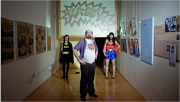
We have an ipad docent at the entrance. Any guests who wants to experience more online while in the gallery can use it as a tool.
For light up night we launched lights in our windows that can be controlled from the outside via an iphone. The guest has control over their experience before they even enter the door.
I am a self-professed geek and nerd, I attend the Consumer Electronic Show in Vegas every other year, I attend the Toy Fair in New York. I bring those innovations and ideas back to the ToonSeum and find ways to integrate them. So the ToonSeum has a giant screen projection in the center of our ceiling that loops cartoons. It is of course blu-ray 3d as well.
We have worked with Behar-Fingal to integrate QR codes into all our exhibitions. This allows guest with smartphones to link to additional content online. Whether it is a wikipage entry on the artists, or video we provide of the cartoonist at work. This is a great tool to take our exhibits beyond our walls and is also cost effective. People are walking around with access to all the information they need. In the future museums won’t need placard after placard of explanatory text. They will just need to provide a link. Their curiosity will take them beyond your walls. Each and every work of art is a potential jumping off point to a world of discovery in the world wide virtual museum.
We know that the traffic has to flow in both directions. A museum should be a destination from those on the web looking for real world experiences, but a museum must also be a gateway to curiosity that can be infinitely explored in new and exciting ways online.
Despite our using technology in so many ways, the ToonSeum is still ultimately about art on the walls. Because we have integrated ways to put the technology in your hands we don’t have to use a lot of monitors and computers. It makes it an individual experience, which is something we learned from social marketing. Everyone wants to interact on their own terms.
I know you operate on a small staff, how does this affect how you manage your various online efforts?
We have a social marketing intern whose only job is to tweet and post. That’s a must! The museum has to have a presence online that allows for immediate interaction. So we respond to every tweet that mentions us, every facebook post. It’s time consuming but it is the most important aspect of social marketing… being social!
All of our staff also has access to post to our various accounts. So we are updating daily. More important though is the fact that our fans are out there, retweeting and posting everything for us. It gives us a much bigger presence.
They also know to speak with the ToonSeums voice. It’s always connected to our mission and not personal. I have seen top-notch museums whose official facebook page has post about their kids getting the flu! Unless there is an epidemic of every kid visiting your venue getting the flu, how does a museum have kids that get sick? It doesn’t. Your venue has to have a virtual identity, a voice that your fans can interact with and it has to be consistent.
This is all easier to accomplish with a small staff. There are no committees, no approval process, no budget meeting, we identify what needs done and do it!
Does your staff size affect how you track the success of all of your online projects?
Every guest that comes in is asked how they heard about us, and their zipcode. We track every single opened email and clicked link. That data is all placed into a matrix we use to measure our success. It doesn’t take a big marketing firm, it just takes a commitment of a few minutes each day.
Can we talk about the Bloggers Blast? What is the event and why focus on bloggers?
I was at the Consumer Electronics Show in Vegas and attended about 5 after parties. What impressed me was they were all geared toward bloggers and social media. I knew this was something the ToonSeum had to do in Pittsburgh.
Traditional press is great, we love them! But today even they are pulling content from bloggers. Bloggers have fans, just like we do. It comes back to embracing a fan-based culture. So we wanted to let those bloggers get a sneak preview at our upcoming exhibitions and programs for 2011. We have special guests, a preview of the art, prizes and every single blogger will get a flash drive filled with all our press releases, promo art and more. If you are reading this and are a blogger, contact joe@toonseum.com for your invite.
We will be following this with tweet parties, where everyone is admitted free if they tweet about the exhibits.
You have mentioned that the ToonSeum was one of the first Pittsburgh museums to develop an iPhone app. What does the app do and what was the development process like? Has there been a good response?
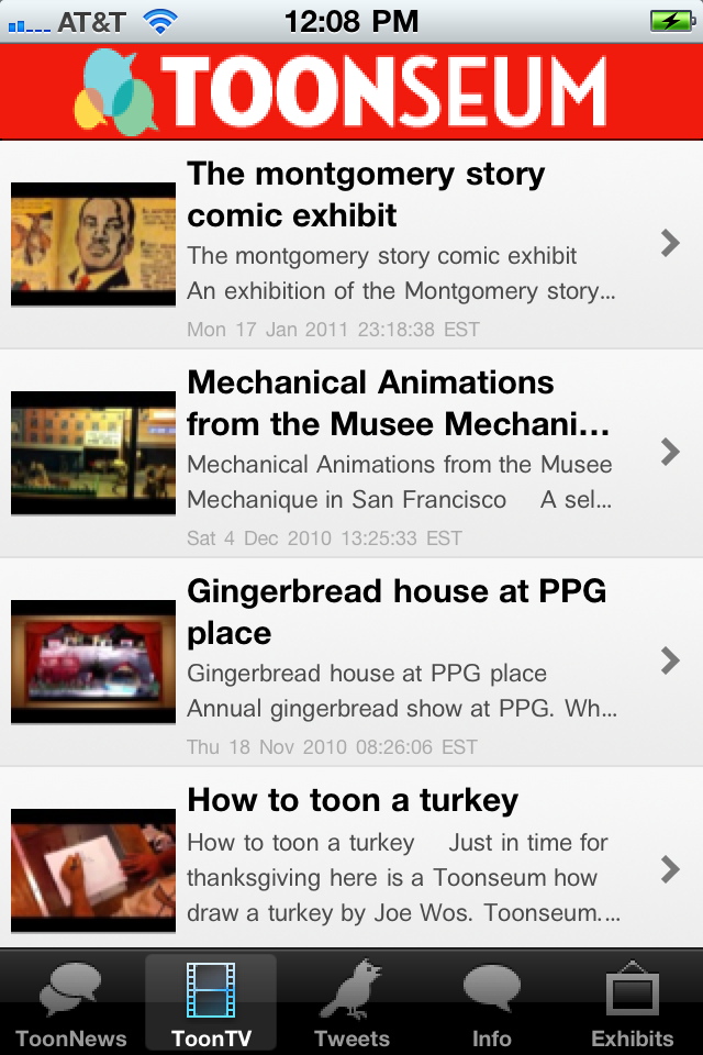
Going to back to my previous experience with another museum, I was often frustrated by the phrase “we’ll look into it.” I began to realize that phrase meant, we don’t know how to do it and aren’t willing to learn. Forget the yellow pages, the phone book is dead. It’s all about web and apps. We knew we needed an iphone app. It provides immediate access to enhance the guest experience. It also goes a long way to legitimizing you to tourist. It’s one of the first things I do when I visit a venue in a new city, I check them out online and then download their app.
Creating an app can be an expensive prospect, thousands of dollars. That was out of the question for our budget. So, I just learned to do it myself. I applied for an apple developer license, found a great site that would allow me total control over the creation of the app, submitted it for approval and that was it. Total process took about five hours, not counting waiting for approvals, which took three weeks. I used rss feeds so that info on our hours and events could be changed on the fly. I created a framework that would allow our youtube videos to be viewed from within the application. As a cartoonist it was easy to do most of the graphic design work myself and there you go. It’s done. Our social marketing intern can update it from anywhere. I can even update from my iphone when I am out of town.
If I am going to run a museum I should know how to do every job. I better know how to market, run the register, curate an exhibition and even mop the floors. I can then have a better understanding of how difficult a task is and more important I can lend a hand when it is needed.
I am working on an android app right now and we are doing a complete web overhaul in spring.
We are geeks, we love this stuff.
Changing The Way You See With Augmented Reality
When looking ahead at what will be the most exciting technology for the arts in the coming year, augmented reality is bound to pop up in the conversation. You may be familiar with augmented reality already. The National Football League has taken advantage of this technology for years to project lines of scrimmage and game time information onto the field in real-time during television broadcasts. So what exactly is augmented reality (AR)? According to Wikipedia:
Augmented reality (AR) is a term for a live direct or indirect view of a physical, real-world environment whose elements are augmented by computer-generated sensory input, such as sound or graphics.
AR layers digital elements on top of our view of the everyday world. This overlay can be done in a number of ways: through the use of handheld devices like smartphones, through desktop computers with a webcam, by wearing specialized headsets, or by projecting a digital images/animations onto a real world location.
Since AR has the possibility to create such a unique visual experience, it naturally has attracted adopters from the creative community. Here are just a few cool projects taking advantage of AR:
DIY Day MoMA – Augmented Reality Art Invasion! On October 9th, 2010, Sander Veenhof and Mark Skwarek decided they would circumvent the traditional art world and host their own exhibition at the Museum of Modern Art using AR. The artists took advantage of the augmented reality viewer app Layar, currently available only on iPhone and Android devices, to create a virtual exhibition of digital works. By downloading the Layar app and loading the “AR Exhibition” layer, anyone with a camera-enabled smartphone or mobile device can view numerous digital artworks throughout MoMA. This includes both 2-D and 3-D images and animations and an additional 7th floor that only exists in the world of AR. The digital artworks have continued to be on display since DIY Day wrapped up in October.
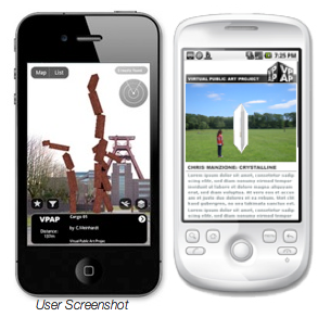
The Virtual Public Art Project Also utilizing the Layar app, the Virtual Public Art Project (VPAP) takes the idea of AR artworks one step further by placing pieces around the globe. The artworks can be viewed in the round and from multiple perspectives, just as you would be able to with a real piece of public art. Check out some of the current works on display on VPAP’s website . If you’re interested in creating your own piece of AR artwork for the public, VPAP puts out multiple calls for submissions.
The Macula Project – Mapping 600 years of history The Macula Project is comprised of a group of artists exploring the relationship between image, sound and the viewer. The city of Prague was searching for a way to celebrate the 600th anniversary of the astrological clock tower situated in the center of the city and turned to the Macula Project for a creative solution. The artists at the Macula Project turned to AR for the project and projected this stunning work that took the audience through the 600-year history of the clock tower. Macula was able to achieve this by digitally mapping the building beforehand and tailoring their animation so when it ran through a digital projector, the perspective lined up perfectly with the real life clock tower.
The Getty Museum – Exploring the Augsburg Display Cabinet in 3-D
If there is one frustrating roadblock shared across the gamut of art lovers, it’s the frustration over not being able to personally handle and explore a piece of art in a museum. The Getty Museum understood this burning desire and took advantage of AR technology to let their visitors have a more in-depth exploration of one of the pieces from their decorative arts collection. Using an online program launched within a web browser, a computer’s built-in webcam, and a printed out “AR tag”, an art lover can handle a 3-D model of a 17th century collector’s cabinet. By rotating and tilting the AR tag, the cabinet will spin 360 degrees and various doors can be opened and explored.
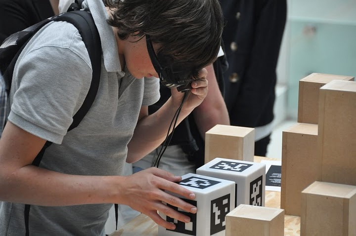
The University of Gronigen – Giving students X-ray vision Part of a permanent exhibit in their Hall of the Bernouilliborg, the University of Gronigen teamed up with Science LinX and Nanopodium to create a unique science experience for their students. The exhibit is comprised of multiple boxes covered with AR tags. By wearing a special set of glasses containing display screens and a camera, the boxes’ walls suddenly disappear for the user. The user can then tilt and turn the now ‘hollow’ box that contains various types of 3-D science-related models, such as a model of a chain of molecules.
The types of projects that are now possible with augmented reality are rapidly growing and the technology is some pretty exciting stuff to play with. But beyond the wow factor that comes with AR, what are some of the ways that arts organizations can use this technology in worthwhile and innovative ways? Can AR extend to projects beyond the visual arts? Are there ways that this technology can be used to engage with large audiences as well as the individual? I don’t think it is too far a stretch of the imagination to envision actors on stage reacting to digital props or musicians playing digitally created instruments. As with any new tech, it will be exciting to see how AR develops and continues to merge our reality with a digital one.
Top Technology Trends: What’s Ahead for Arts Marketers in 2011
This post also appears as a featured article on artsmarketing.org, hosted by Americans for the Arts.
In this tough economy, most of us have encouraged ourselves and others to look ahead to brighter times. But, what exactly lies ahead in the next year for us? How can we make the most of our future?
In 2010, technology influenced our field tremendously. Some predicted trends, like Google Wave and Google Buzz, failed to take off, and many unexpected trends, like group-manipulated pricing and Ask a Curator, flourished. The following are some major trends that have gathered momentum in the past year and/or are poised to take off in 2011:
Group discounts and group-manipulated pricing Group discount sites exploded in popularity in 2010. While many organizations have a group sales manager or special deals for groups, these sites allow people to opt in to a deal that will only go live if enough people opt in, encouraging people to sell to their friends. Groupon now boasts 35 million subscribers and 18 million Groupons sold in North America. However, marketers question their ability to attract repeat visitors. Now that the initial novelty has worn off, hopefully the knowledge we’ve gained will result in smarter offers. I recently heard from a colleague about a ballet company that didn’t cap their Nutcracker offer and lost revenue on their offer.
Since the advent of these group-buying applications, many variants have cropped up. For example, Uniqlo’s Lucky Counter makes clear to the consumer the advantage of group buying, by lowering the price on the offer in real-time as more people sign up. Arts organizations also started implementing dynamic pricing, similar to the way in which airlines price their tickets.
 iPhone sunset in the Andes by Gonzalo Baeza Hernández via Flickr.
 iPhone sunset in the Andes by Gonzalo Baeza Hernández via Flickr.
Go mobile or go home: mobile app development and mobile ticketing In 2010 Wired reported “The Web is Dead”, meaning that the way people use the Internet is moving away from web access on a desktop or laptop computer to mobile applications. Arts organizations have started asking themselves if their website is mobile friendly and, along with companies like InstantEncore and Pop Media, have started to develop apps.
Pop Media has developed Cloudtix, which uses Tessitura to sell tickets in real time through mobile apps and download a scanable ticket to their phone.
Bill Predmore of Pop Media compares the rise of mobile apps this year to website development in 1997. “Arts orgs started out with a ‘brochure site’ and slowly began to evolve as they realized their capabilities. Things will happen a lot more quickly this time.”
So if the web is dead, which is worth more investment: mobile websites or mobile apps? And if you are going to develop an app, which platform do you develop it for? While Apple’s iOS devices (including iPad, iPhone, and iPod) still outnumber Android devices, Android phones have overtaken iPhones in terms of market share.
Predmore advises companies to begin to look into all three: iOS, Android and mobile websites. “Things are changing rapidly and it’s difficult to know what’s going to be there a year from now. For this reason, many organizations are reluctant to make an investment. But patrons are going to expect you to be there and if you’re not, there’s a problem.”
Changing media consumption At the same time that Internet usage is shifting to mobile devices, the way audiences consume entertainment is changing. The introduction of tablet-style devices like the iPad and 4G-capable phones running on Android means more people are consuming mobile entertainment, especially video , than ever before. iPad users are also more likely to complete video ads (63%) than desktop video viewers (53%).
In the past several years, performing arts organizations have started taking their performances outside of the theater and concert hall with initiatives like the Met’s Live in HD, San Francisco Opera’s Opera in the Ballpark, and most recently, L.A. Phil Live. In 2010, we saw a shift to more online streaming video. Sites like Tendu TV and classicaltv aggregate video of performances. Streaming on platforms like Livestream has become more commonplace, notably Chris Elam’s efforts with Misnomer Dance Theatre. Recently YouTube announced that it would offer live streaming to its content partners, several of which are arts organizations.
 Are you in the cloud? Photo: James Jordan via Flickr.
 Are you in the cloud? Photo: James Jordan via Flickr.
The privacy debate Consumers are becoming increasingly aware of how they are being tracked by marketers. At the same time advertisers are under more pressure than ever monetize their online investments as they cut offline budgets. Last year was notable in that two major companies have made privacy faux pas: Facebook over profile information and Google over Buzz. These controversies as well as the rise in location-based apps and ever-nichified Facebook ads have made people more aware of exactly how much information marketers have about them. (If you want to know how much personal information marketers know about you, check out rapleaf.com .
How does this apply to arts orgs? At the same time these privacy concerns have surfaced, arts organizations are being persuaded to move to shared service models, in which databases may be shared by multiple organizations, or have started using other platforms which use cloud computing (where the organization’s data is stored on outside servers). As patrons become more aware of where their information is stored, employees also worry about the security of cloud computing. At the same time, they wonder how secure their database was in the first place. Bottom line: arts organizations should remember that it is crucial to be transparent about their privacy policies to patrons.

Arts organizations, most of which position themselves as serving local community, are starting to understand the potential for hyper-local platforms like this. Location-based applications are increasingly attracting young, urban influencers with disposable income—precisely the audience many arts organizations are trying to attract. People connect to geolocation apps primarily to “get informed” and “obtain promotions” rather than “to compete” to become mayor of their favorite locations.
2011 will likely determine which “check-in” application will dominate. As of November 2010 Facebook Places had 7 times more users than FourSquare, but Places users utilize the service less frequently. So, which platform will win out? Independent companies like GoWalla and FourSquare, or platforms emerging from established networks and services like Facebook and Google?
What do you think were the biggest trends in arts marketing in 2010? What do you see ahead for 2011?
10 Arts and Culture Mobile Apps from 2010
Merely half a day away from the end of the year, today is a great day to reflect on all the different happenings in 2010. One of the big things I have been looking back on is the growth of useful mobile apps for arts and culture audiences and managers. Here is a look at ten of these apps from the past year selected by the Technology in the Arts team and you, our lovely readers:
The Florida Grand Opera | FREE
Available for: iPhone, Android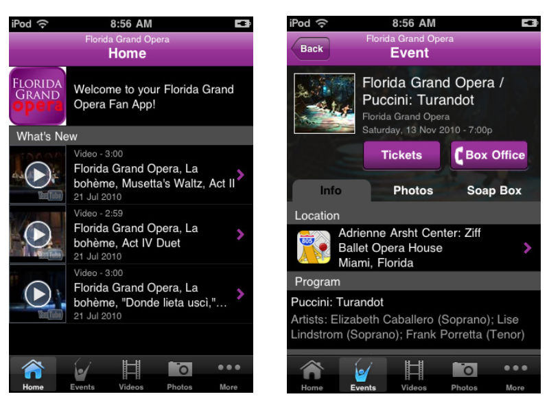 The Breakdown: A great app for the Opera lover in us all, the Florida Grand Opera app offers news about the company, events updates, listings of upcoming performances, and streaming audio of the 2010-2011 season. One aspect of the app I really enjoyed was the videos section, containing a multitude of interviews and performances from the FGO. The only real complaint I have about the app is the necessity to sign up for updates from FGO before being allowed access into the app.
Google Goggles | FREE
Available for: iPhone, Android
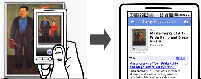
The Breakdown: Google Goggles is a visual search engine built into a mobile app. It utilizes your smartphone's camera to capture and scan an image, object, or landmark and perform a search online to provide information on it. This is a very fun app to play around with and can be very helpful when trying to identify an artwork without a clear label or an unknown landmark. The app is still in beta though and cannot identify anything that is not already currently online in some form.
The L.A. Phil | FREE
Available for: iPhone, Android, & Blackberry
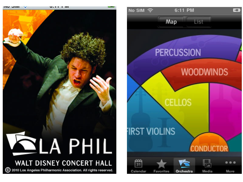 The Breakdown: The LA Philharmonic app has a lot of same offerings as the Florida Grand Opera app in terms of news, media, and listings of events. What sets this app apart is the interactive Orchestra map, laying out the different groups of muscians in the LA Phil. When a user taps on a section of the orchestra, such as First Violins, they are directed to profiles of each musician with in-depth biographies. This app is packed full of great content and an excellent way to learn more about classical music and the people that perform it.
AMNH Explorer | FREE
Available for: iPhone
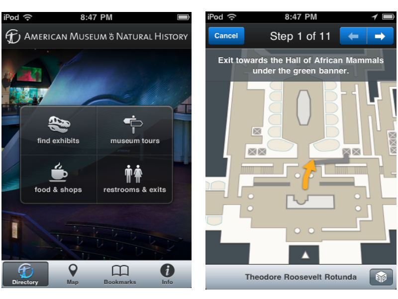 The Breakdown: The Explorer app from the American Museum of Natural History is a great guide for navigating a very large museum. The app acts as a personal in-museum GPS, finding your location and providing information on the exhibits within that area. The app can not only find your location, but provide turn-by-turn directions from one exhibit to the next. This may go against some museum purists love of getting lost within a museum, but on a busy day in a museum packed with visitors this app could be an incredible advantage.
Is This Art? | FREE
Available for: iPhone
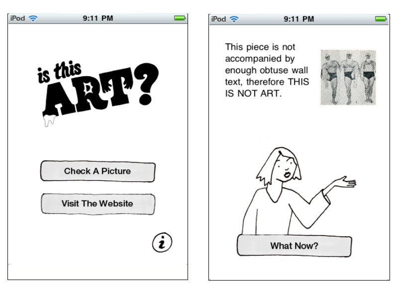 The Breakdown: A fun app from the folks at Deeplocal and the Mattress Factory, Is This Art? is one way to win those age old arguments about what is and isn’t art. Users snap a picture of the art in question and open it within the app to test its validity in the art world. The explanations the app gives are often hilarious such as, "This makes me feel intellectually inferior, therefore THIS IS ART" and, "This piece is not accompanied by enough obtuse wall text, therefore THIS IS NOT ART". All of the images users put to the test can be uploaded to the project's ongoing blog.
Brooklyn Museum Mobile | FREE
Available for: iPhone, Android, & Blackberry
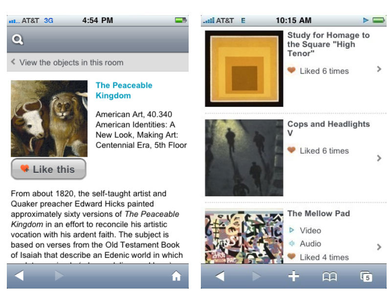
The Breakdown: Another great app for a large museum, Brooklyn Museum Mobile has less of a focus on navigation and more on community and interaction. The app brings in aspects from social media by inviting users to add descriptive tags and/or "like" artworks from the collection. This acts as a recommendation system for other visitors and encourages a more participatory experience. The aspect I like about Brooklyn Museum's offering is that the app runs off of a mobile website, meaning that it is not device exclusive and anyone with a web-enabled device can join in the fun.
The Lighting Handbook | $4.99
Available for: iPhone
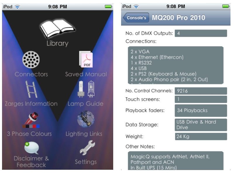 The Breakdown: This is a great app for all of you theater techies. The Lighting Handbook is exactly what it sounds like, an in-depth guide to all things lighting, conveniently in your pocket.
Chicago Gangland Tour | $2.99
Available for: iPhone
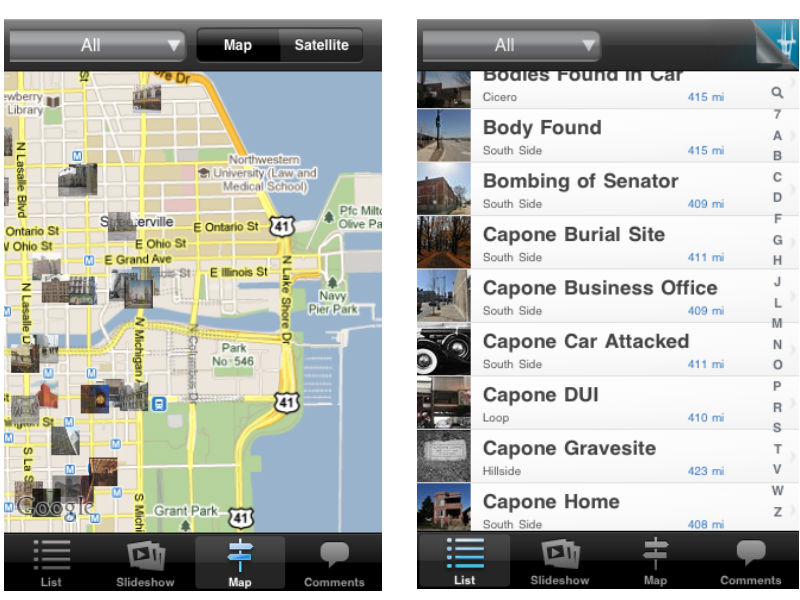
The Breakdown: Ever wanted to walk in the footsteps of famous gangster Al Capone? That's exactly what the Chicago Gangland Tour app helps you do, integrated with google maps to give users a handheld guide for a historical walkthrough of Chicago's mafia history. This app provides info on all the different sites historical relevance and invites users to add their own comments. My favorite aspect of the app is the drop-down menu where results can be sorted by subjects like murders, shootouts, and gangster hideouts.
At The Booth | $0.99
Available for: iPhone, Android
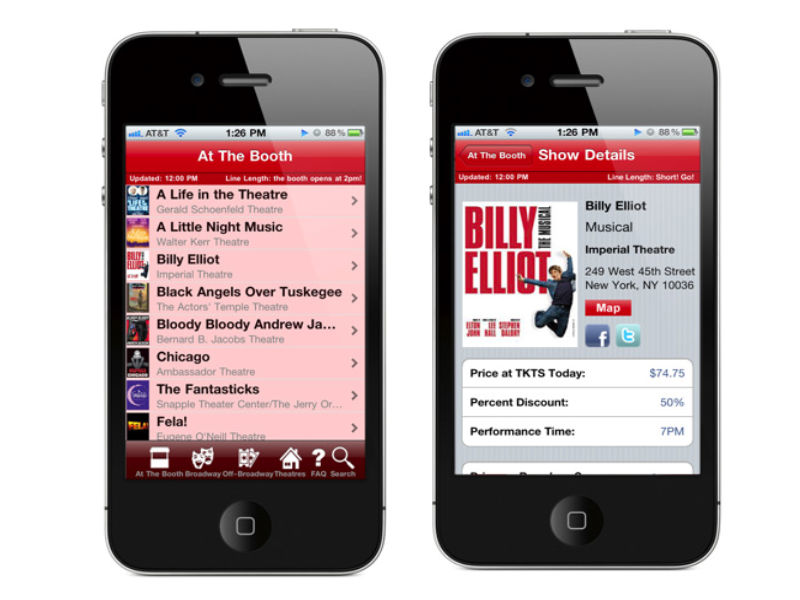 The Breakdown: At The Booth is a full-service app for attendees of Broadway and Off-Broadway shows in New York City. The main page updates with every launch of the app and includes the latest shows and theater locations. For each show the app provides info on the showtimes, ticket prices, discounts, synopses, links to reviews and videos, and nearby restaurants. Listings will appear with a pink undertone to let users know if there are long lines at the theater. The only real complaint I have about the app is that the listings are only viewable in list form, whereas a map option would really assist in seeing all that is available in the immediate area.
The Sundance Festival 2010 | $4.99
Available for: iPhone
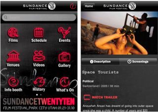
The Breakdown: The Sundance Festival app acts as an online brochure for the annual film festival. In addition to offering videos and reviews on films being shown, the app gives festival attendees real-time updates as to what is happening with the film fest's various events and screenings. The one feature that this app lacks is a way to create custom schedules of screening times and events. This would be invaluable at a festival where multiple things are being offered at once and making the most of the your time requires a lot of planning.
Charitable Donations and the iPhone: What the App, Man?
As the year draws to a close and there is the last, big push for donations by non-profits, who wouldn’t love a one-click, donation button in their app on the iPhone? Well, Apple apparently. There has been some buzz lately over Apple’s policy towards charitable giving on the iPhone.
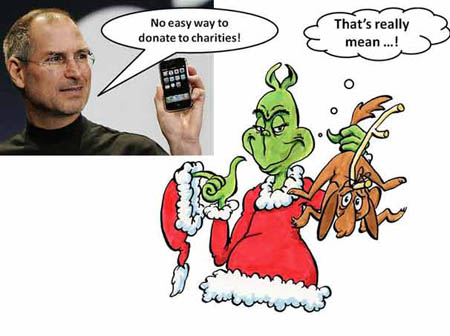
- Photo from PC World

Apple’s policy is that charitable donations cannot take place within an app or through Apple’s app store. If users wish to make a donation, they have to be directed out of the app, through their web browser and may have to contribute additional information. While this may not seem like a huge deal, it does kind of ruin that wonderful impulse that a nice, big red “DONATE NOW” button would have.
So why hate on the big, red button? The answer from Apple has been that they do not want to be responsible for the charitable funds reaching their final destination. But as Jake Shapiro pointed out in a blog post on ars technica:
The excuse that “Apple doesn't want to be held responsible for ensuring that the charitable funds make it to the final destination” is a cop-out. Google Grants has tackled this already, and organizations like TechSoup and Guidestar do a sophisticated job of authenticating nonprofits and charities worldwide.
The real reason may be that charitable donations are just of no interest to Apple. Apple receives 30 cents for every dollar spent in their app store and with a charitable donation, would only be able to claim a processing fee.
While companies like Google and Microsoft have been quick to point out that these problems do not exist with their mobile software, I don’t think this is about finding the one mobile software that perfectly serves the non-profit community. This current stink with Apple more clearly shows the importance of not putting all your eggs in one basket when it comes to developing an organization’s mobile strategy. If you want to voice your displeasure with Apple's policy, an online petition has been started over at care2 and it will be very interesting to see if and how Apple responds.
Where Can I Park for the Show? Now, There's an App for That
 As a denizen of downtown Pittsburgh, I am well aware of how difficult it can be to find a parking spot when I go to the theatre, a gallery crawl, or the symphony. You end up driving to various parking garages only to find a "Lot Full" sign at the entrance.
In a brilliant bit of service to the arts organizations in the cultural district, the Pittsburgh Cultural Trust has created ParkPGH - a multi-platform service providing real-time parking availability information for eight garages in downtown Pittsburgh.
Here are two key reasons why I find this to be a brilliant service:
Addressing a community challenge: By creating ParkPGH, the Pittsburgh Cultural Trust has provided a solution for an issue impacting not just audience members for its own venues, but also audience members for a multitude of arts and cultural organizations not affiliated with the Trust, as well as employees and visitors for other businesses in the downtown cultural district.
Multiple ways of accessing information: The Cultural Trust worked with developers at Deep Local to create a multi-platform service, so that audiences have multiple ways of learning about available parking options. In addition to the iPhone application, ParkPGH has a mobile website, a traditional website, and both text and voice option -- thereby offering the service to anyone with a phone or access to the Internet.
Did I mention that the parking availability information is updated every minute? A key layer of the service developed in collaboration with Traffic 21, a multi-disciplinary initiative of Carnegie Mellon University directed from within Heinz College, which provided research capabilities and back-end support for the ParkPGH project.
So, thanks to the Pittsburgh Cultural Trust for making it easier and more convenient for me to find a parking spot in the cultural district! Hopefully, this idea will catch on in other cities.

