Sitting at work bored? Check out these past AMT Lab articles to get some ideas for manageable projects to improve your organization!
A Visitor's Experience: The Good, the Bad and the Ugly of Smartphone Apps in Art Museums
Having the good fortune of living in Europe for a few years with many of the world’s most beloved fine art institutions in my backyard, I was pleased to test a myriad of their recently launched apps. There is much to be said for the wonderful ways in which mobile devices can enhance the visitor experience. Of course, there are also downfalls attributed to the growing pains associated with mobile. Often I was impressed, entertained, educated, annoyed, and confused – sometimes all simultaneously. Since mobile planning and implementation can be a backend-focused undertaking for museum staff, the following simply offers the perspective of a museum visitor with a smartphone in tow.
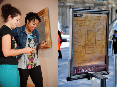
 Visitors use a Davis Museum digital art museum guide. Photo credit: Dot Diva.
No cell phone sign at the Louvre. Photo credit: Tom Arthur.
The Good
- BYOD (bring your own device): Mobile devices are increasing all-in-ones for just about everything. Visitors can skip the line for an audio guide because with the same (if not more robust) content available on their own familiar device, they have the distinct advantage of being audio and multimedia guide self-sufficient.
- Deeper connection: With the inclusion of video and other multimedia content, visitors are offered a closer connection to the artists. The Royal Academy of Arts did a wonderful job incorporating video interviews with Academicians in their 2011 Summer Exhibition app. To back it up, a study conducted at the Davis Museum and Cultural Center found that “on average, participants spent about 39 seconds with a work of art when viewing art without the application, and about 3 minutes and 15 seconds viewing art while using the application.”
- Dialogue: Museums are historically notorious for offering one-way authoritative information. Since most museum mobile apps are outfitted with social media tools such as Facebook and Twitter, visitors are afforded a voice to communicate with the museums (and they actually listen).
- Save and share: I still bring my sketchbook with me on museum visits for notes and doodles, but museum apps make archiving and sharing objects of interest easier to come back to when they offer a “favorite this” feature. Other mobile tools such Pinterest and Twitter hashtags also make the impact of a visit more enduring and accessible.
- Off-site relevance: Many museum apps make content valuable off-site as well as during in-person visits. For example, I dashed through Tate Modern’s Miró Exhibition in a rush, but later read about the impact of the Spanish Civil War on Miró’s work via the exhibition app while waiting to board a plane in Pittsburgh. This pared down version of a catalogue is easier to haul around and cheaper.
- “Edutainment”: Why not learn while being entertained? The Andy Warhol Museum’s DIY Pop app is a great example of experiencing both. We have a frustrated museum education staff member to thank for sparking interest in developing a way to digitally educate the public on Warhol’s silkscreen process while replicating it using our own photos.
The Bad and The Ugly
- Connectivity: Yes, a visitor may skip the line for the audio guide, but once in the gallery app download capability may be spotty since many institutions do not offer Wi-Fi (the cost of which can be a prohibitive expense). To make matters worse, the thick walls of many museums can make using a cellular network virtually impossible. If a visitor can access their cellular network, many multimedia rich museums apps can be data gluttons, especially for foreign travelers out of their network area.
- No phone/camera policies: I’ve become a pro at the art of looking like I’m texting someone, when in fact I’m taking prohibited photos and spreading them on Twitter and Facebook. Some museums are finding it difficult to strike a balance between preventing copyright infringement and fully embracing the use of mobile technology. With apps like “Cards,” you can understand the dilemma of wanting to encourage word-of-mouth marketing while not irresponsibly promoting the dissemination of images not in the public domain. But, as a staff member of the Royal Academy of Arts pointed out to me: “If all the 50 people who came through in the last two hours went home to their Facebook and their Flickr, posted photos of this fantastic place with comments, think of the social media publicity. Think of the viral marketing.” Institutions like the RA are well positioned to proactively ask for artists’ permission for visitors to use and spread images of their work online.
- Slow take-up: Tech savvy visitors who would enjoy a mobile option for museum content consumption are likely a little bummed that art museums tend to lag in mobile innovation. It’s hard to blame museums for not leading the way. Shelley Bernstein, chief of technology at the Brooklyn Museum admits on the museum’s blog that: “[W]e don’t have a large audience for our app. In the galleries on any given day...you’ll see very few visitors pulling out smartphones.” There is a significant demographic gap between the typical museum goer and smartphone owner. Yet, since it is predicted that mobile web browsing will outpace Web browsing on desktop computers by 2015, expect to see a jolt of further mobile enthusiasm from museums on the horizon.
Around the Corner
For individuals such as myself, who are certain their value as a human is inextricably tied to the use of a smartphone, 2010–2011 was an especially great time to be wondering the galleries of Tate Britain, Tate Modern, The Royal Academy of Arts, The Louvre, and more. These institutions’ fledgling apps are a solid start to their entree into mobile tech. In the near future, (especially with the help of new culturally focused app developers) I’ll be excited to see the use of image recognition (a copyright nightmare), mobile transactions (e.g. tickets, membership, gift shop purchases), and the further adoption of augmented reality. Am I asking for too much, too soon? After all, I’m about a step away from expecting my iPhone to wash my dishes if I throw it in the sink. Isn’t there an app for that?
Author Bio
Ashley Paulisick completed her master’s degree in Art Business at Sotheby’s Institute of Art in London in 2011. Her dissertation, titled “The Impact of Mobile Technology on Art Institution Visitor Experiences,” took her to some of the world’s most prestigious art museums, including Tate Modern and Pittsburgh’s own Andy Warhol Museum.
Ashley has also worked in arts administration and as a painter under the “pen” name Ashley Cecil. You can read about and see her work at www.ashleycecil.com and find her on Twitter at @ashleycecil.


