Free Web Sites

Creators Project in San Francisco

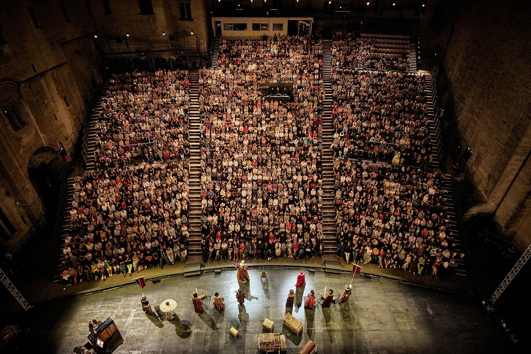
Last weekend the Creator's Project garnered significant attention from national media.  From the mission statement on the website "The Creators Project is a global celebration of art and technology." and "The Creators Project is a new kind of arts and culture channel for a new kind of world."   As an intersection between art and tech it seems appropriate that the blog weigh in and take a look at what they did, how they did it, and the implications.  The Creator's Project has major sponsorship from Intel Corp and VICE with significant online free content focusing on mostly short form interview of Creator associated artists.  This Project offers similar promise to other ventures to offering culture and arts online to ideas such as On The Boards TV and Jacob's Pillow Virtual Pillow but is already operating on a much larger scale than either of these.

The Creators Project offers arts and culture online at a scale that is extraordinary for such a young institution.  The levels of participation on information sharing that is happening through their website looks unparalleled and should be looked towards as a model for successful integration of technology and the arts.   The Creators Project was started in May of 2010 by VICE and seems to have two major interfaces with the public.  There is a exhibit/show that has toured around the world each year and an expanding web presence that now counts video downloads in the millions.  The content is broken out into six different categories:  Music, Film, Art, Design, Gaming, and Fashion and has engaged with artists from all of these areas to provide content online and for the annual festival.  They will be rolling out content collected from the event last weekend (March 17-19, 2012) in the coming weeks.

Current content on the website is a mind blowing array of new directions taken by artists in each of the fields.  One of the standout artists at the event last weekend was a new work from visual multidisciplinary artist Chris Milk.  The installation called the Treachery of Sanctuary incorporated user interaction with digital transformation to look at elements of flight.  Visuals of this can be found here.

Anther fascinating example that was found on the Creator's Project website was the Electronic Shadow from France.  Electronic Shadow uses imaging technology and software to generate interactive 3D maps of people places and objects.  These images then can be used and manipulated in artistic fashions.  The implication for this technology would, for instance, be a game changing one for other art forms such as dance.

Exchange of ideas such as Creator's Project bring together the bleeding edge of Technology and the Arts and as such should be a point of engagement for institutions that are looking to modernize and include new audiences (and younger audiences).  The artists involved have obviously successfully engaged these audiences already and by following the lead of these success stories arts leaders at more conventional organizations can find hope in a new direction in reshaping structure and content to address the demands of a more complex world.


The Cloud

Moving your organization's data to a cloud server might be a good idea at this time.  There are several advantages to working off of a cloud server and a few drawbacks. Some advantages to going to cloud computing:

Accessibility is generally improved through cloud storage.  You can access data from anywhere that you have internet access.

Security on cloud storage services is up to the standard of where ever you have your cloud.  Google and Amazon have some of the best experts on digital security in the world for instance and using a cloud operated by them gives you a greater degree of safety for your data.

The Capacity of cloud storage is very flexible and is expandable with comparative ease.  The fact that cloud storage servers will never need to be upgraded or replaced does save you capital expenses as well as man hours.

The downside:

You don't own it and you have to play by someone else's rules.  If you are using a smaller company, please, make sure to check out their backup plans, security measures, and records regarding downtime and maintenance schedules.

It may be hard to use cloud servers with certain types of databases or other programs and as such may present an integration issue (ticketing systems, development programs, etc).  Make sure you have a plan to get the information from point A to point B if necessary.

In event that you don't have access to the internet you are completely cut off unless you back up to a physical source onsite.  It can be distressing for obvious reasons if your internet service goes sideways and you end up with multiple idle employees until it is restored.


Changing Up The Check-in Pt. 2: Recommendation Engines

groupie_bigA few weeks ago I wrote a post on some of the latest updates to Foursquare's specials. To make the platform worthwhile beyond just a fun game for users, Foursquare has overhauled a lot of their services with version 3.0. This went beyond just specials, the location-based social network wanted to make using their platform a useful way for users to discover new places in their surroundings. Boom, new algorithms that form a better recommendation engine for you and me. What does that mean for us non-techies? It means the 'Explore' tab, a new service that takes info from your check-ins, your friends check-ins and presents you with search results of nearby venues that are more relevant to your interests.
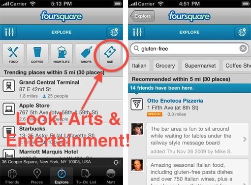
Hit the explore tab, type in something like 'art' or 'mexican food' and Foursquare will take into account all your and your friends past check-ins to come up with the most relevant venue. So not only will it tell you where a venue is, but why you should want to go there. In addition to searching, there are also buttons along the top focused on common venue types people are looking for. You might already be familiar with how recommendation engines work, it is how music sites like Pandora and Last.fm are able to suggest relevant material for their users.

Image via blog.foursquare.com

So why should arts organizations care? Because this may be the simplest of all ways to participate in the location-based game. Claim your venue, add relevant information and start showing up in search results. Claiming a venue is free, gives you control over your brand, and will improve your search and recommendation results not only with Foursquare, but all of the apps and platforms out there using Foursquare's API (programming language and database) like Gowalla and hundreds of others.

While you're staking your claim with Foursquare, you may want to claim your venue on the two other big location-players - Facebook Places and Google Places. Google has some recommendation engines in the works and while Facebook doesn't offer one, claiming your venue there will still make you more visible to a very large group of users.

Claiming your venue on these three platforms is an easy and free way to take advantage of a fast-growing social media form. It's a simple step that may equal a return for your organization that a lot of other social networks can't offer - foot traffic.

  • Learn about claiming venues on Foursquare here.
  • Learn about claiming venues on Facebook Places here.
  • Learn about claiming venues on Google Places here.

Changing Up The Check-in: Foursquare Updates Specials

Screen shot 2011-03-17 at 11.04.24 AM
Image via foursquare.com

Foursquare, the popular location-based social media platform, decided to shake things up a little at the annual South by Southwest festival last week. Rolling out their new 3.0 version, Foursquare has made some significant changes to their platform in the way it operates, most notably in the way it recommends venues and offers specials.

I'll be covering the changes to the recommendation engine in an upcoming post, but today I really want to talk about the new ways arts organizations can offer specials on Foursquare. A "Special" on the platform refers to an incentive that organizations and brands can attach to a venue that is unlocked when a Foursquare user "Checks In" and meets a certain criteria. Up until last week, these specials were limited to either the frequency a user checked in (1st time, 5th time, etc.) or if the user was the "Mayor", a title held by the user that checks in the most frequently at a particular venue.

While a great idea in concept, personally I felt the result was a little lackluster in practice. Becoming the Mayor of a venue is tough, requiring checking in at that venue a large amount of times to temporarily steal the title. While this may be easy to do for somewhere like a local coffeeshop, frequented everyday, it is unrealistic to offer this incentive for an arts organization. Then there is the average check in, some organizations have offered incentives like reduced ticket prices for having a certain amount of check ins, but this is often a one-time special. The hesitation to use a more tantalizing incentive may be the fact that organizations want a little more involvement than having a user hit a button on their cell phone once.

The game has changed with the release of Foursquare 3.0. More types of specials have been added and split up according to whether they are loyalty specials or customer acquisition specials. Plus, nearby specials now appear when a user hits the "Places" tab in Foursquare's mobile platforms, showing users which nearby venues are offering incentives for their foot traffic. Here's a look at how the new specials work:

Customer Aquisition

check-inThe Check-in Special - This is the run-of-the-mill, every-time-you-check-in kind of special. It allows organizations to attach an incentive that users can claim with every check-in and is the one most often seen on the platform. Many organizations may still want to take advantage of this by offering cheaper incentives, such as a dollar off admission, to encourage visitors to adopt Foursquare and take advantage of more rewarding specials in the future.

newbieThe Newbie Special - Most of the new specials say it right in the name and this is no exception, this rewards users only for their first time check-in. Organizations may want to take advantage of this for the same reason as the regular Check-in special, to encourage initial use of the platform.

flashThe Flash Special - Now we start to get into some of the more interesting specials. The Flash special works like a flash sale, once a certain number is reached the special expires. It is first come, first serve. For example, say your special events are dragging a little bit for the first few hours, on average. A Flash Special can be used to create some interest in showing up first, such as "First 10 people to check-in unlock a private meet and greet with ______ !".

swarmThe Swarm Special - Swarm specials are all about building a crowd. Swarm specials are only unlocked if a certain number of users, set by the organization,  check-in at that organization's venue within a set three hour period. This can be a great way to reward a large crowd with an incentive that would be more attractive for a group event than for an individual. For example, an organization could  have a special encore from a performer if that night's swarm special is unlocked.

friendsThe Friend Special - This is by far my favorite new special. Users can only unlock this special by having a certain number of their foursquare friends, not just users that happen to be at the venue already, check-in alongside them. When paired with a great reward, this can be a great way to incentivize people to bring their friends along to your venue. The number of friends required to unlock the special is completely up to the organization.

Rewarding Loyalty

mayorThe Mayor Special - Hey now, we can't forget about the Mayor! This special works the same way as the old special, it is unlocked by the current Mayor of the venue. The Mayor is determined by which user checks in the most times in the previous 60 days and the check-ins only count once per day towards mayorship. This is so a user cannot stand in your lobby and just hit the check-in button over and over again until they have the mayorship.

frequencyLoyalty Specials - A little bit like the regular check-in special, this special rewards frequent visitors who are regularly checking in. One version of a Loyalty special gives users a goal of total check-ins to unlock a reward. Since you can set the number, organizations may want to pair this with a sweet reward for that user who visits over 100 times. Again, only one check-in counts towards this special per day. Another parameter organizations can set with Loyalty specials is the time that user has to reach the set goal, such as having a goal of 10 check-ins for one month. This type of special could be paired up with a more temporary event like an exhibition or a performance series.

It will be interesting to see if and how arts organizations take advantage of these new specials that Foursquare has launched. The biggest advantage to the service is that it is one of the few social media platforms out there that require users to physically be in the space. Coming up in a future post, I will go into some of the other improvements Foursquare has made to its platform, including the ways their new recommendation engine will help direct users to your organization.

Tumblr Is Headed For The Creative Community, Should Arts Organizations Follow?

A vast repository of pop culture memes & internet humor, the blogging service Tumblr has grown significantly since its launch in 2007. With over 12 million blogs and with the recent raising of $30 million in funding, some see Tumblr's future as taking on blogging services like WordPress and Blogger. The site’s hallmarks are its streamlined posting dashboard and reblogging feature. Add on likes and short replies, and this gives the site a familiar feel to social networks like Flickr, Facebook and Twitter.

So this is all well and good, but how does Tumblr relate to the arts? As mentioned on mashable.com recently, Tumblr is going to focus more on developing the growing creative communities on the site.  As Tumblr’s founder David Karp stated:

“You look in fashion, creative writing, photography, music, so many of these creative circles,” said Karp, “and we have these really substantial communities that now live on Tumblr.”

Should arts organizations take advantage of Tumblr’s new direction and add it to their group of social networks? Before getting into that, take a look at Tumblr’s differences when compared to blogging platforms like WordPress or Blogger. I’ve used tumblr myself for a personal blog and here are a few of the features that stood out to me and made it feel more like a social media site:

The posting dashboard. Image via tumblr.com

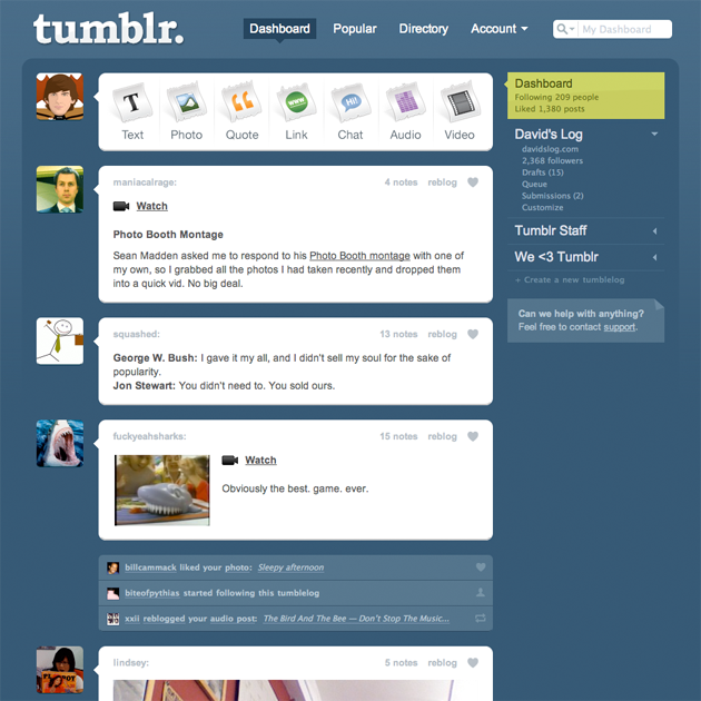
  • The Dashboard Streamlined for different types of media, the dashboard contains buttons that takes bloggers to posting forms customized for the content. This speeds up the posting process and makes posting media content such as audio, video and photos, a lot faster than traditional blog platforms.

A typical submission form on tumblr. Image via tumblr.com

A typical submission form on tumblr. Image via tumblr.com

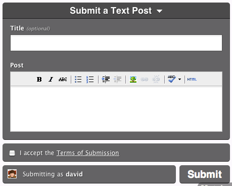
    • The Submission Feature: This feature is especially driven towards community-oriented blogs, where the author can invite his community to write and contribute their own content. Posts can be submitted by followers to their favorite blog through a built-in form and since the posts are automatically formatted, all the author of has to do is hit publish. This is probably the feature I feel would be most attractive to arts organizations, since it asks the constituents to not only read and comment on the organization's blog, but be a driver of content as well. x
    • Reblogging: Probably my favorite feature of Tumblr. This works almost the exact same way that a re-tweet does on Twitter. Pressing the reblog button will instantly re-post someone’s post onto your blog. The feature is impulsive and probably the number one reason content spreads so quickly through the site.x

    An example of the tumblr dashboard. via tumblr.com
    An example of the tumblr dashboard and update feed. Image via tumblr.com

    • The Update Feed Imagine the feed of updates on Facebook or Blogger, Tumblr operates in the same way, aggregating all the Tumblr blogs you follow into one stream. All of the posts appear in a uniform format with the options to like, short reply or reblog.

    Tumblr’s features make it easy and accessible for the individual blogger, but that doesn’t necessarily make it great for organizations. Here are a few issues I saw with how the site operates that might be irritating for some arts organizations:

    • Tumblr is a Clique: While a Tumblr blog can be viewed by anyone, features like reblogging and replies are only available (and visible) to someone signed into a Tumblr account. This is true of many social networks, but since Tumblr is essentially a blogging platform, there is an expectation that the level of engagement should be available for all visitors. Organizations can lose out on connecting with non-Tumblr visitors who cannot “like” or comment on a post that really engages them. x
    • Kept Out of the Conversation: Another problem for engagement on the site is the system for comments - it's extremely difficult to create a conversation. Tumblr users can leave short replies, but there are no systems in place to let authors and other bloggers reply to that comment. What follows is a mess of reblogs and screen captures of comments in an effort to make a threaded conversation. Some Tumblr bloggers have tried to solve this problem using a service like Disqus, but then a problem is created for the Tumblr community. Visitors outside Tumblr can engage, but the comments will not show up in the regular feed or be accessible for Tumblr users through their accounts, and the two communities remain disconnected from one another. x
    • Customization on the site can be tough: The options are limited and those options change completely based on which theme you have installed. Some themes severely limit your options for color choice and background image, making branding difficult. Other themes do not allow for visitors to have a reply option, even within Tumblr. x
    • Remember all those reblogs, short replies, and likes? While these show up in your update feed, there is no built-in way to track them. It’s an exciting experience to see a post go viral and get re-blogged multiple times, but tracking that effect through Tumblr over time is extremely difficult. x
    • Managing the Archive: Managing past posts is difficult and while a mass editor exists, this just gives a visual overview of your posts over time. It’s hard to track a post from more than a few months back and there is no way to export your archives.

    So should an arts organization take advantage of Tumblr anyway? If you have an existing, integrated social media strategy and primary blog in place, it may be worth a shot. Tumblr has a fairly clean interface with Facebook and Twitter, and could be a good way to provide content to an ever-growing community of bloggers.

    If your organization is thinking of making this their main blog, I would hold off since it will be harder to manage in the long run and success metrics would be a pain. It will be interesting to see how Tumblr is going to improve the site to focus on the creative community and what effect it may have on how people interact with blogs in the future.

    Animoto: Create videos without a video camera

    Many arts organizations have experimented with using “trailers” to promote upcoming performances or exhibitions. But what if you don’t have the time, equipment, or expertise to film and edit a video?  What if all you have are photos? Enter Animoto, a free tool that lets you quickly create short videos using a combination of photos, text, and/or video clips of up to five seconds in length.  You can choose background music from Animoto’s library or upload your own.

    To try it out, I created this 30-second promotion for Misnomer Dance Theater's performance back at our 2008 conference.   It took about 20 minutes, including the time I spent actually finding the photos on our Flickr account.

    The process is a pretty straightforward drag-and-drop design. You can add text and choose particular images to “spotlight” with extra screen time. Once your elements are arranged, one click mixes them together into a flashy 30-second video.

    Other than changing the order of your elements, though, you don’t have a lot of control over the final product. Because Animoto automatically mixes the elements together for you, there’s no opportunity to fine-tune individual transitions. This is great if you’re looking for something quick and easy, but it can be a real downside for the more detail-oriented user.

    Throughout the process, there is a strong push to upgrade your account, which can get a little annoying. If you’re with a 501(c)3 organization, you can request a free Pro account (normally $250/year), which allows you to make full-length, high resolution videos that are downloadable. The Pro account also includes a commercial-use license.

    What have you created with Animoto? Do you have other favorite video tools?

    Four free online tools you should know about

    Roving arts management reporter, reporting for duty! I’m taking a brief break from my summer gig at Wolf Trap Opera Company to resume my TitA duties and re-cap the delights of the Opera America Conference this week in Los Angeles. Conferences are great places to exchange ideas. I always come away with a list of things to check out. Here are a few great free tools on my list:

    • Box.net—Simple online file sharing. Can be used instead of a share drive, OR as a way to upload your season brochure for easy patron download.
    • Pitchengine.com-the social PR platform—Make fuss-free digital press releases with easy links to multimedia. No coding, no WYSIWYG editor screwing up what would otherwise be a reasonable task.
    • Twitalyzer.com- Does a slogan like “serious analytics for social relationships” take the fun out of Twitter? No way! Track your impact through hard data, not just anecdotal evidence.
    • Polleverywhere.com-create polls that audience members can answer via SMS text messages, Twitter, or the web. Some great advanced features for a little extra money, too!

    [And I won’t assume you don’t know about Foursquare.com. If you’re not offering people who check in (or your “mayors”) something cool, look into it.]

    And I must mention one that is not free (but cheap): Wildfireapp.com is ideal for setting up campaigns, coupons, and sweepstakes. Great way to capture data on your patrons.

    Also, this is pretty sexy: operabyyou.com

    Look for conference interviews by yours truly coming up on future Technology in the Arts podcasts!

    Thanks to Ceci Dadisman and Palm Beach Opera for many of these sites!

    Storytlr.com - Site To Watch

    Storytlr.com is a completely free Web site that can bring together content from various source feeds (Facebook, Flickr, RSS feeds, Twitter, Vimeo, YouTube, and many more) and allow you to create a Web site from them. Or, you can create an embeddable widget of the streaming content, which Storytlr calls a Lifestream, and place it on your existing Web site. What set Storytlr apart, though, is that it can also take these feeds and turn them into stories. The stories are photo-album style renderings of your feeds during a particular period of time. I'm not quite sure I can do descriptive justice of what stories are like, so you can check out this example Storytlr story, on your own. Bottom line, though, is the story mode is an easy, attractive way to present your feeds to your audience. And, these stories can be made available on your free Storytlr Web site or embedded as widgets on your existing Web site.

    Do you want to get a sense of what life was like at the Center for Arts Management and Technology in October 2008? Take a peek at our story. Even with only a few feeds (using 3 staff member Twitter feeds and CAMT's Flickr account) we created a story that, especially around the time of the 2008 Technology in the Arts Conference, shows what October was like for us.

    An extremely informative backend demo video of Storytlr has been created by Storytlr user Molly McDonald of DemoGirl.com.

    Jump past the break to see ideas for possible uses of Storytlr at arts organizations as well as other thoughts and concerns.

    Possible Uses Arts tourism and trails - gather a group of adventurous folks, give them cell phones, digital cameras, Flip video cameras, and other gadgets, and send them out onto the trail. They tweet, post pictures to Flickr, and send video to YouTube or Vimeo. When they're done, you pull all of it into a Storytlr story and you've got yourself a nice, chronological presentation of what a tour experience is like. Put the story widget on your own Web site, or link to the story directly.

    Performance and touring groups - tap a few members of your production team, artistic staff, performers, and others to volunteer their Facebook statuses, blogs, tweets, and photo feeds during the rehearsal process or tour. Post the Storytlr Lifestream widget to your Web site to give the public an updated, inside look at the production process. When the performance or tour is done, create a story to archive the experiences and share.

    Individual artists - use Storytlr as your Web site. Customize the URL and page template to your style and branding. Populate your new Storytlr site with content from other feeds and sources you already use.

    Fictionalized, documentary-style stories - back when Twitter was first gaining momentum, one of the most enjoyable articles I read about it was about the user zombieattack. This person tweeted, over the course of seven months in 2007, a blow by blow account of a fictionalized zombie attack. Perhaps something similar could be done with Storytlr?

    Caveats and Final Thoughts Get your time zones right - One of the quirks of working with Storytlr is that all of your feeds will come in chronological order. This is sort of the point, I guess, but when you create your story, you can't tweak the order of things at all. I would imagine this feature might be added in the future, but, for now, you're stuck with the time stamps supplied by your various feeds. When I first imported CAMT's feeds to create our story, everything was out of order. It ended up that our Twitter feeds were on EST, our Storytlr account was on a European time zone (the default for new Storytlr accounts, since they're a Europe based Web site) and our Flickr account was set for GMT-1:00 for some unknown reason. I had to get all of my time zone settings in sync and then re-import to Storytlr to get things correctly aligned.

    I've got a need for speed willing, tech savvy volunteers - to effectively use Storytlr, you've got to have quality feeds to pull into it. Users must be aware and sensitive to the fact that their feeds are being used by your Storytlr LifeStream and stories, and adjust the content and frequency of their postings accordingly. They must also know how to contribute to those sources in the first place.

    Work in Progress - Storytlr.com is a relatively new site (launched 9/6/2008), and there are bound to be some quirks and bugs. I noticed, for example, that some of the video clips in Story mode were essentially impossible to play at times. Reading through their blog, I see more than one instance of server downtime. What impresses me most about Storytlr is how they are responding to bugs, downtime, and feature requests. They're completely transparent, and have already developed quite a community of folks who are contributing their feedback to Storytlr's development. Check out the Feedback section of their site. Storytlr seems like it has amazing potential.

    Longevity of Storytlr - according to their site, Storytlr.com is "not a startup, just a fun project that [the developers] are building during [their] free time." This could stay the case; Storytlr could remain free to use and on the Web ad infinitum. However, it could also a) become a 'startup' that charges its users a fee for the service or b) blink out of existence. I would be cautious about investing loads of cash and time into this technology until its longevity has been proven. But a handful of hours? A fistful of dollars? Absolutely might be worth it. I would approach any project on Storytlr as a short-run investment and act accordingly. But, let's face it: nothing on the Internet is forever. Not even diamonds.com (domain expires on 7/15/2012).

    Anyone else out there have any thoughts on what might make a good Storytlr project?

    Building a Web Site for Zero, Zilch, Nada, Nothing...

    The Center for Arts Management and Technology receives calls and emails all the time from artists interested in creating a Web site for free. My first piece of advice is, "Check out WordPress.com." WordPress.com is the hosted version of the popular WordPress blog software, and they offer free accounts. The only caveat is that your site has to use the WordPress.com domain. (Hey, what's a domain?) For instance, my site would have to be something like bradstephenson.wordpress.com. However, you could throw a little cash at your site and use WordPress.com's custom domain. You can read more about that here. But that's not why you're here... you're here because you want it free. You're cheap, and I love you.

    So I decided to set up a 100% free Web site for myself to demonstrate that it can be done. One thing that should be mentioned up front... If you have no interest in learning anything new with regard to technology, you should stop here and pay someone to set up your Web site. The virtual world is like the real world in that you cannot do something new without investing at least a modicum of effort.

    1 - Domain Registration

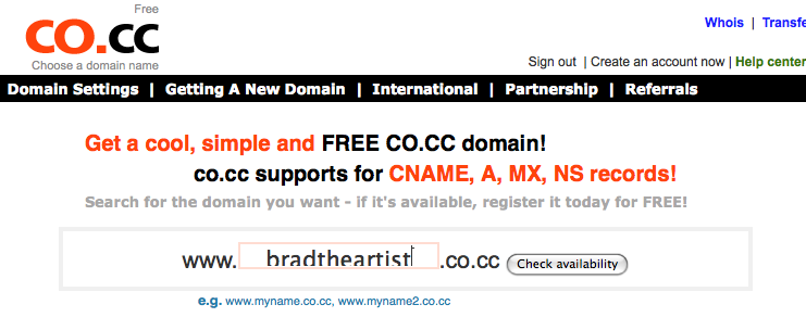
    If you can live without a .com or .org Web address, there are a handful of services that offer free domain registrations. I chose www.co.cc for this exercise.

    BradtheArtist Registration

    2 - Web Hosting

    There are countless free Web hosting services out there (including CAMT, but we offer the bare essentials for arts organizations), and you can get some pretty decent packages. For this activity, I selected X10Hosting.com, because they offer 300 MB of ad-free space. (Some free hosts force you to include their banner ads on your site, which will get you more space and perks but can be obtrusive to your visitors.) There is a searchable directory of free hosting providers at http://www.free-webhosts.com, and X10Hosting ranked very high on their list. Keep in mind that I had to wait 120 minutes after signing up to get confirmation of my account creation. Hoops to jump through? Yes. Can beggars be choosers? Up for debate.

    3 - HTML Template

    Assuming you don't know HTML and don't want to pay someone (free, remember?), you'll want to take advantage of one of the numerous sites that offer free Web templates. Themebot.com has some pretty nice templates of varying styles and languages (i.e., HTML, PHP, etc.) available as free downloads. I snagged an HTML template called Blue Cloud, as it was fairly clean in its structure. I clicked "Dowload" to receive a .zip package containing all the files I needed. This is what the design looked like before I modified it:

    Blue Cloud

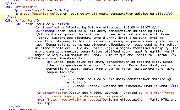
    I then compared this to the index.html file from the .zip package, which looked like this:

    Code for Blue Cloud

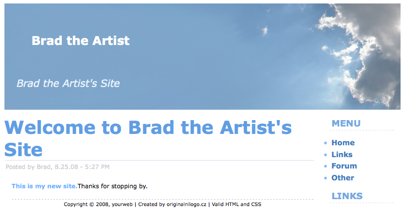
    If you don't know HTML, the simplest thing to do is open the .html file in a browser and in a text editor, then compare the two.

    BradtheArtist

    W3Schools.com offers a nice HTML tutorial for those who need some extra help.

    4 - Making it All Work

    When you create an account with a domain registrar, you should be asked for nameserver information. This is a series of letters and numbers that tell your domain (bradtheartist.co.cc, for example) where to find your Web files. In my case, the Web files will be hosted with X10Hosting.com, so I would simply log into my X10Hosting account, retrieve the nameserver information and enter it into my domain management interface.

    When I set up my free Web hosting account with X10Hosting.com, I received FTP ("file transfer protocol") information, which I need to access my Web space. There are many free tools available for accessing an FTP account, but I recommend "FileZilla" for both PC and Mac. To access your FTP account, you'll need a hostname (i.e., ftp.mywebsite.com), username and password. Enter this information correctly into FileZilla, and you'll see a list of files and folders stored in your new Web space. You can then use FileZilla to transfer the HTML files from your computer to your Web site. Keep in mind that your Web space will look for an index.html or a default.html file to serve as your homepage.

    My Recommendations

    Yes, you can set up a Web site for free, but should you? It depends on your level of commitment to learning some basic HTML and your concern over having a non-standard URL (i.e., co.cc).

    However, my recommendation would be to invest a few bucks into an easy-to-remember .com or .org domain. And if you don't want to learn HTML, set up a WordPress.com account and tie it to your new domain.

    Try not to get frustrated, and feel free to contact us if you need some extra help.

    Please note: This entry is just a demonstration of setting up a free Web site. I do not endorse any of the services listed above with the exception of FileZilla and WordPress, as these are trusted open source solutions with strong reputations.