Arts & Technology

Public Financing for the Arts in Europe Takes a Hit

Tell me if you have heard this one before. In the midst of an economic downturn, a country desperately searches for cuts in spending anywhere it can, as calls for budget austerity grow louder. In the end, it’s the more vulnerable programs that are hit the hardest, which often includes education programs, safety net measures, and the arts community.

While that above paragraph would describe the arts community in the United States in recent years, the trend is now playing out across Europe as debt-ridden countries turn to austerity measures in the face of the European debt crisis. While European countries spend significantly more on the arts than we do in the United States, the dangers of budget austerity in the coming years for the arts community in several European countries are very, very real.

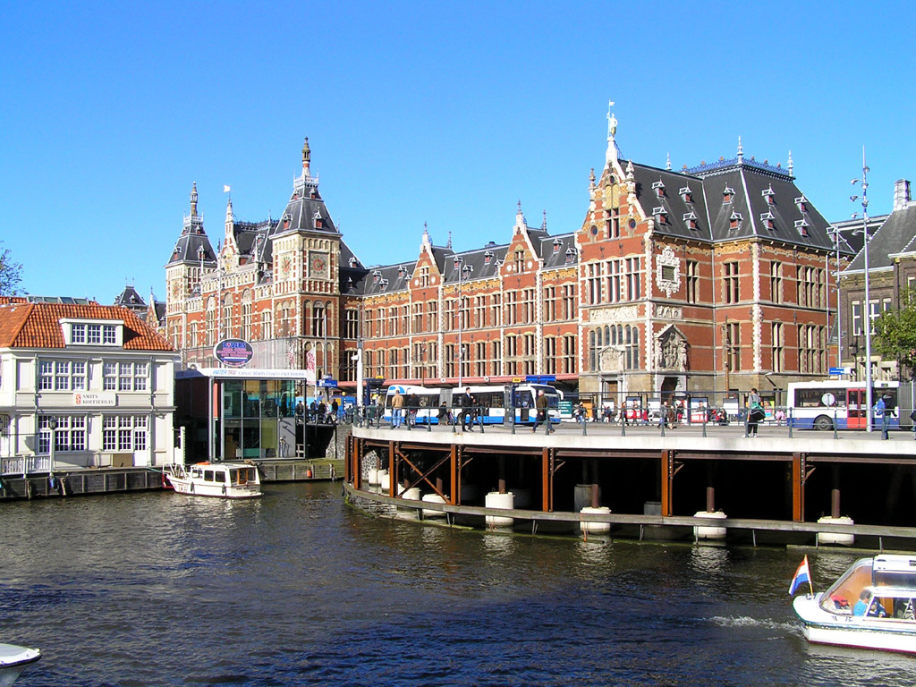
I have been thinking a lot about this issue of arts funding in Europe vs. the United States over the past week, and two events in particular heightened my interest. First, this past Friday, we sponsored a Carnegie Mellon Master of Arts Management Speaker Series event with the Consulate of the Netherlands, who were in town for the annual Dutch Festival in Pittsburgh. We started talking about the difference in the way the arts are funded in a country like the Netherlands versus the way it is funded here at home. More on that in a minute.

The other item that caught my interest was a front page story in the New York Times yesterday about the fate of public financing for the arts in Europe. As I mentioned above, Europe is now going through the same kind of austerity measures that rocked the United States in 2009: debt is growing, calls for fiscal restraint are getting louder, and every program is being measured for its return on investment and how important it is going forward.

The numbers are striking: as the New York Times reports, in the Netherlands, the budget for arts and culture is seeing a decrease of roughly $265 million, or 25 percent. In addition to those cuts, the public is being asked to pay more to see shows and events, with increased taxes on tickets.

These cuts are hitting smaller venues, troupes, and companies the hardest: with less funding to go around, existing expenditures are being targeted at more established performers, forcing more unique acts, which may be struggling for audiences, to face an uncertain future.

And while some may feel that cuts to the arts in Europe would have little effect on the arts here in the United States, one of the expenses artists in Europe are cutting back on are trips and performances overseas, to countries like the United States. Artists are cancelling trips and forcing festivals to find alternative performers.

Another effect this is going to have on the American arts community is over the issue of fundraising. As we discussed with the Consulate of the Netherlands on Friday, there are different views towards art funding in Europe than there are here. In a country like the Netherlands, a resident pays higher taxes to pay for additional services like health care, transportation, and safety net measures. Another element of those increased taxes is funding for the arts; with the government taking a higher percentage out of every paycheck, many Dutch residents feel they are less inclined to donate their own money to the arts because they feel like the government is already doing it for them.

Here in the United States, the opposite is true: the National Endowment for the Arts (NEA) receives such a small percentage of overall government revenue (usually in the range of $150-160 million, compared to billions of dollars in several European countries) that the vast majority of funding for the arts comes from donations from individuals. Since Americans are taxed at a much lower rate, they have more disposable income, and thus more free to donate it to the art of their choosing. There are issues of whether a lot of this money is really going to where it is needed, but that is a discussion for another day.

With European governments cutting back on their arts funding, this is naturally going to lead to artists in Europe to seek alternative sources of revenue. As the New York Times explains, this includes going after their descendents currently living in America – who may be already donating to arts organizations in their communities.

So this presents a problem: a global recession and austerity measures in dozens of countries, all leading to a shift in the way arts are funded worldwide. It will lead to more uncertainty, a greater dispersion of artistic funding and increased competition for the individuals who provide a sizeable percentage of giving.

Is the current model, where American artists rely mostly on private donations and European artists rely on government grants, sustainable? For the United States, absolutely. With calls from some politicians to cut and even eliminate funding for the NEA and other culture programs, there is certainly little chance of seeing an increase in federal funds for the arts.

As for Europe? That is a different story. As the story goes, as the pond gets smaller (in this case, the pond symbolizing the amount of funding), the fish will get nervous, and perhaps seek refuge elsewhere, in the form of spending more of their time fundraising, at the expense of the very same art they are seeking to promote. With artists now having to listen to potential funders, who may have a different vision for what kind of art they want to see, the impact on what kind of art is made and performed is bound to be substantial.

In the short term, the effect is obvious: less festivals, traveling art troupes, and shows. Fewer jobs for artists in countries like Italy, Hungary, Netherlands and Greece. Fewer opportunities for tourists and residents to see the best of what each of these countries has to offer.

It really is sad, but perhaps unavoidable. As I have written before, we seem to find ourselves in the era of budget austerity, and even while the economy has shown signs of improvement in recent months, the desire to increase funding for the arts pales in comparison to support for other existing programs.

The promise and benefit of increased funding for the arts, both at the private and federal level, is well known to all readers of this blog. The New York Times piece describes Europe as the place “where art is life,” and while that is certainly true to anyone who has visited, the newfound austerity measures being put in place represent a significant threat to that very same life going forward.

iPad Retina Display and Art Apps

Not unlike the neutrinos that were scurrying through the mountains in Europe in hopes of undermining Einstein’s Theory of Relativity, the mountainous expectations for Apple’s new iPad had been travelling the tech circles at astonishing speeds. There was much speculation about the iPad’s features, which included, but were not limited to, Siri for iPad, the absence of a home button, faster processors, higher resolution, and the faint possibility of time travel. Like the neutrinos that were mistakenly recorded at speeds faster than those of light, false assumptions regarding some of the capabilities of the new iPad were quickly discarded with its release in March. There may not be a Siri to guide us through life’s uncertainties but even so, the device is something to behold!

The incredible retina display, with its 3.1 million pixels, truly makes it something “you really have to see.” And seeing is exactly what the art world loves to engage in through the various art apps that have been developed over the past few years! The increased display performance means that as pixels dissolve into digital oblivion, artworks can be viewed in crisp detail and in their entirety.

In fact, Art Authority, one of the top apps for viewing artworks, has already upgraded its resolution to match that of the new iPad. The app claims that with retina display, seeing art on the iPad is “as good as in a museum.” That, of course, is questionable since no app can truly replace a museum experience, and in our quest for high definition, one often forgets that life itself is free of pixels. We do not need an iPad to see the world, let alone artworks. Nevertheless, the increased resolution can only serve to improve the quality of apps such as Art Authority.

As for the apps that have not yet upgraded, the results are mixed. In an article in PC Magazine, the author stated that with the higher resolution screen, the New York Times app “appeared noticeably crisper” but the Wall Street Journal was somewhat distorted. The same sentiment was echoed in Mercury News; “Not everything looks better. Apps designed for the lower-resolution screen on the old iPad look less sharp on the new one.” Thus apps designed specifically for the older iPad will most likely need to be upgraded for a seamless, pixel free viewing experience.

So does the new iPad truly create a window of opportunities for art apps? Not necessarily, because the higher resolution doesn't augment the in-museum experience; one need only look up at the artwork displayed in the gallery to see it in all its detail. As such, apps for smart-phones, (where pixilation is besides the purpose) will remain the primary area of research when it comes to creating an active and participatory museum experience. What could, however, benefit from the new iPad is the in-home experience. With the higher resolution, apps such as Artfinder’s George Inness in Italy could be explored with a touch of retinal magnificence. Additionally, sites such as the Google Art Project would be even more staggeringly detailed! It’s a pity that there isn't an app for Google Art Project as yet!

With more and more app developers upgrading to the newer resolution, the digital world of the iPad will surely emerge as sharper, clearer, and more inviting. But let’s hope we won’t lose ourselves, along with our sense of sight, in its stunning display, and will remember to look up at the world, at real life, from time to time. Maybe give our retinas a glimpse of the horizon or better yet, a piece of art!

Facebook, Alternative Bands and Acoustic Sessions @ the MFA

To me, this just about sums up the 21st century Millennial: Facebook invitations, exclusive access to acoustic sessions, alternative bands, behind the scenes privileges, access granted only through social media and a little culture via the fine arts. To what pray tell could I be referring? Why, Boston’s Museum of Fine Arts’ (MFA) partnership with radio station WFNX, of course. Since May 2011, the MFA Boston has been showcasing nationally acclaimed acoustic bands in its galleries. Each month, an alternative band and 35-50 lucky winners are selected to participate in the exclusive Acoustic Sessions series.

How does one get selected to attend? Here’s where the Millennial wins. The concerts are announced on the MFA’s Facebook page and live on WFNX Radio (tune in on 101.7 FM in the Boston area). Interested followers can submit an entry form on the MFA’s Facebook page or call in to the radio station to be selected.

How does it work? The MFA’s upcoming Acoustic Series concert on March 27th is advertised on its Facebook page in the following post:

The MFA and WFNX have teamed up to present some of the best alternative bands, live in the galleries and Kasabian plays next on March 27. You can only see them by “liking” us and entering to win tickets here or listening to WFNX.

According the program’s press release, the artists perform in various galleries- from the European Paintings to the Contemporary American Art room. Their performances are sound and video recorded. They are then shared online, both on the MFA’s Facebook page and WFNX’s webpage.

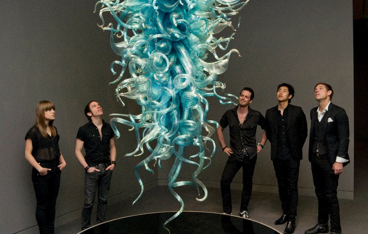
Just when you thought it couldn’t get any more Millennial friendly, the MFA throws in this added exclusive- the performing musicians’ participate in the Museum’s “Art We Love”

program. The musicians select their favorite work of art in the museum, explain why they chose it or its significance to them and are then photographed beside the work. The photographs are uploaded to the MFA’s Facebook page for all to enjoy

and explore, providing unique insight and exclusive information on the musicians.

It is a perfect example of how the collaboration between social media, the visual and the performing arts can enhance the public's artistic experience and engage even those difficult Millennials. Originally from the Boston area, I am proud to share the MFA’s innovative programming with those from away. But I am sure other museums and galleries are up to similar projects. What other museums and galleries have similar, or completely unique, social-media driven, collaborative programs?

Creators Project in San Francisco

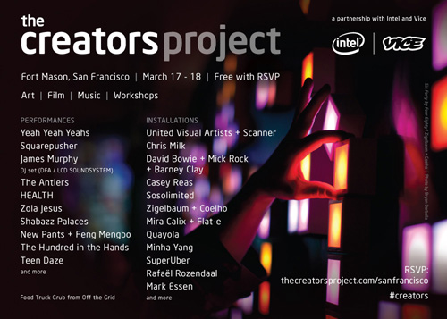
Last weekend the Creator's Project garnered significant attention from national media.  From the mission statement on the website "The Creators Project is a global celebration of art and technology." and "The Creators Project is a new kind of arts and culture channel for a new kind of world."   As an intersection between art and tech it seems appropriate that the blog weigh in and take a look at what they did, how they did it, and the implications.  The Creator's Project has major sponsorship from Intel Corp and VICE with significant online free content focusing on mostly short form interview of Creator associated artists.  This Project offers similar promise to other ventures to offering culture and arts online to ideas such as On The Boards TV and Jacob's Pillow Virtual Pillow but is already operating on a much larger scale than either of these.

The Creators Project offers arts and culture online at a scale that is extraordinary for such a young institution.  The levels of participation on information sharing that is happening through their website looks unparalleled and should be looked towards as a model for successful integration of technology and the arts.   The Creators Project was started in May of 2010 by VICE and seems to have two major interfaces with the public.  There is a exhibit/show that has toured around the world each year and an expanding web presence that now counts video downloads in the millions.  The content is broken out into six different categories:  Music, Film, Art, Design, Gaming, and Fashion and has engaged with artists from all of these areas to provide content online and for the annual festival.  They will be rolling out content collected from the event last weekend (March 17-19, 2012) in the coming weeks.

Current content on the website is a mind blowing array of new directions taken by artists in each of the fields.  One of the standout artists at the event last weekend was a new work from visual multidisciplinary artist Chris Milk.  The installation called the Treachery of Sanctuary incorporated user interaction with digital transformation to look at elements of flight.  Visuals of this can be found here.

Anther fascinating example that was found on the Creator's Project website was the Electronic Shadow from France.  Electronic Shadow uses imaging technology and software to generate interactive 3D maps of people places and objects.  These images then can be used and manipulated in artistic fashions.  The implication for this technology would, for instance, be a game changing one for other art forms such as dance.

Exchange of ideas such as Creator's Project bring together the bleeding edge of Technology and the Arts and as such should be a point of engagement for institutions that are looking to modernize and include new audiences (and younger audiences).  The artists involved have obviously successfully engaged these audiences already and by following the lead of these success stories arts leaders at more conventional organizations can find hope in a new direction in reshaping structure and content to address the demands of a more complex world.


The Role of the Arts in Economic Development

As it pertains to funding for local arts projects, the past few years have not been too kind to the arts community. Budget cuts, austerity measures and changing priorities have meant less funding, and with it less jobs for artists and fewer arts opportunities and events for communities all across the country. As the economy starts to grow (slowly) and optimism about future growth increases, state and local budgets are facing smaller budget deficits and the increasing likelihood of budget surpluses in future years. With these new resources comes the decision over how to spend resources in the best possible way to stimulate growth.

In recent years, the National Endowment for the Arts (NEA) and other groups have given out millions of dollars in grants to local arts groups to help foster economic growth and assist arts communities in struggling areas of the country. As the money available to these groups continues to grow, and cities and states pondering the decision to invest again in the arts, the question is: what role do the arts play in economic development, and how vital is it to future growth?

I have written before about the tough budget constraints that governments are dealing with at the local level and the pressure this is putting on existing arts programs. Unlike the federal government, cities, counties and states are often required to balance their budgets on an annual basis; if sales tax receipts or other forms of revenue are down from the year before, as has often been the case during this economic downturn, governments have to turn to existing programs for cuts or outright abolition. With tax increases politically unfeasible, it’s often the most vulnerable programs that face the chopping block, and this includes the arts community.

Those of us who study public policy and urban planning are cognizant of the effect the arts can have on a city or neighborhood. As much as art enriches our lives and provides a sense of culture, the economic impact is minimal; this is not to take away from the arts community, but is rather meant to illustrate the larger forces that are required for long term economic growth, like housing, higher education, health care and free trade.

The Next American City recently looked at an example of a rust belt city facing tough economic times, Detroit, and how the arts community is helping bring the city back. Through the help of groups like the NEA and ArtPlace America, Wayne State University launched the Detroit FAB Lab, a hub that provides artists with access to equipment and tools for their artwork, like metalworking and woodworking, as well as mentoring services like business coaching and networking. In essence, it provides a community for artists to come together and share their work, their advice and their love for the arts, all with the backing of community grants and support.

Few cities are in need of support like this more than Detroit. Designed to help support the struggling manufacturing base in the Motor City, the grants provide a small step in the overall push to diversify and grow Detroit’s economy as it starts to come back from the recession that took such a toll on the city’s population and well being.

The millions of dollars in funding that are being given out by groups like NEA and ArtPlace also present a series of questions: is this money well spent? If the goal of the money is to spur economic development and growth, is it better spent elsewhere?

We can all agree that funding the arts is crucial to fostering community and culture in cities all across the country. But is absolutely crucial to long term economic growth? That’s where it gets tricky: the list of public policy measures that rank above the arts community is quite long. If given the choice between an artistic redevelopment project and a new hospital or transit station, the physical and transportation needs of the city will win out.

But, as cities and municipalities invest in infrastructure, public services and needed resources, it’s always important to remember how the arts can add to the benefits being accrued. A city with no culture, no life, and no sense of vitality is vulnerable to losing out on the same kind of economic benefits that were desired when public officials decided how to spend resources in the first place. Investing in roads, schools and infrastructure is absolutely essential to an area’s long term economic growth; however, without a vibrant and committed arts scene, the desire of residents and tourists to experience the best of what the area has to offer will be diminished.

There are numerous examples of cities and local governments taking the time to invest in areas of their community and developing art districts. In my home town of Phoenix, the burgeoning Roosevelt Row district is home to First Friday art walk events and galleries showcasing the vibrant culture alive in the city. Other districts in Miami, Pittsburgh, and New York have also popped up in recent years to add vibrancy to formerly struggling areas of their respective cities.

As a policy priority, you will get no argument from me that the arts community ranks behind the essential public services that so many people rely upon on a daily basis. However, good public policy recognizes that the right balance, which involves providing those services and setting aside funding for arts programs that encourage innovation and creativity, along with providing a sense of culture for a given community, is preferable.

As ArtPlace America states, “art creates vibrancy and increases economic opportunity. It is all about the local.” We could not agree more.

Sweet Pantone Tarts

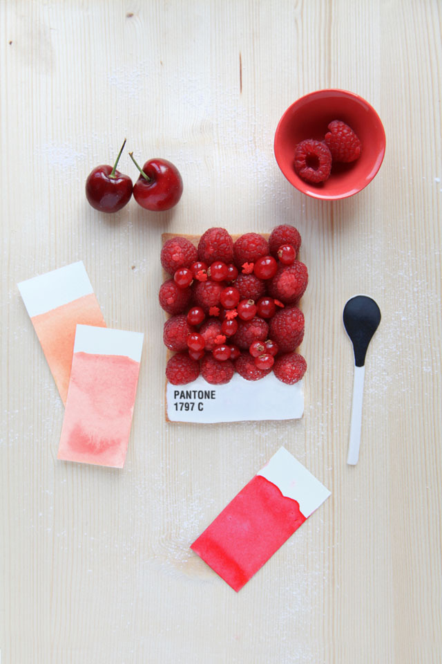
Spring seems to have sprung here in Pittsburgh, and having a week off on spring break makes everything seem lovely. It is under that guise I present this post to you purely for aesthetic reasons. Emilie Guelpa is a French artist/blogger/chef who has created these masterful (et très mignon) tarts inspired by Pantone colors. While I can totally imagine eating them in the café of an art museum, they were created for the magazine Fricote and posted on her blog Griottes. While the blog is currently French only, Guelpa promises an English translation version very soon. In the mean time, you can check out her Pinterest and dream about delightfully colorful tarts.

Well, that’s all I’ve got. I hope you have a great weekend planned and nice weather to enjoy it!


Cowbird, Balloons of Bhutan: Jonathan Harris and Real Life Storytelling

In the mountainous kingdom of Bhutan, nestled between China and India, happiness is no small measure and it’s surely not immeasurable. While its neighbors are under constant scrutiny for economic growth, the kingdom of Bhutan has opted, among other factors, to measure its growth in the well being of its people. As early as 1972, erstwhile King Jigme Singye Wangchuck introduced the concept of Gross National Happiness (GNH), and in 2005, the Royal Government of Bhutan “made the decision to develop GNH indicators in order to move the concept of GNH from the point of academic discourse to a measurable one.”

The government “developed a detailed questionnaire that measured key areas such as “psychological well-being, health, time use, education, culture, good governance, ecology, community vitality and living standards.” The results of this survey can be found on their website, but it suffices to say that the prayer flags in Bhutan flutter with the happiness of its peoples!

A few years later, in 2007, Jonathan Harris, an artist who combines “elements of computer science, anthropology, visual art and storytelling” set out to measure Bhutan’s happiness not in percentages, but in balloons!

Balloons of Bhutan chronicles his two week journey through Bhutan where he interviewed a 117 people and asked them how happy they were on a scale of one to ten. He would then proceed to give them the number of balloons corresponding to their happiness level, and thus increasing that happiness, if only temporarily. Harris’ interviews  provide an insight into the stories of each of these individuals; their identities, their happiest memory, their favorite jokes, and their wishes. In the end, he wrote down each person’s wish on a balloon in a color of their choice. Each of those balloons was “strung up at Dochula, a sacred mountain pass at 10,000 feet, leaving them to bob up and down in the wind, mingling with thousands of prayer flags.”

The website for Balloons of Bhutan, wherein lie a 117 short stories, provides a glimpse into moments of happiness and into the life and culture of Bhutanese people.

Stories rooted in reality and “collected in some unconventional ways” have always held Harris' fascination. In a TED talk in 2007, Harris spoke of his desire to eliminate the role of the narrator in his stories. One such example is his project titled The Whale Hunt, where he “spent nine days living up in Barrow, Alaska, the northern most settlement in the United States, with a family of Inupiat Eskimos, documenting their annual spring whale hunt.” The entire story-line can be divided into sub-stories based on context, characters, color, and moments of excitement and lull (a timeline akin to a heartbeat graph).

Another, more recent, of his projects centered on the idea stories from life and even crowd-sourced journalism is Cowbird, a place where people can “keep a beautiful audio visual diary” of their lives through stories.

Our short-term goal is to pioneer a new form of participatory journalism, grounded in the simple human stories behind major news events. Our long-term goal is to build a public library of human experience, so the knowledge and wisdom we accumulate as individuals may live on as part of the commons, available for this and future generations to look to for guidance.

On Cowbird, these stories can be categorized and read in numerous ways; by sagas or major news events, topics, cities, countries, tags, and people. If you enjoy creative writing, Cowbird is a neat way to share stories with the world and transform the site into a collective “witness to life.” Many will agree that social media content on sites such as Twitter or Facebook can, at times, lack forethought, even originality. (Yes Facebook ask us what’s on our mind, but if the posts on Facebook are indeed indicative of humanity’s contemplative tendencies, we may just be in trouble). Thus Cowbird is different in that it encourages thoughtful sharing of personal musings and ideas.

Jonathan Harris is an undoubtedly novel storyteller, but he desires more than an audience that will listen, he desires one that will engage in storytelling. He has built the foundations of a world that can be interconnected through stories that are his own and more importantly, theirs, the worlds. It is through these stories that we can listen in on a Bhutanese shop keeper talking about her love for Korean television or experience the melancholic evocation of an Islamic prayer call in old Jerusalem while overlooking the Great Dome of the Rock.

The Cloud

Moving your organization's data to a cloud server might be a good idea at this time.  There are several advantages to working off of a cloud server and a few drawbacks. Some advantages to going to cloud computing:

Accessibility is generally improved through cloud storage.  You can access data from anywhere that you have internet access.

Security on cloud storage services is up to the standard of where ever you have your cloud.  Google and Amazon have some of the best experts on digital security in the world for instance and using a cloud operated by them gives you a greater degree of safety for your data.

The Capacity of cloud storage is very flexible and is expandable with comparative ease.  The fact that cloud storage servers will never need to be upgraded or replaced does save you capital expenses as well as man hours.

The downside:

You don't own it and you have to play by someone else's rules.  If you are using a smaller company, please, make sure to check out their backup plans, security measures, and records regarding downtime and maintenance schedules.

It may be hard to use cloud servers with certain types of databases or other programs and as such may present an integration issue (ticketing systems, development programs, etc).  Make sure you have a plan to get the information from point A to point B if necessary.

In event that you don't have access to the internet you are completely cut off unless you back up to a physical source onsite.  It can be distressing for obvious reasons if your internet service goes sideways and you end up with multiple idle employees until it is restored.


Festivals Galore!

As the month of March rolls on, and the weather starts to warm up, two things immediately come to mind: vacation, and festivals. The gang here at Tech in the Arts is on spring break this week, so expect a lighter posting schedule as we take a (well deserved!) break from our studies. Having said that, I wanted to briefly check in and point out two festivals happening this week that are highlighting some of the best and most creative technology and arts projects occurring from across the country.

The first, South by Southwest, or SXSW for short, is currently underway down in Austin, Texas, as anyone with a Twitter account is well aware of by now. Having grown massively in size over the years, the show is divided between three festivals: film, music, and interactive. The interactive portion, including keynotes, speakers, presentations, shows, parties, events and so much more (it really is a sight to behold) is taking place this weekend and ends tomorrow, the 13th.

Tech in the Arts is live down in Austin covering the action; you can follow our Twitter feed (@techinthearts) for live updates and recaps of SXSW events, including the big bash that Carnegie Mellon held this weekend, along with one of our staffers, Terry Boyd, who is tweeting from his personal account (@boydleservice). We all wish we could be there this weekend, but those two accounts are representing us well!

We’ll also have a wrap-up of all the great action at SXSW following the conclusion of the festival, so stay tuned for that.

I’m typing this from beautiful San Francisco, California, and the second festival I wanted to mention is the 3rd Annual Creators Project, taking place this upcoming weekend (March 17th-18th) here in the Bay Area. Sponsored by Intel and VICE, the festival seeks to bring together the best of art, music and is “dedicated to supporting artists in realizing their creative visions through technology.” In addition to the works of art on display, there will be performances by the Yeah Yeah Yeahs, James Murphy, and Squarepusher.

The best part of the festival? It’s free with an RSVP! So if you’re in the Bay Area this weekend, definitely check it out.

Even if you can’t make it to either Austin or San Francisco this week, stay tuned as we’ll be posting follow ups to both exciting festivals and highlighting the best art and technology trends coming from both.


Pinterest 101 for Arts Organizations [mini-nar]

Pinterest is the latest and greatest in social media, we've talked about it before, and it just reached 10 million unique hits in a month, the fastest independent website to ever attain this lofty title. Every blogger with access to a data set out there is looking at the demographics of Pinterest, but what can a visually based social media do for your organization? This Mini-Nar is going to take a look at some of the basic functions of Pinterest, as well as how some arts organizations are maintaining and utilizing their Pinterest accounts. http://youtu.be/JZKgsWlU6Uk

Check out these Pinterests from the video: the San Francisco Museum of Modern Art, the San Francisco Ballet, the Arts and Business Council of Greater Philadelphia, and Lionsgate Be Fit. Some of the demographic data I referred to came from Tech Crunch.

What do you think? Is Pinterest something you'll consider using - or do you already utilize it? Comment on this post and let us know!

TEDxCMU: Ideas for the Arts!

The premise of a TED talk is wonderfully simple; an idea, a good idea, can be captivating, inspiring, and even revolutionary! At CMU, this past Sunday, it was the reinterpretation of an idea that took center stage at the independently organized TED event. There were a total of 12 speakers who gave talks on everything from sodium ion batteries to self-love manifestos, from neuroscience and classical music to the history of comic strips! It may have been snowing outside, but within the auditorium, there was neither a flake of disinterest nor a gust of sighs.


And as serendipity would have it, many of the speakers addressed (even performed!) topics that directly related to the performing and visual arts!

The talks began with Matthew Manos, the founder of the social graphic design firm, a verynice design studio. Manos spoke of about his desire to help not-for-profits through design services but knew that his company would need a sustainable business model; not necessary a for-profit model (thus becoming like all the other design firms), and neither a not-for profit model (he would need help to help!).

It was the idea of social entrepreneurship that helped him realize a model where he would operate as a for profit design firm that would “dedicate over 50% of its services to pro-bono design". As of now, the firm states that it has “provided $250,000 worth of pro-bono design and consulting services in 6 continents to 125+ clients thanks to our team of 60+ international volunteers.”

According to Manos, organizations that rely on fundraising would fare much better were they to operate on the model of a social enterprise. This would help free up time spent in areas such as grant writing and development, allowing an organization to focus on its mission and core activities. As you may have read, Telemarketing was swiftly killed by one of my colleagues, perhaps the entire field fundraising needs some re-interpretation?

But apart from fundraising, a product that clearly requires some re-thinking is powerpoint! Bohannan’s talk is intriguingly titled A Modest Proposal: Dance vs. powerpoint.  Although John Bohannan’s talk was filmed in Brussels, it was shown to the audience via video, and it was absolutely compelling!

According to him, it’s time powerpoint was replaced by interpretive dance. And no, he did not use any slides, pointers, or smart art graphics to make his case. If you haven’t seen it already, see it! See an idea gracefully unfold itself in 18 minutes! For words are static, devoid of the essence of rhythm. They cannot explain what Bohannan so clearly demonstrates using dancers, using the “human body in motion”!

Bohannan is also the creator of Dance your PhD, a contest where PhD students in the field of science present their research using dance. On the contest’s website, a dance inspired by the roaring twenties explains the “Plant Community and Ecosystem Effects of Drought in the Pinon/Juniper Ecosystem” Or how about “Cosmological Simulations of Galactic Disc Assembly” where the “dance starts with a bang, a Big Bang.”

But let’s saunter back to TEDxCMU, and to the talks, where it was the fields science and music that had been dancing to a complicated waltz, and at times, a three step cha cha cha!

One of the inspiring speakers at the event was Stephen Neely, “an Artist Lecturer of Dalcroze Eurythmics” at CMU. According to Neely, the physicality of music appreciation is more important than its cerebral aspects. He compared the feelings experienced when listening to music as those of a child sitting on a swing; an undulating movement between moments of heaviness and moments of weightlessness.

Furthermore, Neely spoke about the difference between what is considered to be art vs. that which is artful. In music, the performance only becomes artful when the audience interacts with the performer, identifies the move from weightlessness to heaviness. And the success of a musical piece depends on its ability to enable the audience to experience an “authentic forward motion” through these phases.

To continue on the complexities of music appreciation, the comprehension of classical music was the core focus of Ardon Shorr’s talk. Shorr is “currently pursuing a PhD in Biology” at CMU and he spoke wonderfully about his idea of “unlocking classical music with neuroscience.” Shorr said that classical music is inherently difficult to follow but it could become easier, and more enjoyable, if we were to visualize “how music is organized” and learn the “shape of symphonies.”

According to him, there is inherent structure in compositions and instead of trying to memorize each and every phrase, it would be easier to group them. He plans to build an interactive website where people can come together and begin to appreciate the virtuosity of Mahler’s symphonies.

In all, TEDxCMU was a great day for the re-interpretation of ideas. Among the audience, many a light bulb of inspiration flickered, eventually becoming brighter as the event progressed.


An Artistic Revision of the American Dream

The American Dream, which for many Americans is the prospect of owning your own home, is dying. Or, at the very least, it is in danger of being lost to a sea of forces, which include overbuilding, overbuying and the economic downturn. With single family suburban homes becoming plentiful over the past decade, and the inevitable housing bubble that devastated so many suburbs around the country that followed, the thought naturally turns to whether this model is sustainable moving forward. What does the future hold for suburban living, and where do we go from here?

A new exhibit at the New York Museum of Modern Art seeks to rethink suburban living and the design of the communities themselves. Taking unique and sometimes radical approaches, five design teams each took a community ravaged by the housing crisis and came up with their own architectural and artistic solution to improve the affected areas and introduce more density, retail stores and sustainable practices. The results need to be seen to be believed, as they provide a completely new and interesting way to look at American housing.

The exhibit, titled “Foreclosed: Rehousing the American Dream,” looks at five suburbs around the country that have been hit hard by the foreclosure crisis: The Oranges, a New Jersey community twenty miles outside New York City; Temple Terrace, Florida, located just outside of Tampa; Cicero, Illinois, a suburb of Chicago; Keizer, Oregon, a suburb of Portland; and Rialto, California, located outside of San Bernardino.

Looking through the five exhibits, one sees a pattern: all five areas under study feature the now commonplace suburban single family homes that have come to dominate the suburbs of American cities, with the design teams seeking to fundamentally change the way we see suburban housing. Gone are the 1,500 square feet or larger single family homes with large backyards and wide spaces between properties; all five proposals call for much more density, shared spaces, and retail and dining options often inside the communities. In essence, what the design teams are trying to do is replicate some of the best features of urban living and transport them to the suburbs.

Even though single family suburban living has proved to be incredibly popular over recent decades, it has always had its share of critics from urban planners, policy makers and sustainable growth advocates. The effect on the environment, through increased automobile use and higher energy use, is widely mentioned. The separation from the community, through isolated properties and less interaction with others, is mentioned as well.

What is so fascinating about the exhibit is the way the design teams take all of these criticisms to heart and seek to remedy the problems of overbuilding and density through five architectural designs that really are about as different as they are similar. As to be expected, they all feature people living closer together and becoming more sustainable, but they differ enormously in how the communities are designed from an aesthetic level. I took a look at all five exhibits (virtually, of course, until I can make the trip to New York), and came away impressed with some of the projects and more skeptical of others. The five exhibits are broken down below:

The Oranges, New Jersey: Located twenty miles outside of New York City, the Oranges is a unique community that is, in the words of the design team, “more urban than suburban,” with close proximity to major roads and transportation options. The Oranges approach is perhaps the most radical of all five designs: it seeks to remove the car from the city by adding multi-level housing to the roads themselves, with occupants using mass transportation options instead. The designs of these new housing complexes are jagged in design and feature different kinds of housing, including multi-family housing units and shared public spaces. My favorite design element is transforming the roofs of the buildings into public places, where energy can be produced and green spaces can be added, helping to make the buildings more sustainable. Of the five exhibits, this one is the least practical, but earns praise for the unique artistic design to the housing units.

Temple Terrace, Florida: Located just outside of Tampa, the Temple Terrace project looks to re-develop 2.2 miles of the community’s downtown area through adding additional housing units and public spaces. This one is perhaps the least controversial of the five designs, as it splits the development between more conventional smaller housing units and another space for multi-family housing and duplexes.

Cicero, Illinois: This one is my favorite, as it seeks to take existing abandoned structures and re-develop them into housing and community areas. Cicero, a suburb of Chicago, grew up as a railroad town, then became a town full of factories in the mid-20th century; as the factories left in the 1980’s, the town started losing jobs and became an economically depressed area. The foreclosure crisis hit Cicero hard, and only worsened the situation. In recent years, the immigrant population of the town has boomed, leading to an increasingly diverse community.

What the Cicero project seeks to do is bring living and working together, and they do this through taking over existing abandoned factory sites and turning them over to housing. After the requisite environmental process, the design team takes these abandoned factories and converts them to high rise housing complexes, featuring shared living areas along with shared community spaces. Living units are on different floors, with each building featuring a community floor that can include shared kitchens, shared living rooms and more. The design team also seeks to change the way houses are financed, through innovative ideas like equity co-op’s and building trusts where people can buy and sell shares of their homes.

My favorite idea of the design was to take garage space and convert alleyways into stores, restaurants and community spaces where residents could earn additional money for themselves through land on their own property.

Keizer, Oregon: Located just outside of Portland, the design team for Keizer sought to combine the best of the town and the best of the country, and their design is striking in terms of how much of nature is included in the very dense living spaces created.

The Keizer design has a massive multi-level apartment complex look to it, but it also does its best to include plants and nature into the design. While there are multiple levels of housing, the nature elements are located at ground level, and include abundant supplies of green space, forest, exotic gardens, plant life and even exotic animals as well. Bridges connect the different complexes and include retail stores, and the series of courtyards that are included feature different nature activities like rock climbing and spelunking.

This design perhaps does the best job of creating a living, sustainable, all-encompassing community within its borders. The designers point out that the project achieves five times as much density and provides three times as much space as the existing Keizer community.

Rialto, California: The final project, looking at the community of Rialto located outside of San Bernardino, seeks to not so much radically change the suburban housing structure as it does to modify it around the edges. The biggest design departure from current practices is the “relaxation of boundaries,” where existing plots of lands are converted into row houses, duplexes and apartments. This means that while you can have a regular single family home on one plot of land, right next to it you could have a row of apartments or smaller homes on the same block. One rationale for this is that if a family residing in an apartment wanted to move up into a single family home, they could do so without having to leave the complex. The design team also adds retail and mass transportation options to the complex, again seeking to create a more complete community within its boundaries.

Current zoning laws and restrictions prevent most if not all of the above changes in each of the five designs from taking place, and the architects and planners associated with each would need changes in the laws if the designs were ever implemented. This is part of a larger concern for neighborhood revitalization and renewal, and as the housing crisis showed us, the current model of larger single family suburban homes is not sustainable in some areas. Changes need to be made, and these five designs seek to identify the best ways to do so.

I encourage everyone to take a look at the five designs online if you can’t make it to New York for the exhibit. It runs through July 30th.

(Photo credit: NY Museum of Modern Art)

Telemarketing is Dead - and I killed it

Fundraising for nonprofit organizations is considered an art, not a perfect science, and it's clear that techniques must be tailored to each individual organization. One of the common pieces of wisdom is that “telephone appeals” (read: telemarketing) consistently work as a fundraising tool for nonprofit arts organizations. I’m not saying random cold calls, but calling people who have funded you before, have a history with your organization and would likely donate again. Nearly one out of every five people will respond and donate to your organization calling and asking for money. As a Millennial consumer, I cannot fathom this.

I, and perhaps you, dear Reader, belong to a generation simply called “Millennials”. Spell check doesn’t know that word yet, but soon it will. We are defined not by high technological competency, which is given to the generation directly before us, but by technological connectedness. I've had a series of experiences which have lead me to create these conclusions about the relationship between Millennials and telemarketing. Millennials, who by the way love to donate, have been raised in a society where everything is connected electronically.

With that connectedness comes with a degree of anonymity. While relationships formed over the web can become as close and as intimate as the penpals of old, they take time. They are cultivated with mutual respect and friendship and while our messages may travel instantly from one to the other, the relationship is built up more slowly.

In this age of instant communication, I think the telemarketing approach is dead to those arts organizations that wish to solicit donations from Millennials. My telephone is reserved for my parents and my grandma, and for calling Renee to let her know I’m outside her building and would she please let me in.

I have had organizations, which I have supported in the past, call me on the phone and ask for donations. It never works.

They always follow a certain pattern. The telemarketer introduces themselves, and asks your name - here again, trying to build up a relationship. But I, the Millennial consumer, am used to long exchanges on Tumblr before ever learning anything than the other person’s username, so that tactic falls short. I thrive in the anonymity of the internet, and this direct and sudden confrontation with a stranger frightens me like a deer in headlights.

Then the telemarketer will try to tell me about the organizations hardships this year; how an economic recession has set them back, or how government legislation has made their work more difficult, could I please help with their annual fund? I, the Millennial consumer, just watched a video of the violence in Syria this morning - you’re trying to tell me you have problems? The problems I care about are the ones involving life and death - and I will negate your ask at every turn.

Finally, the telemarketer has been instructed to ask three times before respectfully hanging up. Are you kidding me? I, the Millennial consumer, tweet, reblog, and share on Facebook all while drinking my caramel latte and finishing an accounting assignment. Your long phone call is wasting my time. Why didn’t you understand when I first said ‘no’? Are you trying to guilt me into this? This is ridiculous. I will never give to this organization again, and their number is now blocked on my phone.

In truth, this all could have been avoided if this organization, who clearly have a record on me, had just emailed me their ask with a direct link, explaining that they need help with their annual fund. The anonymity is intact, I no longer have an individual I don’t know trying to force me into the intimate donor relationship. They haven’t insulted me with blowing their issues into hyperboles (while important to the organization, meaningless to me). And it took all of two seconds to click the link and another to type in my credit card number.

What I’m saying here is, if you’re catering to a mature audience, use telemarketing. Statistically, it works. And probably you’re already using online direct asks in some form, whether its email or otherwise. What I’m hoping you’ll do is pay more attention to who gets what message. If you’re reaching for the Millennials, those fun-loving young kids, maybe tweet them. Email them. Ask them when they attend your next party.

For the love of art, though, do not call.


Art, Games, Art Games!

A curious reversal of roles will take place this March when the world of museums will open its grandiose doors to the realm of video games. While interactive games have often been used to ease visitors into contemplating works of art, the exhibition titled The Art of Video Games at the Smithsonian will, for the first time, display gaming as an art form in its own right. An interesting development, since the art world is known lesser for its playfulness, and more for its profundity.

But before we hit escape and quit on finding common ground, let’s not forget that in our era of interactivity, the profound can be playful! And while it is true that the line between games and art once seemed faint, even non-existent, technology has repeatedly defined it anew.

Art Hack Day in Brooklyn was one such example of the blurring between art and technological, idiosyncratic, fun. Scott Garner, recently featured in the Huffington Post, is yet another artist incorporating an irreverent amount of fun into his practice. His work titled Still Life is anything but still; the painting’s seemingly immovable subject matter tumbles to the side when the painting is titled.

http://vimeo.com/35109750

Still Life “involves a motion-sensitive frame that feeds real-time tilt data to a 3D scene.” With all those expectantly gleaming fruits and vases, it’s so tempting to disrupt the quiet order, balance, and meticulous composition!

Beyond all the fun and interactivity, the idea that artists too have been developing games (the kind that will most certainly puzzle you), is often overlooked. Early in the 20th century, it was the Dadaists that actively embraced games, more specifically games of chance (a concept they found liberating), in their art making process. One famous visual game developed at the time of Dada was Exquisite Corpses, where a piece of paper was folded up and artists drew on their respective folds without context and without limitations. This lead to the creation of a final image that was at times absurd, but always random. Exquisitely random.

Since the daring Dadaists, one contemporary artist incorporating the games of chance into his work is Christian Boltanski. His installation titled Chance was displayed at the 54th Venice Biennale, and more recently at the Nederlands Fotomuseum. The museum writes that “Chance deals with the themes that are characteristic for Boltanski’s work: chance, luck and misfortune.”

One of the components of his installation is an image matching game, where a series of portraits divided into three differing sections are continuously projected onto a screen. The visitor is invited to stop the shuffling of the images on a complete portrait. Chance is one of the few artworks that is most like a game in that users can actually win a portrait if they happen to pause on a complete picture. The game can also be played on Boltanski’s website, so take a chance!

While works such as Chance and Still Life hint at the influence of gaming and interactivity on contemporary art and artistic practices, the Smithsonian explores the exact opposite in The Art of Video Games. One of the areas it delves into is the progressive aesthetic and emotional influence of art and the increasing number of artists involved in the development and advancement of video games.

As the Smithsonian writes on its website, “In the forty years since the introduction of the first home video game, the field has attracted exceptional artistic talent. An amalgam of traditional art forms—painting, writing, sculpture, music, storytelling, cinematography—video games offer artists a previously unprecedented method of communicating with and engaging audiences.”

One such amalgam that will be featured at the museum is the PlayStation 3 video game, Flower. What is unique about Flower is that the game is not about impossibly high scores and series of never-ending levels, rather it is centered on an emotional journey through sweeping landscapes and rolling meadows. A scenic meditation whilst on your PlayStation.

In an interview by the Smithsonian, the curator of the show, Chris Melissinos, talked about gradual artistic development of video games, from the use of an isometric perspective to create depth in Marble Madness, to the influence of  jungle landscapes of Raiders of the Lost Ark on the game Pitfall.

The common thread between artists using games and developers using art is most definitely interactivity. With the amazing technical capabilities of designers and developers, both worlds have become more engaging and meaningful for their respective audiences. But whose team would you play for; the Dadaists or the Developers?


The Best of Both Worlds: QRpedia.

While scanning a quick response (QR) code on the back of a cereal box only to find it directs you to the cereal’s web site is, how can I put this politely, fun (that’s my attempt at sarcasm), it neither reflects the appropriate usage nor does it maximize the potential of those nifty little black and white squares. There's the cereal box QR code, and then there's QRpedia. QRpedia is a program announced by the Wikimedia Foundation in September 2011. It is currently competing in Barcelona at the Mobile World Congress for the title of the United Kingdom’s “most innovative mobile company.” Today, on February 29th, the winner of the award will be announced. The reward? The United Kingdom Trade and Investment’s (UKTI) support to expand the company internationally.

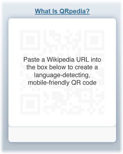
But enough about the competition. What exactly is QRpedia and how does it work in the museum setting? It functions just as an ordinary QR code does, except for its whole language-detecting brilliance. A Polish speaking viewer walks up to, let’s say, Claude Lorrain’s Seaport at Sunset (1639) hanging in the Louvre in Paris. In front of the text panel, the visitor whips out his/her smartphone and snaps a photo of the QRpedia code. The QRpedia code instantly detects the phone’s language and the browser opens to a Wikipedia article on the painting or related topic in that written language. If an article on Claude Lorrain’s Seaport at Sunset isn’t available in Polish, the QRpedia code will direct the user to the next most closely related topic available in that language, perhaps an article on the French, 17th-century landscape painter, Nicolas Poussin.

QRpedia’s language-detecting technology makes it truly unique. For foreign visitors, this eliminates the expense of an audio guide from museum visits (if there is a guide even available in their preferred language) and replaces it with the ease of snapping a photo, the interactivity of a QR code and the straight-forward, mobile-formatted information of a Wikipedia article.

[embed]http://www.youtube.com/watch?feature=player_embedded&v=aXCUOpBytxA [/embed]

Terence Eden, the lead developer of QRpedia, says

QRpedia is the perfect way to get access to massive amounts of cultural information. A typical museum display has less than a paragraph of text, often just in one language – QRpedia can give encyclopedic information in hundreds of languages. Recently, in Derby Museum, a painting by Joseph Wright was taken away for cleaning. The Museum staff have put a QRpedia code in its place so that visitors can still see a high quality image of the painting, and read information about the painting and its creator.

The program was created at the Derby Museum and Gallery in England. Today it is available online for any and every museum, gallery, library, public park, archive, historic landmark and so on. QRpedia has been implemented at numerous prestigious museums and galleries worldwide, including the United Kingdom’s National Archives and Spain’s Fundació Joan Miró. How about the United States, you ask? Why yes! It has been implemented at the Children’s Museum of Indianapolis. But why stop there? Its usage is not limited to arts and cultural institutions. Fun fact- the Occupy movement uses QRpedia codes on its posters and publications to disperse information to a wide and diverse audience.

What’s in it for the museum? A lot, actually.

1) You can create your own, online, as often and as many as you want.

2) For museums with multilingual audiences, a text panel can become cluttered and overwhelming with various translations. Additionally, the space allotted to provide relevant information becomes increasingly limited with numerous translations, causing you to cut-back even further on relevant information.

3) Because Wikipedia is editable, a curator, exhibition director, museum official or artist can translate articles to various languages and create articles if there is a void. That being said, so can anyone else. But be brave. Be bold. Be confident in the power of the public intellectual collective.

4) According to Roger Bamkin, the co-creator of QRpedia and the chair of Wikimedia UK, “We see e-volunteers giving thousands of hours to support museums... Hundreds of new articles have been created in dozens of different languages.” Beyond printing the codes, I’d say the work is done almost entirely for you.

5) QRpedia codes are not limited to paintings and items in your collection. Incorporate them in museum signage, directionals, cafe menus, etc.

6) QRpedia also records usage analytics. Museums, galleries, whoever, can track the number of QRpedia users, the paintings with the most QR code action, the most common languages, etc. In my humble opinion, it offers a rather innovative way to get to know your audience.

Accessible, innovative, interactive (for those inside the museum and those elsewhere translating Wikipedia articles without any intent to ever visit the museum…), and FREE. For museums and cultural institutions looking to expand into the QR code realm, this is the place to start. The Wikipedia articles are already written, online, and translated. Why not offer your visitors a more complete museum experience in their preferred language?

Kickstarter Reaches Major Milestone

Depending on your perspective, the following news is either a cause for celebration, or a sobering reminder of the state of federal funding for the arts in America. Or perhaps both. Kickstarter, the funding platform for thousands of arts and other creative projects, announced last week that it is projected, through its website and thanks to thousands of contributors, to be on track to receive over $150 million in pledges in 2012, by far its biggest and most successful year to date.

This is wonderful news for the arts community, and will help thousands of artists get their projects off the ground. However, the amount does represent a milestone of sorts: while substantial in its own right, the $150 million figure also surpasses the entire 2012 annual budget of the National Endowment for the Arts (NEA), a federally funded program with the might of the United States government behind it.

So it begs the question: as sites like Kickstarter grow in popularity, and help steer more funds to specific arts projects, does federal funding for the arts carry less significance going forward?

We’re big fans of Kickstarter here at Tech in the Arts, and have written about the site’s innovative funding platform and some of the better projects that it has featured. For those who are unfamiliar with Kickstarter, a quick primer: people can post projects online, ranging from art to fashion, film to music, photography to theater, and request donations to get the projects running. The people responsible for the projects outline what they hope to accomplish, how much money they need, and can offer incentives for people to donate money, like free tickets or exclusive merchandise, depending on the amount donated. In the end, if the project fails to reach its fundraising goal (usually within a couple of weeks), no money is exchanged, and the project fails.

As it relates to the juxtaposition of the two entities, first a few caveats. Projects from outside the United States are featured, so the money in question is not confined just within our borders. Second, the site is on track to secure $150 million in PLEDGES in 2012, which does not guarantee funding. According to the site, a little over half of projects fail to meet their fundraising goals, meaning funds for those projects do not change hands. However, with people around the world willing to contribute that much money, it does represent a significant milestone in the arts community.

I wrote last week about the 2013 funding request for the NEA in President Obama’s budget, and welcomed the news about the funding being increased for the new year. However, even with the increase, the budget has failed to increase with the rate of inflation, and is actually a decrease from the early 1990’s, when the budget was in the range of $180-185 million per year.

However, as budget deficits climb and the debt reaches new heights each year, the axe seems to fall on what’s referred to as “discretionary” spending, or spending that’s not mandated by existing laws, first, and that includes programs like the arts, education programs, and public service organizations. This has especially been true in recent years, with calls by some in Washington to drastically cut discretionary programs and cap them from future increases.

As I talked about last week, the NEA is an essential resource for arts organizations, after school programs, schools and community groups who depend on federal programs to survive. Few of these groups generate the amount of internet excitement as the projects on Kickstarter, and cannot rely on social media or online funding mechanisms to continue. Their continued existence rests largely with the help of their local communities, state and local organizations, and most importantly, the federal government.

My concern is that with sites like Kickstarter providing a mechanism for taxpayers to select the individual projects they would like to see funded, the desire to continue to fund the NEA and other arts programs will diminish. Why, after all, have taxpayers pay for a central agency like NEA when individuals can contribute to the projects in their community, or the projects they share an interest with, instead of some program or group they have never heard of?

The NEA has been targeted for elimination in recent sessions of Congress, but thankfully it has survived. Even though the advent of online fundraising tools has provided a steady source of pledges and funding for arts projects, the backbone of arts funding continues to be at the federal and local levels, and any decrease or entire elimination of funding would have a catastrophic impact on artists, the arts community, and arts lovers everywhere.

Another way to look at it this: with the advent of sites like Kickstarter, funding for the arts is increasing, and is becoming a wildly successful endeavor. Last year, Kickstarter received over $90 million in pledges, with several projects hitting the $1 million mark. This is NEW money coming into the arts community, and it deserves to be celebrated.

The ideal, however, is a world where both funding mechanisms continue to move forward, and serve the unique niches they cater to: Kickstarter to the up-and-coming and innovative film/music/theater/art projects and NEA for the community-based groups and local arts organizations.

Congratulations are in order for our friends at Kickstarter, with many more years of continued pledges and success moving forward. It is my hope that the same kind of success and impact continues with NEA, as it faces significant hurdles in Congress to secure future funding.

In Case You Missed It - February 2012

February 2012 was a busy month here at Technology in the Arts, and while its not yet over, let’s take a look at some of the great stories we covered.

There were some neat developments in the world of visual arts and art museums. The Met teamed up with Google and the High Museum of Atlanta released a new app. We also have a wishlist of exhibitions with cool tech elements.

February also featured some amazing events, including a lecture by Chad Bauman, director of communications at Arena Stage, and an interview with him. We covered an Art Hack Day and the Kinetica Art Fair in London. TechSoup launched a Digital Storytelling Contest this month which you can still enter until February 29!

All in all, a pretty solid month. What were your favorite stories in the arts and technology?

5 best practices to keep your email marketing relevant

Guest blogger Amelia Northrup is the Strategic Communications Specialist at TRG Arts, the data-driven arts consulting firm. She previously blogged for TITA from 2009-2011 as she completed her Master of Arts Management from Carnegie Mellon. This post is cross-posted on Analysis from TRG Arts.

email iconWe’re not buying the bad rap email marketing is getting these days. You’ve heard it all before. Open rates are down. Users often filter emails by sender and ignore unwanted or low priority communications. Sophisticated spam filters are plucking out and putting in quarantine anything resembling a sales message. And sophisticated users, especially those in the Millennial generation, prefer other media.

The offsetting fact is that access to email is greater than ever. Users of all ages have smartphones and tablets that make on-to-go communication easy, convenient, and ubiquitous. And, those worrisome open rates for email? They actually reached a two-year high in the third quarter of 2011.

So, when our clients ask whether it is worth it to continue to use e-mail in marketing and fundraising campaigns, our reply is: Absolutely.

Why? 

Email is cost-effective. In TRG’s two decades of experience, the most effective way to reach (and sell to) arts and entertainment patrons is via direct marketing. Simply put, direct communications get the right message in front of the right patron at the right time whether the message goes out by snail mail, telemarketing, or email. (Read a case study on this.) Of all direct channels, email marketing is often the cheapest weapon in your arsenal. Social media and other new media channels can help a campaign, but, like radio, TV and other “broadcast” media, it’s far less likely to reach the intended target and make the same sort of impact as a direct, targeted message.

Email plays a crucial role in today’s multi-channel campaigns.  We advise a 2-1 punch of direct snail mail with some sort of follow-up by email.  That second “touch”  via email acts as a “booster shot” to a campaign already in motion—reminding patrons of a deal or deadline and keeping your organization top-of-mind.

So, what makes email marketing effective?

1. Keep complete, clean patron records.  In all direct marketing, cleanliness is next to godliness--regardless of the channel you’re using, but especially with email marketing. A patron may move from their home and keep their email address and vice versa. Best practice is to keep each patron’s contact information up-to-date and tied to their home address and to their transaction history with your organization.

2. Update patron records regularly.  As a rule of thumb, you should always plan to import fresh lists at the end of each phase of a subscription, membership, and donor campaigns.  Also, refresh your records and email lists after each event or program has finished its run.  That’s how new patrons and their most recent transactions get added to your lists.

3. Make sure that those who opt out stay out. If your email system is worth its salt, it should automatically take people off your lists who opt out—and keep them out if you inadvertently add them again.  But what about patrons who have opted out of all communication with you in your ticketing or CRM system only? You must make sure that your email lists include those opt-outs too.

4. Reserve your right to a one-time email. Opting out from email communication is governed by separate, different standards than are “do not mail” and “do not call” designations. A patron’s presence on one of those mail or call suppression lists need not stop you from emailing. Once there is a business transaction--a ticket sale, donation, purchase of an event--you may email both a confirmation of the transaction and one follow-up communication. Best practice dictates that your one follow-up communication include, prominently, the ability to opt-out from future emails. So, we advise that your follow-up be well-crafted to keep patrons coming back and wanting to hear more from you. (Here are some good examples of follow-up emails from Convio.)

5. Invest time in email data hygiene.  It’s a lot of effort to pull lists correctly and import those lists into your email system--not to mention tracking which are current and who is on which lists.  (That’s why we love systems that integrate all transactions with email addresses!) The rewards of time you invest in your email data are great: higher open rates, greater response to offer, more engaged patrons.  A tool like email, which is direct, cheap and nearly universal, is worth every bit of time you invest, and will be relevant for years to come.

A Look at Typography: Google Web Fonts and More!

This terrific, typographic Thursday, let’s take a flourishing swoop through the world of serifs, ligatures, and stems. If your knowledge of type is limited to Times New Roman, Arial, and the omnipresent Helevetica, its time you enlarged your typographical horizon. For no amount of bolding, italicizing, and underlining can emphasize the importance of using appropriate and engaging typefaces.

Recently, the Metropolitan Museum of Art won the “Best in Class” award from Interactivity Media for its new website. While the Met had a lot of help from Cogapp, a company specializing in digital media technologies, there are number of cost-effective ways to improve the visual appeal of your own site; typography being one of the oldest and most aesthetically attuned.

A little over a century ago, the glistening era of the Parisian Belle Époque was beautifully, and textually illustrated in the posters by Henri de Toulouse-Lautrec. During World War I, Dadaists employed unconventional typography in their manifestos to signal an era of violence that could no longer conform to the bourgeoisie proprieties of the past. Even our love for vintage posters from the earlier half of the twentieth century has a lot to do with the brilliant use of typography!

But somewhere along the line, we became rather stiff in our typographical efforts. Concerns with readability lead to an irrational fear of the serif, and the world forgot that it had come this far, using typefaces besides Arial or Helvetica. While it is true that some of the older typefaces lose their readability when viewed online, there are many, many typefaces that have been created since the advent of the web. These newer font families are easy on the eyes, in both readability and visual flamboyance. Forget Comic Sans, it’s time for Fonts Sans Boredom.

One of the best places to start searching for the perfect typeface is in the neat world of Google Web Fonts. "Google Web Fonts makes web fonts quick and easy to use for everyone, including professional designers and developers. We believe that there should not be any barriers to making great websites. Our goals are to create a directory of core web fonts for the world and to provide an API service so that anyone can bring quality typography to their webpages."

The fonts provided by Google are open source, which means they are free and can be used sans fear! Each font is accompanied by a short paragraph describing its origins and the best uses (titles, sub -headings, paragraph text) for that particular style. You may be interested in an article in Mashable that gives you step by step instructions on How to Implement Google Font API On Your Website.

 Another great resource for the art of the alphabet is the website I Love Typography. The site features lots of informative articles by John Boardley, the publisher of Codex, the journal for typography. If you happen to desire a more typographical world, the website is great way to learn about different typefaces and their appropriate usage. As Boardley writes, “It’s just about impossible to imagine a world without type, but at the same time type’s ubiquity has most of us taking it for granted. So take a closer look.”

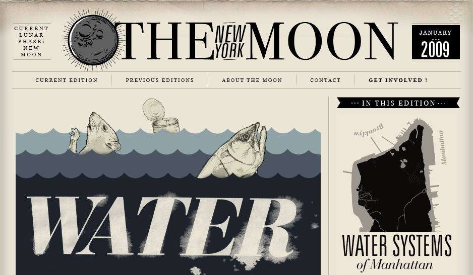
If you do take a closer and more critical look, you will soon notice how some sites employ typefaces to their advantage. I Love Typography is, of course, an undoubtedly great example! Others include The New Yorker, which uses beautiful text and plenty of white space to lessen the clutter and increase its visual appeal. Typographica and The New York Moon (showcased above) are other great examples of websites that transform text into graphic design! An entire list of sites showcasing the marvels of typography can be found in an article by the Design Cubicle.

So let terrific typography embolden you! Let's use it to eliminate textual overload and alphabetical lackluster.

Leading with Social Design at Facebook’s Analog Research Lab

“Everything just is,” says Christopher Cox, Vice President of Product at Facebook. Photos is an application for photos, Events is for events, and Groups is for groups of people. Though many criticize Facebook’s interface and design as bland and uncreative, its designers at the Analog Research Lab test their ideas and design decisions in a highly informed way.  According to a design mind article by Reena Jana, the Analog Research Lab is the company’s creative design space used to

...create branded marketing materials—T-shirts, for instance—for developer conferences and other Facebook events. It’s also where designers experiment with simple fonts and sleek iconography that will eventually influence what appears on the Facebook website.

I had never heard of Facebook’s Analog Research Lab. But its purpose, products and success reminded me of topics I have discussed in previous posts. For example, consider Facebook’s design decisions in light of  Nina Simon’s The Participatory Museum. Facebook has certainly managed to promote a social experience that is accessible, meaningful and unique to each user, in large part due to the structure format and design elements the creative team at the Analog Research Lab develops.

Or consider artist Tanja Hollander’s most recent project, Are You Really My Friend? The Facebook Portrait Project,  exploring the (d)evolution of human relationships as a result of our simultaneous existence in two worlds- the virtual and the real. At the Lab, designers are on a mission to make virtual interactions between individuals less cyber and more real.

The Analog Research Lab is not staffed with full-time employees. Instead, it serves as a space for Facebook designers to express the company and the brand using tools and techniques that are, get this, non-digital. The lab is stocked with a printing press, wood cutting tools, ink, a dark room for developing photos, drying space, etc. It encourages designers to focus purely on design, design techniques, and simpler, less complicated design strategies. True to its name, the Analog Research Lab is also a design research space. Colors, fonts, styles, shapes, etc. are tested on real people to gauge their future success and popularity online. The designers also use the space to make motivational, quirky screenprinted posters. Lots of them. So. Cool.

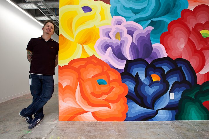
The Lab also serves as the home of Facebook’s new Artist-in-Residency program, a project to create, support and install offline artwork in Facebook’s offices. The first artist, Jet Martinez, recently completed a large, colorful mural titled “Bouquet” to beautify the walls of Building 17, where the company’s engineers work their magic.

Facebook’s offline and online design decisions aim to support human-to human interactions. This may come as a surprise, especially in light of the charged sociological and anthropological discussions that social media has forever affected (for the worse) humans’ ability to interact, engage and relate to one another in the physical world. Facebook’s creative leadership, including Cox, Ben Barry and Everett Katigbak, are committed to the design approach of “social design.” Updates to Facebook’s features, product development and design are made in response to users and their online behavior. Jana explains this approach as one that

…improves how people build human-to-human, versus human-to-interface, connections online.

Take for example one of the Lab’s stationary products- postcards printed with the word “Poke” in red letters. The design is in obvious reference to the virtual action of “poking” a friend on Facebook. To support the human-to-human connection, designers in the Lab created printed postcards, with non-digital design tools, for Facebook employees to write hand-written messages to send through good old fashioned, snail mail. The creative work done in the Lab explores the overlap and divide between cyber and physical interactions- translating Facebook's interactiveness in the digital realm to a tangible reality in our inhabitable space.

It is a neat space- the perfect dichotomy of trendy, vintage workshop and hip, old-school office. I am always curious to see how technology companies incorporate offline art and celebrate non-digital artists in their physical space, if they even do so. Are there other technology companies with similar artistic, in-house projects like Facebook's Artists-in-Residency program? Do technology or digital design companies have a responsibility to support non-digital and offline art? Are cyber users more attracted to online interfaces with simpler, non-digital design elements? Take a look at your own Facebook page. Think about the scaffolding, constraints and structured components that ironically, like Simon suggests, make self-expression so much easier and fluid.