


This terrific, typographic Thursday, let’s take a flourishing swoop through the world of serifs, ligatures, and stems. If your knowledge of type is limited to Times New Roman, Arial, and the omnipresent Helevetica, its time you enlarged your typographical horizon. For no amount of bolding, italicizing, and underlining can emphasize the importance of using appropriate and engaging typefaces.
Recently, the Metropolitan Museum of Art won the “Best in Class” award from Interactivity Media for its new website. While the Met had a lot of help from Cogapp, a company specializing in digital media technologies, there are number of cost-effective ways to improve the visual appeal of your own site; typography being one of the oldest and most aesthetically attuned.

A little over a century ago, the glistening era of the Parisian Belle Époque was beautifully, and textually illustrated in the posters by Henri de Toulouse-Lautrec. During World War I, Dadaists employed unconventional typography in their manifestos to signal an era of violence that could no longer conform to the bourgeoisie proprieties of the past. Even our love for vintage posters from the earlier half of the twentieth century has a lot to do with the brilliant use of typography!
But somewhere along the line, we became rather stiff in our typographical efforts. Concerns with readability lead to an irrational fear of the serif, and the world forgot that it had come this far, using typefaces besides Arial or Helvetica. While it is true that some of the older typefaces lose their readability when viewed online, there are many, many typefaces that have been created since the advent of the web. These newer font families are easy on the eyes, in both readability and visual flamboyance. Forget Comic Sans, it’s time for Fonts Sans Boredom.
One of the best places to start searching for the perfect typeface is in the neat world of Google Web Fonts. "Google Web Fonts makes web fonts quick and easy to use for everyone, including professional designers and developers. We believe that there should not be any barriers to making great websites. Our goals are to create a directory of core web fonts for the world and to provide an API service so that anyone can bring quality typography to their webpages."
The fonts provided by Google are open source, which means they are free and can be used sans fear! Each font is accompanied by a short paragraph describing its origins and the best uses (titles, sub -headings, paragraph text) for that particular style. You may be interested in an article in Mashable that gives you step by step instructions on How to Implement Google Font API On Your Website.
Another great resource for the art of the alphabet is the website I Love Typography. The site features lots of informative articles by John Boardley, the publisher of Codex, the journal for typography. If you happen to desire a more typographical world, the website is great way to learn about different typefaces and their appropriate usage. As Boardley writes, “It’s just about impossible to imagine a world without type, but at the same time type’s ubiquity has most of us taking it for granted. So take a closer look.”
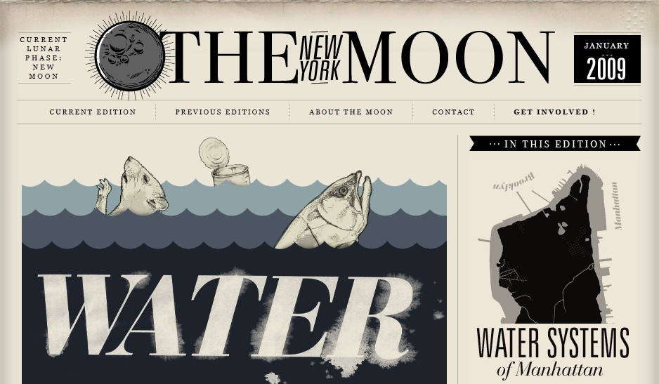
If you do take a closer and more critical look, you will soon notice how some sites employ typefaces to their advantage. I Love Typography is, of course, an undoubtedly great example! Others include The New Yorker, which uses beautiful text and plenty of white space to lessen the clutter and increase its visual appeal. Typographica and The New York Moon (showcased above) are other great examples of websites that transform text into graphic design! An entire list of sites showcasing the marvels of typography can be found in an article by the Design Cubicle.
So let terrific typography embolden you! Let's use it to eliminate textual overload and alphabetical lackluster.