Current — AMT Lab @ CMU

Naina Singh

A Little Sun, Solar Power, and Electricity: Olafur Eliasson at the Tate Modern

A little sunshine can go a long way, or at least, that’s what artist Olafur Eliasson has set out to prove. His exhibition, Little Sun, at the Tate Modern revolves around “solar power, the global energy challenge, light and its importance in and for life.” But at the center of it all, lies not the Sun, but a tiny solar powered lamp called a Little Sun! http://vimeo.com/41830924

Eliasson explains the Little Sun as follows:

Light is for everyone – it determines what we do and how we do it. This is why Frederik Ottesen and I have developed the solar-powered lamp Little Sun. Little Sun is a small work of art with a large reach. One part of the artwork is the lamp and the activities it enables. The other is the successful distribution of Little Sun in off-grid communities, its journey from production to usage.

In some households, there will be a Little Sun that beams during the night. The lamp is also being sold at the Tate Modern and with every purchase, it will be made available at a lower price to those who do not have access to electricity. Furthermore, visitors will be able to create light graffiti using the Little Sun! Yet the luckiest will be those who participate in a blackout event in the Surrealism galleries and use their lamps to see the art!

http://vimeo.com/45573593

But once the lights are turned back on, it’s important to note that Little Sun is not just an exhibition, it’s a for profit company!  One that seeks to expand its distribution networks into the depths of darkness to bring electricity, prosperity, and economic growth to all.

Their business model is similar to TOMs in that they will provide a reduced price Little Sun to off-grid communities for every lamp that is bought. Some additional points regarding their business goals are mentioned below:

We will ensure that Little Sun is made available where typical commercial interests would not reach.

We will focus our energy on the point where the need is most: where electricity is unavailable, unreliable, unaffordable, or unsustainable.

We will drive profit to this point of need – far beyond where industry normally goes.

We will help create and nurture small sustainable businesses by supplying them with Little Suns and providing the support they need to create profit.

We aim to make light, energy, and profits available everywhere.

Little Sun is a stellar example of a project that spans the fields of art, science, and business! Here’s to a little sunshine going a long, long way!

Museum Laboratories and Chrome Experiments!

It truly is difficult to write about an experiment untested with a hypothesis unknown, and in a lab unseen. But I’ll make an exception because Google is the scientist behind it. All that we know about the Chrome Web Lab, we know because of a minute long YouTube video: http://www.youtube.com/watch?v=Bhs0YHUPV24

“See the magic of the web brought to life through 5 Chrome Experiments.

Open to the world online. Live from the Science Museum, London.

Launching in beta, summer 2012.”

Instead of making grandiose, naive, and most likely, faulty predictions, all I will say is that where there is Google, there is oodles and doodles of interesting innovation. So this participatory exhibition at the London Museum of Science is one to experience and experiment with.

Coincidentally, another equally experimental space, called the Laboratory for Museum Innovation, is in the works at the Dallas Museum of Art. Having secured $300,000 in funding, the lab will soon launch a  round of  pilot projects designed to address museological issues such as : Access to Collections; Visitor Engagement and Participatory Culture; Advancing Digital Scholarship; and Transformative Infrastructure. The following was mentioned in DMA’s press release:

“The Laboratory will mount a series of short-term pilot projects that will investigate and focus on enhancing educational resources for K-12 students and teachers; expanding data and information on its collections to aid scholars and visitors; deepening understanding of how visitors encounter works of art; and improving global distribution of content from the Museum and its audiences.”

It’s going to be a summer of scientific experimentation in museums. A fine meeting of cultural and statistical significance!

Cultural Preservation: Future Concerns, Trends, and Hypotheses

The numerous civilizations of the past left behind numerous tangible traces of their heritage. Coveted or discarded, scattered or buried, broken or intact, these objects would soon become artifacts. Archeologists would study them, museums would acquire them, and the rest is none other than History. But what happens when the core activities of a civilization leave scarce amounts of tangibles? What happens when the pace of change is faster than that of preservation? We should start formulating a response, for this describes none other than the 21st century. We live in an age of information, of which a substantial amount now exists online, but is constantly in flux. The Economist described this phenomenon in an article titled History Flushed, where the author argues that archivists are limited in their activities of digital preservation due to anti-piracy legislation and software such as Digital Rights Management.

“As companies more fiercely protect their wares, contemporary digital artefacts run the risk of never being archived. Libraries have no mandate to collect apps, such as Angry Birds or Instagram, which form part of popular culture.”

In the same article, the author mentions how efforts are being made by governmental archives in the UK and the US, and non-profits like the Internet Archive. The latter is a truly comprehensive internet library that was founded in 1996 and has since become a vast collection of  “texts, audio, moving images, and software as well as archived webpages.” With so much of our culture now in digital format, will there be a shift in the responsibility of preservation, one from our museums to organizations specializing in digital archiving?

Yes, I believe so. Because our digital footprints are becoming bigger and more pronounced. And this seemingly unimaginable amount of information, along with our technologies and software, will most likely be preserved by various non-museum organizations; from tech giants like Google, to nonprofits like the Internet Archives, and even individuals (take a look at the Museum of Sounds).

So what of our museums? In a recent post on museum geek, Susie Cairns asked this very question. She wondered whether the plight of newspapers, and their subsequent shift towards digital content, heralds a change in museology. Especially in the way culture is preserved;

“Now is that time for museums. We still need the things that museums do. We still need to know how to select, preserve and disseminate, whether objects or information. What we don’t need is museums. If those same needs can be met by other means (digital or otherwise), the impact on museums will be significant. I think it’s important to keep this in mind as we look to the future, particularly as we see the effects of the Internet on other traditional institutions.”

While I agree with her to a certain extent, it's difficult to imagine a museum free future. The internet has definitely made it easier for us to access information about an object, but not the object itself. And even if the object can somehow be experienced remotely, it will still exist and so will the museum. Yet I can see how a technology such as augmented reality (or something not yet developed) may further separate the preservation of an object from the dissemination of its meaning to audiences. So much so that people need not visit museums.

But museums must realize this too because there have been some interesting collaborations between the tech and cultural world. Google’s work with various cultural organizations through its Cultural Institute, Nintendo’s collaboration with the Louvre, the recent 3-D printing event involving the Met and ScanBot are all examples of museums keeping apace with technology’s giant leaps. Hopefully, they will continue to make such leaps and stay wary of stumbling into obsolescence.

The Space: A Summer of English Arts on a New Experimental Platform

This Olympiad summer, the arts in the UK will be consolidated onto a single online platform called The Space. What’s more? The content on The Space is being provided for free! There’s room, or more fittingly, seats for all, at venues such as the World Shakespeare Festival or Yayoi Kusama’s Obliteration Room at the Tate.

“The Space is a new way to access and experience all of the arts – for free.

Available on computer, tablet, smartphone and connected TV, The Space invites you to take part in the biggest summer of arts the UK has ever seen, whenever you want it and wherever you happen to be. ”

The Arts Council England in partnership with the BBC created The Space as a way for people from all over the world to experience the country’s rich and dynamic arts scene. In effect, a summer of English arts to all! (Albeit without the English summer and its cool Constable Skies).  So The Space is certainly something to look forward too because it will feature some of the UK’s best theatrical productions, dances, musical performances, art exhibits, poetry readings, along with content that has been specifically created for the platform.

Through the course of the summer, the performances staged in theatre, dance, film, and music will be showcased via recordings and live streaming while exhibitions at museums and galleries will be presented via behind-the-scenes footage, photographs, and interviews with artists and curators. The Space will also feature experimental and interactive digital art that can be experienced on the platform itself. Finally, for poetry and literature, there will be a variety of formats, including podcasts, poetry readings, and interactive audio-visual timelines such as the 60 Years in 60 Poems.

While live streaming and online exhibits aren’t entirely new to the performing or visual arts, the presentation of all the arts, all at once, and in one place, is certainly a novelty.  As such, The Space is truly remarkable because it is no ordinary task to fit an entire country’s arts scene onto a single platform! If other countries too made their arts available on interactive, well designed platforms, the internet would surely be a destination in itself. Perhaps the introduction of The Space suggests that it already is?!

The Space also signals another significant trend; the quality of arts being made available online continues to improve. Whether it is in opera, film, or even, educational art history, we are privy to some great material. At the same time, the problem with the online format is that there are times when our Google searches are less than serendipitous and our social networks less than social. On such days, we miss out on a lot of online events, projects, and experiments.

Yet on The Space, what will remain certain is most certainly the art. And at the end of each adequately sunny day across the Atlantic, the platform will be populated with new content for visitors to see, hear, read, and experience. Moreover, the content on this living library of the arts will be available until October. After that, it will be time, once again, to continue our search for the arts on the virtual infinity of the internet (The outer Space).

Canal Educatif: Art History Like You've Never Seen Before!

On YouTube, if you unearth past the layers of apocalyptic cats, nyan cats, evil cats, scary cats, and sneaky cats, you’ll find content that can actually educate you! A double rainbow for erudition! We have all heard about the instructional simplicity of Khan Academy and the brilliance of Ted-Ed, but there’s an equally fantastic channel for Art History buffs that truly deserves some viral appreciation: Canal Educatif à la Demande. Canal Educatif (educational channel) is a French co-operative project. Our aim is to produce a unique series of high-quality educational videos and make them available free of charge to young people and adults.

Since 2007, Canal Educatif (CED) has produced investigative-style documentaries on Art History, Economics, and Sciences and Innovation. Tristement, only the Art History section is available in English and it includes documentaries on works by Holbein, Delacroix, Poussin, and Rodin. But it is clear that the quality of these videos far succeeds their quantity! For example, in Delacroix’s Liberty Leading the People, the documentary explores why Delacroix, an aristocrat, would paint the very ideal he opposed and even feared? And why did Rodin leave his iconic sculptural gateway, The Gates of Hell, unfinished? Why was it never cast in bronze? These are just some of the questions answered in the highly informative series of documentaries produced by CED.

http://www.youtube.com/watch?v=yFu3aJgkYkU

The organization has also explored a new avenue in the dissemination of Art History; the Google Art Project. In a YouTube series called Art Sleuth, CED has created short, detective style explorations of some of the gigapixel paintings on the Art Project. In these clever, 10 to 15 minute episodes, the nitty gritties of close observation reveal that in art too, the devil is in the details ; what seems to be a touching portrait of Marie Antoinette and her children, can emerge as thinly veiled attempt at false benevolence and humility. Coincidentally, there are some works in which there is literally (and figuratively), a Devil in the details.

http://www.youtube.com/watch?v=gjcR90M8of4

To cover its production expenses, CED relies on micro-donations made to their website. So if you’d like to learn more about Manet’s A Bar at Folies Bergères, do make a contribution! Here’s hoping that Kickstarter will soon be launched in Europe because CED’s projects (Filmmaking) seem ideal for the crowdfunding platform. In the meantime, there’s a lot of content offered by CED on both YouTube and on its website. You certainly won't miss the repetitive babbling of nyan cats after having watched Manet’s In the Conservatory or Rembrandt’s The Prodigal Son. Let the sleuthing begin!

The Google Cultural Institute

Once a search engine for the curiously puzzled, the Google of today is not only a superior resource gateway but also a vast and interconnected information hub. When in doubt about your train of thought, just hop on aboard the Google express. Even for doubts verging on the impossible; search for walking directions from the Shire to Mordor on Google Maps and you are admonished that “one does not simply walk into Mordor.

The dangers of Sauron aside, today Google can just as easily claim that one does not simply stop googling. It is now a verb, a translation service, a virtual wallet, a communication and storage platform, a social network, and more recently, a cultural institute.

The Google Cultural Institute helps preserve and promote culture online. With a team of dedicated engineers, Google is building tools that make it simple to tell the stories of our diverse cultural heritage and make them accessible worldwide. We have worked with organisations from across the globe on a variety of projects; presenting thousands of works of art online through the Art Project, digitising the archives of Nelson Mandela and showcasing the Dead Sea Scrolls.

Of the initiatives of the Google Cultural Institute, the Art Project and the Dead Sea Scrolls have received the most amount of attention.  As such, we opted to take a look at some of the other projects that are changing the landscape (quite literally) of online cultural preservation.

Nelson Mandela Digital Archives Project In 2011, the Nelson Mandela Centre of Memory partnered with Google to digitize and disseminate the archives of Nelson Mandela. The collaboration has resulted in a visually engaging timeline of Nelson Mandela’s life, populated with photographs, diary entries, letters, and excerpts from his autobiography. The site  is worth a visit because it both explains and celebrates the enduring legacy of the South African statesman.

World Wonders Project The World Wonders Project is perhaps the next iteration of the Street View mode in Google Maps. In a partnership with UNESCO,  the World Monument Fund, and Getty Images, the project “allows you to navigate virtually around some of the most important, historical and beautiful world heritage sites through panoramic street-level images, experiencing these places almost as if you were there.” The project is an impressive window to the world but is perhaps most suited to educational purposes.

La France en relief When the Grand Palais in Paris organized an exhibition showcasing 17th and 18th century relief maps of fortified towns in France, Google helped render seven of those models in 3-D. As such, seven fortified towns in France were built anew, in all their artisanal detail, on Google Earth. Furthermore, the reach of the exhibition was no longer limited by the very concept being showcased; geography.

La Pavillon de l’Arsenal (Paris Center for Architecture and Urbanism) Just as Google re-envisioned the past at the Grand Palais, at La Pavilon de l’Arsenal, it envisioned the future. Visitors were given a chance to explore the urban landscape of Paris of 2020 through “the first ever 48 screen interactive Liquid Galaxy display, which featured “3D models of the buildings, designed but not yet built, by architects such as Patrick Berger and Jacques Anziutti, Jean Nouvel and Rudy Ricciotti.”

Yad Vashem 
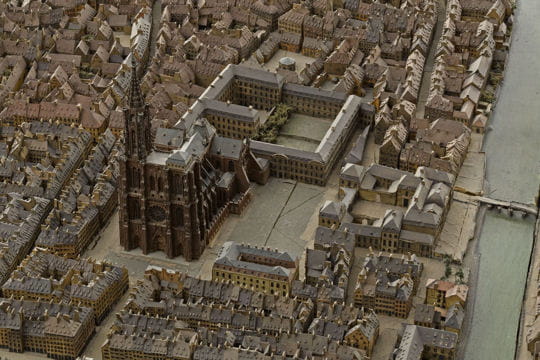
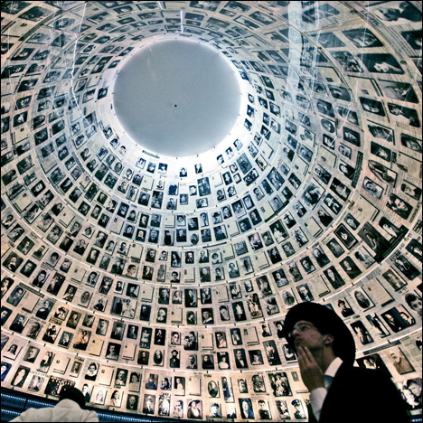
Google has helped digitize the vast archives of Yad Vashem, which is “the world center for documentation, research, education and commemoration of the Holocaust.” Through a technique called optical character recognition (OCR), Google has enabled families to search for both documents and images belonging to their relatives. Here is an example given by Google: “To experience the new archive features yourself, try searching for the term [rena weiser], the name of a Jewish refugee. You’ll find a link to a visa issued to her by the Consulate of Chile in France.”

So there you have it, some of the Google's lesser known projects. Looks like culture is out there, quietly populating the internet. One need only google it.

American Association of Museums Trend Watch 2012

The American Association of Museums recently published a report titled Trends Watch 2012, Museums and the Pulse of the Future. According to AAM, the field of museology could beat to the rhythm of seven emergent practices in upcoming years. Namely, these are crowdsourcing, alternative social enterprises, public engagement, microgiving or crowdfunding, changing demographics, augmented reality, and new educational opportunities.  Of these trends, crowdsourcing, crowdfunding, and augmented reality will be explored in detail as technology fuels their very existence while the arts nourish their popularity. Crowdsourcing

Museums of 2012 should not shy from “harnessing the crowd”, especially when that crowd is more than willing to engage in unique tasks and activities. The report cites examples such as the Smithsonian Museum, which asked the public to vote on “which examples of video games to include in its “Art of Video Games” exhibit. As the PSFK reports, even the New York Public Library sought help from the public in its effort to overlay historical maps “onto the open, modern-day map, drawing from the library’s expansive map database that includes everything from maps of building types for fire insurance purposes to agricultural maps of droughts.” The report mentions Wikipedians in Residence, Digitalkoot project, and the Children of Lodz Ghetto Project as other examples of engaging the online world in content publishing and editing, archiving (through gaming!), and even historical research.

For museums, crowdsourcing is a novel way to increase volunteering while capturing the interest of experts and community members alike. Yet, not all tasks lend themselves well to the phenomenon; the crowd is best utilized when tasks are fun, meaningful, or interesting, and require large amounts of individual input. Additionally, while crowdsourcing speeds up the pace and broadens the scope of projects, “it also increases the burden of oversight and quality control.”

Crowdfunding    

When it comes to funding for the arts, not everybody (including the government) is willing to give a lot. But when a lot of people give a little, what emerges is the financially fantastic, win-win idea of crowdfunding. The report suggests that Kickstarter, Indiegogo, and Peerbackers can be used “to reach people who may never have heard of your museum and invite them to support projects ranging from acquisitions to exhibits to building expansions.”

The report also points to the possibilities of mobile giving with the introduction of Google Wallet and Card Case. Another fundraising initiative noted is Philanthroper, a start-up that helps raise funds for non profits via “an e-mail each day featuring a 501(c)(3) organization that subscribers can choose to support with donations of up to $10.”

For a successful crowdfunding initiative, an organization needs to think beyond the incentive of tax deductible donations. The most successful Kickstarter campaigns involve people in their creation send them tokens of appreciation (often the end products themselves). Thus personalized, fun, and unconventional incentives are key to appeasing to the masses.

Augmented Reality    

Reality limits the possibilities of what is, could be, and was. So augmented reality, in all its limitlessness, was introduced to help us imagine beyond what is. According to the report, “AR refers to a set of technologies that can layer digital elements—sound, video, graphics, even touch sensations—over real world experiences via mobile devices.”

One of the examples noted in the report is
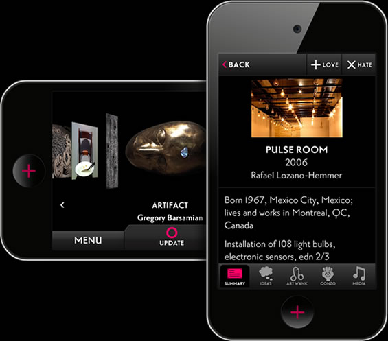
 Streetmuseum Londinium, an app developed by the Museum of London which lets visitors explore Roman London and “ provides soundscapes to accompany scenes of Roman life superimposed on the modern city and encourages users to brush away dirt by blowing into their iPhones, “excavating” virtual artifacts in the process.” Another example of AR, not noted in the report, but cool nonetheless was used by the Science Museum in London. For its exhibit, Making of the Modern World, the museum created an app using a 3D avatar of Top Gear host, James May, who explained the significance of the objects in the exhibition.

Augmented reality certainly opens up possibilities but as the report notes, there is a fine line between engaging visitors and overwhelming or confusing them.  It also suggests that AR can be used to exhibit and exist beyond the walls of the museum. Layar, an app by The Andy Warhol Museum that lets “users to explore Pittsburgh and New York City through the eyes of Andy Warhol”, is one such boundary defying example.

Additional details and insight into all the other emergent practices can be viewed in the AAM report. While these trends may not necessarily define the future of museums, they certainly put them on the path to a new technological era. Museums, who says you can’t be both conservative and trendy?


The O: Audience Engagement at the Museum of Old and New Art in Tasmania

A recent blog post by the Walker Art Center featured some highlights from the Museums and the Web Conference that took place in San Diego earlier this month. Among these conference notes, the audience engagement practices at the Museum of Old and New Art (MONA) in Tasmania were undoubtedly innovative. The 6000 sq ft privately owned museum, which has an “eclectic collection of 2210 antiquities and artworks,” has not a single wall label or sign to guide its visitors. Instead it relies on The O, “the first mobile interpretive solution designed to replace traditional wall labels and signage.”

The O, a mobile device, equips a visitor with all the information they require including museum maps and cafe hours. Additionally, the O uses a visitor’s geo-location to suggest nearby artworks, allowing them to select the artworks they would like to know more about. It then goes on to provide them with curatorial information such as viewing notes and artist interviews. But even here, the approach is unique.

A visitor at the MONA recently wrote about her experience with The O and she mentioned how information on a particular artwork can be viewed in different styles. So Artwank presents you with information in “a formal curatorial style,” while Gonzo provides you with “personal musings on the art from MONA’s owner David Walsh.”

Besides curatorial information, The O lets a visitor interact with an artwork by leaving comments, tweeting about it, and sharing it on Facebook. It even has features that allow them to indicate whether love or hate it; art lends itself well to such extremes. Visitors also have the option of saving their O Tours and retrieving them the next day on MONA’s website. In fact, access to the museum’s online collection is reserved exclusively for those who saved their O Tours.

For the MONA’s curators and museum staff, The O unlocks a lot more than art. It provides them with a whole array of statistics that can be used to improve the visitor experience.The shuffled movement of MONA visitors using The O can provide stats on the most visited artworks,  the most visited rooms, artworks with most likes, the number of tours, museum traffic, repeat visitors etc. Yes, The O is for omniscient.

According to Art Processors, the creators of The O, the device is used at the MONA by over 40,000 visitors per month. Since the MONA’s opening in January, 70% of visitors have indicated that they prefer The O to traditional signage and 80% said that the device enhanced their museum experience.

http://vimeo.com/40188545

The O improves on the visitor experience in several ways. They no longer huddle around a single text panel, reading the description at unimaginable speeds. Their path through the museum is altered by The O’s suggestions, leading them in unexpected directions and towards unseen artworks. They can revisit their tour in 3D on the museum’s website.

Museums have much to benefit from a device like The O.  They may, at times, miss the reassurance of wall texts.  But they can rest assured that with a device like The O, visitors will have access to a lot more than curatorial text.  Conversely, the same visitors will leave behind a dotted trail that can be traced and analyzed by the museum. The O is for opportunity.

Rivers of Ice: Exhibitions at MIT Museum and Everest Base Camp

An exhibition at the Mount Everest Base Camp is no ordinary undertaking. The location itself is bound to generate a few shudders. But for an organization named GlacierWorks, no glacier is too remote a location to increase awareness about the potential impact of glacial loss on Asia’s water supply. Incidentally, for those far from the Himalayas but close to Massachusetts, their work is also being exhibited at the MIT Museum. GlacierWorks is an organization we have written about in the past because of their unique use of “art, science, and adventure” to document changes in the Himalayan glaciers. Through a process of matched photography, using images by 20th century photographers such as Vittorio Sella and Sir George Mallory, they are able to note the decrease in glacial mass that has taken place during the course of the century.  The results are presented in compelling photographic exhibitions that narrate a story of loss in the highest reaches of the Himalayas.

For an exhibition titled, Rivers of Ice: Vanishing Glaciers of the Greater Himalaya, the Everest Base Camp couldn’t be a more appropriate or beautiful location.  “Set against the magnificent backdrop of Mount Everest and the Khumbu glacier, Rivers of Ice presents visitors with a chance to admire the vast beauty of the High Himalaya while reflecting upon the profound changes taking place in this seemingly impermeable landscape.”

GlacierWorks stresses how some of the most important rivers in Asia (Indus, Ganges, Yellow, Yangtze etc.) rely on the Himalayan glaciers for “seasonal flow of fresh water”, and any change in that flow can affect millions of people downstream.

“Data collection in this vast and remote region is impossible for all but the most seasoned climbers, and each glacier has unique characteristics that prevent broad generalizations about the region as a whole. Nevertheless, scientists agree that there is a trend of melting beyond what can be expected to occur naturally.”

Since Everest Base Camp is a mountaineering mecca of sorts, Rivers of Ice is sure to affect the daring mountaineers who tread upon the very glaciers exhibited. Yet more importantly, the cause for concern is destined to wind its way down the Himalayas; to India, China, and the international community as a whole. Those with little to no inclination for steep inclines and frosty conditions can keep up with the exhibit via GlacierWorks’ Facebook and Google+ pages. You can also follow the exhibit on their Twitter, where it will be promoted using the hashtag, #icegallery.

If you wish to see their photographs in person but are daunted by the notion of a journey to the base of Mount Everest, you can make a far less taxing visit to the Rivers of Ice exhibit at the MIT MuseumRivers of Ice seeks to “trigger public dialogue as scientists and policymakers work to better understand the glaciers’ potential impact on the fresh water supply in Asia, and on global environmental issues in general.”

As the MIT Museum explains, the true plight of the Himalayan glaciers has led to a certain degree of controversy in academia. A scientific report earlier this year concluded that the Himalayan glaciers had in effect seen no decrease in ice between 2003 and 2010; the loss of glacial ice had been compensated for by an increase in ice in the caps. Understandably, the behavior of these glaciers confounds climate scientists. Yet they remain a rare, unexplained exception as the study shows that glaciers in Antarctica and Greenland are losing mass at significant rates. Globally, a total of 536 gigatonnes of ice have been lost between 2003 and 2010.

The MIT Museum goes on to say the following:

“As our thinking about Rivers of Ice evolved, we came to realize that the exhibition gives us an ideal platform for opening discussions about climate change, about water resources and, fundamentally, about how science works. Acquiring scientific knowledge is a back-and-forth, trial and error process. As the research continues, we hope for more clarity, but we're prepared for more disagreement about what exactly is happening to the glaciers in the Himalaya.”

GlacierWorks photographs are an excellent opportunity to delve into the conversation about climate change. And even as we wait upon clarity regarding the Himalayan glaciers, the broader trend of glacial loss could not be clearer. It’s easy to forget about climate change when you live under perpetually sunny skies.  But a trip to the Himalayan glaciers on GlacierWork’s website or the MIT Museum will definitely give you something to shiver about.

The Google Art Project and Art.sy: Exploration Engines for Art

The complexity and depth of the world’s art and culture is incredible and incredibly incomprehensible. Incredible because it evades definition and is relentlessly dynamic. Incomprehensible because the individual knowledge, time, and resources required to explore this cultural infinity are all too finite. Thus in this ever expanding universe, it is all too easy to gravitate towards the black hole of ignorance. But fear not, recent developments in technology are here to help steer us away from that ill-fated course. The upgrade of the Google Art Project and the launch of Art.sy are helping us understand our cultural universe, one art work at a time. With Google’s integrated documentation of the world’s museums, our artistic past is both nearer and clearer (literally, with a 7 billion pixel Rembrandt!). And Art.sy’s role as a “dynamic inventory” of emerging artists is an opportunity to discover contemporary art without being at the center of the artistic universe (New York or London).

The second phase of the Google Art Project has seen a massive expansion in the number of museums available on view. “Since last year, the Art Project has expanded its reach: 151 museums are now partners (compared to 17 in V1) providing over 30,000 artworks, from 40 countries (compared to 9 countries last year).”

From the National Gallery of Modern Art in New Delhi to the Getty Museum in Los Angeles, a visitor can experience a significant portion of the world as seen through objects, artifacts, paintings, and sculptures. Its new features include the ability to create your own collections and place them in personal “galleries”. The site also includes an entire section on ways to educate and be educated! For the initiated visitor, it is an invaluable opportunity for art historical exploration!

In its broader implications, the Art Project is a window into national identities as created through heritage and can be viewed as a vehicle for cultural diplomacy. This notion may seem overly ambitious, given the sites’ hyper-virtual immersion in a country’s artistic wealth and apparent disregard of chronology. But it exists nonetheless, as a weaker current that may invoke some to pursue additional research, and even create travel plans!

Additionally, the countries represented benefit from showcasing the wealth of their museum’s collections on an integrated domain, alongside world-renowned museums such as the Met. In essence, the Google Art Project acts as a virtual art fair for the world’s museums. It can either be surveyed at a harried pace or explored with deliberation. Either way, you get to collect works and create galleries for no cost at all!

In a similar vein to the Google Art Project, Art.sy is helping the world discover contemporary art, a category that often transcends national boundaries and is increasingly difficult to keep up with, let alone understand! With Art.sy the difficulties of “discovering fine art” are eased with the development of the Art Genome Project, “an ongoing study of the characteristics that distinguish and connect works of art.”


The website recently launched its beta version and some of its remarkable features were highlighted by the lucky few who were given access. Essentially, Art.sy allows users to discover new artists and works based on a set of 800 characteristics or genes that are assigned to each work of art. Given a user’s interest in a work of art and the underlying genes that are encompassed within, it suggests additional work that may interest them. Users can also choose to follow an artist or a gallery and of course, contact the gallery if they are interested in making a purchase.

A review by BetaBeat praised the site for its ability to lead an average art appreciator “to artists like Sherin Guirguis, a young Egyptian artist whose abstract paintings resemble fractals and eyeballs.” At the same time, it was criticized for only having secured partnerships with the leading galleries of the world and effectively limiting the art on view.  Art.sy also retains an air of exclusivity, one that it may carry with it into the future.

Nevertheless, it would be remiss not to give the unique and brilliant workings of Art.sy a try.

In effect, both Art.sy and the Google Art Project are innovative discovery engines for art. The differentiation lies in that the former knows where you are headed even as you might not. The latter, in contrast, lets you meander your way to a destination unknown, an artwork unseen.

BMW Tate Live: An Online Space for Performance Art

On March 22nd, Jérôme Bel, a french choreographer and dancer, performed in an unknown room at the Tate Modern to an equally unknown audience. Odd as it may seem, there was not a single audience member present in the room. Those who were watching the performance were watching it online, inhabiting a newly unveiled virtual space called the BMW Tate Live: Performance Room. BMW Tate Live bannerThe BMW Tate Live: Performance Room is an innovative series of performances broadcast viewable exclusively online around the globe, as they happen.

It is the outcome of “a partnership between BMW and Tate, which focuses on performance, interdisciplinary art and curating digital space.”  Jérôme Bel’s performance was the first in a series of five online performances that will run through July, featuring the work of artists Pablo Bronstein, Harrell Fletcher, Joan Jonas and Emily Roysdon.

The idea of an exclusively online performance is perhaps more innovative than the technology being used to showcase it, a Youtube channel and a single camera. Catherine Wood, the Tate’s curator of Contemporary Art and Performance, explained in article on Artinfo that they wanted to transmit the work in the “simplest means” and a single camera essentially acted as the “fourth wall” of the performance space.

Additionally, the integration of Twitter, Facebook, and Google+, allows the audience to write comments during the performance and later pose questions to the curators and artists. This allows for the creation of a virtual audience that is connected in real-time through reactions, thoughts, and the Twitter phenomenon, hash tags (#BMWTateLive). Access to these real-time reactions from around the world truly is phenomenal and wouldn't be possible in a traditional setting. The trade-off, however, could be the evolution of an audience that tweets more than it sees, and comments more than it listens.

When asked by Artinfo on whether this online medium may take something away from a live performance, Catherine Wood replied that there has already been much debate “about how much performance documentation is the work and how much it is a record of the work.” But she added that “Live-ness is inherently mediated by technology in the world we live in now. There will always be a place for just a person in a room and a live audience, but I think this is part of the evolution of performance art that we can't ignore."

http://www.youtube.com/watch?v=kf77fzBOoNo

For those afraid of testing the niche waters of contemporary performance art, the increased accessibility and chance to experience an unfamiliar genre through YouTube cannot be ignored. A few swells of interest, a little online momentum, and the waters of performance art will seem a lot less murky or impenetrable. As of the 4th of April, Jérôme Bel’s performance has been viewed 862 times, but that doesn't take into account the number of people who watched it live.

In order to participate in the ongoing conversation, a viewer must to tune into the Tate's website or YouTube channel as the performance is being broadcast. Since the remaining performances are scheduled to take place at 20.00 hours (London), they will be most accessible to audiences in North America (~15.00 hours) and Europe (~21.oo hours), with the exception of a few arty insomniacs in Asia (~1.00 hours). But for those who may be asleep or at work, each performance is archived and uploaded to YouTube.

The next performance is scheduled for April 26 and features Pablo Bronstein, an Argentinian artist who uses “architectural design and drawing to engage with the grandiose and imperial past of the built environment.” In his performance, Bronstein “will work with up to ten dancers to create a baroque trompe l’oeil stage set that exaggerates the perspective within the Performance Room.”

If time permits, tune in to BMW Tate Live for Pablo Bronstein! You may lose your sense of perspective, but find a deeper understanding and appreciation for performance art. If time doesn't permit, don’t miss out on the opportunity to watch these performances on YouTube at a later date.

The Hello Cube at the Tate Modern: A Tweetable Installation

An interactive installation at the Tate Modern caused a wave of twittering and tweeting this past weekend. People often tweet about artworks but can one tweet at an artwork? And will the artwork tweet back? The Hello Cube, an interactive installation at the Tate, answered all of the above in no more than 140 characters. Even more twitterrific was how the dynamic installation continually changed its patterns and colors in response to individual tweets. 
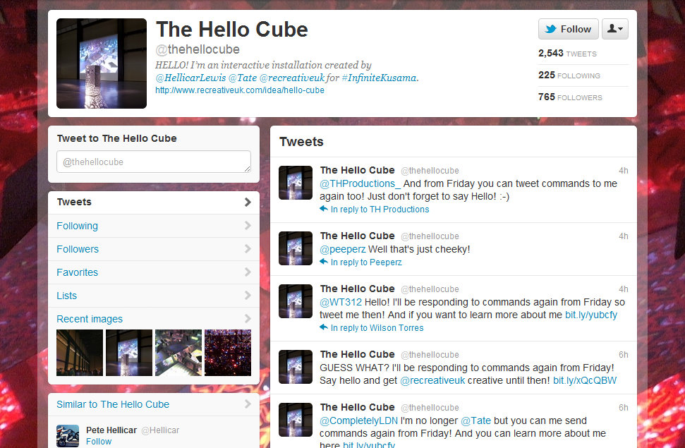
The Hello Cube was the centerpiece for the Infinite Kusama Project, which  centered on engaging younger audiences (ages 16-25) with Kusama’s work.  Described as “a day of the immersive, the hallucinatory, and the expansive,” the project consisted “of a range of workshops designed to take you closer to Kusama's distinctive visual universe.”

The installation got its very own twitter account where users were prompted to tweet at it with commands such as “red love pixelate” or “blue cells faster." I got a tweet response from The Hello Cube within seconds, accompanied by an image of the compositional changes that had occurred in its mirrored inside due to my somewhat imperative commands! Over the course of the weekend, The Hello Cube obliged several thousand tweeters/Kusama enthusiasts, always replying with additional commands that they could try, and created a sense of involvement regardless of, say, the number of miles between Pittsburgh and London!

For those at Tate Modern, the experience was far more insightful; not only did they get to see an amazing Kusama exhibition but they were in physical proximity of The Hello Cube! Besides being able to view the installation's constantly changing interior dynamics that were projected onto an adjacent wall, visitors could also interact with The Hello Cube by saying their hellos or anything else they thought fit to share with the cube (besides tweets, it was programmed to respond to external stimuli such as sound or voices).Visitors could even place their hands inside the cube and see their arm reflected unto infinity!

HelloCube

Hellicar and Lewis, the creators of The Hello Cube, describe it as “an installation that exists as a sculptural object that you can look inside, see patterns, and an infinity of reflections.” It takes inspiration from Kusama’s work titled The Passing Winter, but as noted by its creators, it differs from Kusama’s work in that it is capable of responding to people and to its environment.

The work of Hellicar and Lewis has been featured at The Creators Project and the duo are “interested in creating groundbreaking experiences that use art, technology and design to take people into the moment and impart lasting memories.” In an interview, they noted how they had undertaken a similar project in the past called The Hello Wall, a dynamic outdoor installation where users could control the projections on an external wall in Wembley by tweeting at it.

While Hellicar and Lewis have used Twitter's real time capabilities to foster a dynamic perpetuity and engagement that is both brilliant and unprecedented, the creation of Twitter personas for artworks in itself is intriguing. On Twitter, the inanimate, the intangible, and even the immortal can all lay claim to accounts; San Francisco’s Fog, the Bronx Zoo Cobra, and Voldemort are all suspiciously active! So why can’t art transcend notions of the self, at least on social media? Thus, not only was The Hello Cube an incredibly interactive installation, but its presence on Twitter essentially transformed it into an anthropomorphic object, increasing its accessibility in both a literal and psychological sense.

It would surely make an interesting experiment to see how people interacted with a painting were it to have a twitter account. Wouldn't it be fun if museums created Twitter personas around special exhibitions? What would Rembrandt tweet? How about an account for Abstract Expressionism? Of course, these accounts may have to be temporary but a lot could be learned in a series of short bytes of information. One sees a considerably twitterable future.

For now, we have the delightful The Hello Cube, which having been removed from the Tate, bade farewell to its visitors and declared that it was ‘time for a cube to enjoy the sunshine...” Of late, it was tweeted that The Hello Cube will once again start taking commands this Friday, but as the installation politely requests: "Just don't forget to say Hello!"

iPad Retina Display and Art Apps

Not unlike the neutrinos that were scurrying through the mountains in Europe in hopes of undermining Einstein’s Theory of Relativity, the mountainous expectations for Apple’s new iPad had been travelling the tech circles at astonishing speeds. There was much speculation about the iPad’s features, which included, but were not limited to, Siri for iPad, the absence of a home button, faster processors, higher resolution, and the faint possibility of time travel. Like the neutrinos that were mistakenly recorded at speeds faster than those of light, false assumptions regarding some of the capabilities of the new iPad were quickly discarded with its release in March. There may not be a Siri to guide us through life’s uncertainties but even so, the device is something to behold!

The incredible retina display, with its 3.1 million pixels, truly makes it something “you really have to see.” And seeing is exactly what the art world loves to engage in through the various art apps that have been developed over the past few years! The increased display performance means that as pixels dissolve into digital oblivion, artworks can be viewed in crisp detail and in their entirety.

In fact, Art Authority, one of the top apps for viewing artworks, has already upgraded its resolution to match that of the new iPad. The app claims that with retina display, seeing art on the iPad is “as good as in a museum.” That, of course, is questionable since no app can truly replace a museum experience, and in our quest for high definition, one often forgets that life itself is free of pixels. We do not need an iPad to see the world, let alone artworks. Nevertheless, the increased resolution can only serve to improve the quality of apps such as Art Authority.

As for the apps that have not yet upgraded, the results are mixed. In an article in PC Magazine, the author stated that with the higher resolution screen, the New York Times app “appeared noticeably crisper” but the Wall Street Journal was somewhat distorted. The same sentiment was echoed in Mercury News; “Not everything looks better. Apps designed for the lower-resolution screen on the old iPad look less sharp on the new one.” Thus apps designed specifically for the older iPad will most likely need to be upgraded for a seamless, pixel free viewing experience.

So does the new iPad truly create a window of opportunities for art apps? Not necessarily, because the higher resolution doesn't augment the in-museum experience; one need only look up at the artwork displayed in the gallery to see it in all its detail. As such, apps for smart-phones, (where pixilation is besides the purpose) will remain the primary area of research when it comes to creating an active and participatory museum experience. What could, however, benefit from the new iPad is the in-home experience. With the higher resolution, apps such as Artfinder’s George Inness in Italy could be explored with a touch of retinal magnificence. Additionally, sites such as the Google Art Project would be even more staggeringly detailed! It’s a pity that there isn't an app for Google Art Project as yet!

With more and more app developers upgrading to the newer resolution, the digital world of the iPad will surely emerge as sharper, clearer, and more inviting. But let’s hope we won’t lose ourselves, along with our sense of sight, in its stunning display, and will remember to look up at the world, at real life, from time to time. Maybe give our retinas a glimpse of the horizon or better yet, a piece of art!

Cowbird, Balloons of Bhutan: Jonathan Harris and Real Life Storytelling

In the mountainous kingdom of Bhutan, nestled between China and India, happiness is no small measure and it’s surely not immeasurable. While its neighbors are under constant scrutiny for economic growth, the kingdom of Bhutan has opted, among other factors, to measure its growth in the well being of its people. As early as 1972, erstwhile King Jigme Singye Wangchuck introduced the concept of Gross National Happiness (GNH), and in 2005, the Royal Government of Bhutan “made the decision to develop GNH indicators in order to move the concept of GNH from the point of academic discourse to a measurable one.”

The government “developed a detailed questionnaire that measured key areas such as “psychological well-being, health, time use, education, culture, good governance, ecology, community vitality and living standards.” The results of this survey can be found on their website, but it suffices to say that the prayer flags in Bhutan flutter with the happiness of its peoples!

A few years later, in 2007, Jonathan Harris, an artist who combines “elements of computer science, anthropology, visual art and storytelling” set out to measure Bhutan’s happiness not in percentages, but in balloons!

Balloons of Bhutan chronicles his two week journey through Bhutan where he interviewed a 117 people and asked them how happy they were on a scale of one to ten. He would then proceed to give them the number of balloons corresponding to their happiness level, and thus increasing that happiness, if only temporarily. Harris’ interviews  provide an insight into the stories of each of these individuals; their identities, their happiest memory, their favorite jokes, and their wishes. In the end, he wrote down each person’s wish on a balloon in a color of their choice. Each of those balloons was “strung up at Dochula, a sacred mountain pass at 10,000 feet, leaving them to bob up and down in the wind, mingling with thousands of prayer flags.”

The website for Balloons of Bhutan, wherein lie a 117 short stories, provides a glimpse into moments of happiness and into the life and culture of Bhutanese people.

Stories rooted in reality and “collected in some unconventional ways” have always held Harris' fascination. In a TED talk in 2007, Harris spoke of his desire to eliminate the role of the narrator in his stories. One such example is his project titled The Whale Hunt, where he “spent nine days living up in Barrow, Alaska, the northern most settlement in the United States, with a family of Inupiat Eskimos, documenting their annual spring whale hunt.” The entire story-line can be divided into sub-stories based on context, characters, color, and moments of excitement and lull (a timeline akin to a heartbeat graph).

Another, more recent, of his projects centered on the idea stories from life and even crowd-sourced journalism is Cowbird, a place where people can “keep a beautiful audio visual diary” of their lives through stories.

Our short-term goal is to pioneer a new form of participatory journalism, grounded in the simple human stories behind major news events. Our long-term goal is to build a public library of human experience, so the knowledge and wisdom we accumulate as individuals may live on as part of the commons, available for this and future generations to look to for guidance.

On Cowbird, these stories can be categorized and read in numerous ways; by sagas or major news events, topics, cities, countries, tags, and people. If you enjoy creative writing, Cowbird is a neat way to share stories with the world and transform the site into a collective “witness to life.” Many will agree that social media content on sites such as Twitter or Facebook can, at times, lack forethought, even originality. (Yes Facebook ask us what’s on our mind, but if the posts on Facebook are indeed indicative of humanity’s contemplative tendencies, we may just be in trouble). Thus Cowbird is different in that it encourages thoughtful sharing of personal musings and ideas.

Jonathan Harris is an undoubtedly novel storyteller, but he desires more than an audience that will listen, he desires one that will engage in storytelling. He has built the foundations of a world that can be interconnected through stories that are his own and more importantly, theirs, the worlds. It is through these stories that we can listen in on a Bhutanese shop keeper talking about her love for Korean television or experience the melancholic evocation of an Islamic prayer call in old Jerusalem while overlooking the Great Dome of the Rock.

TEDxCMU: Ideas for the Arts!

The premise of a TED talk is wonderfully simple; an idea, a good idea, can be captivating, inspiring, and even revolutionary! At CMU, this past Sunday, it was the reinterpretation of an idea that took center stage at the independently organized TED event. There were a total of 12 speakers who gave talks on everything from sodium ion batteries to self-love manifestos, from neuroscience and classical music to the history of comic strips! It may have been snowing outside, but within the auditorium, there was neither a flake of disinterest nor a gust of sighs.


And as serendipity would have it, many of the speakers addressed (even performed!) topics that directly related to the performing and visual arts!

The talks began with Matthew Manos, the founder of the social graphic design firm, a verynice design studio. Manos spoke of about his desire to help not-for-profits through design services but knew that his company would need a sustainable business model; not necessary a for-profit model (thus becoming like all the other design firms), and neither a not-for profit model (he would need help to help!).

It was the idea of social entrepreneurship that helped him realize a model where he would operate as a for profit design firm that would “dedicate over 50% of its services to pro-bono design". As of now, the firm states that it has “provided $250,000 worth of pro-bono design and consulting services in 6 continents to 125+ clients thanks to our team of 60+ international volunteers.”

According to Manos, organizations that rely on fundraising would fare much better were they to operate on the model of a social enterprise. This would help free up time spent in areas such as grant writing and development, allowing an organization to focus on its mission and core activities. As you may have read, Telemarketing was swiftly killed by one of my colleagues, perhaps the entire field fundraising needs some re-interpretation?

But apart from fundraising, a product that clearly requires some re-thinking is powerpoint! Bohannan’s talk is intriguingly titled A Modest Proposal: Dance vs. powerpoint.  Although John Bohannan’s talk was filmed in Brussels, it was shown to the audience via video, and it was absolutely compelling!

According to him, it’s time powerpoint was replaced by interpretive dance. And no, he did not use any slides, pointers, or smart art graphics to make his case. If you haven’t seen it already, see it! See an idea gracefully unfold itself in 18 minutes! For words are static, devoid of the essence of rhythm. They cannot explain what Bohannan so clearly demonstrates using dancers, using the “human body in motion”!

Bohannan is also the creator of Dance your PhD, a contest where PhD students in the field of science present their research using dance. On the contest’s website, a dance inspired by the roaring twenties explains the “Plant Community and Ecosystem Effects of Drought in the Pinon/Juniper Ecosystem” Or how about “Cosmological Simulations of Galactic Disc Assembly” where the “dance starts with a bang, a Big Bang.”

But let’s saunter back to TEDxCMU, and to the talks, where it was the fields science and music that had been dancing to a complicated waltz, and at times, a three step cha cha cha!

One of the inspiring speakers at the event was Stephen Neely, “an Artist Lecturer of Dalcroze Eurythmics” at CMU. According to Neely, the physicality of music appreciation is more important than its cerebral aspects. He compared the feelings experienced when listening to music as those of a child sitting on a swing; an undulating movement between moments of heaviness and moments of weightlessness.

Furthermore, Neely spoke about the difference between what is considered to be art vs. that which is artful. In music, the performance only becomes artful when the audience interacts with the performer, identifies the move from weightlessness to heaviness. And the success of a musical piece depends on its ability to enable the audience to experience an “authentic forward motion” through these phases.

To continue on the complexities of music appreciation, the comprehension of classical music was the core focus of Ardon Shorr’s talk. Shorr is “currently pursuing a PhD in Biology” at CMU and he spoke wonderfully about his idea of “unlocking classical music with neuroscience.” Shorr said that classical music is inherently difficult to follow but it could become easier, and more enjoyable, if we were to visualize “how music is organized” and learn the “shape of symphonies.”

According to him, there is inherent structure in compositions and instead of trying to memorize each and every phrase, it would be easier to group them. He plans to build an interactive website where people can come together and begin to appreciate the virtuosity of Mahler’s symphonies.

In all, TEDxCMU was a great day for the re-interpretation of ideas. Among the audience, many a light bulb of inspiration flickered, eventually becoming brighter as the event progressed.


Art, Games, Art Games!

A curious reversal of roles will take place this March when the world of museums will open its grandiose doors to the realm of video games. While interactive games have often been used to ease visitors into contemplating works of art, the exhibition titled The Art of Video Games at the Smithsonian will, for the first time, display gaming as an art form in its own right. An interesting development, since the art world is known lesser for its playfulness, and more for its profundity.

But before we hit escape and quit on finding common ground, let’s not forget that in our era of interactivity, the profound can be playful! And while it is true that the line between games and art once seemed faint, even non-existent, technology has repeatedly defined it anew.

Art Hack Day in Brooklyn was one such example of the blurring between art and technological, idiosyncratic, fun. Scott Garner, recently featured in the Huffington Post, is yet another artist incorporating an irreverent amount of fun into his practice. His work titled Still Life is anything but still; the painting’s seemingly immovable subject matter tumbles to the side when the painting is titled.

http://vimeo.com/35109750

Still Life “involves a motion-sensitive frame that feeds real-time tilt data to a 3D scene.” With all those expectantly gleaming fruits and vases, it’s so tempting to disrupt the quiet order, balance, and meticulous composition!

Beyond all the fun and interactivity, the idea that artists too have been developing games (the kind that will most certainly puzzle you), is often overlooked. Early in the 20th century, it was the Dadaists that actively embraced games, more specifically games of chance (a concept they found liberating), in their art making process. One famous visual game developed at the time of Dada was Exquisite Corpses, where a piece of paper was folded up and artists drew on their respective folds without context and without limitations. This lead to the creation of a final image that was at times absurd, but always random. Exquisitely random.

Since the daring Dadaists, one contemporary artist incorporating the games of chance into his work is Christian Boltanski. His installation titled Chance was displayed at the 54th Venice Biennale, and more recently at the Nederlands Fotomuseum. The museum writes that “Chance deals with the themes that are characteristic for Boltanski’s work: chance, luck and misfortune.”

One of the components of his installation is an image matching game, where a series of portraits divided into three differing sections are continuously projected onto a screen. The visitor is invited to stop the shuffling of the images on a complete portrait. Chance is one of the few artworks that is most like a game in that users can actually win a portrait if they happen to pause on a complete picture. The game can also be played on Boltanski’s website, so take a chance!

While works such as Chance and Still Life hint at the influence of gaming and interactivity on contemporary art and artistic practices, the Smithsonian explores the exact opposite in The Art of Video Games. One of the areas it delves into is the progressive aesthetic and emotional influence of art and the increasing number of artists involved in the development and advancement of video games.

As the Smithsonian writes on its website, “In the forty years since the introduction of the first home video game, the field has attracted exceptional artistic talent. An amalgam of traditional art forms—painting, writing, sculpture, music, storytelling, cinematography—video games offer artists a previously unprecedented method of communicating with and engaging audiences.”

One such amalgam that will be featured at the museum is the PlayStation 3 video game, Flower. What is unique about Flower is that the game is not about impossibly high scores and series of never-ending levels, rather it is centered on an emotional journey through sweeping landscapes and rolling meadows. A scenic meditation whilst on your PlayStation.

In an interview by the Smithsonian, the curator of the show, Chris Melissinos, talked about gradual artistic development of video games, from the use of an isometric perspective to create depth in Marble Madness, to the influence of  jungle landscapes of Raiders of the Lost Ark on the game Pitfall.

The common thread between artists using games and developers using art is most definitely interactivity. With the amazing technical capabilities of designers and developers, both worlds have become more engaging and meaningful for their respective audiences. But whose team would you play for; the Dadaists or the Developers?


A Look at Typography: Google Web Fonts and More!

This terrific, typographic Thursday, let’s take a flourishing swoop through the world of serifs, ligatures, and stems. If your knowledge of type is limited to Times New Roman, Arial, and the omnipresent Helevetica, its time you enlarged your typographical horizon. For no amount of bolding, italicizing, and underlining can emphasize the importance of using appropriate and engaging typefaces.

Recently, the Metropolitan Museum of Art won the “Best in Class” award from Interactivity Media for its new website. While the Met had a lot of help from Cogapp, a company specializing in digital media technologies, there are number of cost-effective ways to improve the visual appeal of your own site; typography being one of the oldest and most aesthetically attuned.

A little over a century ago, the glistening era of the Parisian Belle Époque was beautifully, and textually illustrated in the posters by Henri de Toulouse-Lautrec. During World War I, Dadaists employed unconventional typography in their manifestos to signal an era of violence that could no longer conform to the bourgeoisie proprieties of the past. Even our love for vintage posters from the earlier half of the twentieth century has a lot to do with the brilliant use of typography!

But somewhere along the line, we became rather stiff in our typographical efforts. Concerns with readability lead to an irrational fear of the serif, and the world forgot that it had come this far, using typefaces besides Arial or Helvetica. While it is true that some of the older typefaces lose their readability when viewed online, there are many, many typefaces that have been created since the advent of the web. These newer font families are easy on the eyes, in both readability and visual flamboyance. Forget Comic Sans, it’s time for Fonts Sans Boredom.

One of the best places to start searching for the perfect typeface is in the neat world of Google Web Fonts. "Google Web Fonts makes web fonts quick and easy to use for everyone, including professional designers and developers. We believe that there should not be any barriers to making great websites. Our goals are to create a directory of core web fonts for the world and to provide an API service so that anyone can bring quality typography to their webpages."

The fonts provided by Google are open source, which means they are free and can be used sans fear! Each font is accompanied by a short paragraph describing its origins and the best uses (titles, sub -headings, paragraph text) for that particular style. You may be interested in an article in Mashable that gives you step by step instructions on How to Implement Google Font API On Your Website.

 Another great resource for the art of the alphabet is the website I Love Typography. The site features lots of informative articles by John Boardley, the publisher of Codex, the journal for typography. If you happen to desire a more typographical world, the website is great way to learn about different typefaces and their appropriate usage. As Boardley writes, “It’s just about impossible to imagine a world without type, but at the same time type’s ubiquity has most of us taking it for granted. So take a closer look.”

If you do take a closer and more critical look, you will soon notice how some sites employ typefaces to their advantage. I Love Typography is, of course, an undoubtedly great example! Others include The New Yorker, which uses beautiful text and plenty of white space to lessen the clutter and increase its visual appeal. Typographica and The New York Moon (showcased above) are other great examples of websites that transform text into graphic design! An entire list of sites showcasing the marvels of typography can be found in an article by the Design Cubicle.

So let terrific typography embolden you! Let's use it to eliminate textual overload and alphabetical lackluster.

The future of classical music?

Brahms, Bach, and Beethoven will never know that years into the future, their music would be competing with other forms of entertainment like cinema, television, and Lady Gaga. For the symphonic trio, the world remains a place still captivated by allegro, andante, and capriccio. Yet, the 2008 NEA Arts Participation Survey presents a less than grandioso future for performing arts organizations. The leitmotif being that arts participation continues to decline, and audiences for classical music are both ageing and shrinking. So are there only grey, sonorously thundering skies for future of classical music? Well, perhaps technology can provide little pockets of melodic sunshine. After all, we live in a world of brilliant ideas and constant change. And some musicians are already turning to the next page of notes in classical music’s future.

The harbingers of music’s future can be found in the work of Alexander Chen, an artist and musician who currently works at Google Creative Labs. You may just be familiar with one of Chen’s projects, the LesPaulDoodle, which was so popular that “it became the first Google Doodle to live for an extra 24 hours.” One of his wonderful projects directly pertaining to classical music is titled Baroque.me, a novel visual interpretation of the “first Prelude from Bach’s Cello Suites.”

http://vimeo.com/31179423

Using the mathematics behind string length and pitch, it came from a simple idea: what if all the notes were drawn as strings? Instead of a stream of classical notation on a page, this interactive project highlights the music’s underlying structure and subtle shifts.”

Chen recently created a project titled Mta.me where the New York City’s subway map was transformed into a dynamic string instrument. Using the trains’ real time movements, every interaction between the different train lines evokes a musical pling. As the map gets busier, the underground’s plays an eclectic and staccato tune of thousands of New Yorkers travelling from point A to point B.

http://vimeo.com/19372180

Chen’s work is innovative, interactive, and readable, for those who do not speak the trebled language of sheet music. It also derives music from unlikely places and as he said in Mashable, “I’ve also always liked the idea of inanimate objects generating music, coming alive.”

The visual aspects of music showcased in Baroque.me and Mta.me indicate that live performances can be enhanced by interactive technological components. In fact, at Stanford University, technology itself has become the instrument. Stanford Mobile Phone Orchestra, an initiative for the Center of Computer Research in Music and Acoustics, “is a first-of-its-kind ensemble that explores social music-making using mobile devices (e.g., iPhones and iPads).”

http://www.youtube.com/watch?v=ADEHmkL3HBg&feature=player_embedded

In 2008, MoPho’s director Ge Wang launched Smule, a start-up company that has developed popular music apps such as Ocarina, “which turns the iPhone into the 12,000-year-old wind instrument.” Ocarina literally transforms your phone into a musical instrument; you hold your phone like a flute and blow air into your microphone! And the app has an even greater feature, the ability to share your recordings and listen to other players all over the world. As Wang was quoted as saying in the Stanford Daily, “Software is a good way to express ideas you may have, and it’s easy to get together people around the world to use it. That’s magical.”

At a time when people seem to be giving away pianos for free, (a search on Craigslist for Pianos revealed just that!), instrumental apps are portable, accessible, and most certainly, magical! While apps cannot replace instruments, they can definitely increase interest in the instrument they so dexterously replicate.

Perhaps it will be these very apps, interactivity, and the utilization of technology in music appreciation and comprehension that will make audiences applaud Brahms, Bach, and Beethoven with undulating waves of encores, bravos, and bravissimos. A 21st century Lisztomania of sorts.


Exhibitions on our Wishlist!

In an exhibit at the Museum of Contemporary Art in Sydney, a series of automatically winding tape measures have left visitors immeasurably intrigued. And across the globe in London, a unique exhibition on 3D printing at the Aram Gallery looks at the impact of this technology on the design and artistic process of fields like architecture, manufacturing, and product design. Upon hearing of these exhibitions, we at Tech in the Arts began to dream a futile dream of summery Australia and chilly London before realizing that geographical restrictions are incredibly...restricting. As such, we propose a vicarious, online experience of these fascinating exhibitions.

http://vimeo.com/33709089

Recorders at the Museum of Contemporary Art (MCA) features the work of Canadian Mexican artist Rafael Lozano-Hemmer and consists of  "a 'crowdsourced' show" where "the content is entirely collected from visitors, using technologies such as heart rate sensors, motion detectors, fingerprint scanners, microphones and face recognition software."

One of the installations is titled Tape Recorders, which is a series of motorized tape measures attached to a wall that respond to a visitor’s movement through the space. As a visitor walks by a particular tape measure, the tape begins to unfold vertically, the yellow scale slowly rising against the wall. If a person pauses in front of a particular tape measure, the tape slowly reaches its maximum length (3 meters), and falls to the floor, only to automatically wind itself moments later.

http://vimeo.com/34533540

The beauty of Tape Recorders lies in the installation’s ability to respond to people’s interaction with the various tape measures and to simultaneously make them aware of the duration of their interaction. An article in Humans Invent reported Lozano-Hemmer’s thoughts on the participatory nature of his work: “My pieces do not exist unless someone dedicates some time to them. Most people, with the exception of children, will opt to not participate in an installation in public space – which may seem strange considering that we live in the age of reality TV and the society of the spectacle.”

Another absolutely brilliant installation is titled Pulse Room, which is a room filled with one hundred incandescent bulbs that light up only when a visitor holds the heart rate sensor present in the space. Once activated, the closest light bulb begins to flash in rhythm with the visitor's heart beat, and once the visitor releases the sensor, the  rhythm advances from one bulb to the next, creating a beautiful space that is pulsating with light. "At any given time, the installation shows the vital signs from the 100 most recent participants."

Meanwhile at the Aram Gallery in London, 3D printing takes center stage in the exhibition titled Send to Print/Print to Send. The exhibit “offers an impression of uses of 3D printing in the design industry today” and “shows work by designers and organizations who are developing the capabilities of this technology.”

But 3D printing isn't as novel as it sounds. An article in The Economist notes that 3D printing has been around for "more than a decade" and was originally used by engineers and designers to “make prototypes quickly and cheaply before they embark on the expensive business of tooling up a factory to produce the real thing.” What is novel is that, of late, this technology is being used by designers and manufacturers to create the end product itself.  Rarely do manufacturing technologies surface in the artistic process and yet, 3D printing’s mass customization abilities have been utilized to create clocks, lampshades, dresses, even shoes!

So feel free to print yourself some shoes, clothes, and oh, a pair of tickets to Sydney via London, because these wonderful exhibitions attest to the ability of artists and designers to redeem objects and technologies from the banal utility of everyday life.

TechSoup launches Annual Digital Storytelling contest!

Whether they know it or not, every organization has a story to tell. But sometimes, it just so happens that this story is lost amid the frenetic activities of day-to-day work, and soon finds itself sitting quietly in the old forgotten folder of organizational history. Well, the month of February is the time to retrieve that story and subject it to some digital editing. This is because TechSoup, an organization that enables non profits to achieve their mission through technological solutions, has decided that some stories are best told digitally!

Recently, TechSoup launched its Annual Digital Storytelling contest which, “combines professional instruction and friendly competition into a hands-on media-making project.” Over the month of February,“TechSoup Global will host a series of interactive events including Twitter Chats, live webinars, and trainings designed to help nonprofits produce a one-minute video or five-picture Flickr slideshow that tells the story of its organization.” Yes, a minute or five pictures is all you have!

http://www.youtube.com/watch?v=ccCwQeAo4l4

TechSoup will accept submissions through February 29th, and in March, a panel of judges will select the organizations with the very best videos and “take their digital storytelling to the next level.” Another interesting and fun aspect is the Audience Choice Award, where “winning and notable submissions will be screened in San Francisco and live-streamed online through SecondLife as a special “red carpet” event on March 28, 2012.”

TechSoup’s competition is beneficial to not-for-profit organizations because stories are one of the most engaging ways to raise awareness and gather support. If an organization has a compelling story, people will listen. Better yet, if an organization can narrate it digitally, people will not only listen but they will also share it! And if the vast and ever expanding YouTube community is pleased, it might just go viral!

So non profits, make haste! You have a month and at most, a minute!