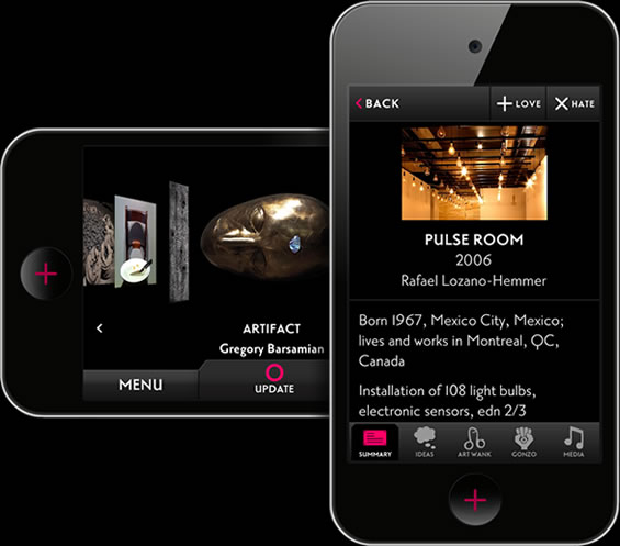
A recent blog post by the Walker Art Center featured some highlights from the Museums and the Web Conference that took place in San Diego earlier this month. Among these conference notes, the audience engagement practices at the Museum of Old and New Art (MONA) in Tasmania were undoubtedly innovative.
 The 6000 sq ft privately owned museum, which has an “eclectic collection of 2210 antiquities and artworks,” has not a single wall label or sign to guide its visitors. Instead it relies on The O, “the first mobile interpretive solution designed to replace traditional wall labels and signage.”
The O, a mobile device, equips a visitor with all the information they require including museum maps and cafe hours. Additionally, the O uses a visitor’s geo-location to suggest nearby artworks, allowing them to select the artworks they would like to know more about. It then goes on to provide them with curatorial information such as viewing notes and artist interviews. But even here, the approach is unique.
A visitor at the MONA recently wrote about her experience with The O and she mentioned how information on a particular artwork can be viewed in different styles. So Artwank presents you with information in “a formal curatorial style,” while Gonzo provides you with “personal musings on the art from MONA’s owner David Walsh.”
Besides curatorial information, The O lets a visitor interact with an artwork by leaving comments, tweeting about it, and sharing it on Facebook. It even has features that allow them to indicate whether love or hate it; art lends itself well to such extremes. Visitors also have the option of saving their O Tours and retrieving them the next day on MONA’s website. In fact, access to the museum’s online collection is reserved exclusively for those who saved their O Tours.
For the MONA’s curators and museum staff, The O unlocks a lot more than art. It provides them with a whole array of statistics that can be used to improve the visitor experience.The shuffled movement of MONA visitors using The O can provide stats on the most visited artworks, the most visited rooms, artworks with most likes, the number of tours, museum traffic, repeat visitors etc. Yes, The O is for omniscient.
According to Art Processors, the creators of The O, the device is used at the MONA by over 40,000 visitors per month. Since the MONA’s opening in January, 70% of visitors have indicated that they prefer The O to traditional signage and 80% said that the device enhanced their museum experience.
http://vimeo.com/40188545
The O improves on the visitor experience in several ways. They no longer huddle around a single text panel, reading the description at unimaginable speeds. Their path through the museum is altered by The O’s suggestions, leading them in unexpected directions and towards unseen artworks. They can revisit their tour in 3D on the museum’s website.
Museums have much to benefit from a device like The O. They may, at times, miss the reassurance of wall texts. But they can rest assured that with a device like The O, visitors will have access to a lot more than curatorial text. Conversely, the same visitors will leave behind a dotted trail that can be traced and analyzed by the museum. The O is for opportunity.
