“Everything just is,” says Christopher Cox, Vice President of Product at Facebook. Photos is an application for photos, Events is f or events, and Groups is for groups of people. Though many criticize Facebook’s interface and design as bland and uncreative, its designers at the Analog Research Lab test their ideas and design decisions in a highly informed way. According to a design mind article by Reena Jana, the Analog Research Lab is the company’s creative design space used to
...create branded marketing materials—T-shirts, for instance—for developer conferences and other Facebook events. It’s also where designers experiment with simple fonts and sleek iconography that will eventually influence what appears on the Facebook website.
I had never heard of Facebook’s Analog Research Lab. But its purpose, products and success reminded me of topics I have discussed in previous posts. For example, consider Facebook’s design decisions in light of Nina Simon’s The Participatory Museum. Facebook has certainly managed to promote a social experience that is accessible, meaningful and unique to each user, in large part due to the structure format and design elements the creative team at the Analog Research Lab develops.
Or consider artist Tanja Hollander’s most recent project, Are You Really My Friend? The Facebook Portrait Project, exploring the (d)evolution of human relationships as a result of our simultaneous existence in two worlds- the virtual and the real. At the Lab, designers are on a mission to make virtual interactions between individuals less cyber and more real.
The Analog Research Lab is not staffed with full-time employees. Instead, it serves as a space for Facebook designers to express the company and the brand using tools and techniques that are, get this, non-digital. The lab is stocked with a printing press, wood cutting tools, ink, a dark room for developing photos, drying space, etc. It encourages designers to focus purely on design, design techniques, and simpler, less complicated design strateg ies. True to its name, the Analog Research Lab is also a design research space. Colors, fonts, styles, shapes, etc. are tested on real people to gauge their future success and popularity online. The designers also use the space to make motivational, quirky screenprinted posters. Lots of them. So. Cool.
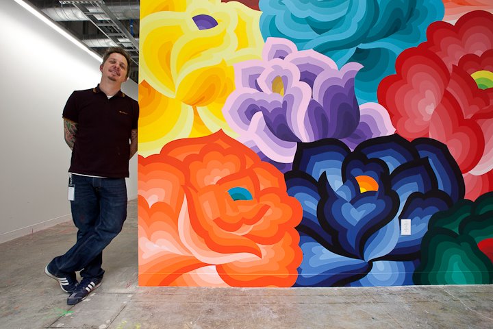
The Lab also serves as the home of Facebook’s new Artist-in-Residency program, a project to create, support and install offline artwork in Facebook’s offices. The first artist, Jet Martinez, recently completed a large, colorful mural titled “Bouquet” to beautify the walls of Building 17, where the company’s engineers work their magic.
Facebook’s offline and online design decisions aim to support human-to human interactions. This may come as a surprise, especially in light of the charged sociological and anthropological discussions that social media has forever affected (for the worse) humans’ ability to interact, engage and relate to one another in the physical world. Facebook’s creative leadership, including Cox, Ben Barry and Everett Katigbak, are committed to the design approach of “social design.” Updates to Facebook’s features, product development and design are made in response to users and their online behavior. Jana explains this approach as one that
…improves how people build human-to-human, versus human-to-interface, connections online.
Take for example one of the Lab’s stationary products- postcards printed with the word “Poke” in red letters. The design is in obvious reference to the virtual action of “poking” a friend on Facebook. To support the human-to-human connection, designers in the Lab created printed postcards, with non-digital design tools, for Facebook employees to write hand-written messages to send through good old fashioned, snail mail. The creative work done in the Lab explores the overlap and divide between cyber and physical interactions- translating Facebook's interactiveness in the digital realm to a tangible reality in our inhabitable space.
It is a neat space- the perfect dichotomy of trendy, vintage workshop and hip, old-school office. I am always curious to see how technology companies incorporate offline art and celebrate non-digital artists in their physical space, if they even do so. Are there other technology companies with similar artistic, in-house projects like Facebook's Artists-in-Residency program? Do technology or digital design companies have a responsibility to support non-digital and offline art? Are cyber users more attracted to online interfaces with simpler, non-digital design elements? Take a look at your own Facebook page. Think about the scaffolding, constraints and structured components that ironically, like Simon suggests, make self-expression so much easier and fluid.
