Data visualization helps art institutions communicate with internal and external communities more effectively and efficiently. There are a numbers of quality data visualization tools available for free, but how arts managers use these tools defines how effective the data visualization. The following four strategies provide a guideline for arts managers to create data visualization with purpose and impact.
How are the arts doing in the US and what can YOU do?
VOIP for Arts Organizations: Are you Virtual or Just Digital?
The Museum App Blueprint
The Art of the Hologram
Election Day: A Quick Summary when Voting to Support the Arts
Infographic: The Journey to E-Commerce
New Infographic: Beacons for Performing Arts Managers
Are you curious about beacon technology? Perhaps you're wondering how you should go about choosing a beacon hardware provider. Or maybe you are considering how you would use this technology in your performing arts organization. AMT Lab Contributor Kate Martin has created an infographic to get you started answering these questions.
Gallery One: Engaging Audiences Infographic
How do you learn best about art? Maybe you lightly browse, interact with friends, or get right in the middle of the action. There are multiple ways to engage with and explore art forms, however cultural institutions may not always program to meet these needs.
The Cleveland Museum of Art's Gallery One activities, on the other hand, were designed with people's learning needs and preferences in mind. In this article I apply WolfBrown's Making Sense of Audience Engagement Audience Typologies to the different initiatives to see how learners can interact with the the Art Lens App, Collection Wall, Interactives, and Studio Play at the CMA.
Idealware's Infographics for Outreach, Advocacy, and Marketing Webinar
Contributors Aoni Wang and Giorgia Gandolfini recently attended Idealware’s webinar, Infographics for Outreach, Advocacy, and Marketing: From Data to Design . This talk delved deeply into strategies for successful design of infographics.
Per Idealware, an infographic is an image that presents data, transferring numbers into a comprehensive visual narrative. Infographics have become very popular among organizations, as they are generally easier to understand and more effective at communicating data to the population at-large than traditional spreadsheets and reports. Infographics attract attention and provide new ways for visitors to engage with data.
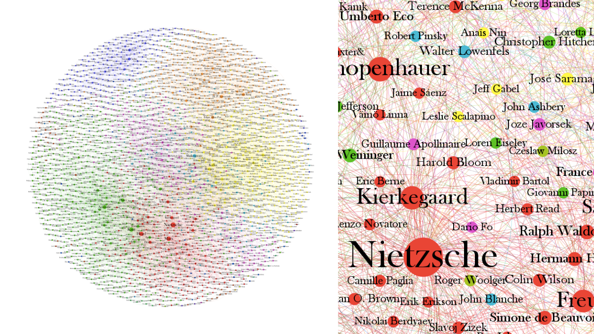
The Graph of Ideas by Brendan Griffen
Two things I know are true: That Rachael Wilkinson's impression of SNL's Drunk Uncle rivals Drunk Uncle himself and that Art.sy’s Fan page is the best source on Facebook for wonderfully distracting food-for-thought. I recently came across yet another dynamic infographic of sorts- the "Graph of Ideas." It presents a beautiful, interconnected and thready web of “Every Big Idea, Ever.” According to Suzanne LaBarre in an interview with map creator Brendan Griffen,
Each node represents one historical figure, and the nodes are color-coordinated to represent specific eras or fields of expertise (red for 19th- and 20th-century philosophers; orange for fiction authors; purple for comedians; and so on). Like-minded people are grouped together, and linked to all their influences, as well as everyone who has influenced them. The more influential a person, the bigger his or her node.
Griffen includes in the map every profile on Wikipedia that has an “influenced by” or “influences” field. Though the map is well-stocked, some great thinkers are absent (athletes and sculptors for example) from it. Griffen explains in the interview,
“I was limited [by] the dataset. Most of the people are philosophers and authors primarily because these are text-driven endeavors. Presumably fans of philosophy and books have entered in the information which sort of makes sense given their overrepresentation in the graph. Sports fans are unlikely to enter these into Wikipedia and so they are underrepresented. Similarly with artists but to a lesser extent.”
Basically, it is a map of the people Wikipedia contributors care about/care to write about. Though this may be the case, it is no less fascinating to explore just how interconnected these great thinkers are. Griffen's final message is inspirational, retrospective, and forward-thinking:
"Everyone is the collective sum of everyone else. We often think great thinkers, scientists, and authors sit in isolation in some cloister waiting for that eureka moment to come to them in a lightning storm. The truth is, the process of discovery forces us to consciously or unconsciously draw on all of our known, and perhaps more significantly, unknown antecedents of knowledge and wisdom to come up with new solutions to the problems we’re facing today."


