

Data visualization helps art institutions communicate with internal and external communities more effectively and efficiently. There are a numbers of quality data visualization tools available for free, but how arts managers use these tools defines how effective the data visualization. The following four strategies provide a guideline for arts managers to create data visualization with purpose and impact.
1. Know the audience
Before arts managers visualize their data, they need to know the audience for their specific message. In general, arts organizations’ audiences can be divided in two groups: external and internal. Each type has a different relationship with the organization, and therefore a different way of looking at data. Arts managers should consider this factor to make their visualizations more comprehensive.
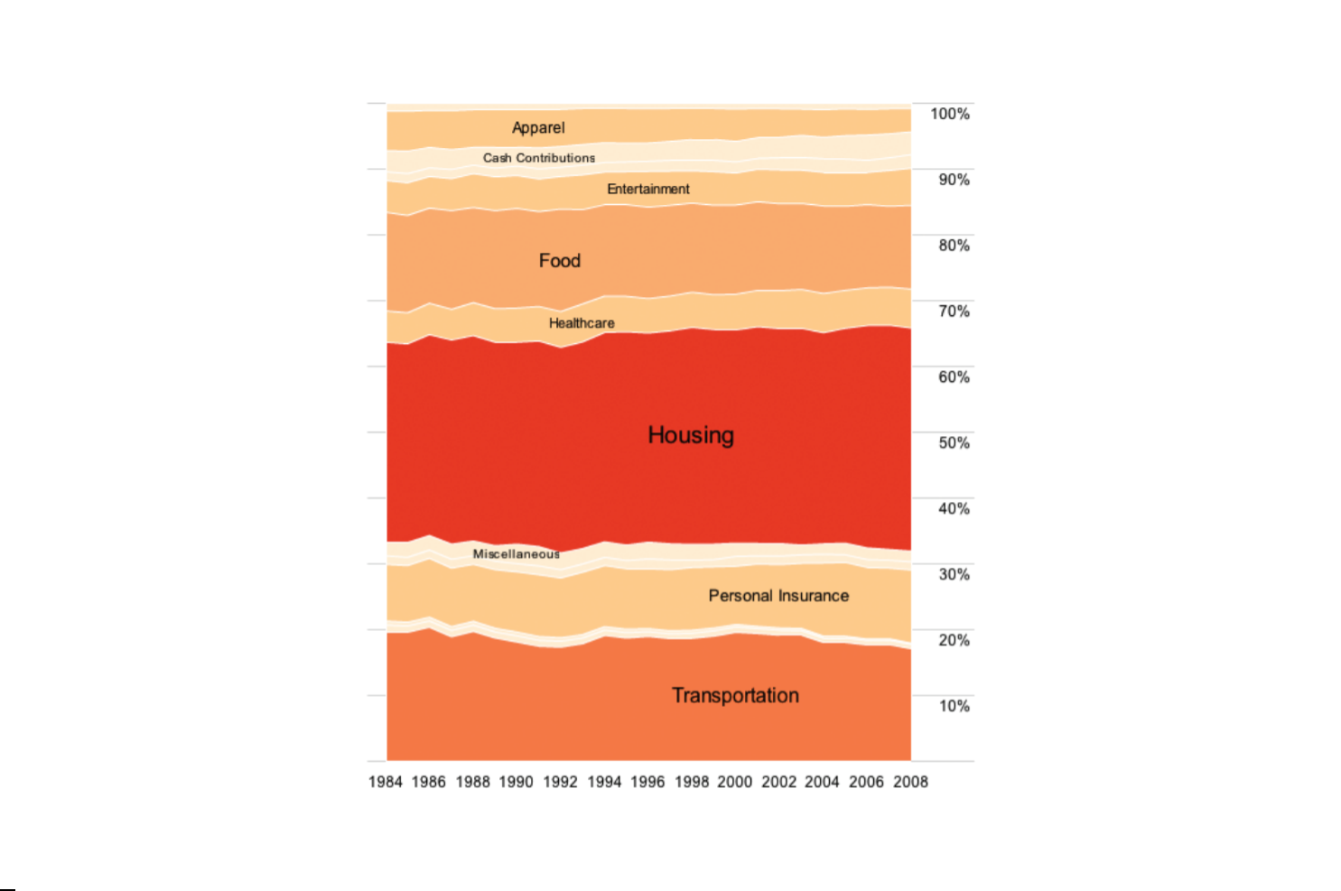
Internal audiences such as board members and staff have a better understanding of goals and ongoing projects at their organization. In this case, managers should create data visualizations which summarize the internal monthly performance of the organization. One example could be reporting on the monthly performance of different departments through bar or line charts, which are easily comparable.

Source: Images from the report Arts and Economic Prosperity in Allegheny County
If arts organizations are publishing the report for the public, they should be focused on creating a story that their target community can relate to. Greater Pittsburgh Arts Council (GPAC) has published the Arts and Economic Prosperity Report which presents the economic impacts of the arts in Allegheny County. In the example below, GPAC wanted to describe how much the arts contribute to the local economy in terms of local salaries. To show this they first report that the arts and culture industry generated $641 million in salaries in Allegheny County alone. To further communicate this to their audience, they put that large number in other terms that resonate with their market. They used the numbers of pointe shoes, pianos, phone bills, and pierogies that could be bought with that amount of money. This technique helps to illustrate how expansive this sum is through many relevant examples instead of merely just the dollar amounts. Arts managers should consider their audiences in advance and decide how to tell their story in the most effective way.
2. Identify the primary purpose of data visualization
Every data-set has a vast amount of information that can be shaped into many different stories. Arts managers have to discover what story they want to convey to readers. Before visualizing the data, managers should write down a list of the key facts and insights from the data. With this list, the manager can then use an aid like this infographic. These graphs and charts are grouped by four main categories: comparison, relationship, distribution, and composition. Making a connection between the data and the type of charts will help arts managers chose the best way to visualize the data. Understanding the characteristics of different charts will help to communicate the data more effectively.
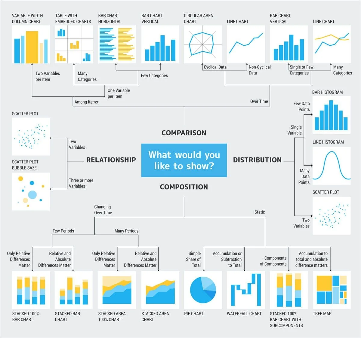
Source: http://extremepresentation.typepad.com/blog/2006/09/choosing_a_good.html
Below is the original data from GPAC that shows the number of jobs generated by arts and culture in different cities. Since each data is categorized by a geographic location, symbol map is ideal to show the patterns or trends of the data. By striving to find the most appropriate chart for their data, arts managers will find the best path to increasing audiences’ engagement with their visualizations.
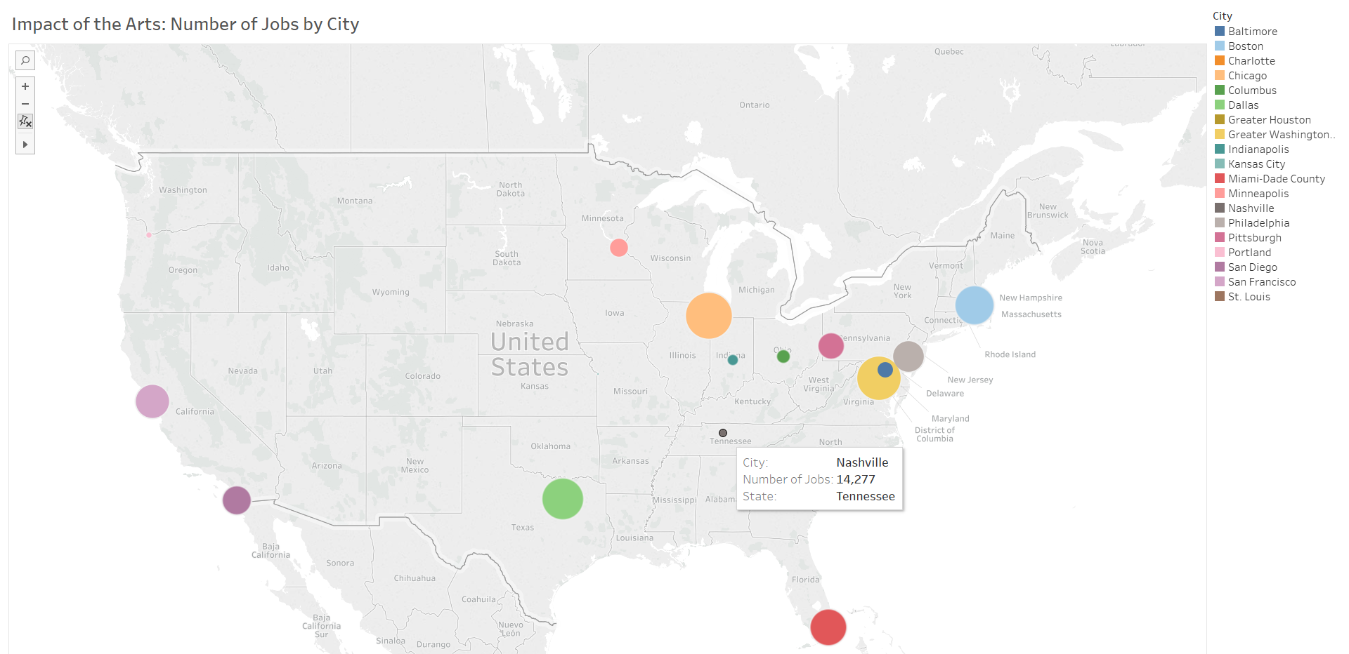
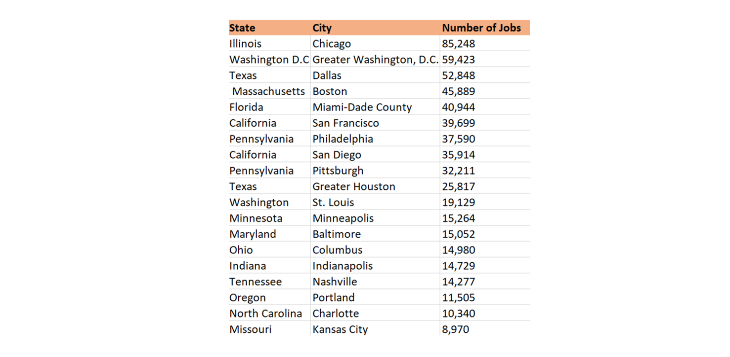
Created by the author with the data form the report Arts and Economic Prosperity in Allegheny County - http://www.pittsburghartscouncil.org/storage/documents/From_Pointe_Shoes_to_Pierogies_-_Impacts_of_the_Arts_in_Allegheny_County.pdf
3. Employ common sense design principles
Source: https://onlinelibrary.wiley.com/doi/pdf/10.1002/9781118722213
Arts managers can increase readers’ interest in their data visualizations by using common design principles. These some easy principles to remember are:
- Font size & color: Most of the time, readers’ eyes go to bold texts or bigger font sizes. Different font sizes and styles are good ways to highlight key points of the data. Font color is ideal for showing the relationship between different variables. Since complementing colors stand out from each other, they are effective tools to show comparison.
- Color associations: Readers might have preconceptions with certain colors, for instance green might mean right and red could mean wrong. These associations can influence a reader's interpretation of the data.
- Location on the page: In Western culture, readers will read from left to right, not right to left. Arts managers need to be aware of that the locations of individual design element can affect the flow of the story.
- Cultural Influence: The trend of a current society can impact the reading habits. Currently, reports are indicating that people are increasingly willing and able to read large amounts of text on their mobile devices. Pew Research Center addresses that about one-in-five Americans under the age of 50 have used a cellphone to read digital books. Arts managers should check that data visualizations are compatible on different mobile devices, and they need to select an individual design element wisely to convey their messages in a more effective way.
4. Be persuasive
Most of the charts contain basic elements such as title, subtitle, visual fields (axes, labels, captions, legend, etc.), and source line. By using these elements clearly, charts become more useful, reusable, and shareable. For instance, if readers are trying to use your organization's data in their presentation, clear explanations of the elements will make them more confident in sharing the data with others. A descriptive title can make the chart more persuasive since it directs the reader to the important information in the graph. For example, the title, “Relationship between the number of attendees and their age,” does not shape the key message of the graph. A more informative title could be, “The number of attendees under the age of 40 have increased over the last three years." Therefore, the descriptive title boosts the readers’ understanding of the content. If you have trouble creating descriptive titles, try to complete this sentence: I need to convince them that . . . [fill in the blank]. This exercise helps the author find the main idea, which is the first step in finding the best descriptive title. By making data visualizations more self-explanatory, arts managers will improve the distribution and comprehension of their data.
Data visualization will improve the communication between art institutions and their internal and external communities. It enables readers to consume a large amount of data quickly and to expand the discussion about the data with others. It is important to not only choose the right data visualization tool, but also to use it to create a story.
Work Cited:
"10 Advantages of Data-Visualization." Visualr. November 1, 2016. Accessed February 27, 2018. https://visualrsoftware.com/advantages-data-visualization/.
Blitz, Shelby. “10 Useful Ways to Visualize Your Data (With Examples).” SISENSE. November 15, 2017. Accessed March 29, 2018. https://www.sisense.com/blog/10-useful-ways-visualize-data-examples/.
Kirk, Andy. Data visualization a successful design process. Birmingham, UK: Packt Pub., 2012.
Marr, Bernard. “5 Top Tips For Presenting Data More Effectively.” Forbes. September 11, 2017. Accessed March 28, 2018. https://www.forbes.com/sites/bernardmarr/2017/09/11/5-top-tips-for-presenting-data-more-effectively/3/#57add25c6ed6.
Vize, Shannon. “The Art of the Hashtag: How to Boost Social Engagement Through Tags.” MONDO. Accessed March 27, 2018. https://www.mondo.com/boost-social-engagement-through-hashtag-use/.
Yau, Nathan. Visualize this the FlowingData guide to design, visualization, and statistics. Indianapolis: Wiley Pub., 2011.