
As arts managers, we are often called on to present our organization's impact to board members or would-be donors. Measures, like money-raised or number of individual impacted, are included in yearly impact reports and grant proposals. They help us secure the funding that keeps our organizations alive. How do these facts and figures tell the story of your organization’s mission and how it was accomplished? Can your art installations or children’s theatre be translated into charts in graphs and more importantly, is this the best means of telling a story?
Many of these questions can be answered through data visualization. Open a dictionary and you will find that data visualization is defined as “the creation and study of visualized data”. This definition is far from telling, and from an arts perspective, fails to identify how data visualization occurs and who it is for.
Join AMT Lab as we explore how visualized data can enhance your organization’s reporting in a number of metrics through the universal language of image and color.
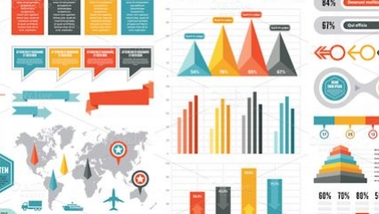
Source: Google
The Simple Science
Last year, your development team may have created a pie chart. One slice had a percentage of donors who were new to the organization. The other chunk showed those who had donated previously. Congratulations! You have already dabbled in data visualization.
To put it simply, data visualization is turning numbers and data in visual representations, so that they may be easily interpreted by people outside of the organization. These can be as simple as a bar chart plotting revenue growth, or a line chart detailing daily attendance at a venue. The ways in which data can be visualized are endless and limited only by the artistic boundaries of employees.
Detailing attendance numbers as a list of figures in a column is hardly appealing and fails to create any sort of narrative for an organization and its work. The visualization of this data, through a line graph or more sophisticated means, allows a viewer to see the numbers as they rise and fall in relation to time. Perhaps peak attendance occurred in the months when an organization was open late, and the low periods coincide with your off season. Being able to see these relations immediately allows coworkers and patrons to understand the data more easily, and may even provide insight into new areas. At a glance, simple charts and graphs are a format that everyone can understand and interpret, when presented properly.
Not Just For Annual Reports
Many arts professionals understand the concept of data visualization as detailed above, but beyond standard methods of implementation, how can arts organizations utilize the data they collect to further their mission? In an article titled And what can I do now?, the Center for Artist Activism, details the process of collecting data and the importance of presenting your findings in an ethical, unbiased way. The idea behind this rationale is that by infusing your hard data with a touch of human empathy, you can convey data in a means that connects to both your mission and the people you wish to convey it to. Data visualization allows arts professionals to create a visual narrative playing upon common visual cues that humans can understand. Playing with concepts of weight, continuity, shape, size, and color allow a reader to infer information quickly and efficiently.
Over the coming months, AMT Lab will continue to explore data visualization and the multitude of ways that arts organizations can leverage this skill to present their impact to boards, donors, and the public. The potential of visualized data is limited only by the capabilities of your staff. Often we find that those with backgrounds in art and design are able to quickly and efficiently adapt to this skill and the many different software offerings that assist with data visualization.
Do you integrate data visualization into your annual reporting? What are you favorite tools and technologies for doing so? Let us know in the comments below!