publishing

iPhoneize Your Web Site with One Click!

Yes, the iPhone provides a true representation of any Web page. However, some page designs - while accurately displayed on the device - are just too difficult to read and navigate on a small screen. Intersquash.com attempts to rectify the situation by generating an iPhone-friendly Web page for your site with one click. The only caveat? Your site content must be RSS-driven. (What's RSS, you ask?)

To iPhoneize your site using Intersquash.com, simply enter your RSS feed URL and Web site title into the Intersquash interface (squasherface? intersquash?) and click the "iPhoneize My Website!" button. BOOM! Your site has been iPhoneized. It doesn't even hurt.

Step One: Enter your site info.

picture-8

picture-8

Step Two: Your site has been iPhoneized.

picture-10

picture-10

The site gives you the option to upload an icon (57 pixels squared) or access the "hearder code." Placing the header code provided by Interquash in the header of your site's HTML will enable device recognition so mobile users will automatically be presented with your iPhoneized page.

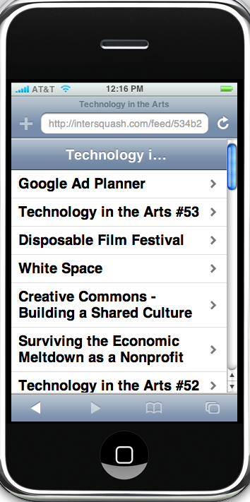
Here is the iPhoneized version of the Technology in the Arts blog.

picture-9

picture-9

By the way, the screenshot above was created using a free software called iPhoney, which allows you to view any Web page as it would appear on the iPhone. Two notes: 1) iPhoney is Mac only and 2) no, you cannot make calls using iPhoney... don't be ridiculous.

Book Review: Don't Make Me Think!

If anyone out there is planning a major overhaul of their Web site, listen up. I've just finished reading Don't Make Me Think: A Common Sense Approach to Web Usability, by Steve Krug. This book is a great guide for anyone who wants to get some insight into Web style conventions, how visitors use Web sites, and usability testing. Why are conventions and usability important? Imagine picking up a newspaper with no headlines, no sections, no page numbers. Web conventions are important to know because, well, people have come to expect them. And, they work.

The book is a quick read (about three hours) and user friendly (it would be self-defeating if it were otherwise). The tips and advice offered by Krug are great pieces of wisdom to have in the back of your mind as you examine the needs of your site's users, work with designers, and seek buy-in from stakeholders.

The second edition of the book was published back in 2005, but the trends and conventions it cites are not out-of-date by any means. And, the backbone concept of "don't make me think" is timeless. This book is definitely worth checking out, especially if you're about to put any time, effort, and money into revamping your organization's Web presence.

Related site: Advanced Common Sense (Steve Krug's site)