Arts managers: stay motivated and focused with the help of these Google Chrome extensions
Measuring Unstructured Data: Brandwatch
Today, an increasing number of arts organizations are aware of the importance of using social media platforms to engage their audiences. While employing different channels is crucial, it is equally important to monitor, analyze and evaluate your organization’s performance across social media platforms.
Site Review - Events Marketing by Constant Contact
Constant Contact has just released its Event Marketing service, and the service meets a lot of the needs that an organization might have when gathering information about prospective attendees. The greatest strength of this new service is its use as data tracking tool. It has integrated a number of elements to allow the event's creator to gather information about and evaluate the experiences of registrants and participants. Standout features include:
Customizing registrants' required information, so the user can decide if he wants to know registrants' companies, websites, phone numbers, etc., including customizable question--for example, "Last show you attended at our theater."
Live tracking of invitee responses.
Event reporting that gives a rundown of who received an email, who has registered, and registrants' details.
Exportable Event Reports, so that information about registrants can be integrated into spreadsheets or analyzed later as a downloadable CSV file.
Survey generator to develop a survey to send to participants to get feedback on their experience, or perhaps before the event (to figure out the number of vegetarians to carnivores, for example).
It also contains some great accessibility features for both the registrant and coordinator.
A dedicated event page hosted on Constant Contact that is linked to from the invitation email, and has a URL that can be embedded on organization's website, sent in additional emails, included on social media profiles.
Ability to pay registration fees from event website through Paypal. Additional payment instructions can also be included, for example, paying by check or at the door.
Customizable, auto-sent registrant confirmation email, including "opt-out" of future event-related communication feature.
The event coordinator can choose a date or respondent number at which to automatically close registration, which Constant Contact monitors.
Ability to modify event details after posting.
Ability to export event details into your calendar.
Great suggestions for content, offering guidelines to word successful invitations and offer relevant event information.
There are, however, two minor gripes that I had with the Event Marketing tool that I wish to note. The first of these is that the Constant Contact invitations are, in structure and design, very similar to the regular Constant Contact emails. I think that this could be a drawback for someone who is skimming through an inbox: they may not realize this is actually an invitation.
The second drawback is the sheer number of steps it takes to create an event invitation and email.
The first screen prompts you to enter the critical event information (date and time/host/location/payment information/etc.) and to title the event. These values are then transferred to the invitation email and the event page.
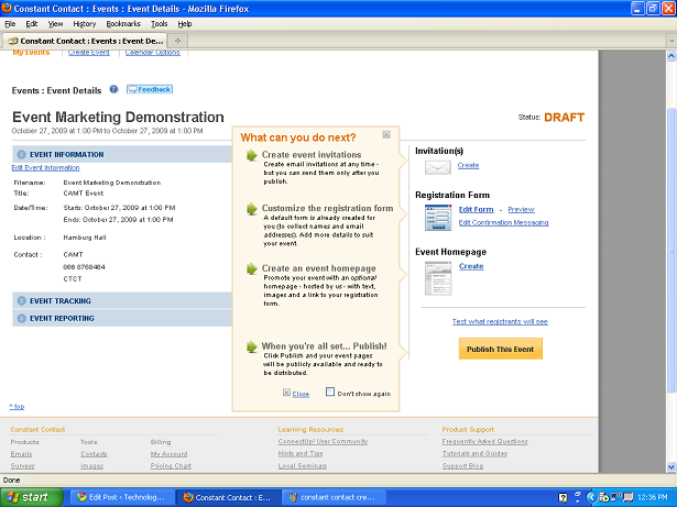
Here I think Constant Contact should have added another screen that requires the user to fill in information that can be transferred to both the invitation and the website. Instead, the next screen the event coordinator sees is as follows:
Though a user can choose any of the steps, the screen encourages the user to create an email, then to decide what information registrants would need to supply, and finally to create a webpage for the event. While it's ok as it stands, I think that Constant Contact could have streamlined the process.
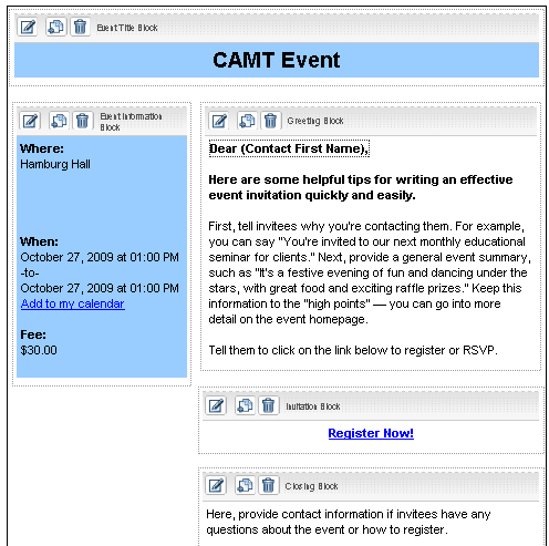
In its current incarnation, the email template is unexciting, similar to the standard Constant Contact newsletter template. A person can move a few boxes around, insert some images somewhat awkwardly into the designated spaces, and change the color of fonts and boxes (there aren't any nifty templates that integrate images). The text in each box (other than event location, date) much be individually edited on the screen.
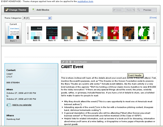
The (not pictured) final effect isn't particularly earth-shattering. I think that Constant Contact would have been wiser to have the event coordinator next see a screen with input boxes like the basic "Event Date/Time/Etc." box, but including the prompts that it currently has on the Invitation and Page creation screens:
Rather than edit information directly in the template, as the user does now, he could fill in information about the event and interesting details (see the suggestions that Constant Contact offers), in addition to adding images that he might want to integrate into his theme. He would then be directed to the event page design screen above, where he could edit the appearance of the event page. Instead of prompts, however, he would see his own user-generated text and images pulled from the previous page. Likewise he would see components of his text and images pulled into the invitation template page--perhaps with some elements repeated on both, and some specific to the invitation or the page.
At this point the user could decide on a theme or template, which would be applied to both this page and the email template. In this way two major steps would have been streamlined, the look and feel of each element, as well as information provided, would be more unified. The user could then make modifications or adjustments (moving boxes, removing images, altering wording) on the above screens, rather than entering data from scratch.
Overall, Constant Contact has created a tool that is very attuned to the needs of organizations who have events to build interest, show support, and raise funds. It enables organizations to keep track of respondents and gather information about them for further communication. It also integrates tools to measure the attendees' perceived success of an event.
Constant Contact does require that the user run Internet Explorer 7.0 or Firefox. Constant Contact starts at $15/month and the site includes video tutorials, and a subscription includes live coaching and phone support.
Book Review: Don't Make Me Think!
If anyone out there is planning a major overhaul of their Web site, listen up. I've just finished reading Don't Make Me Think: A Common Sense Approach to Web Usability, by Steve Krug. This book is a great guide for anyone who wants to get some insight into Web style conventions, how visitors use Web sites, and usability testing. Why are conventions and usability important? Imagine picking up a newspaper with no headlines, no sections, no page numbers. Web conventions are important to know because, well, people have come to expect them. And, they work.
The book is a quick read (about three hours) and user friendly (it would be self-defeating if it were otherwise). The tips and advice offered by Krug are great pieces of wisdom to have in the back of your mind as you examine the needs of your site's users, work with designers, and seek buy-in from stakeholders.
The second edition of the book was published back in 2005, but the trends and conventions it cites are not out-of-date by any means. And, the backbone concept of "don't make me think" is timeless. This book is definitely worth checking out, especially if you're about to put any time, effort, and money into revamping your organization's Web presence.
Related site: Advanced Common Sense (Steve Krug's site)


