

Finding data and analyzing it takes time, something in short supply for most arts managers. But without taking the time to collect and analyze data, arts managers are making decisions without knowledge. Here are two tools and one source to consider as you move forward in your data collection and analysis, which might change the way you think about data while giving you the tools to make presentations to your committees, colleagues, or board of trustees data rich, visually stunning and convincing.
ArcGIS is a mapping tool that makes those of us who used to manually create maps of our data weep with joy. If you ever wanted to understand the similarities and differences between your community, your audience, your donors, etc. this tool might blow your mind. Some samples are provided on their website. In order to understand the topics mentioned, the tool allows you to layer in data from the census (an age layer, income layer, etc.) with CRM data of your audience types and zip codes (i.e. one layer for subscribers, one for single tickets) and your donors (one layer for major and one for lower level donors). You can then visualize overlaps geographically to see if your subscribers, donors and single tickets live in similar or different areas in your community. Knowing that information directly informs how you spend your marketing and development money to cultivate new audiences and donors.
ArcGIS can also be used on the education side of an organization. For example, if you were working on a Shakespearean dramatic work or an exhibition, you could create a story map like Remember, Remember that details the Gunpowder Treason plot of 1605, providing a historical context of your work.

Cost: $1,000 / year

Screenshot Tableau Desktop Example
Tableau is a data visualization tool that expands on the options provided through Excel and Pivot tables. Load your data and then easily do cross-tab analysis and visualization to help understand trends and cross-over points. This is a particularly useful tool for financial data tied to audiences and donors. For example, with donors you can link zip codes with giving dates and amounts to see trends. As Tableau explains: "Ask new questions, spot trends, identify opportunities, and make data-driven decisions with confidence."
Cost: $1000 / year
DATA SOURCE: PRIZM fka CLARITAS
I discovered Prizm when I was marketing in DC in the early 2000s. It was run by Claritas and later purchased by Nielsen. Lucky for all of us, the free version still gives you enough data to make some interesting conclusions about your audience and your potential audience from a psychographic perspective. Geographic data abounds, but your geographic location is like income and education, merely a correlative attribute to an audience. WHY I attend something has nothing to do with my age, income or where I live. It is about WHAT I like to do with my time.

Screenshot Psychographics 20901
The PRIZM data comes from zip codes tied to credit card transactions. This data directly relates to how an audience spends its money (and time). Furthermore, PRIZM has created psychographic types. Thus, if you find that your audience comes from 5 dominant zip codes, looking at the pyschographics of those zip codes helps you understand what drives the audience to you and you can find other zip codes with similarly motivated people. A recent example is an organization that is broadening its audience by taking its concerts to a different location in the county, intending to target an area with the same psychographic type, just 20 miles away from normal performances. For example, my former zip code has heavy arts consumption and is dominated by these 5 psychographics:
If you dig into one, Young Digerati, you find more info:

Screenshot of purchase habits of Young Digerati
It also provides 5 snapshots of the census information, for example household income or age (below):
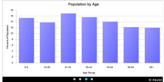
Screenshot Zip Code Age Range
This information provides you with a clear sense of future corporate sponsors, partners, or language for communication to that particular group.
Cost: > $1,000 PRIZM's paid service is best accessed through working with a marketing company who can share it across clients.
These 3 data tools will empower your organization to move forward in understanding the community, stakeholders, and moving forward to greater efficiency and effectiveness with your work. Have you found a different tool that can help you understand and visualize your data? If so, tell us about it in the comments section below!