Marketing

Yet another reason to own an iPhone

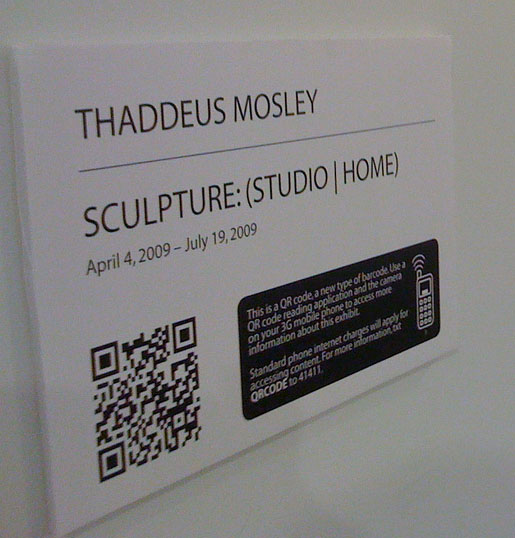
Quick Response bar code at the Mattress Factory If you have been to the Mattress Factory recently to see the new Thaddeus Mosley exhibition, you may have noticed that the title cards and some of the minimal signage have these intricate symbols on them. What you're seeing is a two dimensional bar code called a QR code that can be used to access information via your mobile internet enabled devices such as an iPhone or Blackberry.

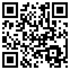
The code on the image above for instance, contains a link to a Youtube video of Thaddeus Mosley discussing the placement of large scale works within the gallery space.

Once you are in the gallery you can text QRCODE to 41411 to receive a simple walk through that tests to see if your phone is compatible with the suggested reader. The BeeTagg reader supports over 50 types of mobile devices and is available as an iPhone application as well.

After you have the reader installed you can access information from signage posted throughout the gallery space. Much like the guide by cell program, there is no proprietary equipment for the museum to pay for beyond the fabrication of the signage and developing the web content. However unlike a guided tour, this allows visitors to explore the space and access information that they are interested in when they want to.

Director of PR + Social Media, Jeffrey Inscho was kind enough to give me a guided tour on Thursday and pointed out some of the kinks that he is still working out. While most of the QR codes bring up URLs on your mobile device, some of them are text only which makes the codes much more dense. This can make it more difficult to take an accurate enough picture for your phone to recognize and decode the data. The smallest that the QR codes can be printed and still be read by most of the camera-phones on the market is about 1.5" square. So the text only cards may end up being replaced with a URL of the text to help ensure that they can be read. Shadows also tend to cause some issues while taking pictures, so you have to watch where you stand.

For the recent Predrive event, before they had installed the signage in the gallery, the Mattress Factory included a QR tag on their advertisement in the City Paper and received around 72 hits, which was more than Jeffrey had expected. Over the course of the exhibition the Mattress Factory will be able to monitor which tags receive the most hits, and get a feel as to how people are using the signage when visiting the museum.
qr1

As of right now, the Mattress Factory is the only museum in the United States that is currently using QR tags within the exhibition space, but the Powerhouse Museum in Sydney Australia has been using them for a a while and have outlined many of the issues that have cropped up in an amazingly detailed step by step guide.

Jeffery stressed that this was an experiment and an effort to help reduce the amount of printed gallery guides they use. It is not a permanent replacement for the printed material, but as the technology becomes more prevalent the QR codes will provide more in depth interaction and information to the visitors.

As of right now the Mattress Factory plans on continuing to use this new technology for future exhibitions and already has some just flat out amazing ideas on how to incorporate it into their Annual Garden Party but I don't want to spoil the surprise.

Best arguement thus far as to why I should update my phone from the bottom of the line Nokia I'm using.

More Proof - "Free" Can Have Value

11816532_5ca1075282_bI've stated on our blog and podcast many times that you can offer your content for free without devaluing that content. Frequent followers will recall two interviews with independent musician Jonathan Coulton (podcasts #38 and #55), who has given most of his music away and still manages to make a decent living. (I cannot define "decent" exactly, but I imagine he does quite well for himself.)

Well, thanks to Amazon's 2008 best-selling albums list, I have even more proof that free does not equal worthless. According to ReadWriteWeb, the best-selling album in Amazon's MP3 store for 2008 was Ghosts I-IV by Nine Inch Nails. Interestingly, that same album was available for free (and legally!) in March via BitTorrent under the Creative Commons Attribution-Noncommercial-Share Alike license.

This means that either: A) People ignored the fact that the album was available for free and opted to pay, or B) people downloaded the album for free and paid after listening because they felt it was worth the money. A third option, of course, is that people were just too dumb or lazy to figure out how to use BitTorrent. This, however, is unlikely. After all, this is the fan base for Nine Inch Nails we're talking about here... not Frankie Valli and the Four Seasons.

This is not to say that opera companies should start giving away tickets. I'm simply saying that arts organizations might consider lightening up a bit when it comes to offering content online.

("Free LSD" photo courtesy of corypina's Flickr stream.)

Home Page Call To Action Survey

Though it might be debatable, it's a commonly held belief that the home page is the most important page of a Web site. A home page must quickly communicate the soul of an organization to a visitor and provide a visitor with easy access to relevant information. Often, it is the most vital and heavily trafficked piece of real estate on your organization's Web site. We recently wondered: how effectively are performing arts organizations in the field using their home pages?

We conducted a survey that examined three common calls to action that we believe all performing arts organizations should have prominently placed on their home page:

  • ordering and purchasing tickets
  • donating or contributing money
  • joining or subscribing to a mailing list or newsletter

These are three actions that most performing arts organizations want their Web site visitors to be easily take. So, just how easy are their home pages making it?

We were also curious to see how many organizations were still using splash (Flash introductions or animations, slide shows, etc.) or landing pages that delay the visitor from getting to the actual home page.

Click past the jump for more information on how we conducted the survey and for the results.

Methodology In all, we looked at 450 home pages of performing arts organizations across the United States. All 50 states and the District of Columbia were represented. There was a mix of dance, theatre, musical theatre, opera, symphony, and choral companies.

We asked two different people to review each home page for links or areas relevant to the three calls to action described above. They then scored each call to action using a scale of 0 - 5:

0 - Not on home page 1 - Hardly noticeable 2 - Somewhat noticeable 3 - Noticeable 4 - Very noticeable 5 - Immediately noticeable

We also asked reviewers if there was a splash or landing page prior to the home page. Finally, we gave the reviewers an opportunity to provide any general comments or thoughts on the home page and its design.

The Reviewers We used workers on Amazon.com's Mechanical Turk service to perform the reviews. 44 unique workers participated in the survey responses. At least two unique workers reviewed each home page.

I'll be talking about our experience with Mechanical Turk in a later blog post. To summarize, Mechanical Turk is a service that allows you to set up and pay workers for completing repetitive, simple tasks, such as a survey, that can be accomplished by a human computer operator.

Because of this crowd-sourcing approach, we manually reviewed the resulting data. We investigated and eliminated some data points due to inaccuracy or due to large discrepancies between to the two individual reviews for a home page. Ultimately, we ended up with valid reviews for 429 of our 450 home pages.

Results The detailed results are below. I was surprised at how well performing arts organizations are doing at making tickets available online. The results are quite strong in that area. The fact that 4.9% of organizations still have splash pages makes me cringe a bit, since I am completely against them. (Why make your users work harder to get to the information they care about?)

Another area where the results surprised me was the reviewer comments. The comments were optional and required that the reviewers spend some additional time to complete their response; given the nature of working as an Amazon Mechanical Turk, time equals money. Some of the comments were really in depth and revealing. This might be a reflection on the quality of the Mechanical Turk service, but it could also be due to the reviewers being excited about contributing and giving feedback to performing arts organizations.

If anyone has any questions about the results or would like any additional information about the methodology used in this survey, please post a comment.

Download Raw Call To Action Survey Data (CSV)

Overview
# of Home Pages Reviewed 429
Splash Page
% of Sites with Splash Page 4.90%
Ordering and Purchasing Tickets
Average Score 3.0
% of Home Pages with a Score of 0 16.8%
Donating or Contributing Money
Average Score 2.5
% of Home Pages with a Score of 0 21.9%
Joining or Subscribing to a Mailing List or Newsletter
Average Score 1.6
% of Home Pages with a Score of 0 38.7%
Reviewer Comments
% of Reviews with a Reviewer Comment 36.60%
% of Comments that were Positive or Neutral 54.1%
% of Comments that were Negative 45.9%

Will You Go? New Patron Facebook Tool

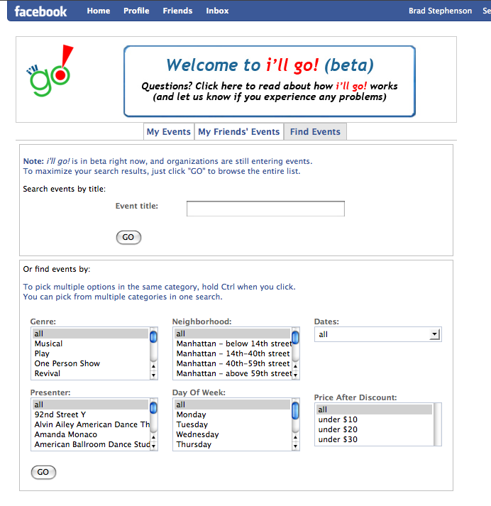
Gene Carr, founder and president of Patron Technology, recently blogged about his company's new Facebook app for New York arts groups and audiences. The app, i'll go!, is a free downloadable tool that provides users a way to connect around events and organizations a way to encourage first-time attendance through Facebook-only discounts.

See a screenshot of the event search interface after the jump.

Searching for an event using the Facebook 'i'll go!' app.

As this app is in beta, I'd strongly encourage New York organizations and audience members to install it and give it a go. If the app catches on, Carr says Patron will expand the tool to include other cities.

Find our more about i'll go! at the app's Web site.

Google Ad Planner

Google has opened access to their Ad Planner to anyone with a Google account. This is news of note for any arts marketing manager or coordinator and might be worth a few minutes of exploration. Ad Planner is a tool that helps you identify Web sites that your target audience is visiting by aggregating tons of search and site visit data. You can narrow your focus by demographic (gender, age, household income, education), by geographic region (country, state, metro regions), or by sites or keywords searched. You can select target Web sites and create a "Media Plan" and explore that plan through aggregate demographic data and interactive charts.

How Google collects this data in the first place is a mystery to me and still subject to discussion, and the limitations of the data can be felt when trying to use Ad Planner to get really specific about your target audience. While playing around in Ad Planner, I found that attempting to drill down too much resulted in, well, no results.

Trying to filter by keywords searched can be particularly problematic. For example, when I search for sites visited by people who search for the keyword "art," and no other demographic or geographic filters applied, I get a large number of results. Searching for people searching for "art" and who are in my hometown of Pittsburgh, or even my home state of Pennsylvania, returns no results. Does this mean that no one in PA is searching for "art?" No. It means that Google Ad Planner, like almost all of Google's products, is still a BETA release that has a long road of improvement ahead of it.

Does this mean that Ad Planner is useless? Not completely. I was still able to get pretty good results searching for demographic and geographic information at the same time (it's just those darn keywords that seem to throw things off). Would I create an entire Web advertising campaign based on the Ad Planner's advice? No. But would I take a look at it to gain some additional perspective and potential targets? Absolutely.

Get Your Phil...

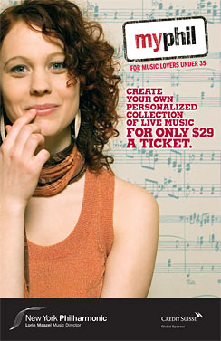
The New York Philharmonic has created a subscription series that allows people under age 35 to build their own season package for only $29 per ticket. Subscribers using MyPhil, as the program has been dubbed, get the best available seats in the house at the time of purchase, so the value of the discount fluctuates depending on the seat(s) one is able to secure. Create a flexible plan with MyPhil.

The subscription plan offers extra tickets throughout the season for guests for just $29 and also provides scheduling flexibility should a conflict arise on the date of your ticketed performance. In addition, MyPhil subscribers get a free one-year subscription to Time Out New York magazine.

This is just another example of an arts organization recognizing the unique needs and habits of the 18-35 set. I'm 31 years old, and the thing I appreciate most about plans like this is the ability to select alternate performance dates should a conflict arise. Young people are less and less likely to plan ahead, as we like to keep our social calendars flexible in the off chance that a better opportunity presents itself.

Confession: I have no social calendar. But if I did, I'd like to keep it flexible.

Web 2.0 Expo: Day Two

The highlight of my day was interviewing Eileen Gittins, the founder, president and CEO of Blurb, an online publishing service that provides print on demand tools for the general public. With Blurb's book layout software, BookSmart, users can create books using their own text and images and upload them to the Blurb server for purchasing, printing and delivery. Like Lulu.com (see Josh Futrell's recent blog post), Blurb empowers writers, photographers, graphic designers, and other artists to control the publishing of their work.

Gittins is a passionate entrepreneur who truly understands her client base. (She started Blurb based on her own frustrations with the publishing industry.) Blurb and the related project Photography.Book.Now exemplify what is truly phenomenal about the power of the Web.

No more spoilers. You can listen to my interview with Gittins (and a few other Web 2.0 Expo players) on Technology in the Arts Podcast #51 on Friday, September 26. (Go ahead and subscribe already, you slouch!)

I also digested this morning some tips on viral marketing during Jonah Peretti's Web 2.0 Expo session, Viral Marketing 2.0. Peretti, known throughout Web circles as a guerilla media guru, is the co-founder of HuffingtonPost.com and BuzzFeed.

Peretti explained that, contrary to popular opinion, a message doesn't become viral because of influential users. Rather, a message spreads because of the network that supports it. For instance, he explained, a fire spreads when the conditions are perfect and not because the spark that ignited it was special.

"Facebook created a network that would make the driest forest possible so the fires would spread," said Peretti.

The network Peretti highlighted today is what he calls the "Bored at Work" network, which is a huge people-powered network comprised of distracted corporate employees. However, he explained that a big problem with trying to spread a viral message is the "radical unpredictability" of the Web. There is no way to know who will make something popular or what will become popular.

So how can Peretti possibly offer any advice on delivering messages that will succeed in a viral way? He admitted that he didn't have a perfect answer. Still, considering his repeated success at gaining viral acclaim (see The Contagious Media Project for a list of his online exploits that have blown up), there is a great deal of cred behind the tips he offered.

For instance, may absolute favorite of Peretti's techniques is one he dubs "The Mullet Strategy." As most people know, a mullet is a hair style that features a short, professional front-end with a long, flowing rear. Peretti compared this "business in the front, party in the back" approach to marketing. Since the most contagious media is often silly, fun and even shocking, it isn't always appropriate for that content to live on the front page of a Web site. However, if there is a "party in the back" and people are enjoying and sharing that party, it will most definitely drive traffic to the other areas of your site.

Like a Moth to a Podcast

I've just discovered and started listening to The Moth podcast. The Moth, for those of you who don't know, is a non-profit storytelling organization that brings in people - actors, playwrights, comedians, poets, personalities, and the average Joe - to tell a story from their own lives. No notes. Just a performer, a story, a microphone, and an audience. The Moth has several different live performance series and programs around the country. Now, The Moth has been around since 1997, but I'd never heard of them until a few days ago. Why? Because 1) I live in Pittsburgh, instead of New York or LA, 2) I'm not hip, and 3) I often struggle to get my recommended daily allowance of culture.

Point is: I found them eventually. I found The Moth through iTunes. I found them through their podcast.

And now? I know for a fact that I will continue to listen to the podcast. I've enjoyed their podcast so much, I'm considering buying CDs and other schwag through their site. I’m writing a blog about them. I’ve told two friends about them. And so on...

It is so very important to have as many points of entry into your organization and its services as possible, and a quality podcast can be one. We’ve got a podcast tutorial here on Technology in the Arts. There are tons of resources and guides out there. It is worth the effort, the equipment, the navigation of the waters of rights and copyright, and the time to create a new point of entry to your organization to gather fans you never knew you had, like moths to a flame.

Desktop Wallpaper As Art

I got bored with my standard, gray desktop today, so I went out in search of something new.  I found some great computer wallpapers that can only be described as art. The beauty I ultimately ended up plunking down on my desktop was at Smashing Magazine.  Every month, they have a new set of wallpapers, available for free download, that have been submitted by artists and designers from around the world; artists such as Vlad Gerasimov, who has created an online studio teeming with his digital artwork.

Along the way, I also found a blog called Kitsune Noir, run by Bobby Solomon, which recently concluded the Desktop Wallpaper Project where artists submitted their works (some great stuff there).  And, I found out that deviantART has a section devoted to artist submitted desktop images.

This got me thinking.  I found all of these great places where individual artists were translating their work (or developing work exclusively) for computer desktops as a way of getting their art out there.  Were any arts organizations doing the same?

I did some searching and almost drew a complete blank.  The only case I could find was the Tasmanian Theatre Company.  Are any arts organizations out there providing desktop wallpapers on their sites? I would have to think that it's a way to keep your organization and its brand in front of computer-bound patrons.

Mobile Advocacy Resource

I've been subscribed to the blog at MobileActive.org for a while now, and a recent post that highlights the top 10 do's and don'ts for mobile advocacy made me realize that it was time to give a shout out to this great site on our blog. MobileActive.org aggregates mobile technology tools and resources for the international NGO community, and the information they offer is applicable and valuable for any non-profit arts organization considering using mobile technology as part of its marketing, development, or advocacy strategies.  You’ll find:

  • A blog with case studies and news related to the use of mobile technology.
  • A directory of projects that have utilized mobile technology.
  • A directory of mobile tools and vendors (such as consultants, SMS and MMS providers, polling tools, software and mobile content developers, and more).
  • Brief strategy guides that offer overviews of using mobile technology for fundraising and advocacy (you’ll need to register on the site to access these PDF’s).

So check it out and let us know what you think.  Also, if you know of any other useful resources, books, or sites out there that delve into the world of mobile technology, please post those in the comments.