
Data visualization (often referred to as “dataviz” for short) is one of the most powerful tools for businesses today. For nonprofit and for-profit organizations alike, digital storytelling is a skill in high demand. For the arts, effective visualization highlighting key issues or successes can make a powerful case for arts and cultural funding, advocacy, and policy. The following provides examples of the power of visualization tools and reviews 7 different free/low-cost options available for all.
Introduction
Data visualization can give words a bigger punch. For example, take the following data from the Arts Education Partnership’s 2022 ArtScan at a Glance—while this comparison chart can make the point that arts classes in schools are undervalued, it takes work to discern that only 26 states (including the District of Columbia) have an arts requirement for high school students.
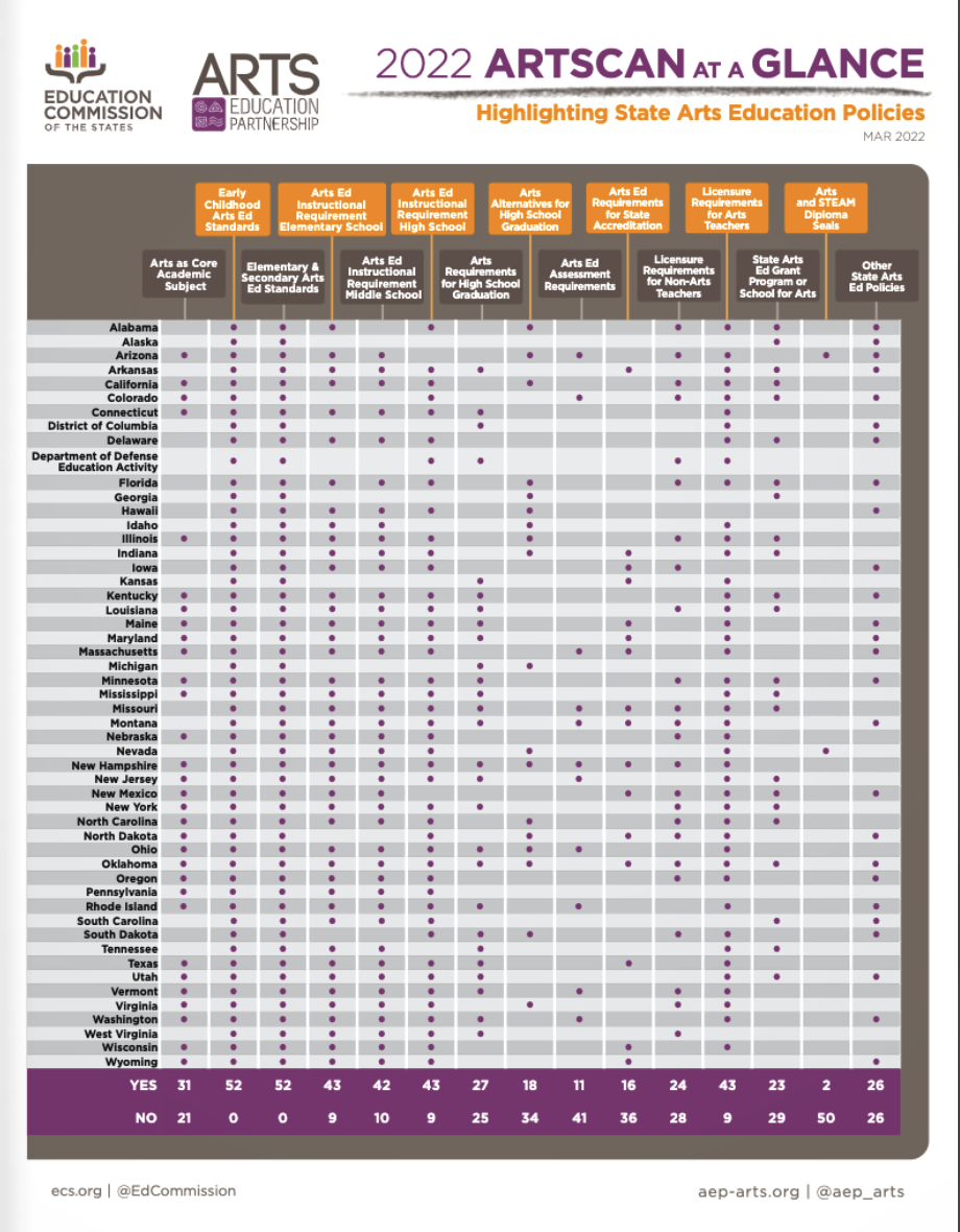
Fig. 1. ArtScan at a Glance Chart Source: ECS.org
However, the following map chart created in Flourish supports the argument and makes a bigger impression on a reader than if the statistic had just been presented through text. Suddenly, the key message becomes observable and real.
It may seem intimidating for those unfamiliar with the tools. Rest assured, there are several free or freemium products available that are user-friendly and beneficial to arts workers with little or no experience in data visualization.
It is important to understand the story and the impact you are trying to make before you begin visualizing. In nearly every industry, creating and presenting high-quality data visualizations has become a necessity. As noted in the Harvard Business Review’s “Good Charts” ebook, the increase of more sophisticated visualizations, large amounts of data, and the rise of accessible tools to create visualizations are imperative enough to learn data storytelling techniques. The following example takes a single graph from Americans for the Arts’ 2022 Congressional Arts Handbook. The same information can be presented in two ways and leave the reader with different foci and experiences.

Figure 3. Source: Americans for the Arts
Aside from communicating data in more digestible ways, visualization tells a story and gives meaning to the data. For nonprofits, data visualizations can be used to show an organization's impact, which ultimately allows donors to see how far their donations have gone in serving an organization’s mission. A truly compelling visualization elicits an emotional response from the audience and can lead to action.
Seven Tools For Dataviz
The following seven tools were selected after an extensive search of popular, highly recommended, and best-suited programs for nonprofits and small businesses. They will be critiqued based on general pros and cons, ease of use, cost, the types of graphs able to be made, compatibility with other devices, and average customer ratings aggregated from popular data visualization review websites and blogs, including Software Advice, SaaSworthy, Capterra, and others.
Flourish
Flourish is highly regarded as a consumer favorite and has phenomenal reviews on multiple sites and blogs. Personally, I found it very easy to create quality graphs when I first started working with data visualization. There are paid subscriptions available. However, I’ve found that even with the Free version, I’m able to create the visualizations I desire with little to no limitations.
Google Charts
For nonprofits already utilizing Google Suite, Charts may be a good option to explore. Along with having the ability to share through other Google products, its other features include custom dashboards, dataset management, and visual discovery. Google Charts offers 18 different types of visualizations that are easily customizable. Users have regarded it as a very easy-to-use tool, especially when it comes to customizing charts for a particular website or presentation.
Infogram
As the name suggests, the primary function of Infogram is to create infographics. It’s a tool that’s been highly preferred by creatives because of its seemingly endless design capabilities. It’s also been touted as an intuitive tool that allows for customization to match your organization’s brand, making it an ideal tool for nonprofit arts and culture workers. Users can import data from several sources, including Google Sheets or Analytics, Microsoft Excel or OneDrive, JSON, Dropbox, and more.
Microsoft Power BI
For those who have some familiarity with Excel, Microsoft Power BI is the next step above that. Power BI integrates seamlessly with its other products if your organization is already using Microsoft products. It also easily converts data to build interactive dashboards, providing important business insights.
ChartBlocks
ChartBlocks is another good option for users with little experience in building out charts. It allows users to import data from several different sources and includes an optional step-by-step guide.
Domo
A robust and powerful business analytics tool, Domo’s cloud-based platform allows for a small team to work efficiently. It provides a comprehensive platform for business analytics and reporting through custom data apps. This intuitive tool allows teams to make better-informed business decisions.
Tableau
Those looking for more expansive software for large amounts of data may consider Tableau to be a more appropriate option. Tableau is often regarded as a top performer in the data visualization world. It is able to directly connect to hundreds of data sources such as Excel, JSON, Microsoft Access, and several others. It is also able to perform data analytics and visualization through its Tableau Public channel.
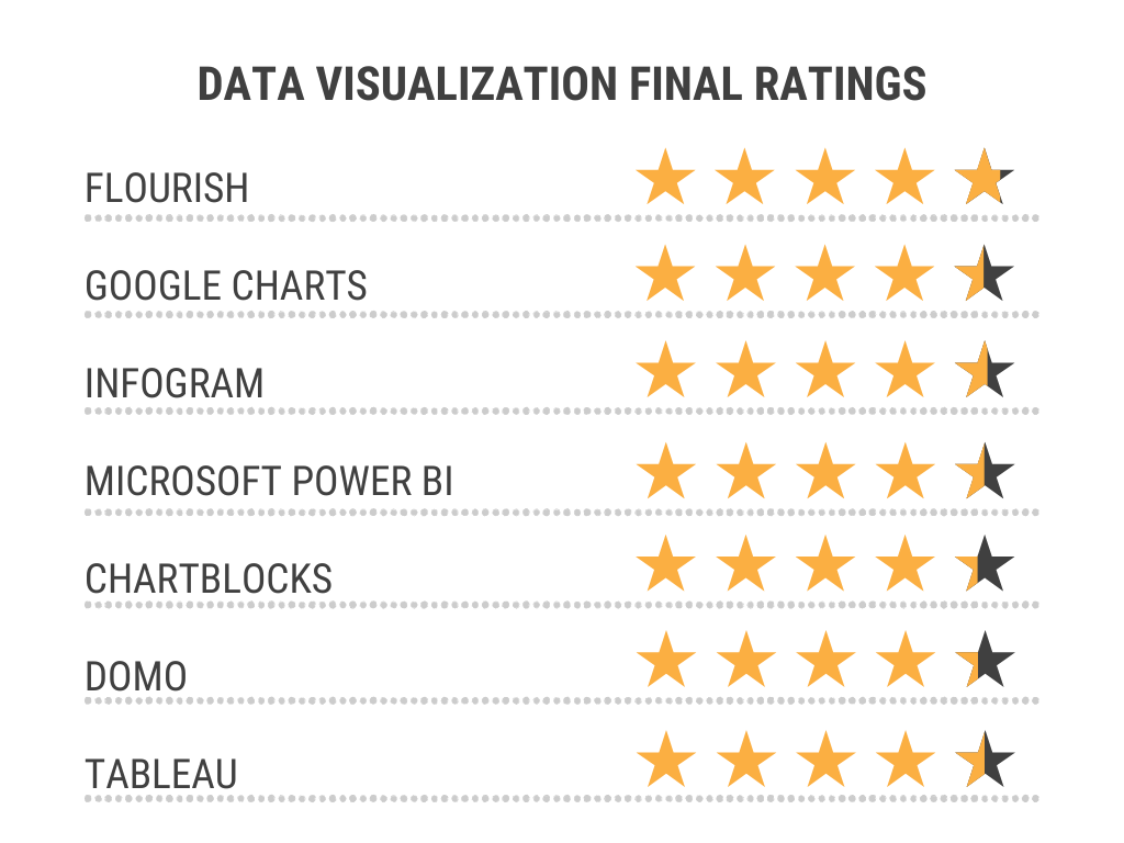
Figure 5. Source: Author
Additional resources
For nonprofits interested in learning more about effective data visualization, the following resources were used to build the foundation of this article and have personally helped me improve my own data visualization skills.
-
“About Google Charts.” Software Advice. Accessed November 2, 2022. https://www.softwareadvice.com/bi/google-charts-profile/.
“About Infogram.” Software Advice. Accessed October 27, 2022. https://www.softwareadvice.com/bi/infogram-profile/.
"ArtScan at a Glance." Arts Education Partnership. March 29, 2021. https://www.ecs.org/artscan-at-a-glance/.
Berinato, Scott. Good Charts: The HBR Guide to Making Smarter, More Persuasive Data Visualizations. Boston: Harvard Business School Publishing Corporation, 2016.
Biswal, Avijeet. “What is Power BI?: Architecture, and Features Explained.” Simplilearn. Updated July 30, 2022. https://www.simplilearn.com/tutorials/power-bi-tutorial/what-is-power-bi.
“ChartBlocks Reviews.” Capterra. Accessed November 3, 2022. https://www.capterra.com/p/135426/ChartBlocks/reviews/.
“ChartBlocks Reviews & Product Details.” g2. Accessed November 3, 2022. https://www.g2.com/products/chartblocks/reviews.
“Chartblocks Review.” CompareCamp. Accessed November 3, 2022. https://comparecamp.com/chartblocks-review-pricing-pros-cons-features/.
“Domo Reviews & Product Details.” g2. Accessed November 3, 2022. https://www.g2.com/products/domo/reviews.
“Google Charts.” Google Developers. Accessed November 2, 2022. https://developers.google.com/chart.
Haan, Kathy. Edited by Rob Watts. “The Best Data Visualization Tools Of 2022.” Forbes Advisor. Updated October 18, 2022. https://www.forbes.com/advisor/business/software/best-data-visualization-tools/.
Khalturin, Denis. “10 Best Data Visualization Tools To Facilitate Data Analysis.” Improvado. December 8, 2022. https://improvado.io/blog/the-best-data-visualization-tools-top-bi-software.
King, Timothy. “The 19 Best Data Visualization Tools and Software for 2022.” Solutions Review. December 9, 2021. https://solutionsreview.com/business-intelligence/the-best-data-visualization-tools-and-software/.
“2022 Congressional Arts Handbook: Facts & Figures at Your Fingertips.” Americans for the Arts. Accessed November 12, 2022. https://www.americansforthearts.org/by-program/reports-and-data/legislation-policy/legislative-issue-center/congressional-arts-handbook.
“Powerful features to help you make infographics, charts, and reports.” Infogram. Accessed November 3, 2022. https://infogram.com/features.
“Pricing.” Infogram. Accessed November 2, 2022. https://infogram.com/pricing.
Simplilearn. “23 Best Data Visualization Tools for 2023.” Simplilearn. October 28, 2022. https://www.simplilearn.com/data-visualization-tools-article#GoTop..
Smith, Ally. “7 Data Visualization Tools for Nonprofits.” Fundraising KIT. August 23, 2021. https://fundraisingkit.com/blog/nonprofit-data-visualization-tools/.
Stobierski, Tim. “Top 6 Data Visualization Tools for Business Professionals.” Harvard Business School Online. January 12, 2021. https://online.hbs.edu/blog/post/data-visualization-tools.
“Visualization types in Power BI.” Microsoft Learn. September 2, 2022. https://learn.microsoft.com/en-us/power-bi/visuals/power-bi-visualization-types-for-reports-and-q-and-a.
“Why Domo?” Domo. Accessed November 6, 2022. https://www.domo.com/why-domo.