


Canva is an incredibly popular design tool across sectors—but is Canva Pro worth the cost? What extra features does it entail?

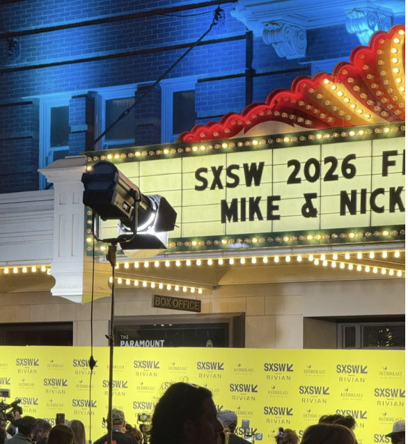
This article analyzes how SXSW 2026 reflects broader changes in the film festival circuit, particularly the transition from acquisition-driven markets to marketing-oriented platforms. It considers the implications of this shift for distribution strategies, industry access, and the sustainability of independent filmmaking.
Tom Lloyd's light-based sculptures are now on view at the newly reopened Studio Museum in Harlem, marking the institution's return to 125th Street after years of renovation. This review examines how Lloyd built a practice around electric light and technology at a time when Black artists faced pressure to work in more representational forms, and why his work remains relevant today.
This article offers a philosophical analysis of Hamnet, focusing on how director Chloé Zhao constructs a cinematic language grounded in pre-linguistic perception, myth, and embodied affect. Centering on the character of Agnes, the essay argues that the film traces a movement from a holistic, pre-symbolic mode of being—rooted in nature, sensation, and maternal lineage—into the symbolic order shaped by rhetoric, narrative, and art. Drawing on mythology, psychoanalytic theory, and Western philosophical traditions, the analysis explores how grief resists linguistic assimilation and how artistic representation functions as a belated ethical container for loss. Rather than resolving trauma through narrative closure, Hamnet foregrounds ambiguity, sensory immersion, and emotional resonance as primary modes of meaning-making. The article ultimately positions Zhao’s film as a critique of interpretive dominance in Western thought, proposing cinema as a space where perception precedes language and where art enables a shared, collective encounter with otherwise inexpressible pain.
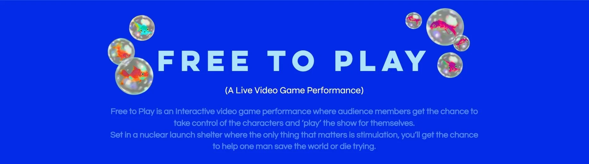
Free To Play: A Live Video Game Performance redefines interactive theatre by merging live performance with real-time gameplay. Supported by the Frank-Ratchye STUDIO for Creative Inquiry, the production explores how digital platforms, gamification, and audience participation reshape creative agency and engagement in contemporary performance.
The Bear’s season 4 faces criticism for moving too slowly, but this review argues why the slow pacing is essential to the show’s exploration of trauma and the healing process. By analyzing key episodes, such as Sydney getting her hair done and the big fight at the end, this article explains how the show focuses on teamwork rather than individual genius. The analysis covers the season’s most impactful moments and states why patience in storytelling matters for representing what real recovery looks like.
Data visualization (often referred to as “dataviz” for short) is one of the most powerful tools for businesses today. For nonprofit and for-profit organizations alike, digital storytelling is a skill in high demand. For the arts, effective visualization highlighting key issues or successes can make a powerful case for arts and cultural funding, advocacy, and policy. This article reviews 7 accessible dataviz applications.
Data, data all around. All this data, and what to do with it? Arts nonprofits around the country are working diligently to leverage attendance figures, donation reports, CRM systems, and social media analytics to make the most of their data. Reports are downloaded, numbers are crunched, and well-formatted excel sheets are made to identify trends and communicate organizational goals. When it comes to sharing this information with internal stakeholders, however, a picture really is worth 1,000 words (or in this case, numbers). Tableau is a business intelligence (BI) software that turns those facts and figures into accessible visual graphics, and is worth considering for your organization’s data-crunching needs.
With more than 23,000 customer accounts, Tableau has established itself as a powerhouse of data visualization experts. Clients include aerospace companies such as SpaceX, healthcare institutes like John Hopkins Hospital, and even financial sector customers such as Goldman Sachs. But what does Tableau- a rather expensive budget line item- do for its non-profit customers like the Red Cross? What does data visualization even mean for non-profit groups, let alone arts organizations?