As a new buzzword, “Big Data” is all over our daily lives. However, the tech industry specializing in data collection and analysis doesn’t mean that other industries haven’t found value in using data. For anyone who knows baseball (or has watched Moneyball), we know that data analysis has become part of the player selection process. From a business perspective, big data enables companies to mix their patron data into a broader pool of consumer data and extract correlations that help them know with unprecedented specificity who are most likely to respond to their appeals. The great thing about data is that it replaces guesswork with facts and gives these corporates reliable answers, clear directions and predictable results. The not-so-great thing is that it replaces personal expertise and human intuition with cold hard math, a process that arts administrators who’ve built their careers on creative management practices might have trouble getting used to.
Database Decisions for the Nano-Nonprofit: Part 1
Arts organizations of all sizes grapple with the question of how best to house information on the array of individuals with whom they interact. From ticket buyers to donors, members to volunteers, every arts organization builds a variety of relationships with a variety of constituents. Complicating matters, of course, is that many times these groups overlap. For the organization that wants to understand all the dimensions of its patron relationships, obtaining complete and nuanced profiles is often a challenge, time-consuming at best and impossible at worst. Recent years have seen a burgeoning of Constituent Relationship Management systems (CRMs), about which a wealth of literature is available.
Redefining Participation: Notes from the Newspaper Industry
The Audit Bureau of Circulation (ABC) reported its latest figures on the American newspaper industry last week, noting that in the six-month period ending on 9/30/2012, circulation figures across the industry largely held steady. Sunday circulation increased by 0.6%, while daily circulation fell slightly, 0.2%. For an industry that has experienced a drastic nosedive over the last several years (some would point to the last two decades), these figures, especially when combined with those of the preceding six months, should come as a breath of fresh air. Leading the charge—if we’re feeling optimistic—is the sharp, ongoing rise of digital circulation, which now comprises 15.3% of the total mix (up from 9.8% the year before). That print editions continue to decline comes as no surprise, but what is striking is the degree to which digital gains are boosting overall circulation figures, in some instances resulting in tremendous increases for individual publications. A prime example is The New York Times. With a total average daily circulation of over 1.6 million, The New York Times expanded its reach by 40% since 9/30/2011—all of it digital. The nation’s leading newspaper, The Wall Street Journal, which began counting paid online subscribers in its circulation figures in 2003, experienced similar, if more modest, growth (9.4%), as did the Los Angeles Times (11.9%). So too in Newark (48.1%), Tampa Bay (30.4%), Honolulu (26.3%), Cleveland (20.5%)…the list goes on.
So what happened? Did Americans begin to read online newspapers en masse over the last two years? Likely not. Rather, ABC made significant changes in its reporting mechanisms to enable newspapers to more fully capture its “cross-media” audience instead of only its print circulation. The changes, which went into effect in late 2010, include metrics to audit and report digital newspaper editions that are accessed by readers on websites, tablets, and smartphones. It’s taken the industry time to figure out both how to deliver its products to audiences in desired digital formats and how to track these multiple modes of participation. But with 24 months of that data now collected, “year-over-year” comparisons can begin to be made that produce a decidedly more nuanced portrait of the industry.
Whether or not that picture is more or less bleak than before is open to debate, certainly. For the arts, it might be an encouraging note as the industry wrestles with how to measure and evaluate online modes of participation. The most recent NEA Survey of Public Participation in the Arts (2008) inquired broadly about the subject; one question assessed online access of any performing arts (theater, music, or dance) and another the same for visual arts. As the authors of Beyond Attendance: A Multi-Modal Understanding of Arts Participation (2011) advocate, additional research is needed to gain a more detailed understanding of online participation; measurement systems likewise have to adapt. If the newspaper industry’s experience is any guide, when they do, the arts will be far better positioned to assess, and ideally to serve, its audiences.
Image Credit: Steelworkers reading the newspaper, Aliquippa, Pennsylvania, July 1938; Library of Congress, Prints & Photographs Division, FSA/OWI Collection, LC-USF33-002822-M2
A Data Visualization of Art & Money
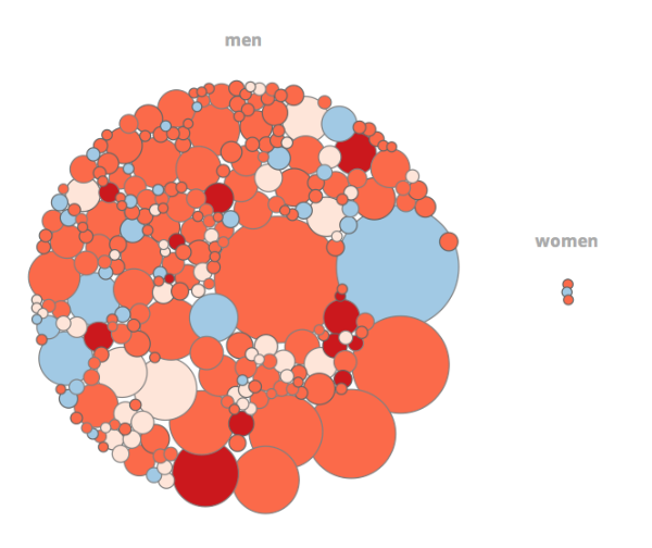
Looking for a well-worth-it distraction? Check out Art & Money, an animated art auction infographic by Jean Abbiateci. It visualizes metrics for the top 270 most expensive artworks sold in auction between 2008 and 2011.
Methodology: the radius of the bubbles is calculated on the amount of sales. Theses prices do not include the buyer's commission.
Data visualized includes the size of the artwork, the artist's nationality, date created, selling price, etc. The data is then sorted in different categories so viewers can explore the relationship between male and female buyers, a comparison between top-selling work of dead artists and living artists, a look at how the top auction houses compare, etc.
Any surprises? Share with us!
iPhone vs. Android: What your Smartphone-of-Choice Says About You.
Based on over 80 million responses, Hunch blog has complied a rather…intriguing…analysis, and snazzy infographic, of smartphone users- highlighting the trends and differences between iPhone and Android users. What do you think? If you use a smartphone, do you relate to a smartphone-specific trend? How accurate/inaccurate are the findings?


