

Geographic Information Systems (GIS) applications can connect museums with their communities in ways that make project management and decision-making informed and strategic. There are numerous ways that GIS maps can be used—they can provide a picture of who is visiting the museum and how they are interacting with the space once they are there. Additionally, they can aid visitors with their experience of museum collections. Overall, GIS is an underutilized tool in a time where connecting with (and understanding) the communities museums aim to serve is at the forefront of strategic planning. This article, building on its previous installment, provides case studies that show various ways GIS can be utilized in museums to enhance reach and impact within communities. It also discusses common institutional barriers to the use of GIS systems and how museum professionals might overcome them.
Where Museums and GIS are Now
As discussed in “Enhancing Museum Accessibility with GIS”, museums that display, conserve, and educate on art have inherent benefits to society. However, these benefits cannot be realized if museums and the whole community they serve cannot connect. Therefore, it is imperative that museums use strategies to create a more accessible relationship between their organization and all constituents in their region. Some strategies can be leveraged with the use of Geographic Information Systems (GIS). GIS is a powerful and practical tool that helps people and businesses to visualize the location of demographics layered on other criteria of interest. Many industries have been using GIS in a plethora of ways in their work. With proper funding and education museums throughout the United States could utilize GIS to create more accessible programs and environments for community members.
When it comes to GIS, museums and cultural institutions do not use this technology in a uniform way. Some museums in the country have integrated GIS to create a museum-wide digital map for patrons to use during their visit, such as Detroit Institute of Arts, while others utilize very little to no geospatial mapping in their operations. Due to several barriers, GIS is not commonly employed in the industry yet. Christopher Goranson, a distinguished service professor at Carnegie Mellon University who is an expert in GIS, discusses these barriers, “It's important that the technology is accessible and understood by more than one person on the museum staff”. Kristen Kurland, a teaching professor of architecture, information systems and public policy at Carnegie Mellon University, agrees with Goranson on his observation. Kurland states, “Common hurdles are understanding the full capabilities of GIS and staff who know how to use it”.
Moreover, besides a lack of education on GIS software, museums (depending on their size and budget) may lack the funds necessary to invest in this technology. Goranson touches on this hurdle, “Custom built solutions that can't be maintained and/or heavy investments in license fees for proprietary software may not be responsible if the use of the software will be limited or otherwise not contribute significantly to the mission of the museum.”
In the end, Goranson’s point about a museum’s mission is key in the discussion of GIS in museums. If a museum can use GIS in fulfilling its mission, then this large investment is money well spent. However, if a GIS is bought and applied without clear direction and understanding of what the technology is being used to accomplish, then that investment may be wasted. Thus, it becomes increasingly important for museums to grasp not only education on GIS software but also to understand where, why, and how they will implement this technology. Kurland mentions that it is crucial for industries to learn from experts and people who use this technology frequently. She states, “Another [hurdle] is connecting with those in other industries that use tools such as CAD, BIM, and AR/VR/MR” and “I recently wrote a book called GIS Jumpstart for Health Professionals and expect a similar book (or roadmap) to help ‘Jumpstart’ art non-profits and museums would be helpful”.
If museums could combat these obstacles across the board, it may very well open up an entire frontier of data collection and visualization for the industry. In the end, barriers to utilizing GIS in museums could be solved in large part by increased funding for these institutions to experiment with and implement the technology.
GIS From the Perspective of a Museum Professional
In Pittsburgh, the Carnegie Museums of Pittsburgh (CMP) have dipped its toe into using a GIS. Shannon Jeffcoat, Director of Membership and Annual Fund at CMP, spoke of the museum’s process of using Power BI to create heat maps Power BI is a Microsoft-owned tool that includes GIS capabilities and allows companies to use their data and create visuals such as heat maps. Heat maps visualize data as concentrations of color schemes—often red to green—for example, red will show a higher concentration of a specific variable, while green demonstrates a lower concentration. The heat map created by CMP shows the concentration of visitors from various zip codes in the Pittsburgh area. Jeffcoat discussed how these heat maps are helpful in understanding “[...] who is coming and not coming through the door”. Moreover, Jeffcoat spoke about how heat maps and a more amplified use of GIS could be dynamic in “[...] making the membership base more reflective of what the community looks like.” The CMP has created a variety of community access memberships that have been instrumental in opening up the museums to a wider portion of the community. These community access memberships seek to remove the price barrier community members may have in getting a membership to the museums. By utilizing heat maps, it can help the development team at CMP make informed decisions about their community access membership program.
While heat maps have been an important new project for the CMP, Jeffcoat discussed her overall interest in implementing more use cases for GIS in the organization. She stated that she would like to use a GIS to look at “onsite behavior” of the constituents who visit the museum. Being able to look at “where people are coming from and what they are doing in the building” can help the CMP better understand their visitors’ use of their space and ultimately serve the community in a more accessible way.
GIS and Community Outreach
Ultimately, the usefulness of GIS in the context of museums and the community relies on GIS being a good fit for those constituents in the first place. Goranson states, “GIS is a tool, so I think it would be worth investigating if the community would want to engage with museum data that has a geospatial component.” Goranson’s point here is very important because understanding where the community is and what they really want seems to be the first step in creating successful relationships and programs. This strategy is something that has been used in community development and public art to find out where efforts are really going to make a meaningful impact. GIS has been used in cities across the United States to create more accessible public art programs. In Cambridge, Massachusetts Madeline Doctor used GIS to visualize what places in the city would benefit from public art. In order to create a map to ascertain this, she used three demographics including earnings, where public art was currently located, and areas able to be reached by bus. By mapping out this data, Doctor could then evaluate to score locations based on where public art would be most accessible and needed.

Inage of the three different layers Madeline Doctor used on her public at evaluation GIS.
Image Source: “Welcome to GIS at Tufts.” GISTufts, https://sites.tufts.edu/gis/.
This is one example of how GIS can be utilized in evaluating what a community needs. In this case GIS could be leveraged both for internal and external programs at these institutions. By using constituent and city data museums could employ GIS to determine what areas of the surrounding community are interacting with the museum the most and the least. They could also layer on demographics, such as income, in order to see if any patterns arise. By creating maps that explore these aspects, museums could not only create programs that offer reduced pricing based on zip code, but they could also develop programs that meet constituents where they are. If museums already are implementing programs that have them physically going into the community, a project like this could be extremely helpful in determining where these programs will make the greatest impact. GIS could assist museums in parsing out which neighborhoods may be lacking in community service, areas that are most accessible by public transportation, as well as many other decision-impacting factors. For instance, the New England Aquarium has used a GIS in accordance with its education programs. In order to increase accessibility for school students the institution used “zip code information to map school visitation in the Boston area”. Utilizing GIS helped them to bring their program to schools that were not being given the same opportunities as other institutions in the area.
GIS and Engagement
Aside from GIS being used as an evaluation tool, public art administrators have also used GIS to create public-facing interactive maps. These maps not only help people to discover where art is in a respective city, but they can also aid in information in regard to transportation and time needed to view these pieces. The city of Aurora, Colorado, has a GIS of all the public art in the community on its website for public use. This map, which was created using ArcGIS, provides users with the option to view any art currently on display. When a user clicks on an artwork, they can view the location of the work on the map as well as get a link to directions to the piece. The GIS is interactive and user friendly, as it allows anyone with access to the internet and a phone, tablet, or computer to play around with the technology and gain insights into what the city’s public art scene looks like. Minneapolis, Minnesota also used ArcGIS to create a series of self-guided public art tours. The city created seven different tours that each offer a different number of sites, estimated completion time, and what mode of transportation is best for the tour. When a user clicks on the tour they want to participate in, they are taken to a corresponding interactive map that shows them the route. Each path on the map has number markers that when clicked on shows a pop-up of the artwork that is located in that spot. This use case of GIS is interesting because it helps users travel around an area to achieve a certain goal with greater ease. By using GIS, it makes public art much more accessible to the community, as it is effortlessly located and included with its position are other important aspects that viewers of the art would want to know to be able to approach these sites.

The map of the public art tour in Minneapolis, MN.
Image Source: “Story Map Journal.” Cityoflakes.maps.arcgis.com, https://cityoflakes.maps.arcgis.com/apps/MapJournal/index.html?appid=b7a95c1156ea48da9e8686b17088918f.
Some museums across the country have utilized GIS in a similar way to that of the public art self-guided tours. As mentioned above, the Detroit Institute of Arts rolled out a tour titled “Lumin” using augmented reality in 2017. The tour was created using Google Tango and allowed constituents to use phones to interact with pieces of art. When a user placed their device over the respective artwork, media popped up that gave the audience members a plethora of complementary information on the piece. The tour integrates GIS and developed an AR component to allow visitors to explore art in a new perspective. In 2017, the tour was deemed enough of a success that the Knight Foundation gave the Detroit Institute of Arts a $150,000 grant to continue to develop the tour. The use of GIS at the Detroit Institute of Arts parallels the way the city of Aurora used the technology in their public art program. The program they created gave constituents who visited the museum a more accessible and guided experience. Lumin helped visitors get around the physical building as well as offered them a more engaging and personalized look into the history behind the artworks included in the tour. With increased support and education, programs like Lumin could be leveraged to solve accessibility issues within museums, such as feeling welcome in the physical space and connecting with the contents of the institution.
Video example of Lumin
GIS Software on the Market
As a preliminary barrier for museums exploring GIS is lack of education on the topic, it is important to understand some of the GIS software that currently exists on the market. In the predecessor to this article, “Enhancing Museum Accessibility with GIS”, Policy Map, QGIS, and Simple GIS Client were discussed as practical software for museums. After discussions with GIS experts, this article will break down three different applications, along with ArcGIS. Kurland and Goranson both agree that the Esri ArcGIS product line is practical and effective for a museum's programs and work. Kurland states of ArcGIS Pro, “[...] more advanced tools such as Esri’s ArcGIS Pro are needed to build integrated applications to CAD, BIM, and VR as well as advanced analytics for demographic studies, fundraising, etc.” Whereas, Goranson speaks highly of ArcGIS StoryMaps, “Other tools like Esri's StoryMaps can be helpful for narrating a series of visualizations [...]”. The ArcGIS suite is a comprehensive mapping tool that has the power to be used for both internal and public-facing creations. The products Esri offers have been used in numerous art organizations’ mapping projects, such as the Aurora, Colorado public art tours. Specifically, the developers of the public art tours used ArcGIS StoryMaps which is a productive and immersive tool that can be used to create maps constituents can employ. The whole suite consists of dozens of products that can be used separately or together, depending on the criteria of a respective product. Museums that utilize the ArcGIS suite could also create immersive programs using VR that could help visitors to create meaning and connection during their museum experience.
While Esri's products are well-rounded and functional for high-level metric visualization, for museums that have a smaller budget or have never ventured into GIS before these products may be overwhelming due to the sheer number of options. Continually, because of the premiere products Esri offers, the price also comes at a premium. Nevertheless, Esri offers the Esri Nonprofit Organization Program which allows nonprofit organizations to use Esri’s products at a more affordable price. Membership to the program is gained through an application process, and any 501(c)3 is eligible to apply. This program offers four packages with increasing prices, products, and levels of training and support. Due to the application process, training needed, and cost, the ArcGIS suite may not be most practical for museums who want to experiment with GIS before rolling out programs involving the technology.
ArcGIS Suite
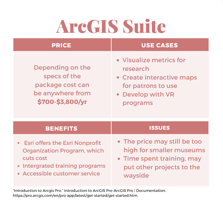
Infographic Source: Author
Tableau
For museums who want to test out GIS, there are several economical options on the market. Kurland recommends Tableau, for institutions that want to achieve some smaller projects with the technology. Tableau is data visualization software that can be integrated with databases such as Salesforce. Because Tableau is an effective tool to organize and analyze data, this tool would be useful for museums that want to create community outreach programs, install location based reduced admission, or examine where visitors are coming from. Continually, Tableau offers more affordable pricing compared to Esri. Tableau gives its users a choice of three packages ranging from $15, $42, and $70 a month. Moreover, the company offers a free trial for companies that want to experiment with the software before they commit to it. For nonprofit organizations who have an annual budget not exceeding five million dollars, Tableau also has a nonprofit program where the company donates the license to Tableau Desktop. Therefore, this software is an option to give smaller museums access to integrate GIS into their operations.
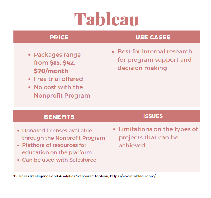
Infographic Source: Author
Google Maps
Google Maps is also a more cost effective option for museums that want to use GIS, as it is included with the Google for Nonprofits program. Google for Nonprofits is an offering by Google that gives nonprofit organizations access to the Google suite for no cost. Goranson is a supporter of Google Maps as a tool to visualize metrics. Google Maps is capable of generating a GIS to do internal research for museums to expand their access, as well as being able to construct public facing tools to allow visitors to play with museum specs. Continually, Google Maps may be useful for an institution that wants to make a case for the use of GIS in their programs. By utilizing this tool, museum professionals could create figures and maps to communicate to donors and foundations why funding for GIS may be imperative to reaching their mission.
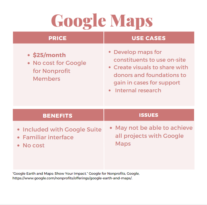
Infographic Source: Author
Kepler.gl
For museums that want to work heavily within their community and create programs that expand past the walls of the institution, Kepler.gl may be a valuable tool. Goranson speaks highly of the software for, “[...] visualizing extremely large datasets”. Kepler.gl is practical for museums that want to do research and analyze their data to make decisions about operations and programming. Users can input their data and then are prompted to add layers in order to create a final map. However, while this software can be used at no cost and can take in a lot of files, it is not exceptionally user-friendly for a novice. Kepler.gl requires a decent understanding of how GIS works in order to leverage the tool. Moreover, it is important to note that this software is an open-source project which may bring up concerns about data privacy and ethics for museums and their constituents.

Infographic Source: Author
GIS and the Future of Museums
As discussed above, it is clear that GIS can be used to remove gaps between museums and the public. However, with a lack of knowledge and monetary support for this technology its integration into museums may be fractured and slow. Nevertheless, as GIS and its beneficial use cases become more popular, museums may begin to take on the technology in a uniform way. Looking ahead to see where GIS could take museums in the future, Goranson and Kurland both agree that this technology could very well be used to increase constituent involvement and participation. Goranson argues, “Virtual environments and augmented reality provide good opportunities for exploration. Imagine if you could go back in time (virtually) to explore the context for a piece in a museum, or to understand how current events of the time impacted the creative process of the artist.” Although it may be a slow process, GIS could very well allow museums to reach exceptional accessibility standards and seek to develop personal and immersive experiences.
-
Aber, Blake. “Enhancing Museum Accessibility with GIS.” AMT Lab @ CMU, AMT Lab @ CMU, 22 Nov. 2022, https://amt-lab.org/blog/2022/10/enhancing-museum-accessibility.
“Access for All.” Carnegie Museums of Pittsburgh, 25 Mar. 2022, https://carnegiemuseums.org/join-support/membership/access-for-all/.
“Arcuser Online.” Augmented Reality & GIS, https://www.esri.com/news/arcuser/0311/augmented-reality-and-gis.html.
“Body of Devotion: The Cosmic Buddha in 3D.” Smithsonian's National Museum of Asian Art, 25 Mar. 2020, https://asia.si.edu/exhibition/body-of-devotion-the-cosmic-buddha-in-3d/.
Boyd, Peter D A. “GIS in Museums - a Case Study.” Academia.edu, 23 Apr. 2014, https://www.academia.edu/3086606/GIS_in_Museums_a_case_study.
“Business Intelligence and Analytics Software.” Tableau, https://www.tableau.com/.
Cole , Daniel G. “Incorporating Museum Collections into GIS Research” . Esri, https://proceedings.esri.com/library/userconf/fed16/papers/fed_126.pdf.
“Community Ties: Understanding What Attaches People to the Place Where They Live.” Knight Foundation, https://knightfoundation.org/reports/community-ties-understanding-what-attaches-people-to-the-place-where-they-live/.
“Curating the Digital: 3D, Digitization, and Mapping.” MCN, https://mcn.edu/resources/curating-the-digital-3d-digitization-and-mapping/.
“Detroit Institute of Arts to Premiere Lumin, a Mobile Tour Using Augmented Reality, Jan. 25 Developed by DIA in Partnership with Google and Mobile Developer Guidigo: Detroit Institute of Arts Museum.” Detroit Institute of Art, https://dia.org/about/media-room/news/detroit-institute-arts-premiere-lumin-mobile-tour-using-augmented-reality-0.
“Detroit Institute of Arts Wins 2017 Muse Gold Award for Its Augmented Reality Tour, Lumin, from American Alliance of Museums Knight Foundation Awards $150,000 Grant to Expand Lumin: Detroit Institute of Arts Museum.” Detroit Institute of Art, https://dia.org/about/media-room/news/detroit-institute-arts-wins-2017-muse-gold-award-its-augmented-reality-tour.
Esri. “Arcgis Storymaps.” ArcGIS StoryMaps, https://storymaps.arcgis.com/.
“Esri GIS Solutions for Museums .” Esri , Esri , https://www.esri.com/content/dam/esrisites/sitecore-archive/Files/Pdfs/library/brochures/pdfs/museumbro.pdf.
Fredricks, Jana. “Geographic Analysis of Nonprofit Data: A How To Case Study.” Arts Management & Technology Laboratory , Carnegie Mellon University , https://static1.squarespace.com/static/51d98be2e4b05a25fc200cbc/t/5d485c67f4bb2c0001af9a8d/1565023336589/Fredericks-Using+Geographic+Data+to+Understand+Donors.pdf.
“Google Earth and Maps: Show Your Impact.” Google for Nonprofits, Google, https://www.google.com/nonprofits/offerings/google-earth-and-maps/.
“GIS Mapping Software, Location Intelligence & Spatial Analytics.” Esri, https://www.esri.com/en-us/home.
Grincheva, Dr. Natalia. “Turning Geo-Spatial Museum Data into a Soft Power Evaluation Tool.” American Alliance of Museums, 7 May 2019, https://www.aam-us.org/2018/12/05/turning-geo-spatial-museum-data-into-a-soft-power-evaluation-tool/.
GuidiGOapp. “Discover How Things Looked: Lumin Project at the Detroit Institute of Arts.” YouTube, YouTube, 30 Jan. 2017, https://www.youtube.com/watch?v=eS2E12aXMvE.
“Home.” PolicyMap, 13 Oct. 2022, https://www.policymap.com/.
“Introduction to Arcgis Pro.” Introduction to ArcGIS Pro-ArcGIS Pro | Documentation, https://pro.arcgis.com/en/pro-app/latest/get-started/get-started.htm.
Iyengar, Sunil .“Taking Note: Arts Organizations and Community Attachment.” Taking Note: Arts Organizations and Community Attachment, https://www.arts.gov/stories/blog/2020/taking-note-arts-organizations-and-community-attachment.
Jeffs, Amy, and Gabriel Byng. 2017. “The Digital Pilgrim Project: 3D Modeling and GIS Mapping Medieval Badges at the British Museum.” Peregrinations 6 (2): 80–90. https://search-ebscohost-com.cmu.idm.oclc.org/login.aspx?direct=true&db=asu&AN=127326739&site=ehost-live&scope=site.
Kowach, Ashley. “Podcast: Gis and Fundraising, an Interview with Kristen Kurland.” AMT Lab @ CMU, AMT Lab @ CMU, 16 Aug. 2022, https://amt-lab.org/podcasts-interviews/2019/2/gis-and-fundraising-an-interview-with-kristen-kurland.
“Large-Scale Webgl-Powered Geospatial Data Visualization Tool.” Kepler.gl, https://kepler.gl/.
Malinverni, Eva Savina, Roberto Pierdicca, Francesco Di Stefano, Roberto Gabrielli, and Alessandra Albiero. “Virtual Museum Enriched by Gis Data to Share Science and Culture. Church of Saint Stephen in Umm Ar-Rasas (Jordan).” Virtual Archaeology Review 10, no. 21 (July 2019): 31–39. doi:10.4995/var.2019.11919.
Mjohnston. “GIS in Science and Education.” Field Museum, 15 May 2018, https://www.fieldmuseum.org/science/special-projects/gis-science-and-education.
“Nonprofit Software Pricing Program.” Nonprofit Software Pricing Program, https://www.esri.com/en-us/industries/nonprofit/nonprofit-program.
“Our Platform.” Tableau, https://www.tableau.com/products/our-platform.
“Qgis.” Welcome to the QGIS Project!, https://www.qgis.org/en/site/.
Reeser, Devon. “Five Ways to Use GIS to Strengthen Your Nonprofit Fundraising.” GIS Lounge, 27 Oct. 2014, https://www.gislounge.com/five-ways-use-gis-strengthen-nonprofit-fundraising/.
Richardson, Doug. “GIS and Public Policy.” Esri, 11 July 2019, https://www.esri.com/about/newsroom/arcnews/gis-and-public-policy/.
Rogers, Will. “From Reactive to Proactive: How GIS Is Helping TPL Lean into Leadership.” Harnessing Technology to Accelerate Land Protection: GIS at The Trust for Public Land. Lincoln Institute of Land Policy, 2019. http://www.jstor.org/stable/resrep22064.7.
Simple GIS Software. “Lightweight Yet Powerful GIS Software.” Simple GIS Software, https://simplegissoftware.com/simple-gis-client.
Spagnuolo, Sofia. “Using Digital Maps in Museums & Art Galleries.” Mappedin, https://www.mappedin.com/blog/use-cases/museums/using-digital-maps-in-museums-art-galleries/.
Staff. “10 Best GIS Software in 2022 (Geographic Information Systems).” COFES.COM – Make All the Right Business Moves., 27 July 2022, https://cofes.com/gis-software/.
Stein, Robert. “Museums and Public Opinion: Exploring Four Key Questions about What Americans Think of Museums.” American Alliance of Museums, 25 July 2018, https://www.aam-us.org/2018/01/20/museums-and-public-opinion/#:~:text=National%20public%20opinion%20polling%20shows%20that%20Americans%20overwhelmingly,of%20lawmakers%20who%20take%20action%20to%20support%20them.
“Story Map Journal.” Cityoflakes.maps.arcgis.com, https://cityoflakes.maps.arcgis.com/apps/MapJournal/index.html?appid=b7a95c1156ea48da9e8686b17088918f.
“Story Map Shortlist.” Auroraco.maps.arcgis.com, https://auroraco.maps.arcgis.com/apps/Shortlist/index.html?appid=d5fc148676a242ce854759a8c6135c49.
“Tableau for Non-Profits.” Tableau, https://www.tableau.com/foundation/license-donations.
Ufer, Tim. “The Relationship between GIS and Marketing.” USC GIS Online, 10 Feb. 2021, https://gis.usc.edu/blog/marketing-and-gis-relationship/.
Wayne, Chris. “Take a Tour: Exploring Geospatial Technology in Museums.” Directions Magazine - GIS News and Geospatial, https://www.directionsmag.com/article/9706.
“Welcome to GIS at Tufts.” GISTufts, https://sites.tufts.edu/gis/.
“What Is GIS?” Geographic Information System Mapping Technology, https://www.esri.com/en-us/what-is-gis/overview#liSwitcher.
“What Is Power Bi? Definition and Features: Microsoft Power Bi.” What Is Power BI? Definition and Features | Microsoft Power BI, https://powerbi.microsoft.com/en-us/what-is-power-bi/.
“What Is Tableau?” Tableau, https://www.tableau.com/why-tableau/what-is-tableau#video.