

There are many open sources available for arts organizations to learn more about their community. These data sources are valuable for designing marketing strategies, arts programs, and fundraising plans, among others. Rebecca Ezekiel states that 65% of the population are visual learners who comprehend and absorb visual information quickly. Additionally, according to the Aberdeen report, organizations that use data visualization tools are 28% more likely to find timely information than ones who do not. Hence, arts organizations should visualize the data to increase their efficiency and productivity. Arts professionals can use data visualization tools for board meetings, annual reports, strategic planning, and program evaluation. There are a number of data visualization tools available for free, but not every tool is easy to use. Here are five free data visualization tools that have high accessibility.
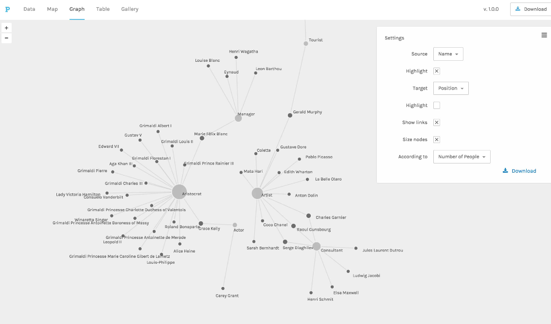
Tableau Public is a free online program that allows users to create visuals for storytelling with . The primary goal was to make sharing data on the internet as easy as uploading videos. With Tableau Public, users can create interactive charts and graphs, stunning maps, live dashboards, and other visualizations. It has a capacity to handle huge and fast changing datasets like those used in Big Data. Arts managers can use this tool to create their current and potential audiences’ profiles and build marketing strategies. Jennifer Moreci, one of AMT-Lab contributors, discusses more about how arts organizations can use Tableau to improve their strategic planning process

PC Screenshot of arts & metrics Website - Source: http://artsmetrics.com/en/digital-culture-report-2017-use-of-data-in-cultural-institutions/
2. Palladio
Palladio is a toolset that makes it easy to upload and investigate data. Since developers want to make it possible to visualize the data without any barriers, users do not need to create an account, and Palladio does not store the data for the users’ security. This tool is great for tracking cashflow and donor data, and for showing the relationship between different variables. Also, it has a feature called Gallery View that displays the data in a grid setting for quick reference. This would be useful for arts institutions to organize art collections and props.

PC Screenshot of Stanford Website - Source: hdlab.stanford.edu/palladio/
3. RAWGraphs
RAW works as a link between spreadsheets and vector graphics. It has an intuitive interface so that anybody can use it easily. There is no registration required, and it only takes four simple steps to visualize the data: input data, choose a chart, customize, and export. There are 16 professional charts that users can choose from or they can create own chart. It is a drag-n-drop style so that users can easily move and arrange the data and see the result in real-time. This tool would be appropriate for analyzing audience profiles and evaluating an organization’s performance.

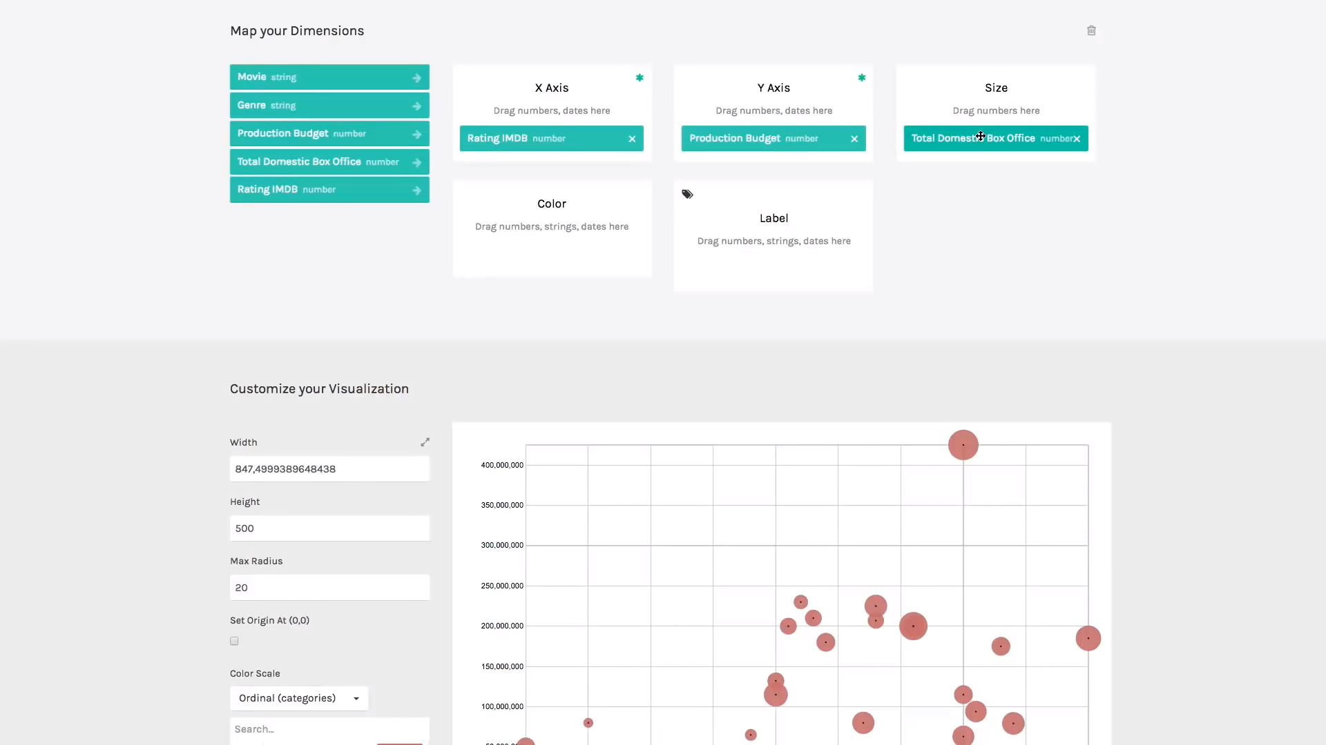

PC Screenshot of YouTube Video - Source: https://www.youtube.com/watch?time_continue=27&v=2TtYlty-M5g
4. Carto
Carto is a web-based location intelligence software that discovers and predicts the insights from spatial data. It has the capability to visualize the data in order to identify and analyze the relationship between different regions. Moreover, the data will enable people to do in-depth analysis of behaviors and influences in a community. This program would be useful for arts managers to understand the difference between neighborhoods and observe the organization’s impact in different communities.

PC Screenshot of Carto Website - Source: https://carto.com/
5. Microsoft Power BI (Business Intelligence)
Microsoft Power Bi is a cloud-based business analytic tool that brings all cloud information to one centralized location. Users have the flexibility to access this information whenever and wherever they need it. Although it provides various functionalities, it is a bit more complex than earlier recommended products. It streamlines the import of the data from Salesforce and Google Analytics etc. This would be a good tool to see the overall performance of arts organizations.


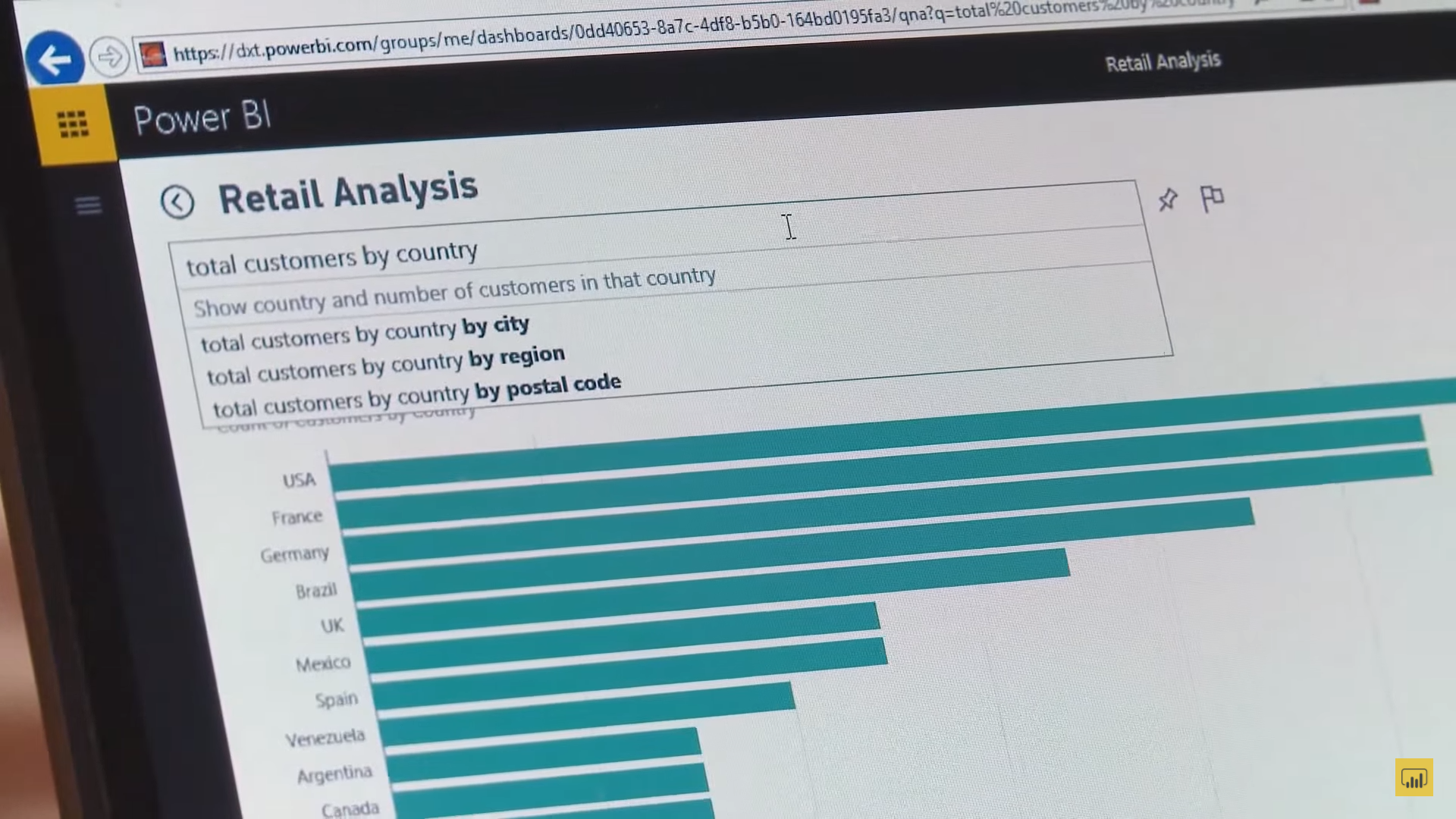
PC Screenshot of YouTube Video - Sources: https://www.youtube.com/watch?list=PL1N57mwBHtN0e-wvgVmrnn3Yd_WU7EHM-&time_continue=23&v=nMyZATdlg48
Microsoft Power Bi is a cloud-based business analytic tool that brings all cloud information to one centralized location. Users have the flexibility to access this information whenever and wherever they need it. Although it provides various functionalities, it is a bit more complex than earlier recommended products. It streamlines the import of the data from Salesforce and Google Analytics etc. This would be a good tool to see the overall performance of arts organizations.
Individuals who do not have a basic knowledge of data may put distance between themselves and data analysis tools. However, data is now essential to operate an arts organization efficiently and to maintain a healthy institution. If you are not familiar with data analysis, these five data visualization tools would be a good starting point to enter the world of data. Software engineers have designed many tools that have easy and convenient interfaces. Prospective users can explore free trials and use educational video examples to find the most compatible data visualization tool with their system. These tools will enable arts organizations to communicate with their staff and convey messages to their audiences more effectively. Has your organization experimented with any of these tools? Tell us about it in the comments.
Work Cited:
-- "10 Advantages of Data-Visualization." Visualr. November 1, 2016. Accessed February 27, 2018. https://visualrsoftware.com/advantages-data-visualization/.
Ezekiel, Rebecca. "Visual Learners." Studying Style. Accessed March 1, 2018. https://www.studyingstyle.com/visual-learners/.
Kirk, Andy. "BEST OF THE VISUALISATION WEB… DECEMBER 2017." Visualising Data. February 12, 2018. Accessed February 26, 2018. www.visualisingdata.com/.
-- "The Top 5 Biggest Advantages of Data Visualization." Salesforce. Accessed March 1, 2018. https://www.salesforce.com/hub/analytics/data-visualization-advantages/.