Review

The Royal Opera's The Show Must Go On, Reviewed

has the player assuming the role of a stage manager at a variety of different productions.  The degree to which the player succeeds or fails at a series of mini games effects the show itself at the end of the scenario.  This game was play tested on a IPad 1 for this review. Fun:  (4 out of 5 stars) The game plays well.  The characters are charmingly rendered and are well suited to the genre of performing arts that they represent.  The music of the show in question plays on cheerfully in the background and was a highlight.  There was a good sense of immediacy in the constituent games within each production and as such the overall sense of timing was well designed.  The strategies involved in game play were pretty linear and as such may be better suited for a younger audience.

Playability:  (4.5 out of 5 stars) The game is quick to learn and master.  The constituent games are well suited to the touch interface.  Each module within a show has enough different about it to keep most people engaged for hours.

Depth:  (2.5 out of 5 stars)  The app and the four shows yielded about six and a half hours of game play.  The player has to unlock each show in order and can play individual modules in the score attack mode.   For an adult player the replay factor is limited after the four show scenarios replay is probably quite a bit better for a younger audience.

Value: (4.5 out of 5 stars) For the price of $.99 this feels like a bargain.

Overall: (4 out of 5 stars) There are a lot of good things going for The Show Must Go On.  This app is a fun and easy introduction to four famous shows.  The music that plays with the game is lovely, even when played through iPad speakers.  I highly recommend checking this app out for killing time during holiday travel, it worked well for me.

Everybody's talking about Google Art Project

Is Google Art Project setting a new standard for the online art world, or is it all just hype?  Since its release a few days ago, the public has taken its first stroll through the project’s virtual galleries and in general, first impressions have been enthusiastic.

Birth of Venus

Birth of Venus

"The Birth of Venus" by Sandro Botticelli. Uffizi Gallery, Florence via Google Art Project

Arts lovers are all abuzz about its fabulous image quality, its accessibility to broad audiences, and its educational potential.  While it is too early to tell how much of an impact Art Project will actually make on museums and the art world, the collaborative spirit and innovative technology of the site shows great promise.

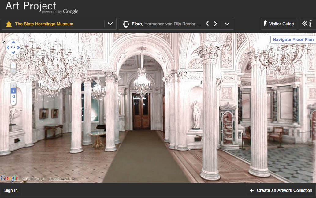
For the past 18 months, Google has collaborated with 17 world-class museums to create "Street View"-style tours of their permanent collection galleries.  While “walking” around a gallery, a virtual museum-goer can zoom in on any one of 1000 artworks.  Many of these images are also accompanied by information such as descriptions of the work, artist biographies, links to more in-depth coverage on the museum’s website, and even some informational videos.

The Hermitage Museum via Google Art Project

The Hermitage Museum via Google Art Project

The State Hermitage Museum, St. Petersburg, Russia via Google Art Project

Even better, one artwork per museum is available in “gigapixel” resolution of up to 14 million pixels so that you can zoom in almost microscopically close to the canvas.  This allows for an intensive scrutiny of artwork that has not been previously available online.

In addition, visitors have the option to curate their own virtual collections, including details that are captured by zoom, and comments about the art.  These collections can be shared via Facebook, Twitter or embedded link.  It’s free, but you’ll need to sign in to a Google account to create your own collections.

  • Navigating through the virtual galleries can be mesmerizing. Personally, I loved the feeling of revisiting those museum galleries that I hadn’t been to in years. It was a truly moving experience to be able to unlock those visual memories. And for those museums that I haven’t yet visited but have always wanted to see, it was great to get a taste of what visiting might actually feel like.

  • The Street-View technology at times can be quite cumbersome and frustrating. Often, I found myself stumbling around, bumping into invisible walls, fruitlessly clicking away and trying to back myself out of corners. In addition, the image resolution of the navigation tool can be fuzzy, especially in contrast with the images of the artwork itself.

Starry Night

Starry Night

  • The “gigapixel” technology is jaw-dropping, and it feels so much more intimate than your run-of-the-mill online image. As Nancy Proctor and Julian Raby of the Smithsonian point out, "to engage with the work of art in this way transforms the web experience from an informational one to an emotive one.” I imagine, and hope, that these super high-resolution images will someday become ubiquitous in online museum collection. While not a substitute for seeing the art in person, these images are breathtaking in their own right. Detail of "Starry Night" by Vincent Van Gogh. MOMA via Google Art Project

  • Many pieces in the galleries are blurred out due to copyright issues. While this is understandable, it can also be distracting. Furthermore, most of the museums offer very few actual galleries to explore. MOMA, for example, has just one gallery and the lobby. And the lobby doesn’t have any art that is actually visible or accessible to the viewer. Over at Art21, guest blogger Kevin Buist has some interesting thoughts about the uncanny effect of seeing so many doorways into other galleries that in fact are blocked by those invisible walls.

It’s an impressive debut, despite its flaws.  Perhaps most exciting is its collaborative approach to making museums accessible to new audiences around the world.  While virtual gallery tours have been offered online before, they have existed in isolation from one another.  Art Project brings them together in a visually stunning way, where curious users can wander around museums that they didn’t even know existed.

Some have criticized that Google is cherry-picking the museums involved and therefore curating its artistic content, but I would counter that they had to start somewhere.  If the Art Project is successful, doubtless they will need to grow their museum roster, especially to include non-western museums.  And I suspect that some of those navigational kinks can be worked out over time as well.

It remains to be seen if the Art Project will truly be able to sustain audiences over time, but I hope that it can.  Anytime art can reach new audiences in innovative ways, I think that it’s cause for the art sector to celebrate.

Product Review: Choral Management Software

Since the ChorusAmerica conference is coming up this week, I have been looking into the growing field of choral management software. I began with the question of why choruses would invest in discipline-specific software instead of a more general tool.  In conversations with creators of three relatively new tools (Choral Management Package, Groupanizer, and Museminder), it became apparent that choruses have some very specific needs that more general management software isn't addressing well -- needs such as managing repertoire, tracking attendance, sharing calendars, and maintaining a performance history.

The tools in this article have a wide variety of features, capabilities, and pricing structures. Each has the potential to save you time, ease communication, and prevent duplicate work. I encourage you to try the demos and videos to see if a program is a good fit for your chorus.

And, as always, let us know about your own experiences. Are you using a choral management program?  Do you have a favorite piece of software that isn't listed here?

Choral Management Package (CMP)

In 2004, Filemaker7 invited the public to enter their innovative software solutions into a contest. In response, Ray Fahrner reworked a system he had built for his own choir into a package that could be useful to a wide range of choruses. He didn't win the contest, but his changes and the feedback he got from testers and reviewers led to the release of the Choral Management Package (CMP) in 2005.

CMP has a mix of choral-specific features -- such as a music library and event history -- along with capabilities to track financial transactions and to manage contacts. While the tool is designed to help any director, Fahrner noted that it is most helpful to the busiest directors and to directors who manage multiple choruses.

Fahrner emphasized that CMP is a true "package" -- a self-contained, downloadable program that you install on your desktop. During a transition to a new computer, the entire database can be burned onto a CD and installed on the new machine.

The Choral Management Package is available to download for a one-time fee, which includes 30 minutes of tech support or customization. A free demo is available via the CMP website.

Groupanizer

Groupanizer, the newest of these three, hit the market in early 2009. Tom Metzger created the software with communication foremost in his mind. He describes Groupanizer as a "private social network for choruses." Leaders can update calendars and send emails, and chorus members can update their learning progress and access shared files such as member handbooks or policies.

Metzger explained that the more members a chorus has, the more the group will benefit from automation. Smaller groups can benefit as well, but they often have fewer resources for technology -- a primary driver behind Groupanizer's tiered pricing based on group size.

Metzger is working on an update that allows members with certain "roles" to connect to tailored job descriptions and timelines. He also has plans to release versions in German, Finnish, and Swedish in the near future.

Groupanizer's monthly fee depends on the size of your chorus. A 30-day trial is available online.

Museminder

Margaret Cribbs originally created Museminder as a dance studio management program. In 2007, seeing the technology needs her own chorus faced, she began tailoring the system to handle choral management as well.

In reworking the program for choruses, one of Cribbs' main projects was to create a music library. This library allows you to search for pieces using information such as composer, arrangement, language, or number of copies. Other features of the original studio management software are of particular benefit to choruses as well -- including personalized calendars, integrated email, attendance tracking, and an array of reports. The event management component allows touring choirs to manage their tour rehearsals, performances, and promotional events all in one place.

Cribbs explained that mid- to large-sized choruses would benefit most from her software, as would choruses that need to track a substantial number of financial transactions.

Cribbs is working on an update that links the music library to the event component, which will give users historical information such as when a piece was last performed.

Information about Museminder's monthly fee is available on the FAQ page. The online users guide contains videos and screenshots of the program.

Product Review: Online Submission Tools for Music, Video, Visual Art, and Writing

Now that websites and email addresses are as ubiquitous as mailing addresses and phone numbers, organizations that accept submissions have a new way of receiving work from artists.  Many find that receiving submissions via email can be overwhelming, and coordinating review of pieces among judges or editors can result in a lot of cluttered in-boxes and overlooked submissions.  Getting a panel together to review portfolios for a competition may be costly, and relying on the numerous moving parts and unforeseen expenses adds a level of complication that could be unnecessary. Fortunately, there are a number of products that have been developed over the past few years that are designed specifically for everything from publishers to film festivals.  These online tools enable organizations to receive submissions and have a review process that cuts out the need for endless emails or envelopes of slides or manuscripts.

All of the products below have a central place online where submissions are uploaded by applicants and stored for review, annotation, comments, and more by administrators or jurors. They each excel in different mediums, and have a variety of costs associated with them.

Submishmash

Developed by a writer, this free program was intended to enable small journals and publications to accept and review submissions in a more streamlined and organized manner.  Slightly customizable to link from and match your website, this submission tool offers unexpected flexibility and enables publishers to accept payment (submission fees, etc.) electronically with the submission.  Developers of submishmash have extended the scope of downloads to include photos, music, and additional types of media.  Submishmash streamlines the review process, allowing editors to communicate with one another, make notes on what stage of the process they are in, and enable the authors of work to check in on their submissions to see what stage of the review process they're in.  Files are downloaded to editor's computer for review.  Quick list of notable features:

  • Handles word documents (automatically converts to PDF when reviewers download), images, and audio files

  • Ability to email form and personal letters to author and editors with one click

  • Ability to fund contests and publications by charging submission fees without setting up a PayPal account

  • Streamline the editing process and eliminating the messiness and confusion of email submission acceptance by putting all work in one place for review

  • Allows authors to submit word documents which are automatically converted into PDF for review

  • Publisher can run multiple competitions and calls for submissions simultaneously

  • Free to use (if you do end up charging for submissions, a small percentage of that is taken by developers)

Submishmash developers are working on more customizable and advanced versions that will be available for purchase, but plans to keep the current version free.

CueRate*

*CueRate is a product of the Center for Arts Management and Technology, home of this blog.

cuerate

cuerate

CueRate is an extremely flexible and powerful tool for arts organizations of all types.  Designed especially for organizations "where artists or students apply for scholarships, fellowships, awards or grants," CueRate enables submissions of images, video, audio, or text, and can handle multiple file uploads at one time.  Embeddable in your website, it allows artists to submit a resume and artistic statement in addition to their artwork.  Files can be reviewed within the application itself, preventing panelists from having to download items onto their computers.  Designed to assist large juried competitions with accepting and reviewing submissions from around the world, CueRate has a variety of capabilities that can be implemented both remotely and onsite.

  • Designed to accept written, video, audio, and image files

  • Submissions do not need to be downloaded onto your computer, but can be reviewed in the browser

  • Artist statements, resume, and responses to particular questions can be answered and included with submissions

  • Customizable to match your website

  • Tech support

  • Variable expense based on your organization's needs

  • Panelists can review from remote locations or adjucation can be moderated in one location with panelists scoring individually but experiencing work at once

  • Customize your rating system

  • Score entries in a manner that can be converted into excel, pdf, and online files

Entrythingy

entrythingy

entrythingy

Offering a free trial, entrythingy is geared toward galleries and festivals that accept only submissions of images.  Structured similarly to CueRate, Entrythingy has many of the same features, and the cost to an organization depends entirely on the volume of submissions received.  The website for Entrythingy offers many videos to step interested organizations through the process of using the product.

  • Handles image files

  • Entries can be judged online or by jurors downloading work to their computers

  • Accepted entries can be shown in an online gallery using embeddable code

  • Entrythingy pricing is based on the volume of submissions received, entrant emails sent, length of time artwork is stored on the site, and gallery sales made using the gallery widget

  • Organization can hold and accept entries for multiple competitions simultaneously

  • Good do-it-yourself information online with videos and screen shots to help organizations learn functionality

Slideroom

Slideroom Juror View

Slideroom Juror View

Like CueRate, Slideroom has proven ideal for organizations and institutions that accept submissions of portfolios of visual work.  Used most widely by colleges and universities, reviewers can make comments on images and share these comments with others who are viewing the submissions.  From a juror's standpoint, the online layout is snazzy and sharp, and access can be customized across users.  Slideroom also allows administrators to generate reports in Excel and PDF.

  • Handles image files

  • Online help and support

  • Attractive layout and design

  • Pricing plan based on plan level and can be a monthly or annual fee

  • Applicants see a very clean and simple layout

  • Applicants can upload text files to include statement and resume

  • Standardized rating system where jurors can rate pieces and portfolios

Site Review - Events Marketing by Constant Contact

Constant Contact has just released its Event Marketing service, and the service meets a lot of the needs that an organization might have when gathering information about prospective attendees. The greatest strength of this new service is its use as data tracking tool. It has integrated a number of elements to allow the event's creator to gather information about and evaluate the experiences of registrants and participants. Standout features include:

  • Customizing registrants' required information, so the user can decide if he wants to know registrants' companies, websites, phone numbers, etc., including customizable question--for example, "Last show you attended at our theater."

  • Live tracking of invitee responses.

  • Event reporting that gives a rundown of who received an email, who has registered, and registrants' details.

  • Exportable Event Reports, so that information about registrants can be integrated into spreadsheets or analyzed later as a downloadable CSV file.

  • Survey generator to develop a survey to send to participants to get feedback on their experience, or perhaps before the event (to figure out the number of vegetarians to carnivores, for example).

It also contains some great accessibility features for both the registrant and coordinator.

  • A dedicated event page hosted on Constant Contact that is linked to from the invitation email, and has a URL that can be embedded on organization's website, sent in additional emails, included on social media profiles.

  • Ability to pay registration fees from event website through Paypal. Additional payment instructions can also be included, for example, paying by check or at the door.

  • Customizable, auto-sent registrant confirmation email, including "opt-out" of future event-related communication feature.

  • The event coordinator can choose a date or respondent number at which to automatically close registration, which Constant Contact monitors.

  • Ability to modify event details after posting.

  • Ability to export event details into your calendar.

  • Great suggestions for content, offering guidelines to word successful invitations and offer relevant event information.

There are, however, two minor gripes that I had with the Event Marketing tool that I wish to note. The first of these is that the Constant Contact invitations are, in structure and design, very similar to the regular Constant Contact emails. I think that this could be a drawback for someone who is skimming through an inbox: they may not realize this is actually an invitation.

The second drawback is the sheer number of steps it takes to create an event invitation and email.

The first screen prompts you to enter the critical event information (date and time/host/location/payment information/etc.) and to title the event. These values are then transferred to the invitation email and the event page.

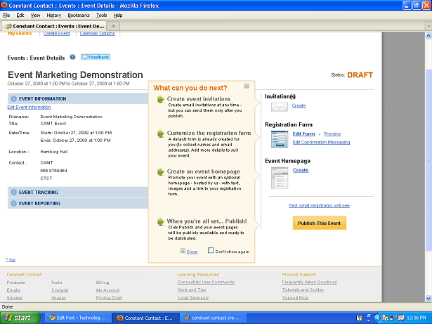
Here I think Constant Contact should have added another screen that requires the user to fill in information that can be transferred to both the invitation and the website. Instead, the next screen the event coordinator sees is as follows:

constant contact navigation screen

constant contact navigation screen

Though a user can choose any of the steps, the screen encourages the user to create an email, then to decide what information registrants would need to supply, and finally to create a webpage for the event. While it's ok as it stands, I think that Constant Contact could have streamlined the process.

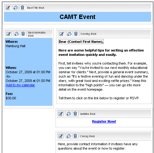
In its current incarnation, the email template is unexciting, similar to the standard Constant Contact newsletter template. A person can move a few boxes around, insert some images somewhat awkwardly into the designated spaces, and change the color of fonts and boxes (there aren't any nifty templates that integrate images). The text in each box (other than event location, date) much be individually edited on the screen.

cc invitation prompt

cc invitation prompt

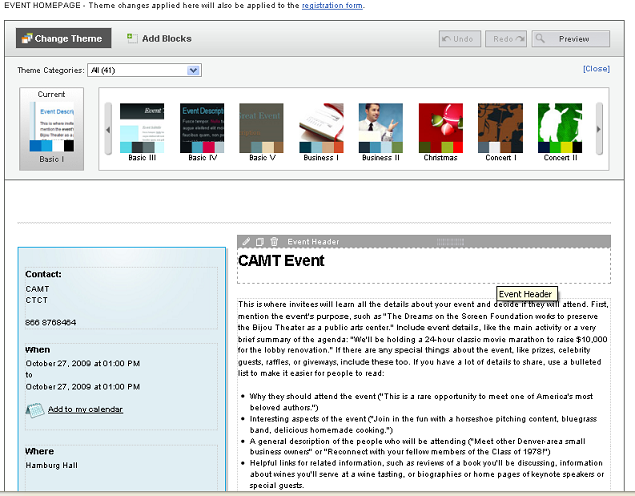
The (not pictured) final effect isn't particularly earth-shattering.  I think that Constant Contact would have been wiser to have the event coordinator next see a screen with input boxes like the basic "Event Date/Time/Etc." box, but including the prompts that it currently has on the Invitation and Page creation screens:

cc site prompt

cc site prompt

Rather than edit information directly in the template, as the user does now, he could fill in information about the event and interesting details (see the suggestions that Constant Contact offers), in addition to adding images that he might want to integrate into his theme.   He would then be directed to the event page design screen above, where he could edit the appearance of the event page.  Instead of prompts, however, he would see his own user-generated text and images pulled from the previous page.  Likewise he would see components of his text and images pulled into the invitation template page--perhaps with some elements repeated on both, and some specific to the invitation or the page.

At this point the user could decide on a theme or template, which would be applied to both this page and the email template. In this way two major steps would have been streamlined, the look and feel of each element, as well as information provided, would be more unified.  The user could then make modifications or adjustments (moving boxes, removing images, altering wording) on the above screens, rather than entering data from scratch.

Overall, Constant Contact has created a tool that is very attuned to the needs of organizations who have events to build interest, show support, and raise funds. It enables organizations to keep track of respondents and gather information about them for further communication. It also integrates tools to measure the attendees' perceived success of an event.

Constant Contact does require that the user run Internet Explorer 7.0 or Firefox. Constant Contact starts at $15/month and the site includes video tutorials, and a subscription includes live coaching and phone support.

Now available: Virtual Gallery Software Review!

Virtual Gallery Review

Virtual Gallery Review

Technology in the Arts just released a publication reviewing virtual gallery software for artists and arts organizations interested in creating 3D virtual exhibitions. Access the PDF publication here. The publication reviews three online gallery systems: Virtual Gallerie,  Image Armada, and Scenecaster / 3D Scene.  Which one is best for your organization? Check out the publication to find out which virtual gallery software meets your needs.

This research was initiated by the CUE Art Foundation, which sought to find an existing software system that will allow artists to create and display virtual exhibitions easily.

iPhoneize Your Web Site with One Click!

Yes, the iPhone provides a true representation of any Web page. However, some page designs - while accurately displayed on the device - are just too difficult to read and navigate on a small screen. Intersquash.com attempts to rectify the situation by generating an iPhone-friendly Web page for your site with one click. The only caveat? Your site content must be RSS-driven. (What's RSS, you ask?)

To iPhoneize your site using Intersquash.com, simply enter your RSS feed URL and Web site title into the Intersquash interface (squasherface? intersquash?) and click the "iPhoneize My Website!" button. BOOM! Your site has been iPhoneized. It doesn't even hurt.

Step One: Enter your site info.

picture-8

picture-8

Step Two: Your site has been iPhoneized.

picture-10

picture-10

The site gives you the option to upload an icon (57 pixels squared) or access the "hearder code." Placing the header code provided by Interquash in the header of your site's HTML will enable device recognition so mobile users will automatically be presented with your iPhoneized page.

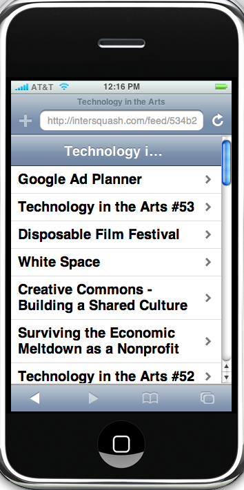
Here is the iPhoneized version of the Technology in the Arts blog.

picture-9

picture-9

By the way, the screenshot above was created using a free software called iPhoney, which allows you to view any Web page as it would appear on the iPhone. Two notes: 1) iPhoney is Mac only and 2) no, you cannot make calls using iPhoney... don't be ridiculous.

Meeting Wizard - Coordinate meetings with ease

meetingwizard1

meetingwizard1

Does this scenario sound familiar? You need to bring a group of people together for an in-person meeting or a conference call. You send out an e-mail suggesting some dates/times for the potential meeting or call and ask the group to reply with their availability. The group sends a barrage of e-mails to you -- only for you to realize that none of the suggested dates/times will work for the entire group. So, it's back to the drawing board... I'm here to tell you that it doesn't have to be that way. Thanks to the geniuses at MeetingWizard.com, there is a free, online service that: sends out meeting invitations, tracks respondents' availability, confirms meetings, and sends out meeting reminders -- all in one easy-to-use system.

So how does it work? After signing up for a free account:

1. You invite participants providing a number of optional dates/times.

meetingwizard-step1

meetingwizard-step1

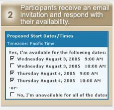
2. Participants respond to invitations by indicating when they are available.

meetingwizard-step2

meetingwizard-step2

3. You confirm the meeting or event after reviewing responses.

meetingwizard-step3

meetingwizard-step3

In addition, there are many other features that ensure you don't forget important details, and that all participants receive complete information about meetings.

Probably the best aspect of MeetingWizard is the fact that users only need an e-mail address and access to a Web browser in order to use it. By keeping the user-side technology simple, they have quite cleverly created a practically universal tool.

A colleague of mine mentioned this tool to me about three years ago, and it has proven to be both an immense time-saver and a wonderful frustration reducer. It has become such a trusted tool in my administrative "bag of tricks" that I tend to assume that everyone knows about it and uses it also.

After watching two resourceful colleagues wrestle with coordinating meetings earlier this week, I mentioned MeetingWizard to them only to learn that they had never heard of it. My high school geometry teacher told me never to assume, because it makes an...well, you know what it does.

So check out MeetingWizard today and reduce your administrative stress!

Book Review: Don't Make Me Think!

If anyone out there is planning a major overhaul of their Web site, listen up. I've just finished reading Don't Make Me Think: A Common Sense Approach to Web Usability, by Steve Krug. This book is a great guide for anyone who wants to get some insight into Web style conventions, how visitors use Web sites, and usability testing. Why are conventions and usability important? Imagine picking up a newspaper with no headlines, no sections, no page numbers. Web conventions are important to know because, well, people have come to expect them. And, they work.

The book is a quick read (about three hours) and user friendly (it would be self-defeating if it were otherwise). The tips and advice offered by Krug are great pieces of wisdom to have in the back of your mind as you examine the needs of your site's users, work with designers, and seek buy-in from stakeholders.

The second edition of the book was published back in 2005, but the trends and conventions it cites are not out-of-date by any means. And, the backbone concept of "don't make me think" is timeless. This book is definitely worth checking out, especially if you're about to put any time, effort, and money into revamping your organization's Web presence.

Related site: Advanced Common Sense (Steve Krug's site)

Yelp about Yelp

We've all heard the cliche, "Everyone's a critic," but Yelp puts that into practice. Yelp is a Web site whose content is driven by real people giving their own reviews on what's available in their cities: restaurants, stores, hotels, and (here's where it gets interesting) arts and entertainment. Anyone can sign up to be a Yelper.  Then, on with the griping or the applauding or the mehing. With lots of traffic headed Yelp's way (almost 4 million people visited Yelp in April 2007, according to their site), suddenly the collective opinions of the average Joes out there become quite powerful.

Has your organization been Yelped?

I first heard about Yelp while I was at the 2007 NAMP conference in beautiful Miami. The speaker mentioned that he had heard of some businesses who, after receiving negative Yelps, had posted signs declaring "No Yelpers Allowed!"

What a terrible thing to do! It would have been so much better to hang a sign, "Yelpers welcome. Please let us know if we can help you in any way during your visit. Enjoy!"

In fact, Yelp itself offers a guide for business owners that provides great advice on how to handle your organization's image on Yelp. Their list of "Do's" and "Don'ts" is educational and extremely helpful. There is also information about other services that are available to enhance your listing and visibility, but these probably cost a little bit of lolly and don't really seem necessary to effectively promote your company.

So, check it out, see if you've been Yelped, and maybe get involved. Heck, maybe even hang a "Yelpers Welcome" sign or have a "Yelpers Night." And keep an eye open. This type of community reviewing is going to become more and more popular since it aggregates honest (we hope) and open communication from a variety of viewpoints rather than a those of a lone critic.

http://www.yelp.com/