Introduction
Two things I miss the most during the pandemic are fun and human connectivity, the absence of which have been exacerbated in these colder months. Books are something that I, along with many others, turn to for solace or entertainment. Books offer a place to escape, gain deeper understanding, and find connection during difficult times, like this pandemic. Significantly, thanks to technology, reading doesn’t have to be a completely solitary activity. A few reading tracker apps have emerged with social features. This article will compare two of them: the more established Goodreads and BookSloth, a newer platform.
The Basics
Before setting out to write this article, I was already a Goodreads user. From my Goodreads account, I added all of my books into BookSloth so that my library for recommendations would be as similar as possible. There has been some chatter about being able to automatically import your Goodreads bookshelves into BookSloth in the future, but that doesn’t seem to exist yet (although you can export your Goodreads library to a .csv file).
Goodreads is a well-known reading tracker app and website launched in 2007. In 2019, it had 90 million users. Amazon purchased Goodreads in 2013, causing some users to want to distance themselves from the app. In addition to ownership, the app and website have some features that users aren’t thrilled with, such as the absence of half-star ratings, search issues, and a clunky interface.
BookSloth was founded in early 2018 in Puerto Rico by Xiomara Figueroa and Lincy Ayala. The creators were inspired to develop a reading tracker app in the aftermath of Hurricane Maria when they turned to books for comfort in the absence of cell service, internet, and electricity. They wanted to create an app that would allow readers to connect and build a community around books after experiencing that difficult situation.
A notable difference from the start, BookSloth is only available as a mobile app. For this review, I focus on comparing BookSloth to the Goodreads app, although Goodreads is also available on the web. I compared the iOS versions of the apps because that is what I had access to, but both are available for both iOS and Android., although some users have pointed out that there are missing features on the Android version of the Goodreads app.
Figure 1: Goodreads and BookSloth logos. Source: Goodreads and BookSloth.
The Library
Because BookSloth is newer than Goodreads and lacks an API to some of the larger datasets (like Amazon Books), it has some missing titles. While importing my library, there were about 20 results missing—mostly poetry and essay collections—out of my 105 books. Historically, I have not had any trouble finding the titles I’m reading on Goodreads, except for maybe a few poetry collections from independent presses.
If you find that a title is missing, BookSloth allows you to fill out a Google Form, linked from the search results, to request that it be added. Apparently, BookSloth uploads new books every 1-3 days. Because of this use of crowdsourcing, there appear to be a few mistakes in a some entries. One of my books, In the Dream House, was listed twice: one without the cover image and one with the incorrect author. While BookSloth is in its infancy and its library is still being built, by being an early adopter, you can help build a new platform.
Building Your Library
Goodreads notoriously allows users to build “shelves” to organize their books. It has preset shelves classified as “Want to Read,” “Currently Reading,” and “Read,” but you can also create and name your own shelves. (For example, I have a “Favorites” shelf.)
BookSloth does not have the “shelving” metaphor and limits users to categorizing books as “Currently Reading,” “To Be Read,” or “Read.”
Ratings & Reviews
Both Goodreads and BookSloth allow users to rate and review the books they read, but they differ in the specifics.
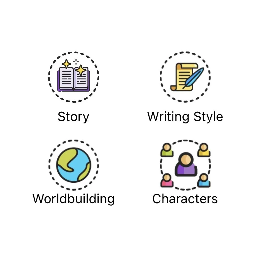
Goodreads allows users to give books one to five stars—no half stars—and leave a 15,000 character review. This 15,000 character (about 2,400 word) limit lets users write pretty extensively. BookSloth also has a five star ranking system and lets users assign half stars. Additionally, users can identify what aspects of the book they liked from a list of qualities. The qualities are story, writing style, world building, characters, romance, perspective, artwork, plot, inspiring, insightful, practical, and educational (a few of the icons shown below). BookSloth also limits users to a mere 2,000 characters for reviews, requiring them to distill their opinions.
Figure 2: Screenshot of BookSloth’s icons for book qualities. Source: Author.
User INterface
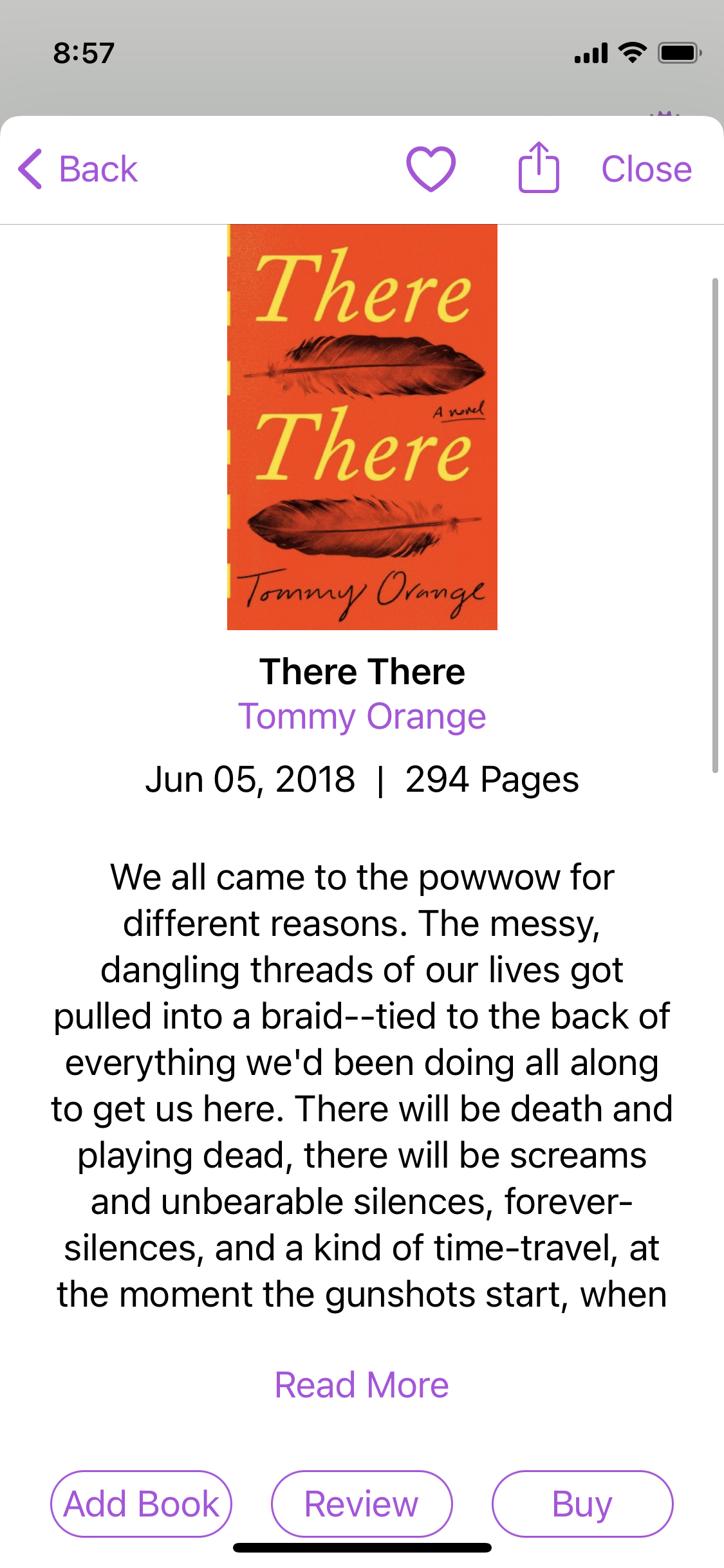
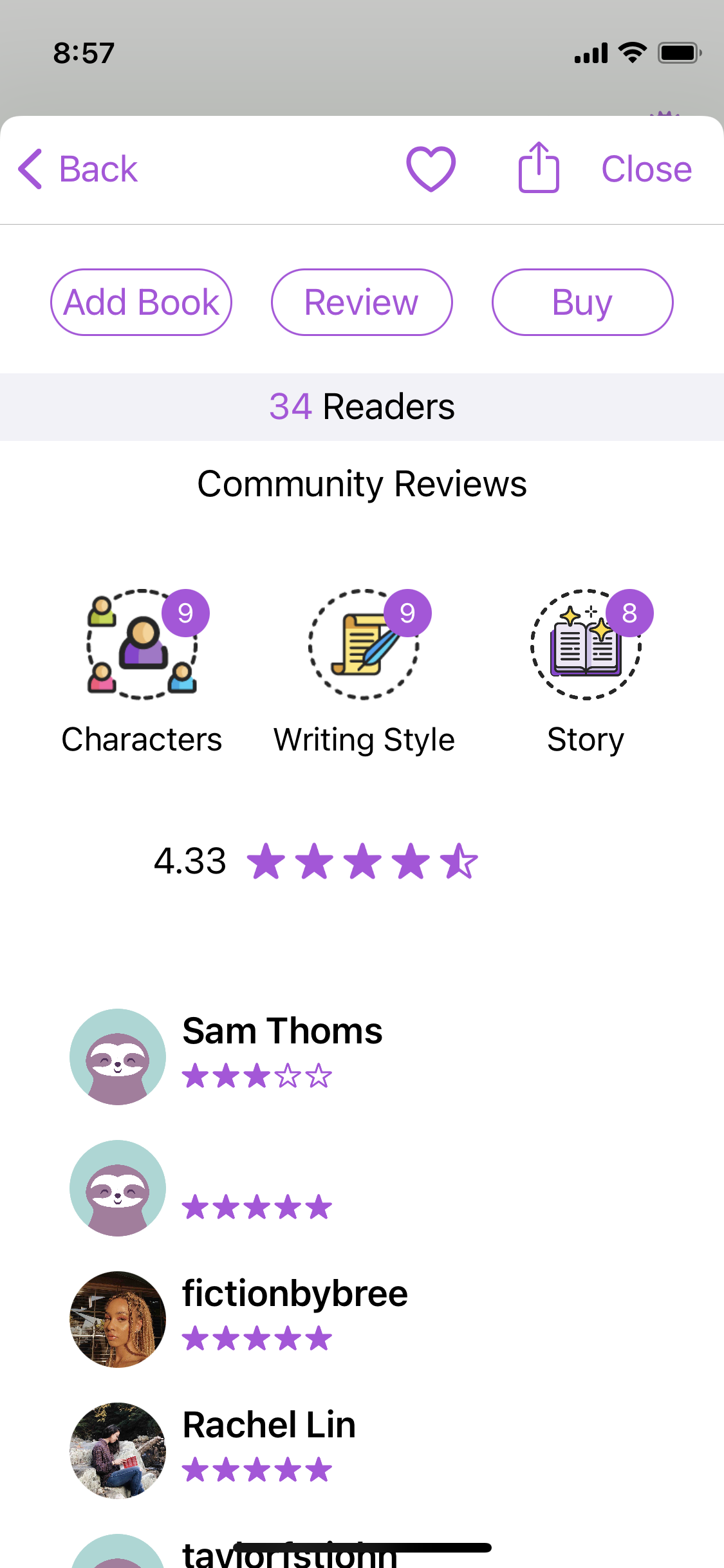
Overall, the BookSloth app provides a more enjoyable visual experience. It has a very clean design, integrating a fun purple and turquoise color scheme and a lot of colorful icons, as seen above. The screenshots below show a sample book description page.
Figure 3: Screenshots of book description for “There There,” by Tommy Orange, on the iOS version of BookSloth. Source: Author.
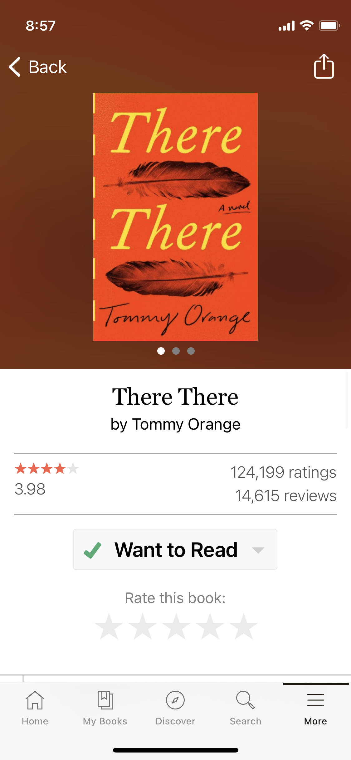
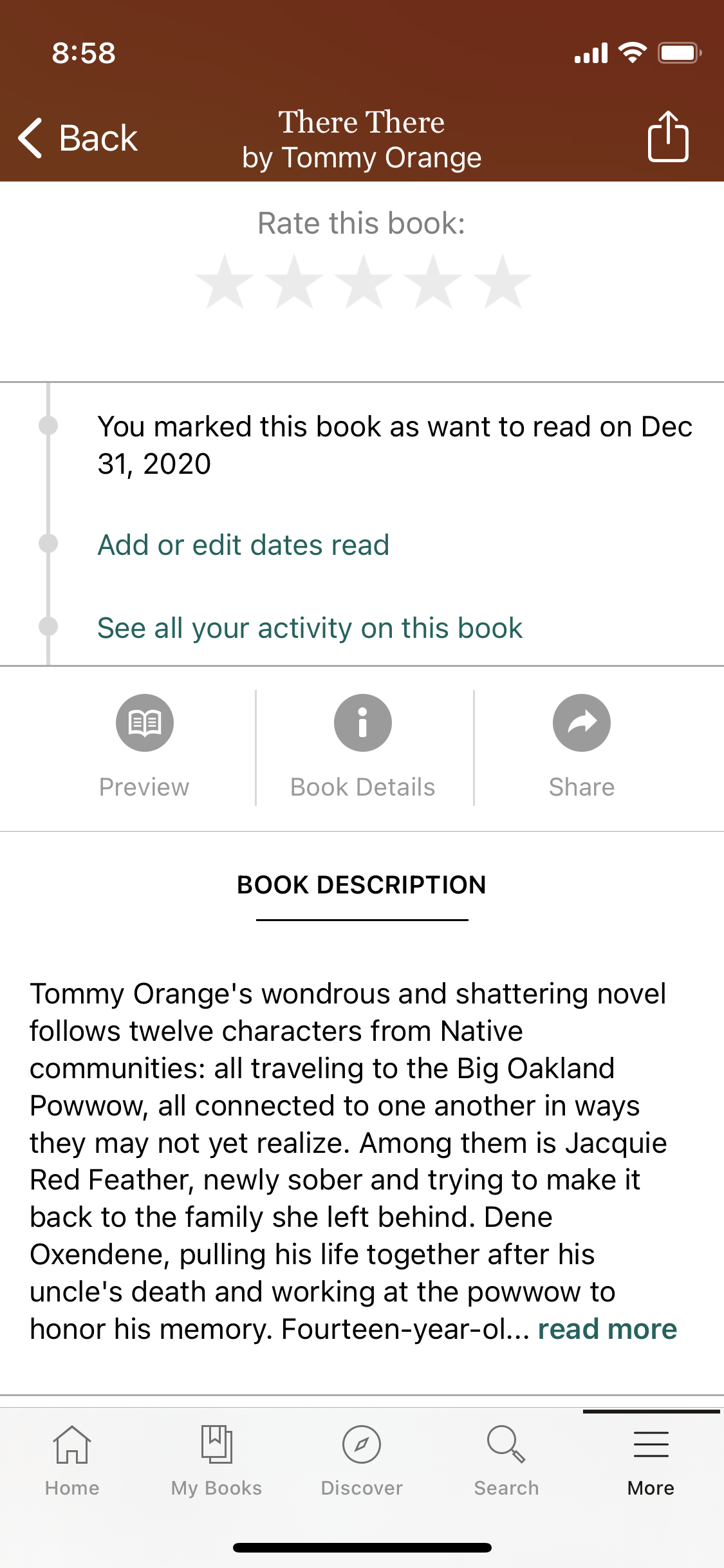
The Goodreads app has a more plain design and utilizes a beige color scheme throughout, reminiscent of book pages. The main graphics on the app are pictures of book covers. The screenshots below show a sample book description page.
Figure 4: Screenshots of book description for “There There,” by Tommy Orange, on the iOS version of Goodreads. Source: Author.
Based on reading app reviews and other articles about Goodreads, the app’s outdated UI seems to be one of the biggest pain points. In this article, Syvie Stephanie imagined a redesign based on user research. Notably, several elements of the Goodreads redesign—including the use of icons and less segmented pages—reminded me of the current BookSloth interface. If UI is your main priority in an app, BookSloth is definitely the preferred choice.
BookSloth also has dark mode capabilities that mirror devices’ settings, at least on iOS. The Goodreads app does not adjust to dark mode.
Social Features
Each app’s goals affect their social features. Goodreads’ seems to be aimed at helping you keep up with what your existing friends are reading while BookSloth tries to help users discover a new reading community with similar tastes.
The hub of social activity on Goodreads is its homepage, which functions similarly to a newsfeed on other social media sites. There, users can see updates from friends and those they follow, including new reviews they’ve written, new books they’ve marked “to-read,” and progress they’ve made on books. Users can like and comment on all of these updates. One annoyance is that this newsfeed also informs users when the people they follow become friends with new people, which clutters the otherwise book-focused feed.
BookSloth’s social features are concentrated on the app’s “Community” tab. There, users can post or respond to others’ discussion posts. The posts that appear on users’ discussion pages are not isolated to those they follow—it’s a discussion board of all users. People can classify their posts as a “recommendation,” “ask,” or “other,” so users can sort their feeds by category. With this approach to socialization on the app, BookSloth encourages users to connect to new people who may have similar tastes in books. BookSloth does also allow users to follow and be followed by other users. In the search bar, you can choose to search for other users, invite friends to the app, and also view BookSloth’s suggestions for people to follow, which are based on the number of books you have in common.
Discovering New Books
Search Bar
A benefit of Goodreads is that it has a more developed search bar: users can search by title, author name, ISBN, or use their phone cameras to scan the cover of a book. On BookSloth, users can only search by book title. Both apps allow users to search through genres to find books.
Figure 5: Screenshot of BookSloth’s search bar. Source: Author.
Figure 6: Screenshot of Goodreads’ search bar. Source: Author.
Discover Pages
Both apps have “discover” pages for users to visit and see what books are popular amongst users and in the world at large. The BookSloth discover page includes a list of personalized recommendations. Goodreads also provides personalized recommendations in the app’s “More” tab, but some users have noted that they wish this was more centralized. The Goodreads Discover page includes things like “Featured Lists” and “Most Read This Week,” which is based on the app’s analytics.
A priority of BookSloth’s Discover page seems to be exposing users to books they may not have discovered on their own, particularly those in categories that have been historically underrepresented in literary circles. On my Discover page currently, I have categories of “Books by Black Authors,” “Celebrating Pride,” and “Hispanic Heritage Books.”
Final Thoughts
Personally, I would love to use BookSloth over Goodreads because of its cleaner design, but I don’t think I’m ready to give up being able to see my friends’ updates on Goodreads. I would also be hesitant to stop using Goodreads altogether since BookSloth is missing some of the books I’ve logged there.
If you’re new to using reading tracker apps and looking to build a new reading community, I would definitely suggest downloading BookSloth. I would also encourage existing Goodreads users to try BookSloth like I am. One way to get its community and library to grow is for more people to join and request the books they like be added.
I don’t think either app is better than the other—it more depends on what features you value more. I plan on having both apps on my phone, keeping my library on Goodreads and using it to check up on what friends are reading and using BookSloth to discover new titles and maybe get into some bookish discussions.
Figure 7: Infographic comparing Goodreads and BookSloth. Source: Author.


