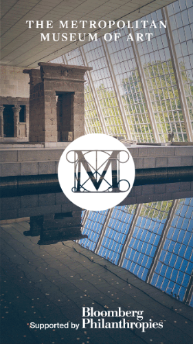
Have you ever wandered around the Metropolitan Museum of Art and wondered where you were or if an exhibition was still showing? Well, the Met as a treat for you. In the newest update of their mobile app, they have incorporated an interactive detailed map that shows you the floor plan of the entire museum, including exhibit locations and artwork placement. With specific information about upcoming and current exhibitions, including their exact location in the museum, this app has become much more useful since its sans-map days last year.
Liz Filardi and Spencer Kiser of the Digital Media Department at the Met stated how “The map issue has become an important lesson about user-experience design, user expectations, and behavior... It goes without saying that one of the most important services smartphones offer is global positioning and wayfinding, and smartphone owners expect wayfinding solutions to be abundant and sophisticated.”
As the Met is the second largest museum in the world, this first generation map helps tremendously when navigating the vastness of the space. This new map function will be incredibly useful for first-time patrons and out-of-towners alike. Visitors no longer have to rely on security guards to ask where they are.
The Met App Features
· Map of the museum and ability to pin the location of events, exhibitions, and artworks
· Recommendations on what to see, from artworks to architecture
· Full listings of exhibitions, events, and how to visit the museum
· A special section for Met Members with upcoming events and opportunities
· Ability to save your favorite art, events, and exhibitions, and add them to your calendar
· Optimized for use with iOS Accessibility features – including VoiceOver, Zoom, and Larger Text
As of July 2015, the Met has also released an Android version of their app.
What This Means for Technology and Museums
Museums have had an increasingly hard time keeping up with technology as constituent expectations rise. Social data shows that museum competition may now not be other museums, but more of the likes of Netflix and mobile games taking patrons away from more traditional institutions.
“A museum who is more responsive in the now will be better off in the future,” said Elizabeth Merritt, founder of the Future of Museums at a lecture I recently attended at the Carnegie Museum of Art in Pittsburgh. This statement rings true now more than ever.
With that in mind, the creators of the Met app have done a fantastic job by being honest, upfront, and transparent about the positive and negative aspects of their app that was released in August 2014. With eight updates in the last year, the Met has listened to constituent complaints and addressed their problems accordingly.
Their first major task was inserting a map feature, as it was their biggest complaint. Even though the review portion of their App Store has been disabled, app viewers have been giving constructive feedback on various posts the Met has been writing about their new map feature. One such comment reads, “access to information about the items in particular galleries would be a nice feature from the app…so many things come to mind that could be done with your incredibly rich content, the mind boggles.”
But how much is too much for a museum to supply on an app? The purpose of the app is to be a helpful aid in navigating, planning your visit, or getting a closer look at select exhibitions or pieces, not as a means to replace going to the museum or copying the artwork labels in such detail as to not read them in person.
But, Do I Like It?
As someone who does not live in New York City nor frequents the Met as much as I would like, this app is incredibly useful. I know every time I visit, I always get lost--even to the point that I'm sure that I haven’t even seen the whole museum. Now with the age of the mobile app and interactive maps, directionally challenged people like me can rejoice.
Getting down to the nitty-gritty of the app, the structure is great, but I feel like it should be…better. I know I know it’s still in its first year, but I expect the Met app to be incredibly creative and hip like the Met itself. The style of this app looks to be geared toward tech-newbies with its very simple layout with large fonts, large pictures and simple one-color background.
In the United States, 71% of its citizens participate in the arts by using electronic media to watch or listen to art. The Met is doing a great job keeping up with the times, but it needs to push a little further to create a more lasting impression in the app world. One such way, very much in vogue at the moment, is utilizing beacon technology. This technology would allow the Met to portray more specific information per exhibition and for visitors to pinpoint exactly where they were in the museum. In the past the Met has done beacon trials, so it will be very interesting to see if this is where they go in the future.


