

This two-part post was excerpted from the research conducted and report written by Carnegie Mellon Master of Arts Management students Daria Butler, B Crittenden, Daral Moore-Washington, Jackson Smith, and Freya Zhang. To read part one about tools for data collection and measuring impact, go here.
After data collection, it is necessary to analyze and visualize the data to tell good stories. This process transforms numbers and descriptions into vivid stories that can be used to prove impact to different stakeholders. This post will look at the best practices for data analysis preparations, quantitative and qualitative data analysis methods, data analysis tools, visualization methods, and data visualization tools.
Data Analysis Preparations
Before analyzing the data, there is a recommended process that must take place first, including data validation and data editing. The purpose of validation is to find out, as much as possible, whether the data collection followed the pre-set standards, without any bias, and is representative of the target population. Validation can be conceived as a three-step process:
Verify whether each respondent was actually interviewed/surveyed or not.
If research criteria exists, make sure that respondents were chosen as per the research plan
Check whether the data collection procedure was duly followed.
It is common to see that large data sets include errors. Respondents may fill fields incorrectly or skip them accidentally. To make sure that there are no such errors, the organization needs to conduct basic data checks and may edit the raw research data to identify and clear out any data points that may hamper the accuracy of the results.
For qualitative data, it is also important to annotate the transcripts—labeling relevant words, phrases, sentences, or sections with codes. The process of labeling will organize the data for dissemination and make the analysis stage much easier. The video below clearly explains the process of annotating a speech. A similar practice can be applied to annotating interviews.
Figure 1: Video explaining how to annotate a speech. Source: YouTube.
Quantitative Data Analysis Methods
There are two approaches to analyzing quantitative data:
Descriptive statistics is the basic level of analysis, which helps researchers summarize the data and find patterns. It provides statistics like average age, gender proportions, and mean household income. Though it provides absolute numbers, it does not explain the rationale or reasoning behind them.
Inferential analysis shows the relationships between multiple variables to generalize results and make predictions. For instance, inferential analysis could show the correlation between age and individual income and the correlation between race/ethnicity and life satisfaction.
In summary, for quantitative data analysis, it is recommended to use both descriptive statistics and inferential analysis. For instance, the total number of artists served, the total number of artworks produced in studios, or the average number of artworks sold per artists could be examples.
Qualitative Data Analysis Methods
There are four approaches to analyzing qualitative data:
Content analysis can efficiently analyze responses from interviewees. The goal is to find common patterns across the data set. It is common for interviewees to mention something similar. It will help organizations to generate the patterns and recognize certain phenomena.
Narrative analysis is used to make sense of the interviewees’ individual stories. This type of analysis highlights important aspects of interviewees’ personal stories and experiences that will best resonate with the audience.
Discourse analysis, like narrative analysis, is used to analyze interactions with people. However, it focuses on analyzing the social context in which the communication between the researcher and the respondent occurred. Discourse analysis also looks at the respondent’s day-to-day environment and uses that information during analysis.
Grounded theory refers to using qualitative data to explain why a certain phenomenon happened. It does this by studying a variety of similar cases in different settings and using the data to derive causal explanations. Researchers may alter the explanations or create new ones as they study more cases until they arrive at an explanation that fits all cases.
For qualitative data analysis, it is recommended to use both content analysis and narrative analysis. The former can help find common patterns across a data set as it is possible for some interviewees to have similar responses. The latter method can be used to make sense of the interviewees’ individual stories and experiences. By doing so, an organization will not only obtain the common opinions among the artists but also build personal connections.
Quantitative Data Visualization Methods

Figure 2: Scorecard chart example. Source: Authors.
Scorecard charts: Scorecard charts are particularly effective if organizations want to show an immediate and interactive overview of a particular key performance indicator, whether that is number of artists served, site visitations, or contributed income.

Figure 3: Bar chart example. Source: Authors.
Bar charts (stacked bar charts): They can be visualized using vertical or horizontal bars. They are best used to compare a single category of data or several. For example, they can easily show the number of artists in each discipline.

Figure 4: Histogram example. Source: Authors.
Histogram: A histogram visualizes the distribution of data over a continuous interval or certain time period. Each bar in a histogram represents the tabulated frequency at each interval/bin. For instance, it can easily show the age and income distribution of artists, which gives an estimate as to where values are concentrated, what the extremes are, and whether there are any gaps or unusual values.

Figure 5: Pie chart example. Source: Authors.
Scatter plots: They are graphs in which the values of two variables are plotted along two axes, the pattern of the resulting points revealing any present correlation.
Pie charts: Pie charts are particularly useful when demonstrating the proportional composition of a certain variable over a static timeframe. The proportions in terms of gender, race, and studio locations can be easily presented by pie charts.
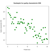
Figure 6: Scatter plot example. Source: Authors.
Qualitative Data Visualization Methods
Maps: As geographic origin is one of the most frequently documented metadata dimensions of locations, maps can serve as a prominent visualization method to show the spatial distribution of artists’ locations.

Figure 7: Map example. Source: Authors.
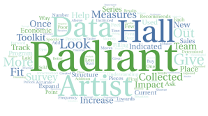
Figure 8: Word cloud example. Source: Authors.
Word clouds: A word cloud is an image developed with words used for a particular text or subject in which the size of each word indicates its frequency or importance within the context of the information. Word clouds offer a digestible way to present complex sets of unstructured information of answers from interviews or surveys. For instance, a word cloud would be a good fit for framing the responses to a question such as “What’s the first word that [organization name] makes you think of?”
Graphic timelines: A timeline is a type of chart that visually shows a series of events in chronological order over a linear timescale. Graphical timelines make it easy to understand critical milestones, such as the progress of a project schedule.

Figure 9: Timeline example. Source: Authors.
Flowcharts: A flowchart illustrates the steps of a process in sequential order. It is a generic tool that can be adapted for a wide variety of purposes and can be used to describe various processes. Elements that may be included in a flowchart are a sequence of actions, materials, or services entering or leaving the process (inputs and outputs); decisions that must be made; people who become involved; time involved at each step; and/or process measurements.

Figure 10: Flowchart example. Source: Authors.
Mind maps: A mind map is a diagram that is used to visually outline information. One of the most common types of mind map is a large brainstorming web where a central word or idea branches out into related subjects. As ideas are fleshed out and connect to one another, people can see how concepts tie together to get a better understanding of what they are trying to study.
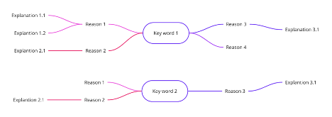
Figure 11: Mind map example. Source: Authors.
Fishbone diagrams: The fishbone diagram is a cause-and-effect diagram that helps organizations identify the reasons for imperfections, variations, defects, or failures. The diagram looks like a fish's skeleton with the problem at its head and the causes of the problem feeding into the spine. Once all the causes that underlie the problem have been identified, organizations can start looking for solutions to solve the problem.

Figure 12: Fishbone diagram. Source: Authors.
Data Analysis Tools
Data analysis tools can range from free options like R Studio to expensive options like SAS or SPSS. They can also range from non-coding options like Excel to intensive-coding options like Python.
Large corporations tend to choose relatively more complicated tools with more powerful functions. The cost of the tool may not matter much to them. For nonprofit organizations with relatively small budgets, it is recommended to use free and simple tools with enough functionality to support their data analysis. There are several reasons for that:
They usually do not have a large enough budget for expensive tools .
They usually do not have a large datasets .
Usually, the data is not too time-sensitive or price-sensitive .
They usually do not need to build advanced statistics or machine learning models.
They usually do not have the technical talent on staff to use complicated tools.
Data Visualization Tools
Most data visualization tools are related to business intelligence. Common tools include Google Data Studio, Tableau, Looker, and Microsoft Power BI. Still, there are some price differences among these tools. Google Data Studio is totally free and Tableau is free for nonprofits, while both Looker and Power BI are not free but have discounts for nonprofits.
Many companies in the computer software industry and large corporations prefer to use Tableau, which takes the highest market share in the U.S. Also, many tech companies tend to use Power BI. Looker and Google Data Studio take a lower market share than these two tools.
All four of these tools could meet the needs of small-sized arts nonprofits in terms of data visualization. When determining which tool to use, convenience and accessibility should be the top priorities.
In summary, data analysis and data visualization plays a significant role after data collection. These steps determine what the story is and how the story is told. It is crucial to know who the audience is from the beginning. There are many data analysis and visualization tools for organizations to use, especially for quantitative data. Organizations should take their budget, their services, and the nature of the organization into consideration when deciding which to use.
Conclusion
There are certain limitations in the research conducted for this post. The literature regarding data collection, data analysis, and data visualization is not specifically targeted to the arts field. It is possible that some methods and techniques in the field have not been commonly used in the nonprofit arts and culture sector. These tools, however, provide a starting point for the arts and culture sector to find what data analysis and visualization methods work for them.
Resources
ASQ. “What is a Flowchart?” Quality Resources. https://asq.org/quality-resources/flowchart.
Auraria Library. “Data Visualization: Quantitative vs. Qualitative.” Research Guides, November 11, 2020. https://guides.auraria.edu/c.php?g=528873&p=3964258.
Bhatia, Manu. “Your Guide to Qualitative and Quantitative Data Analysis Methods.” Humans of Data, September 5, 2018. https://humansofdata.atlan.com/2018/09/qualitative-quantitative-data-analysis-methods/.
Canary, Austin. “How to Analyze Interview Transcripts in Qualitative Research.” Rev (blog), October 10, 2019. https://www.rev.com/blog/analyze-interview-transcripts-in-qualitative-research.
Data Visualization Catalogue. “Histogram.” https://datavizcatalogue.com/methods/histogram.html.
Data Visualization Standards. “Bar Chart.” https://xdgov.github.io/data-design-standards/visualizations/bar-chart.
Durcevic, Sandra. “Top 10 Data Visualization Techniques, Concepts & Methods In Business.” Datapine (blog), October 5, 2018. https://www.datapine.com/blog/data-visualization-techniques-concepts-and-methods/.
Windhager, Florian et al. “Visualization of Cultural Heritage Collection Data: State of the Art and Future Challenges.” IEEE TRANSACTIONS ON VISUALIZATION AND COMPUTER GRAPHICS 25, no. 6 (June 2019). https://ieeexplore-ieee-org.proxy.library.cmu.edu/stamp/stamp.jsp?tp=&arnumber=8352050&tag=1.