

Introduction
Access to the arts is not even across the United States. The ways that people living in rural areas access artistic content differs from how people participate in urban centers. Additionally, access to the arts varies across racial and ethnic groups, something that the sector is beginning to grapple with. Comparing county-level arts vibrancy data is one way to detect these patterns.
The first post of this series introduced some public policy issues that are impacting the arts and communities’ access to them, particularly during the coronavirus pandemic. This post looks at what access to the arts looks like at the county level in the state of Pennsylvania through mapping arts vibrancy data and using statistical analysis in R.
Arts Ecosystem Case Study: Pennsylvania
Pennsylvania is an interesting case study for the arts and public policy because of the geography of the state. The state’s two largest cities, Pittsburgh and Philadelphia, are situated on both ends with the state’s capital and a cultural hub, Harrisburg, in the middle. There are large swaths of rural areas in between. The metro areas are both more socioeconomically diverse and generally wealthier than the surrounding areas. This makes it hard to do any analysis on anything related to demographics in PA because it almost requires three analyses: one for all of PA and two more for each major city. This research will include a county-level analysis, but it does not capture the whole story. More data and deeper analysis at the census-tract level (when such data exists) would help provide insight into these issues.
Some county-level demographics are shown below. In order, the maps show the total population concentration followed by the percent of the population that is Black, Asian American/Pacific Islander (AAPI), Native American, and Latino.
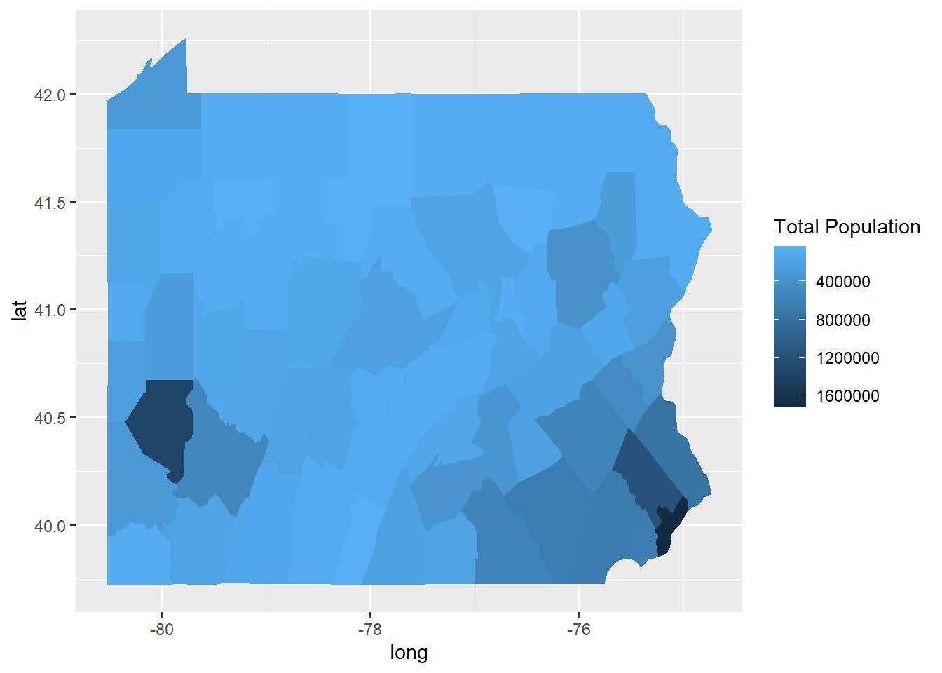
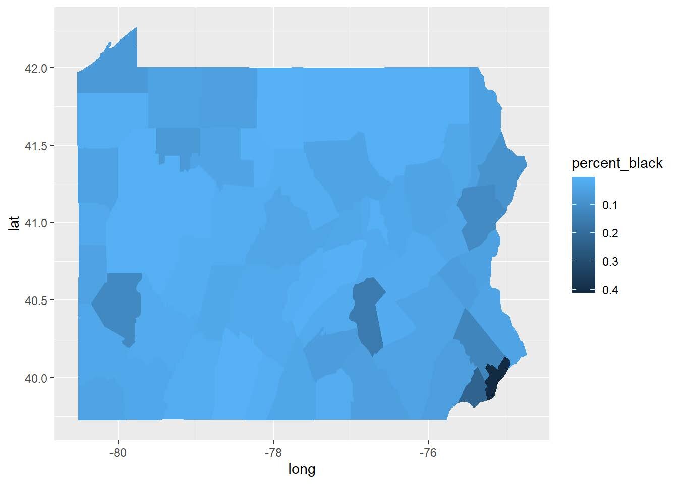
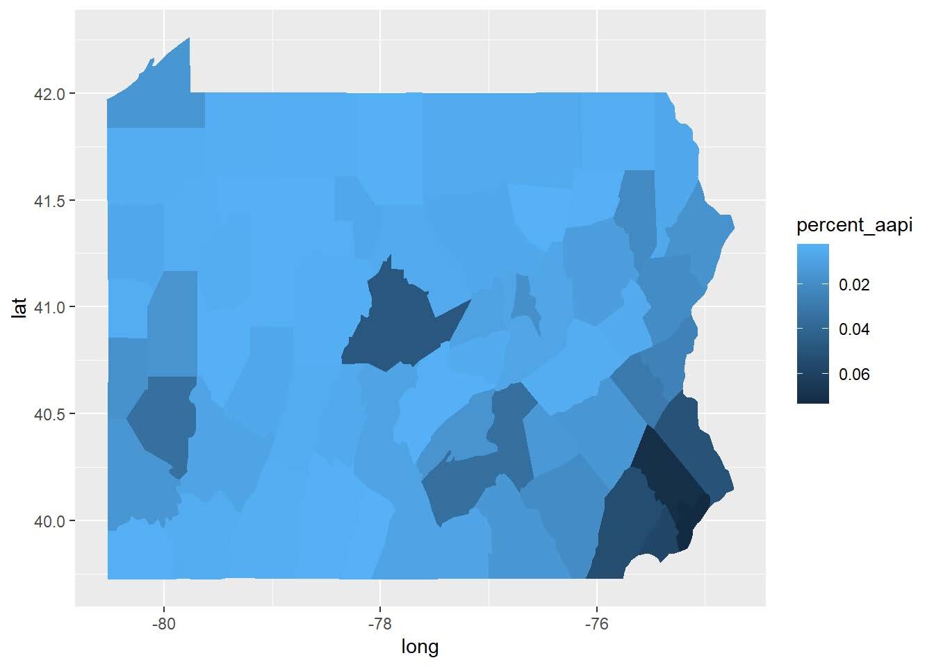
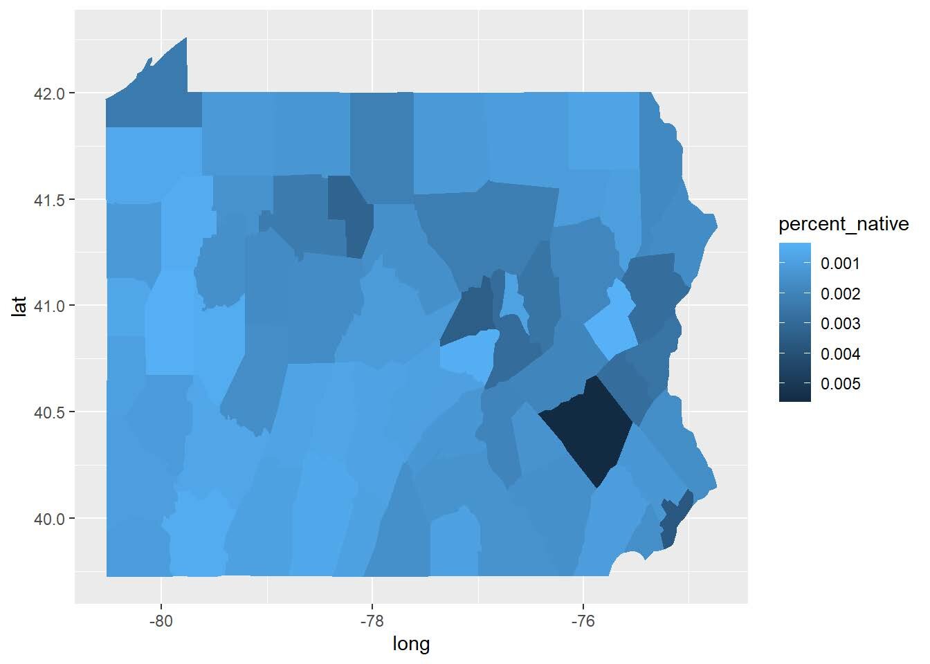
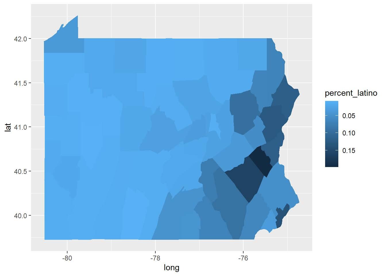
Figure 1: Maps of Pennsylvania’s demographics. Source: Author.
When arts organizations in PA are overlaid over the total population, a similar, expected pattern emerges: they are concentrated in the cities, with some spreading out to the middle.

Figure 2: Concentration of arts organizations (represented by black dots) laid over population density in Pennsylvania. Source: Author.
From the map, one would assume that people living where there is a high concentration of arts organizations would have easier access to artistic opportunities. The number of arts organizations in an area, however, does not tell the whole story.
Arts Vibrancy
SMU DataArts has a map tracking “arts vibrancy,” which is their measure of how vibrant a county is based on the amount of arts providers, arts dollars, government support, socioeconomic factors, and other leisure activities in the county. The figures below show the concentration of arts providers (indicated by the pink dots) overlaid on top of county-level arts vibrancy data for the five indicators.
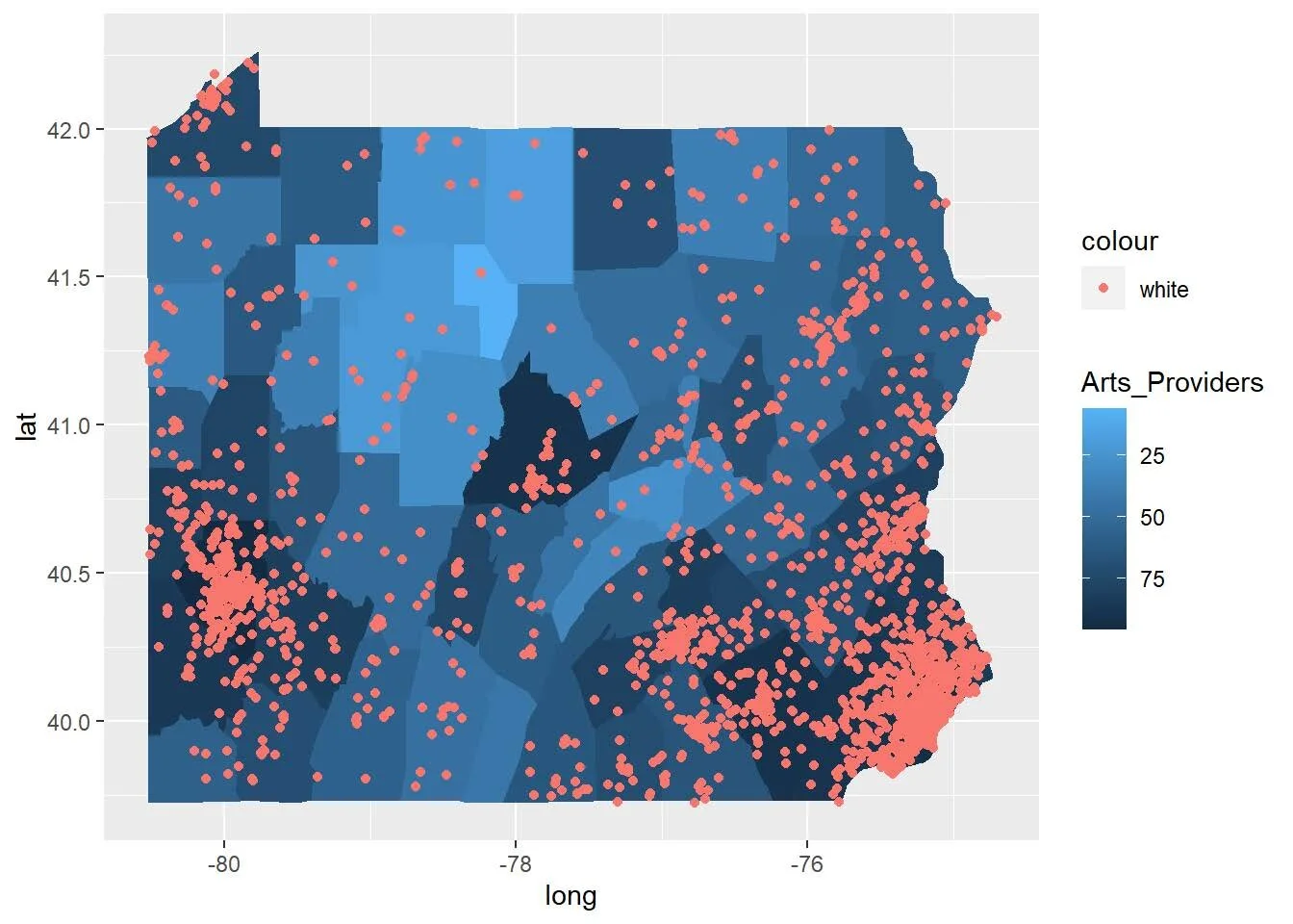
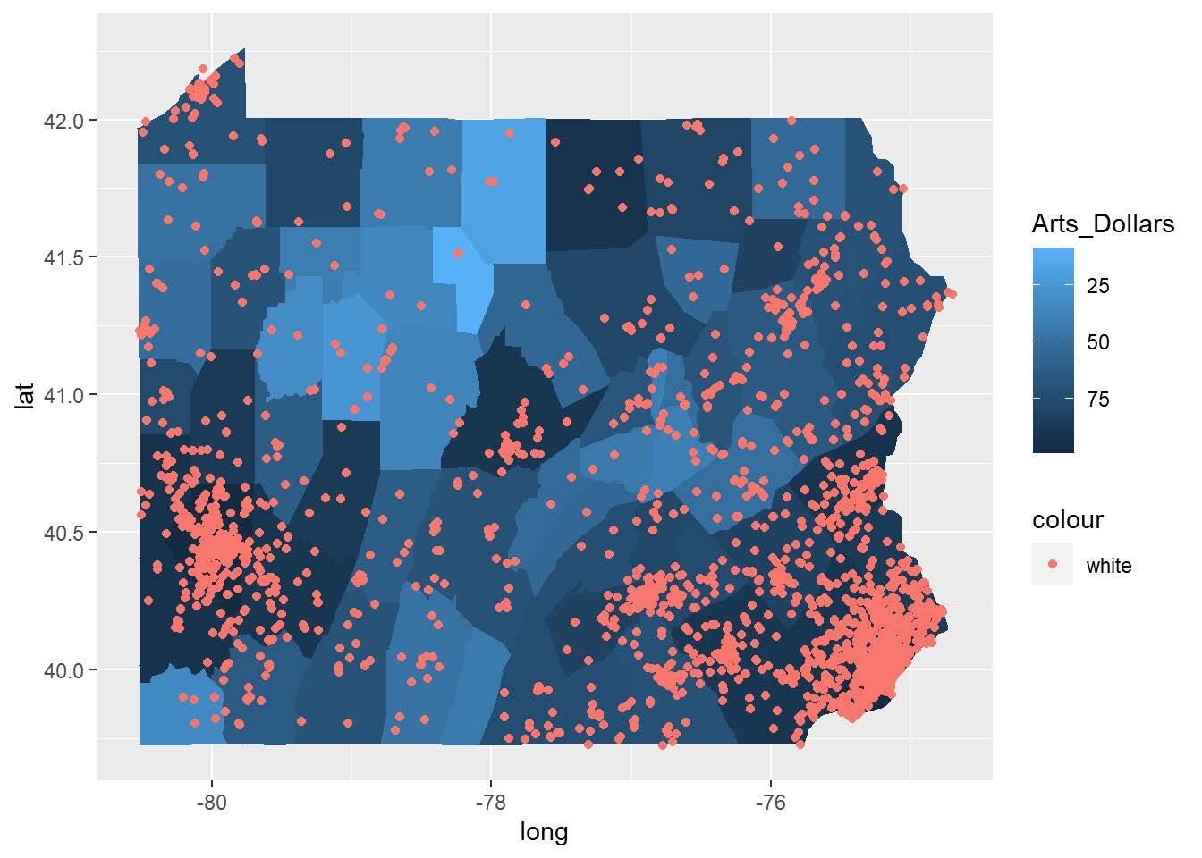
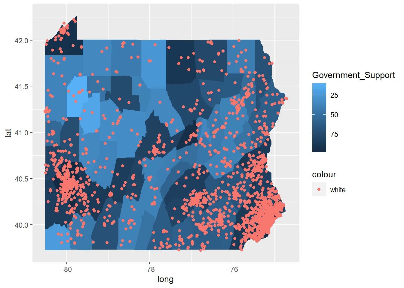
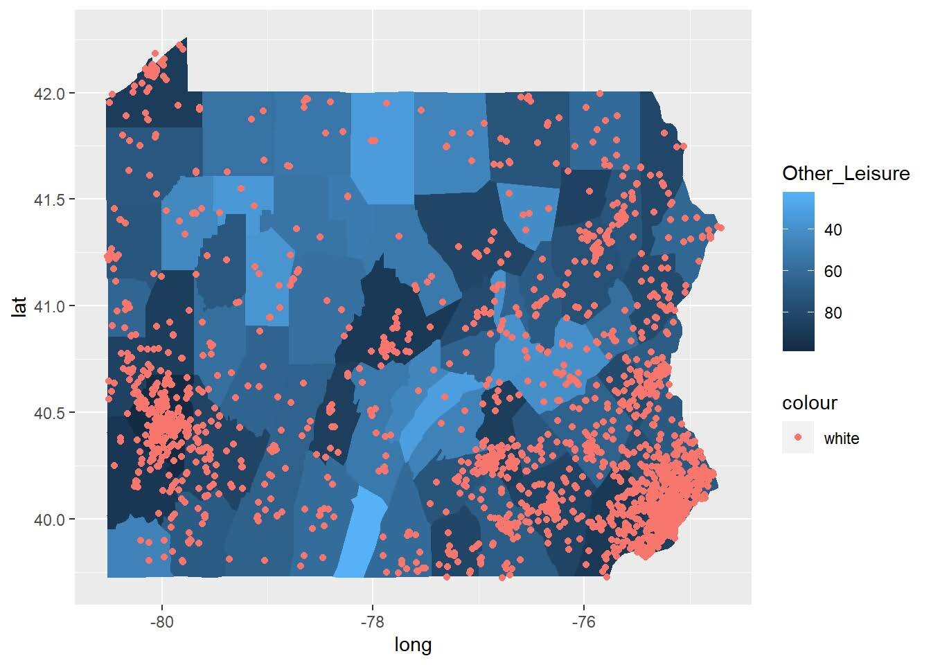
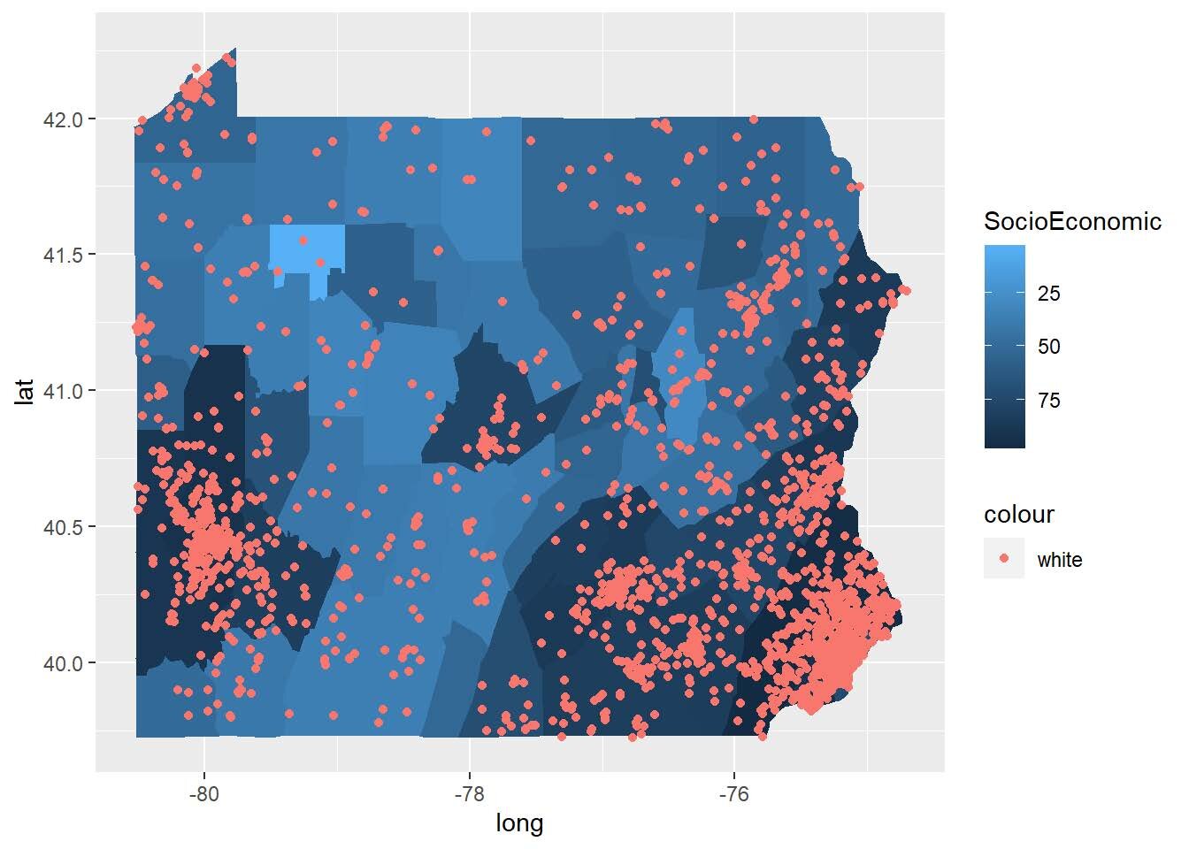
Figure 3: Maps for each of the five arts vibrancy indicators. Source: Author.
I wanted to look deeper into the arts vibrancy scores from the SMU DataArts website. It calculates arts vibrancy based on the five categories mentioned before. I wondered which of those were related to each other. For example, was government support significantly correlated with the number of arts providers in a county, or were socioeconomic factors more important?
To determine if there are any clear trends in which variables are important in predicting high arts vibrancy, I used a variable importance plot from a random forest model in R. “Random forests” use machine learning to learn to make predictions. From the random forest model, one can determine the importance of different variables when predicting an outcome. The “importance” of different variables is measured by the “increase in node purity” (IncNodePurity)—a calculation “based on the reduction in sum of squared errors whenever a variable is chosen to split.”
I used the Arts_Providers variable as the dependent variable since that’s a close proxy to arts vibrancy as a whole and got rid of the other large categories to focus on smaller variables, both from SMU DataArts arts vibrancy measures and from socioeconomic information.

Figure 4: Variable importance plot created with R showing relative importance of variables (listed on the left). Source: Author.
The plot above shows that the variables “Total_Compensation” and “Total_Expenses” have the highest importance when predicting a county’s arts vibrancy. Total compensation is the total amount nonprofit cultural organizations pay to staff and artists, adjusted by a cost-of-living index, and total expenses measures all nonprofit arts and cultural organizations’ expenses. Both of these variables fall in the “arts dollars” category when calculating arts vibrancy, revealing that the amount of money arts and cultural organizations in a Pennsylvania county put into their operations is the best predictor of the county’s overall arts vibrancy score.
Municipal WiFi (indicated by the variable “WiFi”) has the lowest importance, which makes sense since it only exists in four counties in PA. This also reveals an opportunity for growth for PA as more arts organizations release content online due to the pandemic.
Impact of Municipal WiFi on Arts Access
As in part one, municipal free WiFi is one of the key ways that local governments can guarantee access to the arts for all. But how important is it in increasing arts vibrancy? To measure this, I was able to get a list of all cities that have some sort of regional WiFi network and then used ArcGIS to identify the cities’ counties to be able to use the arts vibrancy map.
Some issues with this methodology exist, however: some counties have more than one city with free WiFi in them, which might mess up the findings. The dataset also does not take into account how good the WiFi networks are. For example, Philadelphia, PA, is on this list but is largely known as a failure of municipal WiFi. This method also does not include any timeline data to indicate whether when the systems were put in place impacted arts vibrancy over time.
Using the full vibrancy dataset this time (not filtering to just PA), I used a regression analysis to see how those counties with municipal WiFi (both in and outside of PA) compared with those without WiFi in PA. This regression tests the relationship between the variable “ArtsProviders” and WiFi capabilities, using socioeconomic factors as a control.

Figure 5: R table of regression results. Source: Author.
The results are shown above, revealing that there is evidence that access to municipal WiFi, even while controlling for socioeconomic factors, leads to an increase in arts providers. The small P-value (<0.05) in the “Significant?” column indicates that municipal WiFi is at least statistically significant in increasing arts vibrancy while controlling for socioeconomic factors
Conclusion
It is important for arts organizations to consider who they are reaching and what factors impact that. While the number of dollars put into the arts in the form of compensation and expenses seems to be the best predictor of overall arts vibrancy, implementing municipal WiFi appears to be an opportunity for growth since the prior analysis indicates that it can increase arts vibrancy. During the pandemic, a lack of access to the internet is the biggest barrier to participation in arts and cultural activities. Through internet access in the form of municipal WiFi, people could access artistic content regardless of if they live in a county with a high concentration of arts organizations.
Resources
SMU DataArts. “Arts Vibrancy Map.” 2020. https://sites.smu.edu/Meadows/ArtsVibrancyMap/#.
U.S. Census Bureau. “American Community Survey (ACS).” https://www.census.gov/programs-surveys/acs.