My name is Randolph Jones and I am the Digital Content Manager at the Oregon Shakespeare Festival (OSF). I was asked by the Arts Management and Technology Laboratory to summarize Capacity Interactive’s Digital Marketing Bootcamp (DMBC) held in NYC October 29 – 30. When attending a conference like DMBC, I can’t help but feel elated, hopeful, and at the same time overwhelmed with the ideas and advice that I should be implementing at my own organization. In one session, Tom O'Connor of Tessitura Networks summed up this dilemma as the need to "Do all the things!!!" The idea (and the accompanying meme) prompted a good chuckle from those in attendance. Everybody implicitly understood how the intersection of marketing, technology, and the arts can be a rewarding juggling act.
Before leaving for New York, I sat down with the marketing and communications team here at the Oregon Shakespeare Festival and outlined our digital plans for 2016 with the caveat that this conference may change my mindset. Here are some of the highlights I’ve summarized from presenters and how they have influenced my thinking about digital engagement at OSF.
Erik Gensler reminded us that the recent shift in media consumption and consumer expectations requires us to move away from “Interruption” marketing: broadcasting a general message to very large audiences (like traditional television, radio, and newspaper advertising). We’re required to “interrupt” an existing experience to make our case. The latest shift in consumer behavior requires a wider use of “Permission” marketing: methods by which we share a much more personalized message with a smaller crowd that is more likely to be interested. There’s significantly more value in targeting our work to narrower, more interested subsets rather than broadcasting to a large crowd of varied interest level.
While at OSF, I’ve never considered our marketing practices in terms of this split but it makes a lot of sense. Though it’s still important for us to employ both forms of marketing, I’m newly aware of the mix we have and how much we’re doing to grow our “Permission” marketing methods.
Alli Houseworth discussed the process of building lobby experiences for patrons at Woolly Mammoth. Staffing the interactive lobby experience with human concierges (called "creatives") made a huge difference in participation and metrics gathering. Both pre-show and post-show experiences were conceived from an “entry point”: a creative question posed by the production that underlies the interactive qualities of each part of the lobby installation.
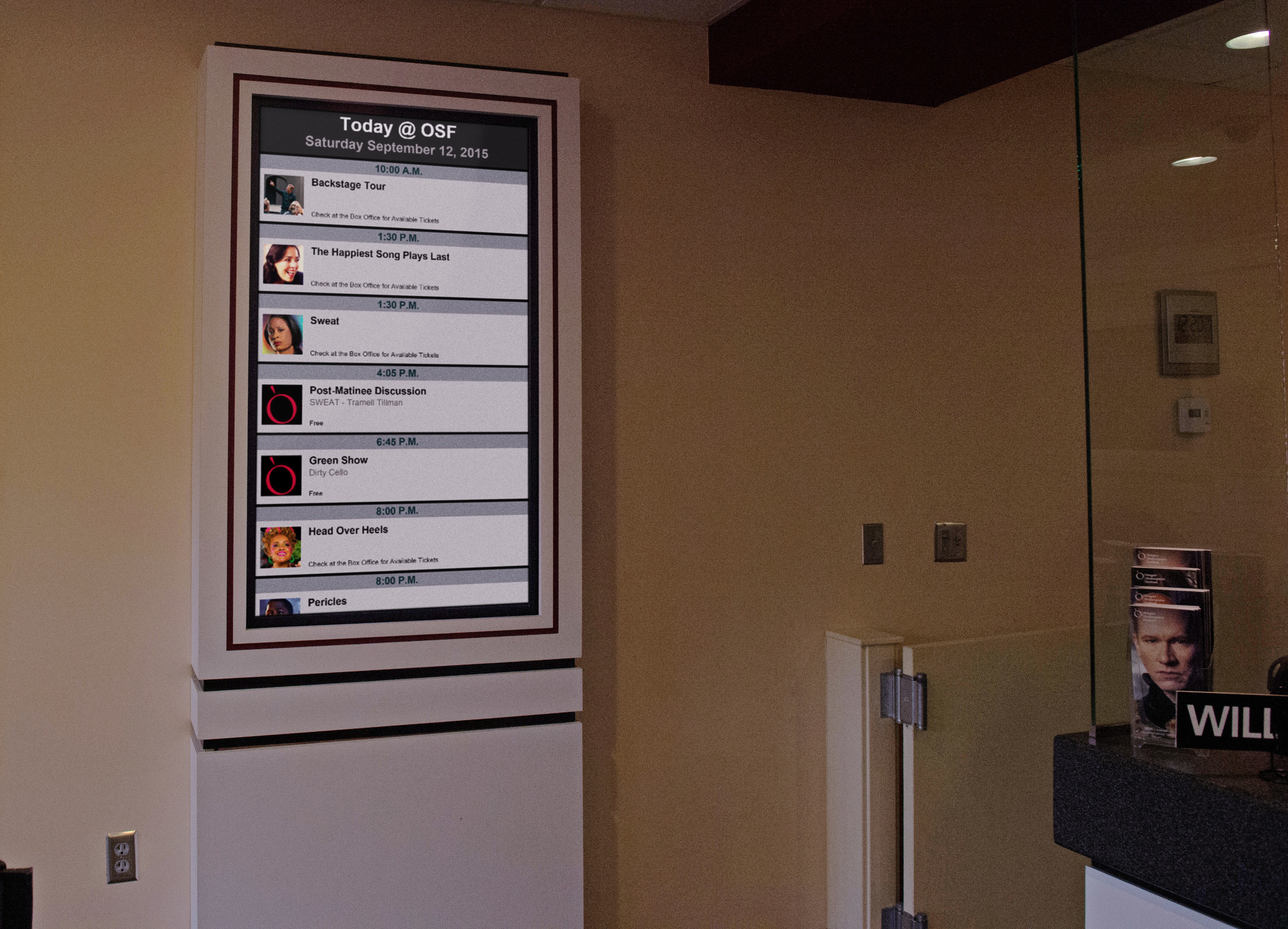
At OSF we recently expanded our digital signage in our two indoor venues. While we’ve found varying degrees of success in simply having displays available, I see the next step as an interactive one involving the integration of technology and people. The example of Woolly Mammoth’s experience revealed the effectiveness of a concierge-led experience. We can certainly add touch screens and other kinds of hardware and software to our lobbies, but interaction will be much more effective and trackable if we include a human guide. Creating our own “entry point” for these experiences can add to the value of the work we produce inside of our theatres. While it’s tempting to build elaborate and deeply linked lobby experiences for all of our shows, this is one idea that we’ll need to adapt to our own needs as a repertory theatre. Given our resources we should be selective about which shows initially get this treatment or when we might create an experience that links several productions in one lobby installation.
Kim Rust pointed out that social media experiences are now predominantly mobile. Our data shows that 60% of our social referrals are mobile. Organizations that are just starting out in the mobile space should favor a responsive website for selling tickets before tackling a mobile app. In light of this, OSF’s website must be responsive and dovetail more closely with our patrons’ social media experiences. There are many newly emerging “mobile-only” demographics which are just as important to reach as our existing audiences.
OSF is currently working to make our website useful on all devices. While we’ve enjoyed seeing examples of content-oriented mobile apps, Rust affirmed our existing mindset which echoes AMT Lab’s previous work on the subject: it’s necessary for us to broaden our reach with a responsive website first. When it comes to broadening our existing audience, the mobile demographic will be key for us in aligning with our core values of diversity and inclusion.
Diego Zambrano and Mohan Ramaswamy encouraged us to do everything possible to simplify our website’s forms by seizing opportunities to auto-populate and guess information for users. When mapping the Metropolitan Opera’s entire web experience, there were clear moments when it was necessary to inspire with a dark background and edge-to-edge imagery, and other moments when it was necessary to inform with white backgrounds and clear, crisp displays of choices.
The separate needs to inform and inspire are two additional ideas I’ll continue to develop in our own content. When I overlay this on osfashland.org, I see new opportunities that we can capitalize on. While we’ve discussed internally that our website’s colors are too “dark,” we need to look more deeply at what informs and inspires our layouts and design palette. This year, we’ve already learned that taking care of seemingly small and invisible issues for our patrons can have a significant impact on their satisfaction level. I look forward to taking a more critical look at the forms in our purchase path.
Thomas Weitz explained the process of building the new San Francisco Ballet website. It required a flexible layout that could adapt to seasonal shifts in marketing and fundraising priorities. He noted the importance of choosing a core piece of the web experience and making it continually accessible from every part of the site.
I’m considering implementing this concept by investigating what could become the unifying core experience at osfashland.org. As a repertory theatre with a dynamic schedule, we may also want to adapt the fundamental layout of our landing page to meet our seasonal shifts. One thing that our audience values is the familiarity of the OSF experience; it’s not unusual to find patrons that have been visiting us every summer for a decade or even longer. We, like other organizations serving long term patrons, will need to preserve a sense of familiarity for our most dedicated audiences, while meeting newer online audience demands. Just as the San Francisco Ballet will soon use dance as the unifying hub of their digital content, we can also unify our online presence with Shakespeare and the many classic, modern, and contemporary artists who contribute to the work on our stages.
This is by no means an all-inclusive list of what I took home with me, but these are some of the most influential insights that could shape the way that OSF leverages technology going forward. I take great pride in the fact that at the Oregon Shakespeare Festival, we’re pretty good at taking new ideas and uniquely adapting them to the experiences we already offer and leveraging new tools to meet our own core mission.


