

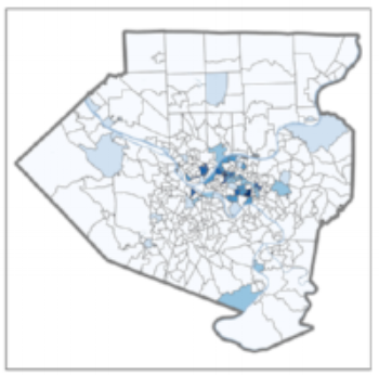
All nonprofits can benefit from knowing where their patrons are coming from. Nonprofits regularly gather address data on their donors and attendees, and geographic analysis is one useful way to visualize and make the most of that information. MapTogether’s Illustrated Guide to Nonprofit Geographic Information Systems (GIS) provides an excellent and accessible guide to geographic analytical tools (also known as GIS, or geographic information systems). As MapTogether explains, geographic analysis places information in a “where context,” and deepens our understanding of where someone (or something) has been, where they are, or where we can expect them to be in the future.
AMT Lab contributors have explored how geographic analysis can help increase programmatic effectiveness, but there are many other ways nonprofits may leverage their data with geographic analysis. For example, address level data can be particularly useful in marketing and development strategies aimed at acquiring or retaining new donors and attendees.
While this scenario is achievable, there is a catch. As with any data-based project, 90% of the work happens before it’s time to analyze. There are important intermediate steps a nonprofit administrator must take in order to leverage the full possibility of their address level data. Outlined below are 5 steps an administrator should take before delving into geographic analysis headfirst.
(1) Define your Question
The first step of any analysis project is taking a stab at framing your question. This question will be the lens through which you assess the strengths and weaknesses of your data. Additionally, it will define the scope of your analysis. Your data will inevitably answer some questions more easily than others. For example, understanding the distribution of your donors across a geographic location (say, by zip code) may be fairly straightforward. This research question may look like this: what areas in our town/city/state have the highest concentration of donors? On the other hand, visualizing areas of high-donor concentration in order to target potential donors in other geographic areas with similar demographic and geographic attributes may take a little more finagling. This question may look like: where do our donors live, and what other areas in town/city/state have similar characteristics?
(2) Identify your Outputs
The products of geographic analysis are map-based – but maps come in many shapes and sizes. What attributes are you interested in visualizing (addresses, demographics, behavioral)? Are you interested in large scale maps (state/national/international) or small scale (local)? Identifying the target outputs of your analysis early in the process will help you identify the best analysis tool, as well as inform the data cleaning process. Consider the sharability of your analysis: do you plan to share it with organizational stakeholders such as staff, board, or potential donors?
Some analysis tools are better suited to data sharing than others. For example, Tableau Public and ArcGis Online provide cloud-based platforms that can be embedded into a website or accessed via URL. If using cloud-based options, you want to be sure your sensitive data is protected appropriately. The desktop counterparts Tableau Desktop and ArcGIS Pro, as well as Google Earth and many other software provide local analysis tools. Files created with this software will only be accessible by devices that have access to the software.
(3) Select Your Analysis Tool
This step warrants a full article in and of itself. In fact, AMT Lab contributors have written several reviews of software with geographic analysis capabilities. Rather than comparing products, here are a few considerations when exploring analysis tools:
Cost: this software can get very pricey very quickly. It is important to consider how much use you will get out of the tool: are you using this kind of analysis for only one project, or are you interested in incorporating geographic analysis across departments or on a regular basis? Some tools, like Tableau, offer discounted or donated licenses to nonprofits that meet prescribed criteria.
Time: how long will it take to learn the software? These tools can be labor intensive to learn, and you want to be sure it will not be more advanced than you have reasonable time to learn. Luckily many of these tools have extensive training resources available, including some specifically tailored to nonprofit needs.
Compatibility: Compatibility between your internal data and the geographical analysis tool varies from software to software. For example, Tableau is Salesforce compatible and allows a direct link between the CRM and the software. In all likelihood your data will require some kind of adjustment or cleaning, and the easiest place to do that is Excel. Excel exported files (.csv, or .xlxs) are compatible with most if not all major geographic analysis tools. There are more advanced data cleaning tools available like Tableau Prep, but Excel is sufficient for basic to intermediate analysis in many cases.
(4) Prepare your Data: Explore and Clean
Once you have defined your question, outlined possible deliverables, and assessed available analysis tools, the data exploration can begin! This is an opportunity to take stock of what information your organization has collected, and what shape it’s in. Ideally your data is centralized and easily exported, such as in a CRM system. Data exported from a CRM will more easily comply with data best practices and require less tedious cleaning. If your organization’s data is siloed between departments, or housed in a spreadsheet that requires manual entry, your clean-up job is going to be more involved. In which case, get some snacks, tuck in, and know it will all be worth it in the end.
Regardless of how the data is organized and maintained, the exploration and cleaning process magnifies the pros and cons of your data management practices. Combing through the records will illuminate steps your organization can take to increase data accessibility for future analysis. Tech Soup published a nonprofit guide to Collecting and Reporting on Data that provides valuable data entry and management checklists for all nonprofit data (not just donor data).
(5) Locate Additional Geographic Data
Now that you are familiar (maybe too familiar) with your organization’s data, revisit your question. Can the data sufficiently answer the question? If you’re interested in the geographic distribution of donors, the internal data you’ve just cleaned is most of what you need. If the goal is to place your internal data in context alongside demographic and geographic attributes of the larger population, it may be necessary to turn to external data sources. Fortunately, there are excellent public sources of geographic data, such as the Census Bureau, and possibly at the city, county, and state levels of government as well. There are also robust private datasets compiled by organizations like Reference USA, which provide a variety of in-depth data via many public libraries. AMT Lab contributors have explored additional sources of data, as well.
The considerations framed above are both critical and often overlooked. We tend to underestimate the amount of time it takes to properly prepare to undertake this type of analysis, particularly when it is new for the organization. In reality, about 90% of the work happens before the software is even involved. Once you start visualizing your data you will find the insights gleaned will be worth sharing cross departmentally. Be prepared for your first geographic analysis to take longer than you want it to -- but don’t be disheartened! As you streamline the maintenance of your organization’s data and become more savvy with geographic analysis tools, it will be a quicker and easier process next time. And the next, and the next, and the next.
Resources
Fredricks, Jana. n.d. “A Picture Is Worth 1,000 Numbers: Tableau or Not Tableau.” AMT Lab @ CMU. Accessed November 7, 2018. https://amt-lab.org/blog/2018/10/a-picture-is-worth-1000-numbers-tableau-or-not-tableau.
Kim, Gillian. n.d. “Digital Storytelling: 5 Tools That Make Data Worth Looking At.” AMT Lab @ CMU. Accessed October 2, 2018a. https://amt-lab.org/blog/2018/3/-5-tool-for-data-visualization.
———. n.d. “New White Paper: Open Data and Data Visualization in Arts Organizations.” AMT Lab @ CMU. Accessed October 2, 2018b. https://amt-lab.org/blog/2018/9/new-white-paper-open-data-and-data-visualization-in-arts-organizations.
Moreci, Jennifer. n.d. “Tableau: The High Cost/ High Reward of Data Vizualization.” AMT Lab @ CMU. Accessed October 2, 2018. https://amt-lab.org/blog/2015/2/tableau-the-high-cost-high-reward-of-data-vizualization.