
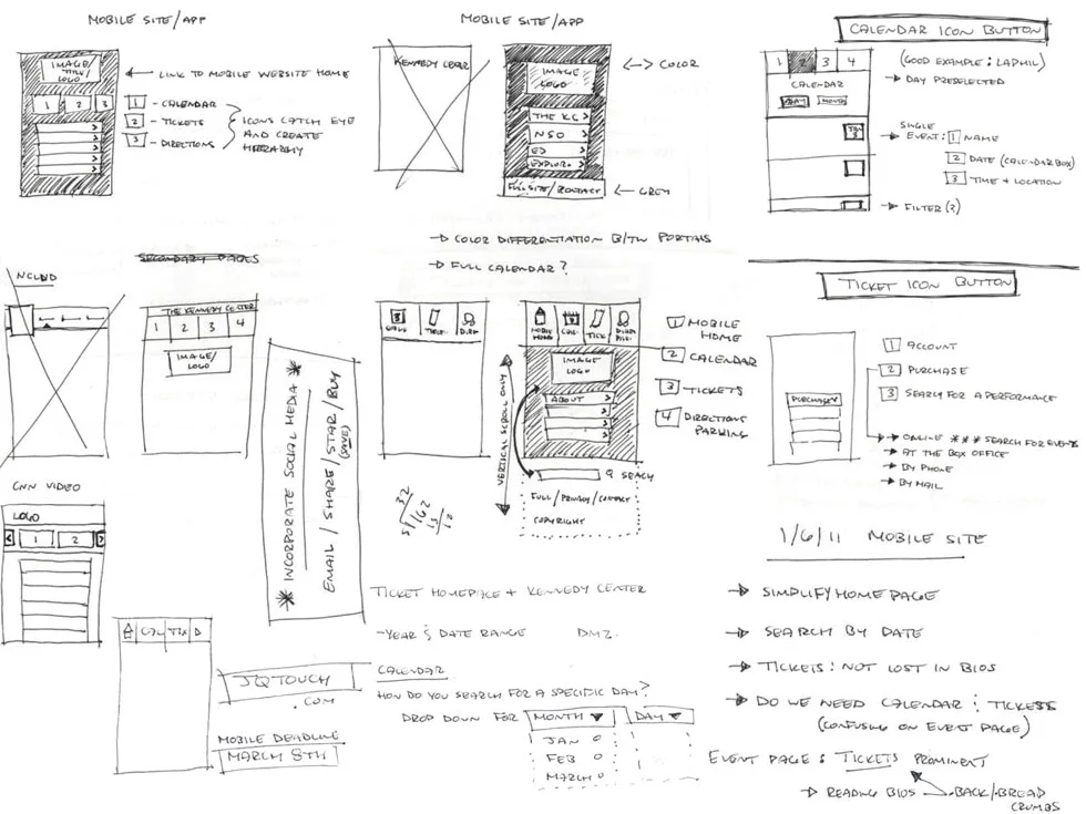
According to a study conducted by market research firm NPD Group in early 2013, 37% of consumers who used to perform certain activities on their computers – especially general web browsing and checking Facebook – now do so on their mobile devices instead. PCs are still the dominant type of device used for Internet access, but some believe that the findings of this study suggest a shift to the contrary as early as this year. Regardless of exactly how soon mobile device Internet browsing will overtake PC browsing, we as an industry recognize the importance of evolving with our patrons’ behavior and preferences. However, the actual decision-making and implementation processes can be more complicated, especially with the added challenge of the limited budget that is all too common in the arts sector. Focusing your resources on a great mobile website can often be a more cost-effective route than creating an app. The Kennedy Center demonstrates the full potential of a mobile-optimized website with an efficient interface designed with patron usability in mind. As long as mobile tech remains a relatively new outlet for reaching our constituents, there are countless things we can learn from their example, but here are 4 to get you started:
1) Providing multiple ways for users to navigate the website accommodates their individual interests and thought processes. It is obvious that in designing their mobile site, the Kennedy Center considered the diversity of their audience base as a multidisciplinary arts center. Some of their patrons might be enthusiasts of a certain art form – such as ballet – so they can “Browse by Genre” to see only that type of event. Those that prefer to base their search on their availability can “Browse by Date” to view a calendar that includes full event listings for each day during the month. With this structure, users can choose what layout is most fitting and intuitive for them.
2) Keep as much important content “above the fold” as possible to minimize scrolling. Ideally, a mobile website has condensed information that is conducive to browsing on smaller screens, but in many cases, users may still need to scroll in order to read the entire page. The Kennedy Center design addresses that problem by presenting as much content as possible “above the fold” (i.e. visible to the user without having to scroll vertically). This is especially apparent on the main menu page, where all six buttons and a picture can be seen without the user having to touch the page.
3) Include a link to the full HTML version of the website so users have complete access to your web content. Since designing a mobile-optimized website almost always includes omitting certain information for the sake of efficiency, it is essential that users be able to see the full site if they do not find what they are looking for on the mobile version. Although most of the major content in the Kennedy Center’s mobile website appears above the fold, the information below the fold is equally important: the header contains contact info as well as a link to the full site.
4) Minimize the users’ need to type. In mobile optimization, the goal is to help users make decisions more quickly, whether those decisions include finding parking information or buying tickets. The Kennedy Center mobile site’s donation option features a 3-question form that only requires users to manually type in the amount they would like to contribute. The other two questions consist of a drop-down menu for choosing a recipient and an on/off toggle switch for opting in or out of donor benefits. By streamlining their online contribution process this way, the Kennedy Center has not only made it easy to donate, but has opened up possibilities for new types of donors as well.
What are your experiences with the user-friendliness of mobile-optimized websites? Or, if you’ve already embarked on a mobile optimization project, how has the concept of user-friendliness guided your design? Sound off below or at @TechInTheArts on Twitter!
Featured photo credit: Karey Helms' design portfolio