In this interview episode, our former Podcast Producer, Alyssa Wroblewski, along with our former Technology and Innovative Content Manager, Grace Puckett, sat down with Heather McElwee, the Randi & L. Van V. Dauler, Jr. Executive Director of the Pittsburgh Glass Center. They discussed the user experience (UX) and user interface (UI) design of the website, www.pittsburghglasscenter.org.
[Musical introduction, fades out]
Angela: Hello, AMT Lab listeners, and welcome to an interview episode brought to you by the Arts Management and Technology lab. My name is Angela Johnson and I'm the Podcast Producer. In this episode, our former Podcast Producer, Alyssa Wroblewski, along with our former Technology and Innovative Content Manager, Grace Puckett, sat down with Heather McElwee, a Master of Arts Management alum and the Randi & L. Van V. Dauler, Jr. Executive Director of the Pittsburgh Glass Center. They discussed the user experience and user interface design of the website, www.pittsburghglasscenter.org. Please note that this episode was recorded on April 3, 2020, during the coronavirus pandemic. They were practicing social distancing by recording over Zencastr. Therefore you may hear differences in the audio quality. We hope you enjoy this episode, brought to you by AMT Lab.
Alyssa: Alright. So, Grace and I are here today with Heather McElwee of the Pittsburgh Glass Center. Could you take a moment to introduce yourself to our listeners, Heather?
Heather: Hi, everyone. Thanks for tuning in today. This is Heather, the Executive Director at Pittsburgh Glass Center, like Alyssa said, and I've been there since the Glass Center opened in 2001.
Alyssa: Alright, thank you so much. So, according to the website, the Pittsburgh Glass Center is a nonprofit public access education center and art gallery, a state of the art glass studio, a community builder, and a hub for innovation and creativity. Several of the Pittsburgh Glass's events include workshops, hot glass demonstrations, and auctions, to name a few, and the center features world renowned glass artists who create and teach glass making.
Grace: So, typically the very first interaction a visitor has with an organization is through its website. Therefore, the goal is to catch the visitor's attention immediately and impress them, which can be difficult if there's a flaw within the UX and UI design. For some of our listeners who may not work with UX or UI design on a regular basis, UX design refers to the user experience design or a platform or product's functionality. The UI design, also known as user interface design, refers to a platform or product's look and feel. A platform can be easily ruined if the user experience is highly functional but the user interface doesn't look good, and vice versa. One can't function without the other.
Alyssa: Alright. So, I had a chance to visit the website and I explored around, learned a lot about the events and the organization, and even tried to break the website a couple of times. Something that I noticed about the website was that it was pretty simple to use at first, and that if someone was simply interested in finding and signing up for an event or making a donation, then it was pretty simple to do and nothing really stood in its way. However, if we wanted to learn more about the organization and what's available, then there is a plethora of information available, but nice and easily tucked away into organized columns. So to start us off today: I'm curious, Heather, what was an important function to you for having the website built? Was it the simplicity, or was it a couple of other factors that you were considering?
Heather: Yeah. Good question. You know, I think that one of the challenges when we redesigned this website is that the Glass Center has a variety of different audiences that we serve. And so when we were designing, we were really trying to think about the user experience for those different audiences. So for example, you've mentioned a couple of things already. Somebody might be interested in coming to sign up for a class; we wanted to make sure that it was really easy for them to understand where they could find out about our classes and workshops and make the process of actually signing up and paying for that class and registering as simple as possible. Another person might be interested in just learning more about our events and finding out, you know, when they could come visit us. Someone else might be interested in shopping and buying some of the retail items that we have. Someone else might be interested in making a donation. So when you have all these different audiences and different kind of paths that they're going to follow on the website, that was one of the most complicated things, trying to keep things really simple and clear. So at a high level, when you first come to the website, you can pretty easily understand which direction you need to go based on what it is that you want to do.
Grace: Yeah, that makes a lot of sense. I know sometimes when people who are new to an organization and they're coming on and they're seeing your website for the first time, if there's a lot going on, it can be really daunting at first. I know I myself have had some instances like this, where I've gone onto a website of an organization that I'm not familiar with and I just get lost. And I'm like, where am I going with this? So it's nice to know that you guys really kept simplicity as a main focus for your design process.
Heather: Yeah. And I think, you know, to speak to the other piece of that: you know, we are a visual arts organization and we talk a lot about the fact that glass art in particular is a visual art and a performing art. And so it was really important to us that users could kind of see the sorts of things that take place in our building. And that's what ultimately led us to the decision to use that large video header on the homepage. When you first get to our home page, basically, most of what you see is this looping video and then a really simple, clean header bar that allows you to kind of pick choices from there. And then if you start to scroll down, of course, you can get into much more detail. But the other interesting thing about that video is that, while we love the video, it actually did cause us some issues in just trying to get it scaled small enough so that the user experience wasn't affected, that it took a long time for that video to load when somebody first came to our page. So that was an interesting challenge that I think speaks to both of those things, both from a design aesthetic and from an experience aesthetic or concept.
Alyssa: That's actually funny because I remember seeing that video the first time that I visited the website and, admittedly, I watched the video loop through twice before I realized what exactly I was doing and continued to move on through the website.
Heather: Good. We captivated you.
Alyssa: It worked.
Grace: Heather, speaking of the video header, just because I know that this is a tactic that a lot of different organizations try out, especially when they're trying to, you know, captivate, like you were saying, when you were first working with the video header: were you guys using YouTube links? Were you embedding a link? How did that process kind of look for you guys, since you were having issues with that loading? I know that that's a common problem across the board.
Heather: Yeah, so we did work with a firm that helped us to redesign the website and they were trying to embed that video. We wanted the clean look that when you came up, it just filled your whole screen, as opposed to a YouTube that has some framing and some other things around it. So, we were trying to embed it and keep the quality high, even if somebody had it open on a really big screen but also, again, reduce it small enough so that it would load quickly no matter what speed somebody was coming to the site from.
Grace: Now you're saying that you used a firm. When using this firm, and maybe even before reaching out to them, was there some sort of testing with a couple of different site building platforms, such as Squarespace or Weebly? I know those are common for maybe new developing organizations, maybe not necessarily what Pittsburgh Glass Center looked for at first. But I'm curious how you guys went around selecting, you know, are these the platforms we were going to use, kind of the template? So thinking about how you built out and tested the website into its current state.
Heather: Sure, yeah. Good question. We actually didn't think about it really from that standpoint as much. And I think you kind of nailed it, like a smaller, maybe slightly less complex organization can certainly think about designing something on a WordPress and have it using different plugins to kind of make that work. Because of our class registration system and some other aspects, our site is a little more complicated than we thought we would be able to achieve. We knew we wanted a professional to help us, so that was kind of step one. And we weren't necessarily so concerned about what site that person or that team, what platform they designed the site on, as much as we were really concerned with us having a ton of control over the site ourselves. Our previous website was much less user-friendly from a change aspect. We could change most of the blocks within kind of any section, but if we wanted to say change, if you go to our website, you know, we've got four headers, basically: Explore/Artists/Learn/Support. And if we wanted to change one of those headers, for example, that would be something we would have to go back to the designers and have them change. And so one of our main priorities with this new site was to create it on a platform that would give us a lot of flexibility. That folks internally at the Glass Center could go in and put in a new video for the header, change the words that are across that video header, change everything from the titles, to the body font, and everything in between if we wanted to at any time. And so, when we were looking for firms, that was really one of the first things we told them. And we didn't necessarily worry so much about what they built it on beyond that point, as long as they kind of assured us that we were going to have that control and flexibility. And we do with the site, which is great.
Alyssa: So you have the staff trained to work with the website and go in at any time and readjust something if they need?
Heather: That's correct.
Alyssa: Oh my goodness. How long did it take to train everybody for that?
Heather: It actually wasn't too bad, because the way that it's set up, it's actually really easy to make changes. So the site's built on Drupal. It didn't take long to train people. I will fully admit I am not trained in how to do that, but the two folks in our marketing department definitely are.
Alyssa: Oh my goodness. That's awesome. I like that.
Grace: I'm just going to ask a little bit more in depth in terms of the control piece. Because when you say you're wanting control, are you talking about., maybe not so much down to the hardcore base code level? Which, maybe that is part of the control, or are you talking about more like essential template changes? Not necessarily layout of where everything is, but in terms of font, color, ease of changing things in and out...that sort of control? Because I know everybody likes to have a different level of control and everyone has different skillsets. So with code being a big part, sometimes, of the layout piece: did you guys want to go that far or simply what you stated in terms of the ease of changing things and making sure you don't have to go to the designer for every single little change?
Heather: Right. More so the second. We aren't coding. Our marketing group isn't getting in there and changing code. They're working with a WYSIWYG editor that they can make changes, but pretty substantial changes. Like, for example, with our old website: something that we would sometimes want to do is put kind of a banner just across the homepage that would say something like, 'These are the hours we're closed for the holidays'; you know, just so that as soon as somebody got to the website, they can see holiday closing hours. They don't have to go digging for, 'Is the Glass Center open between Christmas and New Years?' you know, 'what's going on'? And before, and with our old website, that was something that we would have to send to the developer and say, 'can you please put this banner up on this date and take it down on this date, and it looks something like this?' We actually had to do a similar thing just here recently because of the state order for non-essential businesses to close. So there's actually a banner right on our homepage right now that talks about our closing due to Covid-19. And that was something that we were easily able to change, basically, the layout of the home page in order to add that banner.
Alyssa: So how much and what kind of maintenance goes into the website then in case something does pop up where there's an error, or in case you do need to make a change to a banner, such as for Covid-19?
Heather: Yeah. I mean, I think we do have an ongoing relationship with the company that builds our site. We pay a monthly maintenance fee, a pretty minimal monthly maintenance fee, to them that just basically gets us a couple of hours and their eyes on the site to make sure that everything's functioning, all of the links are working, etc. We haven't broken anything as we've gone in and messed with stuff. And then, yeah, the other part is just that I'd say our marketing team are making - I want to say they're making changes to our site daily, but that might be a little bit of an exaggeration - minor changes certainly weekly. There are minor changes that are happening to copy or to add things. Another good example might be the fact that, because of the situation that we're in right now, we just added a whole new page to the website: virtual programs. So there's a whole new kind of subcategory and a bunch of pages actually that are all linked to all the virtual programs that we've developed since we've been closed for Covid.
Grace: Just to bounce off that a little bit: with the implementation of virtual program, how has that potentially changed the maintenance for the website that you said was happening at least weekly, if not daily? Has that changed that at all? Or is it still pretty consistent, since you guys do have such a good relationship with the design company that you worked with? And it sounds like your marketing team has hands on it pretty much on the regular.
Heather: Yeah, I think it hasn't really changed much. Granted, it only went up on Monday of this week. So it's pretty new. But no, I don't think it's added anything extra, particularly. People can take virtual tours, they can listen to some audio recordings of the artists talking about work that's in the current gallery/exhibition, they can download, hands-on activities that they can do at home related to the exhibition...things like that.
Grace: Wonderful. Thank you for answering that question. I know that things are changing rapidly for the arts industry in general, so I appreciate that. Thank you.
Heather: Sure.
Grace: I'm just gonna kind of pivot us a little bit back to the design piece. When looking at the UX design or UI design of a website, what do you think an arts manager can do to learn more about how they can improve upon the current designs that they may have in place?
Heather: Yeah, I think that's a good question. And one of the things that we did was we actually talked to people in all those different audiences so that we could get a better understanding of the paths that people were taking or what the goal they were trying to achieve when they came to our site. So I would say that, you know, talking to and listening to the people that are ultimately going to be using your site is a great first step. And one that doesn't take any sophisticated technology, any knowledge of code, or any of those other things. Like, understanding what it is you're trying to accomplish with your website is the first and foremost question you should be asking and a great way to get some of those answers is to talk to users.
Alyssa: And I'm assuming that this is a conversation that is continuously ongoing with your users in case there is an error that pops up or in case they have any feedback or any contributions that they want to add?
Heather: Absolutely.
Grace: Just thinking about that...as you're building things out, did Pittsburgh Glass Center do any sort of AB testing for pages or different platforms that you guys were thinking about using? Maybe this was something that was done in tandem with the design company?
Heather: Yeah, we did do some AB testing as well as some site mapping. The company we worked with did look at our old site and the paths that people were taking via that old site to help us kind of look at what might be more efficient or what might make more sense with the new site. So, yeah, that was definitely a piece. I think one of the things that was really interesting to me, too, having been through the design of our previous website at the Glass Center and then living through this design: it's really interesting to me, not being the one who necessarily lives and works in this world all the time, how much that the theory behind the design of websites had changed in the approximately six years since we had previously redesigned our website. And I'll just give you a short example: previously, six or seven years ago, when we did our last website, the thought process was that you wanted the content in really kind of digestible little pieces. You didn't want these long scrolling pages that the users just had to keep scrolling through to find content. You wanted everything broken up into little, tiny chunks and new pages that, you know, people can navigate really easily. Well, that was almost the exact opposite that we heard when we went to design the website about a year and a half ago that, you know, ended up with the current site that we have now. And one of the main reasons for that, we were kind of told and discovered, was because of mobile. On mobile, it's actually much easier to just keep scrolling, to look at information on a page, than it is to try to navigate with some kind of menu through a bunch of different pages. So if you need to click through five different pages to get to where you're ultimately going on mobile, that can be really frustrating. So that was a big change in design that I thought was really interesting. That was a complete 180 from where we were last time.
Grace: Yeah, that's actually really interesting. An organization that I worked for a couple years ago, actually, I helped build and work on the site mapping that they did for a website from scratch, because they were a new organization. And one of the things that was constantly touted in terms of design was single screen pages. And trying to map that out for a site that you knew people were going to be on multiple different devices, especially mobile was really interesting. And hearing you say that now, that the theory is having those longer pages that people were originally trying to get away from, is really interesting. That we've kind of had this coming back to these longer pages that some people in the arts were trying to get away from.
Heather: Yeah, that's exactly where I was. And it may be that, I mean, I'm sure there are varying opinions on that, but at least the firm that we worked with and the people that we talked to and from a user experience side definitely agreed that they would rather see a long scrolling page, that they then have one place they need to click to take them to a second page than click, click, click, click, click, you know, on a mobile.
Grace: Yeah, I wonder if it does come back to the whole simplicity thing that you and the Pittsburgh Glass Center really focused on when you were redoing the design for your website into what it is now, that people who are on their phones, they don't want to have to constantly click and click, and you're like, okay, where am I? You get lost in that map of the site just as a user. And I know that can be really frustrating. It feels like sometimes we're burying information when we're not trying to do that. That's not the intent of the design in the first place. But that's nice to know. And I guess that the current theory does say it's okay to have these long pages that a couple of years ago you may have been told not to do.
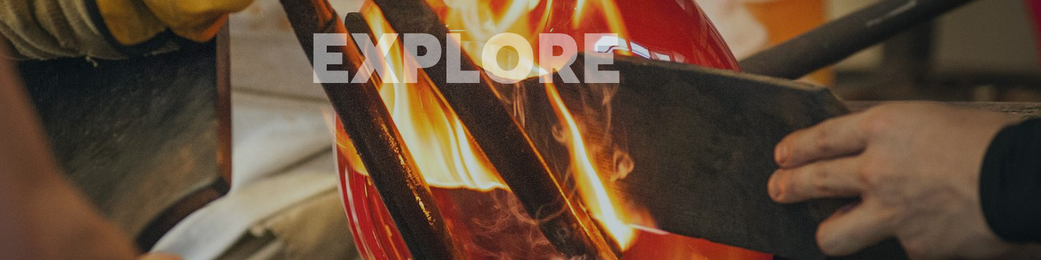
Heather: Yeah, absolutely. I think one of the other challenges from our perspective that was interesting, talking about those audiences: when you look at our four top navigation areas, if you will, we talked a lot about what those should be. And it's interesting, because in the end we kind of decided on a hybrid approach. Initially, we thought, you know, maybe those should be what the audiences are, so we have just kind of the casual visitor who just wants to kind of know, what are you all about it? You know, I heard about you somewhere, or I stumbled upon your page. What are you/I'm just interested in learning more. So, the kind of casual visitor like that. To, an artist who knows the Glass Center, or at least knows glass art and knows about the Glass Center and wants to come and find a really specific piece of information about how they can apply for an exhibit, let's say, and they're super savvy about glass art. That's kind of another group of people. Or someone who wants to come make a donation. They're a supporter, you know, and they want to be able to do that. And we were really debating about creating those names as that top navigation versus actions like "explore", "learn". And in the end, like I said, you can kind of see, we took a hybrid approach. So, "Explore" kind of became the catch-all for that person who's saying. I don't know what the Glass Center is, I want to kind of find out more. We kept "Artists", even though it's not a verb. And that is a noun, an audience group, because we knew that there would be artists who would be coming to the site and could immediately select that and see things that were specifically for them. Then we offer a lot of different classes and workshops, and at one point we thought about calling "learn", "classes" or something like that, but we also do these experiences called “Make it Now‘s”; we do all these things that we don't necessarily call "classes", but they are opportunities to come and learn and do something. And it's for everybody from youth through adults, teachers where we offer Act 48 credit, and so that "Learn" catch-all really became for all of those different things. And then, finally, that idea of how people can support or get involved with the Glass Center fell into that catch-all of "Support".
Grace: Can I ask what the motivation was of going for the hybrid approach? I think you've touched on it some a little bit, but I'm just curious. What was the kind of deciding factor between names versus
actions?
Heather: Basically, we couldn't find four or five names we liked just as nouns and we couldn't find four or five verbs we liked just as verbs. We felt like "Explore" really captured what we were trying to get at there. But what would you call that audience if you were going to name that audience as the header tag?
Grace: No, that's a good point,
Heather: Right? I mean, it's hard to come up with something.
Grace: Yeah. I mean, how many times have you, as a user, come across something that clearly is trying to target multiple different types of audiences and you're like, but I fit into that one, and that one, and that one? So, how can I get to all of that? So, that's really interesting. Because I know, for me, personally, sometimes when I come across something like, "Oh, well I want to explore both of those, but I'm torn between the two" and it's maybe a part of the thoughtfulness that goes behind some of the UX and UI design that by using a hybrid in your case that actually helps foster the ability, or maybe even just the curiosity, behind a new person to kind of deepen that interaction and take the time to explore.
Heather: Yeah. Thanks. I mean, that's what our hope was. In the end, we decided that any confusion we were causing by taking this hybrid approach was mitigated by the fact that it actually seemed more clear and that most people probably wouldn't even stop to think that some of those words are nouns and some of them are verbs.
Grace: So, going off of that, and the way that you're thinking about even just naming things, not just the layout itself, but how are you trying to guide the experience itself? What parts of that went into designing the various like, class registration system, the ticketing platform for some of the events that you guys put on? Were there different issues between designing that with the website and how to make those two work in tandem together? Just because those are two different kinds of experiences, but still both digital.
Heather: Yeah, it really, it really was. And that was probably the most complicated piece of the entire design of the website. So, if you do select "browse our classes" or "browse classes" from any one of those directions that you can get there, it takes you to a page that has a pretty sophisticated filtering system down the left-hand side that lets people...if you know you can only take classes on Saturdays, you could select Saturday as the day of the week and it's only going to show you classes on Saturdays. If you know that you want to take a one-day workshop versus a on- week intensive, you can make that selection. If you know that you're a total beginner and you've never done this before, you can select only to see the beginner classes. The filtering system was not something that we found readily available in any of the class registration database software that we planned to use to kind of back up this website. And so this page is actually a skin design. It's actually pulling information out of our database via an API in terms of the number of people that are registered for classes and things like that. But it's actually creating this whole other kind of layer of information that we can add to all of the classes that wasn't readily available in the registration software itself, if that makes sense.
Grace: Yeah. No, that makes sense. And that's actually, I love seeing those kinds, personally, just because I know that with the way that my own schedule is so tight in certain places, having the ability to easily go through someone's database like that, using a skin like you guys have really seems to improve my own personal user experience. Alyssa, have you dealt with anything like that? And how do you feel about those kinds of systems as a user perspective?
Alyssa: I actually did encounter that when I was looking at the Pittsburgh Glass Center website and I had a chance to filter around for a couple of classes and, honestly, the convenience behind that was incredible, to have that experience where I can find a class that I'm comfortable with or could fit my interests. Like, the fact that I could do that was, like, very handy and very, very helpful, and I felt very welcome in that experience.
Heather: Great. Yeah. I'm glad to hear that. I mean, I think, like I said, I think that was one of our biggest challenges because the Glass Center at any one moment might have 300 or 400 different class offerings. That's hard to look through if you don't know what you're looking for, or if you're just scrolling and scrolling and scrolling, you know? Or paging through pages of different class content. That can be really overwhelming. And while we wanted all of that information on the website, we certainly wanted to be able to include all 400 different types of classes, we also wanted to be able to make the user have an experience that they could find what they wanted. So that was something that took a lot of time and development and thought behind it. But I'm glad that you both are saying that it was useful.
Alyssa: Oh yeah, it really was.
Grace: My only other question about that particular system is, because we were mentioning it a little bit earlier: are there any differences that you've noticed in that particular system using the API, for users who may be messing around on a computer versus a mobile device? Because I know that sometimes ticketing platforms like that or even just registration platforms don't always pin well on one device versus another, so I'm curious how, or if, you guys have experienced any of that?
Heather: Does this filtering skin cause problems on mobile versus an iPad versus a full computer? We haven't experienced any issues. It is definitely a little harder to kind of click the selection of the filter on mobile because the little boxes are a little bit smaller, of course, unless you kind of enlarge it, click it, and then shrink it back down. But, everything was designed to be fully accessible. We know that a ton of people sign up for our classes from their phone, and so that was a really big priority. And when we were going through testing, we were absolutely, all of us, as well as people who weren't familiar with what we'd been doing so far, we were making them use the test site and try to register for a class and see if they could do it on their phone.
Grace: Thank you. I know that sometimes that's an element of UX and UI design that new organizations don't always think about because there's so much going on, when they have a small staff to do all this work. So it's really nice to know that Pittsburgh Glass Center has the capability and has actually taken the time to figure that out.
Heather: Thanks. I think the other thing we kind of learned as we did the site: our previous site was a responsive site, where, you know, things scaled and did things appropriately. And I'm trying to remember the exact terminology, because again, this isn't the world that I operate in exclusively, but that, basically, there's one thing to have your site be responsive, that it works on mobile and it kind of rescales itself. And it's another thing to design a site to be really efficient on mobile. And that the second is what we really tried to do, is to design a site that not just was responsive if somebody happened to be looking from their phone, but the statistics that we looked at when we started to design this site is that something like 50% of your website views come from a mobile device at this point, whether that's an iPad or an iPhone or Android, or, you know, whatever type of thing you might have. So if that many people are viewing your site from a mobile connection, you shouldn't just be thinking about how your big site kind of scales down to be acceptable on mobile; you should be thinking about, how you could make the experience on mobile be just as good as if someone's sitting at their computer.
Alyssa: Yeah. Admittedly, I'm scrolling through the website right now on my phone and it looks stunning to me. Like, there's plenty of pictures, it still has all the functionality as when I was scanning through the website on the desktop. You know, like, I can even see the titles of some of the materials on here, of the threat, I think it's called? It's incredible that it has that level of detail. And you can get to know so much about the Glass Center through the website alone, even as a mobile experience.
Heather: Yeah, thanks so much. Yeah. The Glass Center, because we are a visual arts organization, as I mentioned earlier, has so many stunning photos. Fire and glass blowing and glass making, as you might imagine, create some really beautiful images. And so that was our other big priority: how do we use as many dynamic images as we can on our site to get people excited and help them understand what we do? So every single class that's listed has a picture of what it is, either what you're going to make or what the instructor makes, if you are taking a class, or more of a masterclass. And that was a really big priority for us too. Like, it's great to have a description, but a lot of people are visual. And if they say, "I want to sign up for Bodacious Beads". Well, what does that mean? Here's a picture of a bunch of different types of beads you could make in that workshop. What does the glass flower look like? Here's a picture of what you'd be making. So that was a huge priority too. And a lot of work to pull together. I'm sure our Marketing Director has a count cause she pulled the photos, but I'm sure there are hundreds and hundreds of photos on this website; different, individual, unique photos.
Alyssa: Oh my goodness. And that takes some planning too, because if there's a chance where you are hosting a website where there hasn't really been material made before, you have to take a moment to quickly put together the glass, take a photo of it, and post on the website well before the workshop is there. And there are plenty of other, like, action shots that you can take to put on the website.
Heather: Yeah. That's one of the things that our Marketing Director is always saying. If somebody proposes a new class idea, she says, "Okay, great. Get me a course description and an image by X date."
Alyssa: There you go.
Grace: We've been touching on this a lot in terms of working across multiple devices. One thing to keep in mind that sometimes flies under the radar is when you're looking for a responsive design, you'd want to make sure that it works not only just on your laptop and your phone, but keep in mind that different people have different screen sizes. This is coming from a personal experience, but when you're working on a Dell versus an Apple laptop, or even the Mac desktop, those screen sizes are different, and they will pin differently, so make sure when you're working with whoever your designer is or anything like that, that is something that you take into consideration and that you check across different devices and even just different device types in terms of Apple versus Mac, because we actually didn't realize that we had a problem until we did that, because someone else brought it up and we were like, "why is this image cut off on the half on this, but just working fine on another?" And that was something that we realized. So it's the little details that sometimes can fly under the radar. So that's a little side note for people who may be thinking about doing a redesign: make sure you're checking, not on just phones versus iPads versus laptops, but also Mac versus a Dell PC, that sort of thing.
Heather: Yeah. And our design company was doing that for us and was showing us, this is what it's going to look like on an iPad, this is what it's going look like on an Android, this is what it's going to look like if you have the 21-inch screen, this is what it's going to look like if you have the 13-inch screen, and also across browsers as well, because sometimes browsers do funny things.
Grace: Yeah, I think that's one benefit, definitely, of being able to use a design company. Because we were very new at this and we were kind of doing it on our own. So there was something that we had to learn. But I love the fact that the design company will help walk you through that. And that they're aware. It's very comforting to know, as someone who had to try and figure this out on her own.
Heather: And if you think about it, I know it's hard to, especially if you're a small organization or a young organization, a new organization, it's hard to think about investing the money and having somebody help you with that design when you think like, "well, you know, there's WordPress and it's so user friendly. Like, we can do this!" you know, when you stop and think that your website is, in many cases, the best marketing tool for your organization; it's the way that people can get to you from anywhere beyond your catalog, beyond all of the things that you actually produce in house when you stop and kind of think about it from that perspective, you realize that it's worth making a decent investment.
Grace: Absolutely. I completely agree with that. I think that WordPress, Squarespace, and Weebly...those types of platforms are a great place to start, but once you have the funding to be able to invest in doing that, that's something that I think every arts organization, when they finally get to that point and can do that, they should. The benefit to your audience facing side, it's astronomical and something that you can't go without nowadays.
Heather: Yeah, and I think that's more and more funders are recognizing that, too. At least, that's what I have kind of seen, is that via audience development grants and organizations making the case that this is their biggest and best marketing tool to bring in new audiences, they've been kind of understanding that and have been more supportive of funding something that in some ways might actually be more of a capital fund. Organizations that say, well, we don't fund capital, but maybe you can figure out a way to make a new website be more of an audience development grant than it is a capital asset.
Alyssa: Well, hey, thank you so much for joining us today, Heather. It's been a real pleasure and we appreciate you taking the time to talk to us about the website.
Heather: It's been great to talk to you guys too.
Alyssa: All right. Thank you so much. If you want to learn more about the Pittsburgh glass center, check out their website at pittsburghglasscenter.org.
Angela: Thanks for listening to the AMT Lab podcast. Don't forget to subscribe and to leave a comment. If you would like to learn more, go to amt-lab.org, that is A M T dash L A B .org. Or, you can email us at amtlabcmu@gmail.com. You can also follow us on Twitter at @TechInTheArts or on Instagram, Facebook, or LinkedIn at Arts Management and Technology Lab. You can find the resources that we referenced today in the show notes. Thanks for listening. See you next time.
[Musical outro]