


Looking for a well-worth-it distraction? Check out Art & Money, an animated art auction infographic by Jean Abbiateci. It visualizes metrics for the top 270 most expensive artworks sold in auction between 2008 and 2011.
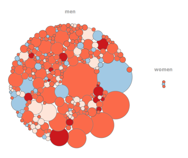
Methodology: the radius of the bubbles is calculated on the amount of sales. Theses prices do not include the buyer's commission.
Data visualized includes the size of the artwork, the artist's nationality, date created, selling price, etc. The data is then sorted in different categories so viewers can explore the relationship between male and female buyers, a comparison between top-selling work of dead artists and living artists, a look at how the top auction houses compare, etc.

Any surprises? Share with us!