As a publishing organization, AMT Lab exists to provide an exchange, a catalyst for innovative ideas, and a conduit for knowledge at the intersection of arts, management, and technology. Much of this is achieved by looking outward, through dedicated researchers taking a holistic look at how the arts and technology coexist at both the individual and institutional level. Although based at Carnegie Mellon University, AMT Lab researchers see this work through a global lens. Like any other organization, reflection and evaluation are essential to achieving AMT Lab’s mission in the long-term.
At the start of 2019, AMT Lab sought a website redesign to improve the user experience of their platform. Over the course of 15-weeks, I worked with AMT Lab’s Executive Director, Chief Editor of Research, and Chief Technology Manager to create a plan for a redesign of the AMT Lab website. Below is my process.
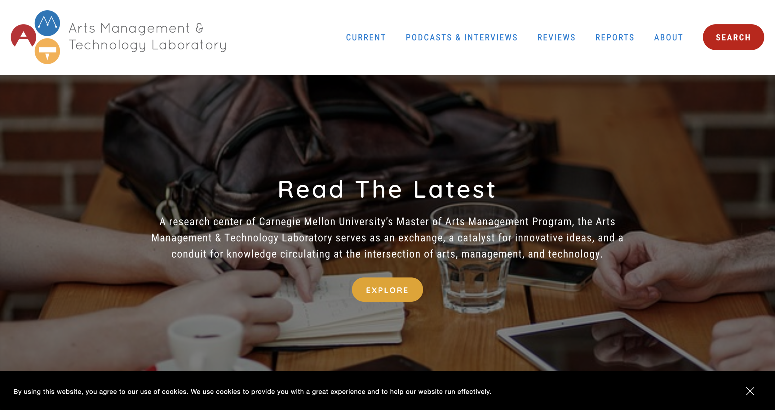
AMT Lab Homepage, May 2019
Redesigned AMT Lab Homepage, September 2019
Project Goals
Understanding AMT Lab’s aspirations for the future was an integral first step in the redesign process. Through conversations with senior staff and feedback from researchers and readers, the following goals for a new site were established:
Increase total time individual users spend on the site
Increase number of interactions (clicks) individual users initiate
Increase readership on the “Publications” section by revisiting its UI design
Improve overall search functionality
Create a new homepage layout that allows for easier navigation between all site elements and better showcases content
Create a more intentional space for podcasts
Method
From a design perspective, it was important to provide options for what AMT Lab could be. In the world of building websites, there’s no absolute solution for design. Best practices for UX and UI design are constantly evolving, and the needs of individuals as users of the Internet do not stay stagnant. My approach to this project was two-fold: I conducted an analysis of the current site’s functionality and used that insight, coupled with the goals for the new site, to develop two beta sites. These beta sites would be presented to various AMT Lab stakeholders for feedback, which would be used to inform the design direction of the new interface.
Analysis of the Current Site
AMT Lab operates through Squarespace, a third-party software provider for website building and hosting. Squarespace customers use pre-built website templates that allow them to customize web pages with drag and drop elements, such as text blocks, images, videos, forms, and custom code. By spending time deconstructing the back end of the current AMT Lab Squarespace site, a few key problem areas were discovered:
The current template did not support site-wide searching options (ie. If a user wanted to search for all articles containing the term “AI,” the site could not retrieve items beyond the current active page.)
Posts were not consistently categorized and tagged, compromising the site’s metadata feeds
Some key elements (ie. “Publications” and “Podcasts”) were buried within pages, finding content required lengthy scrolling time and numerous clicks
Despite these challenge areas, it was ultimately determined that in terms of content (post text, imagery, range of topics covered), the current site was successful.
Wireframing & Beta Site Planning
Samples from the Bedford Template wireframe
Wireframing was an essential step in the design process. Not only did this help me as the designer from a planning standpoint, but it also allowed me to collaborate more effectively with my clients. Wireframing, in its simplest terms, is a tool for designing at a structural level, similar to storyboarding. It lays out content and functionality while taking into account user journeys that connect each web element. Through wireframing, I was able to get my ideas out of my head and communicate them to my client in a way we both understood. Planning for the beta sites was a conversation between client, reader, and designer, rather than trial and error.
Samples from the Rally Template wireframe
Another key step in the planning process was researching Squarespace templates for options that supported the site goals and were highly customizable for Blog Blocks, the main content block AMT Lab uses for readable content.
Prototyping
Two beta sites were built using the Squarespace Rally and Bedford templates. These sites were not complete designs, but rather tools for AMT Lab stakeholders to use to preview updates and changes. Major focus areas of the beta sites included Home Page Layout and UI updates to Publications, Blog Posts, and Podcasts. Through focus group testing, the Bedford template was chosen and implemented for the new iteration of the site.
The Future
Meaningful user-experience design is at the heart of any website. In cultural institutions, websites are often the front-line entity for potential patrons. Websites are gatekeepers to an institution. In the same vein as mission and programming, their design must be curated to fit the specific needs of an audience. For any cultural institution, establishing a common language across all stakeholders, (designer, client, and audience), is key to getting the best outputs from a website design process. Like any project that demands cross-departmental collaboration, finding this language and the right tools to encourage dialogue can be time-consuming and an iterative process. However, the payoffs to both institutions and the communities they serve are invaluable.


