Policies

2008 MUSE Awards Announced

Now in its 19th year, the MUSE awards competition recognizes outstanding achievement in museum media. The competition is an activity of the Media and Technology Standing Professional Committee of the American Association of Museums.

The MUSE Awards competition received nearly 180 applications from a wide variety of museums in North America, Europe, Australia and Asia. Entries included audio, cell phone, and interactive handheld tours, interactive kiosks and multimedia installations, podcasts, blogs, games, websites, online collection and image databases, videos, and e-mail marketing campaigns.

Thirty eight judges – museum and media professionals from across the county – were involved in the process of selecting the winners. Winning entries were expected to demonstrate outstanding achievement in content quality; interface design; functionality; production quality; visual appeal; the user’s experience; and the intent to which new directions were charted or old challenges resolved through technical innovation. A complete list of judging criteria and MUSE Award winners can be found on the Media and Technology website.

Web Usability Notes from TitA: Canada

Josh Futrell and I are sitting in a Web usability workshop at Technology in the Arts: Canada at the moment, and I thought I'd share some notes from the session. The workshop is being led by Robert Barlow-Busch, director of product design at Primal Fusion, a semantic web startup in Waterloo, Ontario, Canada. Robert's overriding thought about usability testing is quite simple but very important: "Observe people using your Web site."

Josh Futrell at TitA: Canada Josh looks please to be learning about usability.

Why conduct usability testing?

  • More useful
  • Easier to use
  • More desirable (more positive emotional responses)

Aside from basic usability testing, Robert also just talked about projective exercises, which determine what type of emotions people attach to your organization. In the session's particular projective exercise, we were asked to imagine that a group of car manufacturer logos were members of a family. Who in the family would each of the logos represent? Robert's point was that this type of activity is more engaging than simply asking, "What do you think about Ford, Chrysler or Volvo?"

By the way, the entire group agreed that Ford was the drunk uncle. Sorry, Ford.

How does this translate to the arts field? An example that Robert presented was for an arts organization to use this type of activity to test how people view the organization's logo in comparison to the logos of other available activities (cinema, zoo, arcade, video games, Netflix, etc.).

Other resources:

The full set of slides from Robert's workshop will be available soon at TechnologyInTheArts.ca.

Master of Your Domain

Seinfeld jokes aside... It is very important for arts organizations to remain masters of their domains. We were recently contacted by a relatively large arts organization that was having trouble accessing their Web site. Each time they tried to access the site, they encountered a message explaining that their domain name registration had expired and that they would have to bid to regain control of the domain.

I thought it would be helpful to explain what a domain name is and why you should never let yours expire.

What is a domain name?

Every site has an Internet Protocol (IP) address that looks like this: 206.187.23.211. However, it would be very cumbersome to always have to say: "Hey, check out my Web site! It's http://206.187.23.211." That's where a domain name comes into play.

A domain name is the memorable name used by most people to identify your Web site. For instance, if you go to http://204.194.30.217, you will get the Artsnet Web site. But it's much easier to ask people to visit "Artsnet.org" than "204.194.30.217."

To register a new domain name, you must use an officially licensed registrar, such as Network Solutions.

What happens when a domain name expires?

When a domain name expires, it is officially up for grabs. If someone were to buy your domain name upon expiration, they would have complete control of that Web address. Basically, three bad things could happen:

  1. They could keep it and never return control to you.
  2. They could charge you an exorbitant amount of money for the domain name.
  3. They could redirect your old Web address to any site or use the address to host a malicious site. Your Web visitors would no longer see your schedule of upcoming performances; rather, they might see pornography - or worse - a George W. Bush fan site!

In fact, there are individuals who earn a living snatching up expired domain names and charging extreme prices for the original owners to regain control.

How does one remain master of his/her domain?

  1. ALL arts organizations should know the name and contact information of their site's domain name registrar. If you don't know this information, you can use a lookup service. For instance, go to the Network Solutions WhoIs page and enter a Web address in the search field. To see the registrar information, click the link labeled "Show underlying registry data for this record."
  2. Set some type of automated reminder for yourself in advance of the domain name expiration date. Many registrars offer this feature, but it's always good to set up your own reminders so you don't miss an alert that has fallen prey to your spam folder.
  3. Create a technology binder for your organization that contains all important information about your organization's internal and external tech operations. This binder should contain information about your Web site (domain registrar, hosting provider, administrative access, etc.), as well as all software and hardware license and maintenance details. TechSoup provides a bit more information on this subject.

If you need assistance obtaining your domain name registrar information, please feel free to contact us.

(Please Note: The 'Seinfeld' image above was used without the permission of Sony Pictures. If they send me a cease and desist order, I will gladly comply. I will also brag about my first official cease and desist order.)

OPEN NOW! - The Power of the Subject Line

Recently, I attended a webinar from Patron Technology on how to effectively use the subject line in e-mail marketing messages. And they should know! Patron Technology, a sponsor of the 2008 Technology in the Arts Conference, has been on e-mail marketing with arts organizations for years with its PatronMail service. Why does the subject line matter?

According to Christine Blodgett at Patron Technology, "The subject line IS the marketing message. It is your first point of contact with an e-mail recipient. If they don't like it, then they won't open it. If they don't open it, then it won't produce the desired effect."

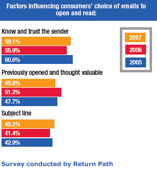
A recent survey conducted by Return Path reveals the subject line to be the third most important factor for determining whether or not someone will open an e-mail marketing message.

So how do can we best harness the power of the subject line?

Make every word matter - When you look at your inbox list, how many words do you typically see in the subject line? Not very many, right? So:

  1. Keep it concise - Under 50 characters (approximately 7 to 10 words)
  2. Pay attention to word placement - Place incentivizing phrases ("Free tickets for.."), time-based phrases ("Last chance to..."), and informative labels ("______ Monthly Bulletin") toward the beginning of the subject line.
  3. Be clear - Tell them what's inside. Make sure the content promised in the subject line is easy to find in the e-mail.
  4. Be honest - DON'T oversell it!
  5. Be consistent - If you have a type of message that you send out on a regular basis (like an e-newsletter), make sure to label them in a consistent way so that recipients will easily recognize them in their Inboxes.

Splog... Sounds Fun, Is Evil

You arts bloggers out there should be on the lookout for a sinister Web prowler known as the "splog," or spam blog.

Splogs automatically lift the content from real blogs to increase their own search engine rankings and generate advertising opportunities.

Wired.com recently release a How-To Wiki for fighting splogs: Read it now.

And Lorelle on WordPress, a blog about blogging, has a post about identifying splogs: Check it out.

Be sure your blog isn't being ripped off by a splog, as it could be detrimental to your site traffic and Google ranking.

1...2...3...Upgrade!

We just upgraded the Technology in the Arts blog to WordPress 2.5 and I'm jazzed. The new version has so many new features back here on the administrative side of things: an auto-save feature, a simpler interface, and access to great plug-ins (or widgets). The process was quick, painless, and transparent to our loyal readers. But, we didn't just trust to luck that it would be so. When performing major system upgrades, here are some rules of thumb I like to follow:

  1. Learn as much as you can beforehand. Does the product have a blog or a press release that will walk you through what's new? Are there any forums or discussions with additional insight about upgrading? Investigating before you upgrade will give you a jump start on the inevitable re-learning you'll need to do and it will also help you to decide whether or not the upgrade is worth doing in the first place.
  2. Backup everything. Is there a chance something could go wrong? Absolutely. So backup everything (or as much as is practical). Before upgrading our blog, we backed up our files and database, just in case.
  3. Put your foot in the water. If you have the ability or the luxury, perform the upgrade in a safe, test environment before applying it to any live or working systems.
  4. Have an escape route. Even if you've tested the upgrade and it worked perfectly, always expect the worst. Have contingency/restore plans in place and the necessary tools and staff at hand should something, Spock forbid, go wrong.
  5. Don't forget about the learning curve. Any upgrade is going to require at least some sort of re-learning on the part of the user. If the upgrade is significant, or if you have many people who are affected by the upgrade, don't forget to spend time developing a training plan before you move forward.

Managing Email

I have recently become interested in - nay, obsessed with - tracking down the most effective way(s) to manage my email inbox, and I wanted to share a couple things that really work for me.

  1. Inbox Zero. Instead of letting my inbox fill up, I process everything at self-established intervals using Merlin Mann's Inbox Zero steps: Delete, Delegate, Respond, Defer and Do. Following these five rules at a regularly scheduled time will ensure a clean inbox. Keep in mind, though... When you choose to defer, you must move that email out of the inbox and create a task for yourself.
  2. Three Folders. I have set up three main email folders: Follow Up, Hold and Archive. When I choose to defer (see above), I simply place the email in the Follow Up folder and create a new task list entry. If I'm waiting on a response before I can complete an item, I place it in the Hold folder. And if I simply need to save the email for future reference, it goes in the Archive folder.
  3. Five Sentences. I try my best to keep email responses to five sentences or less, based on a Web site I discovered a few months ago. Thought I might occasionally run longer, this concept has helped me focus on the structure and purpose of my message: Who am I? What do I want? Why should I get it? When do I want it? I even put a little message about the five sentence philosophy into my email signature so people know I'm being efficient and not rude.

I also noticed recently that Getting Things Done guru David Allen offers a free document, Getting Email Under Control, on his Web site. It isn't groundbreaking, but there are several good ideas and reminders.

How do you keep your email under control?

Creative Commons: Not perfect but it works

Thought I'd give a little teaser on our upcoming podcast interview with independent musician Jonathan Coulton, known by millions of geeks as the guy who wrote the song Still Alive for the award-winning console game Portal. Jonathan Coulton

Coulton will be featured in Technology in the Arts Podcast episode 38 (to be published Friday, March 14) talking about how he's used Creative Commons and other online practices to build a rabid and connected fan base.

Creative Commons, Coulton explains, allows an artist to apply a standard copyright and then scale back the restrictions. While many musicians and record executives are trying to find ways to lock down their songs, Coulton has found a way to make money giving his music away for free.*

Coulton, and others like him, understand that once you establish a fan community hundreds of thousands strong who are deeply connected to your work, you'll have no problem paying your bills. And Coulton certainly likes people to pay if they can... After all, he has a family to support.

Check out our upcoming podcast for the full Coulton interview, and check out Coulton's songs here.

So what do you think? Can free work for musicians? Should musicians run their own careers?

*Free is fine, but you can also support Coulton's work. Find out how.

Library of Congress Partners With Flickr

The U.S. Library of Congress has formed a partnership with the photo-sharing site Flickr to make more than 3,000 historical photographs from accessible to the public. As reported in a recent issue of Avisio from the American Association of Museums, "The photographs are from two of the Library of Congress's most popular collections, the George Gratham Bain News Service and the Farm Security Administration/Office of War Information. They include high-resolution images—with no known copyright restrictions—of newsworthy events in the 1910s and color photographs from the 1930s and 1940s." The collection is housed in an area of Flickr called The Commons, wherein the site claims, "These beautiful, historic pictures from the Library represent materials for which the Library is not the intellectual property owner. Flickr is working with the Library of Congress to provide an appropriate statement for these materials. It's called 'no known copyright restrictions.' Hopefully, this pilot can be used as a model that other cultural institutions would pick up, to share and redistribute the myriad collections held by cultural heritage institutions all over the world."

It will certainly be interesting which cultural institutions choose to make their photo collections available through The Commons. As many institutions derive revenue from granting permission to use their photographs for a fee, I wonder to what degree this project will take off beyond the Library of Congress...

Shame on You, User!

Interesting little piece on AppScout.com today featuring highlights from Kyle Monson's interview with Google's user experience designer, Jon Wiley. The bit I found most intriguing is that Wiley discussed user feelings related to unintuitive Web user interfaces (UIs). According to Monson, Wiley mentioned that a frustrating UI can make a user feel bad about him/herself. Often in the design phase, there isn't much thought that goes into the psychological effects of a Web page or navigation, and I think this is another layer that deserves consideration.

This is especially true for arts organizations that typically have an aging constituent base. Do you really want to make someone feel ashamed that they can't figure out your online ticketing system?

An example Google UI:

All of my options are right in front of me and fairly clear.

An example of a bad UI:

No, I do NOT not wish to NOT unsubscribe... what?

Read the full AppScout entry.