As arts administrators we often ask ourselves how we can more deeply engage with our audiences. Museums have been at the forefront of this movement, offering hosts of hands-on activities to supplement the visitor’s experience and help them connect to the art. With the Knight Foundation’s recent $5m endorsement of art and technology in Philadelphia Museums, it becomes clear that technology can play a big role in shaping visitors’ experiences. And what better way to spend a dreary afternoon than in the Carnegie Museum of Art taking a look at how the museum’s Gallery Guide, its mobile app created in 2016, can transform the experience of visiting the museum?
In spring of 2017 AMT Lab contributor Kara Post created a Museum App blueprint that establishes a set of standards to consider when designing or evaluating a museum application for the enhancement of the visitor’s experience. While the role of technology in regards to the museum experience has been debated continuously in the context of the arts industry, this model provides a more objective framework for evaluating CMOA’s Gallery Guide.
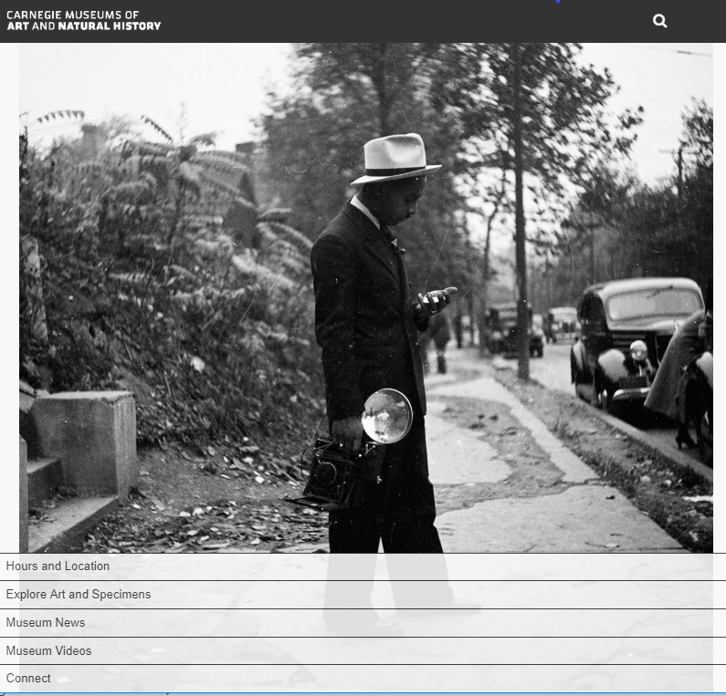
Screenshot of Gallery Guide home page
Navigation
Central to a positive visitor experience is the ability for guests to quickly locate where exhibits and amenities are in the space. In the app’s Gallery Guide, under “Hours and Location” on the home page, an imbedded map pinpoints Carnegie Museum and Carnegie Museum of Natural History. It also lists the museum’s hours of operation and conveniently tells the user whether it is open at the current time. However, the map does not identify the visitor’s current location or lay out the exhibits. Therefore, while the app helps facilitate a successful trip to the museum, it does not assist in navigating the exhibits on site.
Screenshot of Hours and Location portal
Interactive Features
This portal on an app can allow visitors to engage with the curations in an activity-based manner. From the home page, the “Museum News” and “Museum Videos” are curations of the Carnegie Museum’s exciting and recent updates regarding events, installations, and acquisitions. The blueprint recommends personalized games and tours, as well as integrated social networking platforms, neither of which Gallery Guide offers. Considering this best practice, there are opportunities for CMOA to provide more interactive content to engage its visitors via the app.
Screenshot of Museum News portal
Screenshot of Museum Videos portal
Descriptions of Artwork
Digital artwork descriptions are arguably the best way for a museum to add supplementary content to its exhibits. The CMOA’s “Explore Art and Specimens” selection is curated specifically around the museum’s exhibits. “Collection Highlights” portal is where the gallery content lives, divided into two categories, objects and tours. The objects page is a compilation of all the pieces that make up the three available tours. As you’d expect, the tours page is the component that guides the visitor through the gallery.
Screenshot of the Explore Art and Specimens portal
Screenshot of the Collection Highlights portal
Screenshot of available tours under Collection Highlights portal
For specificity, the app’s Impressionist tour consists of five paintings selected by the Associate Curator. Each painting has a separate page with basic information on the work, along with around two minutes of commentary by the curator. Although I had to locate the paintings myself, the app’s audio content was much more engaging than reading the museum labels. The audio commentary was fascinating, revealing techniques the artist used, how the piece fit its period, and observations one might find interesting.
Screenshot of pieces of art curated for Impressionism tour
Sample view of individual work of art covered by the tour
While I enjoyed the commentary that the app provided, I felt more attached to my phone than usual. I also felt as if I was spending more time finding the painting I was supposed to be looking at than going to whatever painting compelled me, and the tour only addressed five works in the Impressionist collection. The app’s object codes feature can be used to find a particular painting on the platform. However, most works of art do not have a code.
The app, underdeveloped now in this regard, could be a great resource in the future if most works were catalogued, either by utilizing the current system of codes or by implementing a QR code system.
Required Settings
An app’s settings are important because they dictate who can and can’t use the app. Although only available for iOS operating systems, I easily connected to wireless and could access the webpage with all the content. Considering the fact that a great deal of arts institutions struggle with providing stable public WiFi, this is a huge plus. Although the app has a search bar, it is limited to artwork coding as mentioned above. The app also lacks accessibility features and a help page. The app is easy to access but could use more features to make usability more streamlined.
I found CMOA’s Gallery Guide, when artworks were catalogued, to be a great supplement to my experience of navigating the Scaife Galleries. It can also be a great resource for planning a trip to the museum or effortlessly browsing museum news and videos inside or outside of the museum building. While several features can be further developed, the Gallery Guide is a good start in using technology to synthesize museum-specific resources for the visitor and in some cases increase overall engagement with the art.


