There has been a lot of buzz lately about mobile technology with the release of mobile apps by some major museums like MoMA, The Brooklyn Museum, and the Museum of Natural History. Reviews have been mixed, but the discussion about the way mobile technology should be used in museums has definitely picked up speed.
The popular view of mobile technology seems to be focused (a little too much?) on one main format - having a downloadable, mobile application. While developing your own app can be a good way to deliver content to your visitors, it is definitely not the only approach. I decided to take a look at four different ways that some museums have been experimenting and implementing mobile tech in their institutions.
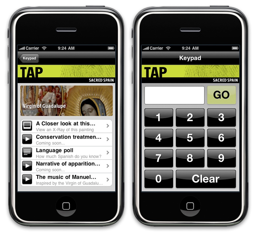
- The TAP home screen and numeric input screen. via the Indianapolis Museum of Art blog
Providing not just an app, but also the device itself - TAP at The Indianapolis Museum of Art
The IMA wanted to include all their visitors in their mobile tech program, not just those who own a smartphone. So they took the extra step of providing gallery goers with an iPod Touch for the duration of their visit. By placing the device in the visitor’s hands, everyone has access to the digital content the IMA provides and no user is alienated for not owning or having an incorrect mobile device.
The iPods cost five dollars to rent and only contain the TAP app and an instructional video on how to use both the iPod and the app in tandem with the galleries. The app works on a numeric input system, a 3-digit code is associated with every piece in the tour that presents users with different content such as video interviews with artists, text files, pictures, and audio files explaining the artwork.
By sticking to one type of device, the IMA was able to tailor the user experience exactly the way they wanted, which was their main goal for developing a mobile program. This approach circumvents the need for an app store and allows for all content to be controlled in-house. The content management system is the same one used for their website and allows IMA to instantly edit and update their content without needing to go through a third-party developer. The devices also have built-in polls and can provide both museum staff and TAP users with the real-time results.
Visit the IMA’s blog to check out the development process of the Tap Program and some of their ideas about developing a successful mobile standard for museums.
Integrating mobile websites and mobile apps: The Brooklyn Museum
A mobile website is the mobile-friendly version of an organization’s existing website. In a recent post, we examined the differences between mobile websites and mobile applications.
The Brooklyn Museum has developed a mobile website that is accessible from any web-enabled mobile device. In addition to sharing information about the institution, users are encouraged to get involved by recommending pieces of art work and apply descriptive tags through the Brknlynmuse and Gallery tag! features of the mobile website.
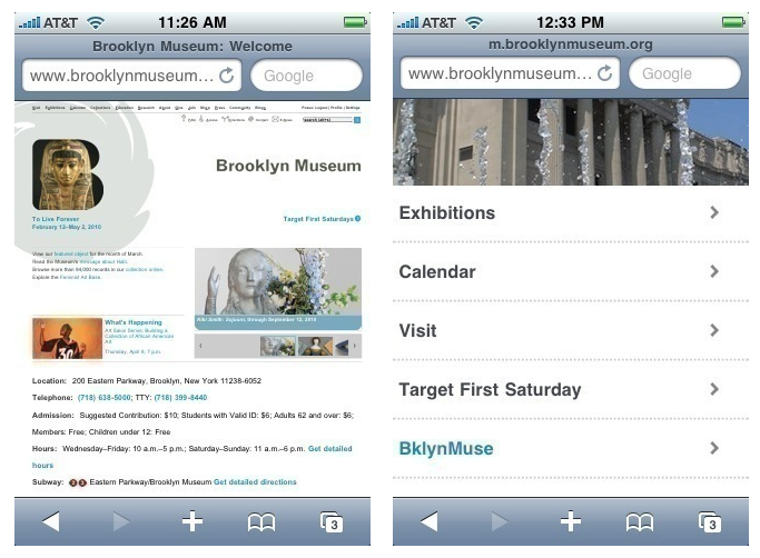
- Brooklyn Museum's main website (left) and their mobile site (right). Via the Brooklyn Museum blog
To create a more accessible experience for those with more app-friendly devices, Brooklyn Museum also created downloadable apps for both iPhone and Android that simply wrap the current mobile website. The same functionality and features of the mobile site are there, the apps just act as a different port of entry. This has proven to be a more sustainable approach to their mobile strategy than building each app up from scratch.
You can find more info on Brooklyn Museum’s blog for their approach to their mobile website and their mobile applications.
Connecting to content with QR codes: The Mattress Factory

The Mattress Factory, an installation art museum in Pittsburgh, has been experimenting with implementing QR codes in their exhibits in an effort to reduce the number of brochures in their museum as part of a green initiative. QR stands for “Quick Response”, connecting users to content within seconds of scanning the code with your phone. A QR code is a two-dimensional barcode that is readable by mobile devices with 3G access, a built-in camera and a barcode reading app.
A developer is not required to create QR codes; and with this method, a museum can start immediately experimenting with mobile technology.
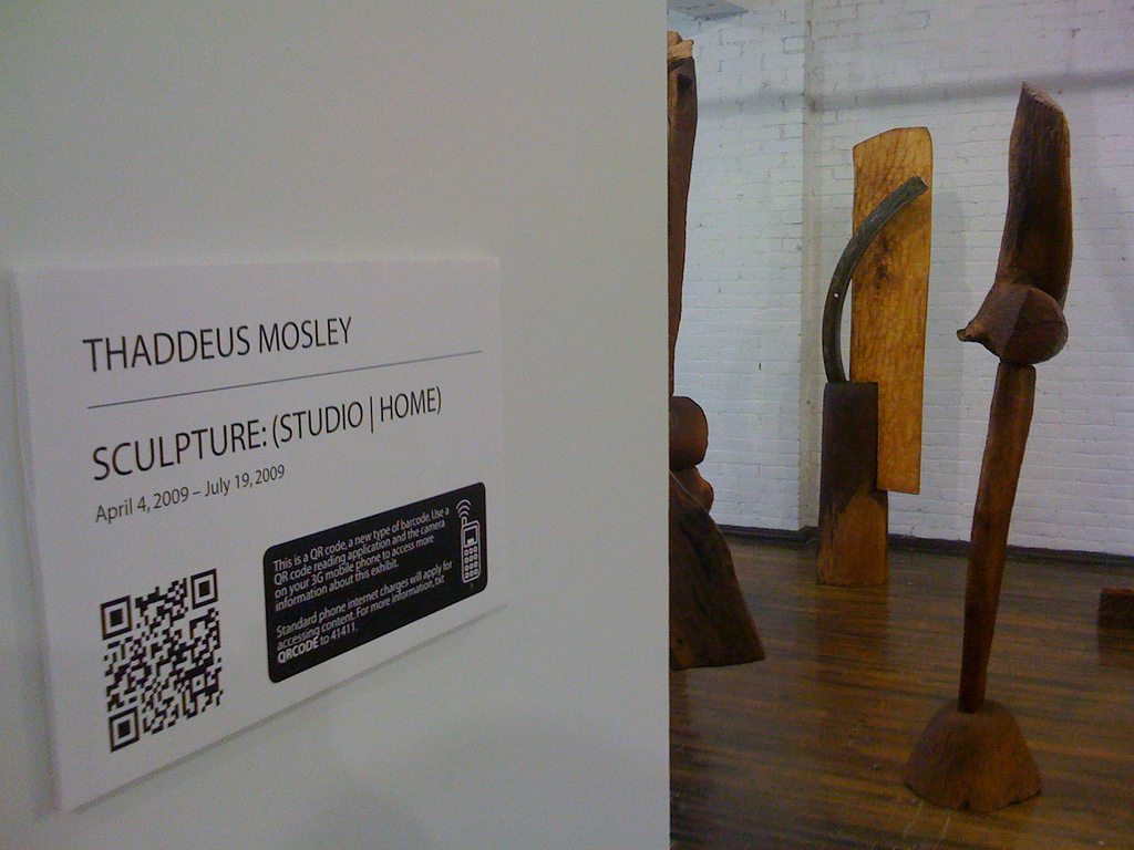
- QR code placement in the Mattress Factory's exhibition space. via the Mattress Factory blog.
The codes are free to generate and contain text information. Once you generate a code online, it can be printed out and placed next to the piece in your collection. For more media based content such as pictures, audio and video, the content must be uploaded to sites like YouTube or Flickr. The QR code will link users directly to that content.
More info on the Mattress Factory’s use of QR codes can be found on the Mattress Factory blog.
Taking advantage of an existing app: Augmented Reality with the Andy Warhol Museum
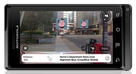
Augmented Reality (AR) refers to using a mobile device to view digital images overlaid onto real locations. AR apps use a smartphone’s built-in camera and GPS to identify where the user is and overlays the content for that location.
-
Warhol, Warhol, Everywhere! A typical street view using the Andy Warhol layer. Via the Andy Warhol Museum.
The Andy Warhol Museum’s AR layer places images of Andy Warhol’s face over real-world locations in Pittsburgh and New York that were historically relevant to his life. Touching each icon provides users with pictures of artwork and/or content associated with each location and the way it played a part in Warhol’s career. The Andy Warhol AR project is not an app itself, but a filter layer that is installed on an existing AR app called Layar, available for Android devices and iPhones.
You can find some more info on the Andy Warhol AR project here and how to create your own AR layers here.
So where does your organization weigh in? We would love to see some your opinions in the comments section of what you feel are some of the advantages and disadvantages of these approaches. What would most influence your organization’s approach to mobile technology?
Related Posts: Museums and the Web 2011: Thomas's Recap The State of the Mobile: The 2011 Museum & Mobile Survey
