


We are surrounded by data, making it difficult to figure out where to begin, let alone how to analyze or use the information. New tools and resources are regularly being introduced, and AMT-Lab writers frequently research data analysis – check out Katherine Schouten’s post “So you’ve got some data…now what?” and Kristen Sorek West’s post on using dashboards. The ability to create a useful dashboard is an important step to effectively analyzing and interpreting your data. Dashboards enable users to save time with a quick reference feeding from key metrics and data sources. While it takes some effort to initially learn the system and set up the best model for your organization, dashboards save significant time later and are very effective for daily monitoring and providing quantitative support for key decisions.
Sparkwise is one of many data visualization tools allowing users to build dashboards, but was actually designed with nonprofit organizations in mind. The free web-based system is particularly useful for low-budget organizations or those just beginning to apply data analytics. The simple interface and focused metric selection provides an easy introduction to visually presenting data. The Sparkwise Wise Start Guide is a great resource, with steps for using data to tell and visualize a story alongside best practices for defining goals and applying metrics towards data-driven decisions.
Integrate Existing Data
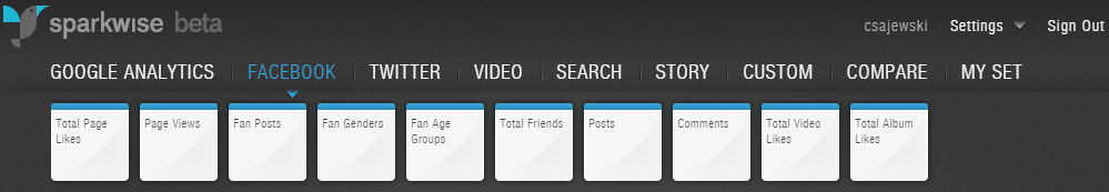
Sparkwise supports integration across data sources that already exist for most organizations including Google, Facebook, Twitter, and YouTube accounts. Integrating information from multiple channels increases the dashboard’s effectiveness by supporting side-by-side comparison. Metrics are added through a simple drag-and-drop function, and then each “widget” can be customized or arranged around the dashboard.
Sparkwise includes versatile widgets for monitoring data from other sources as well. Web and news search widgets track keywords by total or percent change over a specified period. Widgets from other sources such as Kickstarter are also supported, or users can manually enter data into tables and charts through Google spreadsheets.
Create Customized Boards
Users can create storyboards from dashboards with customized text, logos, images, and videos and then publish the board to the web or social media. Such tools would be especially effective for a fundraising campaign to build support with real-time updates and calls to action, or as an interactive visualization for presenting information to a board of directors.

Future Developments
Sparkwise is in beta, so the developers are still making improvements. When adding a widget, it is not always clear what the tool is measuring, leading to trial and error, and there are some limitations to the customizable features. Additionally, when first setting up the system, the introductory guides cannot be accessed from within the dashboard. While a user may design different dashboards for different program aspects or metrics, the dashboards must be accessed and created under one account. Still, as the company continues to improve the site’s functionality, this will be an excellent resource for nonprofit organizations.
In its current beta mode, Sparkwise is best for organizations with some experience looking at Google and social media analytics. The free software is great for small organizations with limited time who want to begin making data-informed decisions. By harnessing the power of dashboards, Sparkwise can help organizations begin to build a data-informed culture in which measurement becomes as essential element of work company-wide.