Designing a disability-friendly website that works for people with all kinds of different needs can be a challenge for any organization. Below are six areas that are quick considerations to improve the accessibility of a website. Many times arts organizations don't feel that they have the time or money to even step into the realm of accessibility. Yet many of the steps below could be done today with no additional expense. With this ease of implementation, arts organizations also need to consider web design that meets the minimum standard of Web Content Accessibility Guidelines 2.0 (WCAG).
WCAG 2.0 are a series of guidelines for improving web accessibility that allow patrons with disabilities interact successfully with the website on their own. WCAG 2.0 are organized into three levels of conformance: 1. Level A – meets the most basic web accessibility features, 2. Level AA – deals with the biggest and most common barriers for disabled users, and 3. Level AAA – meets the highest level of web accessibility. To achieve at the Level AA and Level AAA of WCAG 2.0 standards, arts organizations should keep in mind the following concepts when designing a website.
1. Don’t use colors as the only visual means of conveying information.
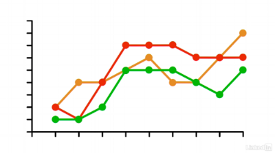
Imaging visualizing the outcome of an arts program in your organization using the graph above. What would this look like to someone who is colorblind? They have difficulty distinguishing which curve refers to which data. Color blind people will see a graph like the following image:
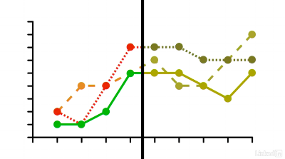
From this simple illustration, it is clear that good web design should not have information that is conveyed solely by colors. It should use at least three different methods such as different shapes, patterns, text, or labels to present the information. The following graph shows how different patterns can make curves distinguishable.
2. Ensure the contrast ratio between the text and the background is at least 4.5:1 for normal text and 3:1 for large text.
Contrast ratio is the ratio calculated from the foreground and background color in the RGB hexadecimal format. Checking contrast ratio of texts can help specific learning disabilities such as dyslexia, dysgraphia, visual processing disorder, and visually impaired people with low vision and color blindness. In order to test colors that you have already chosen, one great tools is the WebAIM’s Color Contrast Checker.
Source: WebAIM’s Color Contrast Checker
The above image shows that the contrast ratio for this color setting is 5.19:1. This setting passes three of the WCAG standards, but it does not pass the WCAG AAA standard for the normal text. Arts organizations can also generate a new color palette through Color Safe to meet the WCAG standards.
3. It must be possible for all tasks to be completed using a keyboard.
Source: Pixabay
Some people with mobility challenges or issues with dyspraxia are not able to use the mouse. In addition, visually impaired people are not able to see the screen, and they also need assistive technologies like the speech recognition software. Therefore, these visitors need to use a keyboard to navigate through the page. You can test your website’s keyboard navigation by going to the homepage and pressing “tab” on the keyboard. Doing this will show an arts organization if each hit progresses the cursor through the page appropriately.
4. Make sure that the most commonly used assistive technologies work on the website.
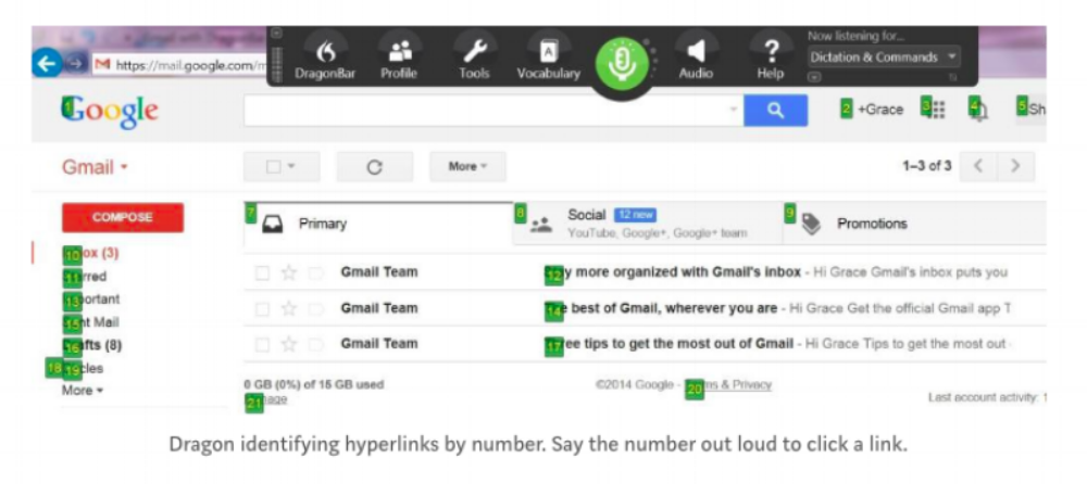
The most basic and commonly used assistive technologies include screen magnifiers, screen readers, and speech recognition tools like Dragon NaturallySpeaking. As the following image shows, Dragon NaturallySpeaking identifies hyperlinks by number. And users speak the number out loud to click a link.
Source: Author Screen Shot from Medium
In addition, there are a lot of web design practices for assistive technologies to work. For instance, arts organizations can provide alt text for all images on their websites. Alt texts are the little pop-up words when your cursor point to the image. For website visitors who use a screen reader, alt text is the only way to inform them about the image because the screen reader cannot obtain the information from merely the image.
5. Increase the images and multimedia accessibility.
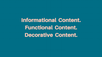
Source: Author created by Canva
Whether talking about images, interactive, audio, or video content, the type of content needs to be decided from the beginning. To elaborate, there are three types of website content: informational content, functional content, and decorative content. Informational content is where the most important information is contained. On the other hand, some content is categorized as functional. This content includes links, form controls, website navigation, or tasks within the browser. The final type of content is decorative content, which is not really that important to the page. Arts organizations have to keep in mind that both the informational content and the functional content need text equivalents, while the decorative content does not.
6. Set organized content hierarchy and a clear page title.
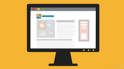
A clear paragraph title can make the assistive technology respond quicker to the command.
Source: Author Screen Shot from LinkedIn Learning
Assistive technologies can easily read the headline or just the first sentence of the paragraph. Therefore, it is important to make sure the headline structure is matching the content. The page title consists of words displayed in the browser’s title bar. This is critical because it is the first thing that the screen reader announces.
Experts in accessibility recommend creating the title that read from specific to general. For instance, title that reads “Augustin Hadelich Returns – Heinz Hall – Pittsburgh Symphony Orchestra” would be a better title than “Pittsburgh Symphony Orchestra – Heinz Hall – Augustin Hadelich Returns” because the former enables people to confirm quicker that they are where they want to be.
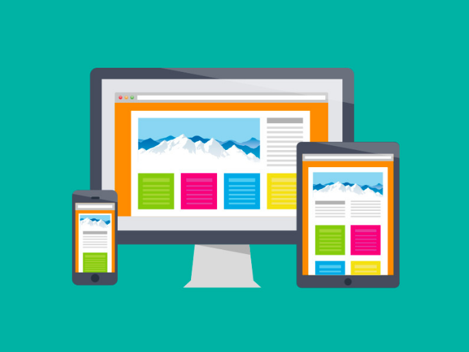
There are many interesting topics to explore regarding the WCAG compliance. For example, businesses have their standard for the target button size, varying from 34x34 pixels for Microsoft, 44x44 for Apple, and 48x48 for Google. Responsive design for mobile, tablet, and desktop have great benefits for people with learning disabilities as well. Lastly, forms that have large response areas are easier for people of any ability to fill in. All of these topics are worth thinking about as arts managers. Most importantly, don’t forget to test any improvements to accessibility with members of the population you are trying to assist!
Resources:
Coburn, Jess. “5 Steps to Make Your Website Accessible and Avoid a WCAG Lawsuit.” Applied Innovations. Accessed April 28, 2018. https://www.appliedi.net/blog/5-steps-to-make-your-website-accessible-and-avoid- a-wcag-lawsuit/.
Hausler, Jesse. “7 Things Every Designer Needs to Know about Accessibility.” Medium. April 15, 2015. Accessed April 28, 2018. https://medium.com/salesforce-ux/7-things-every-designer-needs-to-know-about- accessibility-64f105f0881b.
Desta, Yohana. “9 Simple Tips for Making Your Website Disability-Friendly.” Mashable. April 22, 2014. Accessed April 28, 2018. https://mashable.com/2014/04/22/website-disability-friendly/#8m7XizvtKPq2.
Anderson, Shaun. “How to Design Websites for Blind/Visually Impaired, Deaf, Disabled & Dyslexic Visitors.” Hobo UK SEO Services. April 4, 2018. Accessed April 28, 2018. https://www.hobo-web.co.uk/design-website-for-blind/#accessible-website-design.
“Federal Social Media Accessibility Toolkit Hackpad.” DIGITALGOV. December 6, 2017. Accessed April 28,2018. https://www.digitalgov.gov/resources/federal-social-media-accessibility-toolkit- hackpad/.
Featherstone, Derek. “Accessibility for Web Design.” LinkedIn Learning. January 11, 2018. Accessed April 28, 2018. https://www.linkedin.com/learning/accessibility-for-web-design/next-steps.
“What are the Web Content Accessibility Guidelines?” WUHCAG. Accessed April 28, 2018. https://www.wuhcag.com/web-content-accessibility-guidelines/.
Diamond, Shayna. “Barrier-Free Website Design: Creating Accessible Sites.” Scitent. February 24, 2016. Accessed April 28, 2018. https://www.scitent.com/2016/02/24/barrier-free-website-design-creating- accessible-sites/.

