

What art museums do you know with great websites? The Walker Art Center? MoMA? Can you name any that do not focus on contemporary or modern collections?
Spoiler alert: I can - the Rijksmuseum.Yes, I am on a Rijksmuseum kick.
In honor of the Rijksmuseum’s gorgeous restoration, let’s talk about how an art museum with an extensive traditional collection can successfully leverage good website design. I would argue that a contemporary or modern collection is not a prerequisite for an engaging website.
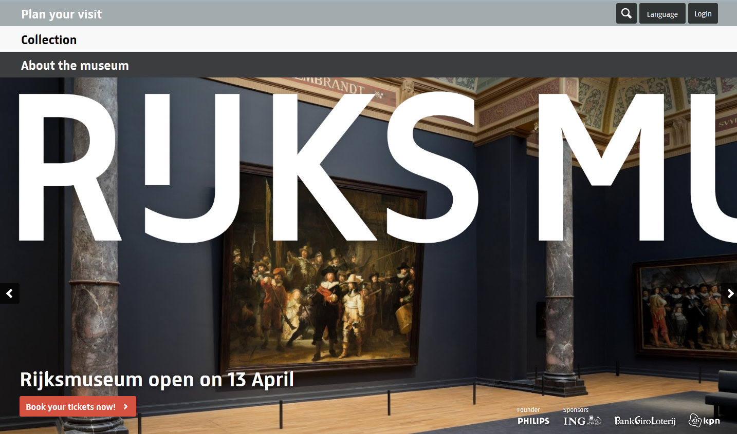
The Rijksmuseum is no stranger to blending their historic values with modern aesthetics. Their renovated space presents the collection in an entirely new way - with only Rembrandt’s The Night Watch returning to its original position. This aesthetic is also clearly visible on their website.
rijkswebpage
The Rijksmuseum website is sophisticated, functionality wise (we’ve talked about how great Rijksstudio is before). The look is stylish yet mature, and appropriate for the collection it reflects (highlights of which appear in a rotating banner on the landing page). The three navigation bars convey appropriate and necessary information in a simple layout that does not feel simplistic. Perhaps the only criticism I can offer is a lack of centralized navigation - there’s no one location for all the links on every page. But, I am an adult and can use the back button and found the page easy to navigate.
Even as the renovation of the Rijksmuseum is an even further return to “tradition” - original ceiling arches have been restored, the original mosaic floors uncovered - their website stands as a wonderful example of what a museum website should be. It’s easy to navigate, visually appealing, and represents who the museum really is. So check it out - and if you're in Amsterdam, get tickets to their reopening, April 13, 2013.
Can you think of any other museums with great websites?