A digital oil painting of Santa Maria della Salute by Charles W. Bailey, Jr. demonstrates the versatility of digital drawing apps.
The museum of the 21st century is embedded in its community, it is intent on creating purposeful learning opportunities, and it is focused on audience engagement and experiences. As such, museums are well equipped to provide informal learning opportunities for their communities, including hosting exhibits and experiences that are visitor-centric and actively engage audiences.
The 21st century has seen a dramatic increase in digital media, including virtual reality, 3D printing, and digital drawing. Artists like David Hockney, for example, are creating fabulous work using just an iPad. Furthermore, the ubiquity of smart phones and tablets in today’s society means that virtually anybody can try their hand at digital-based art. Consequently, the multitude of digital drawing apps open up some exciting audience engagement possibilities, and have the potential to be extremely useful in museums. These apps could be used to accompany the growing field of digital art exhibitions and to provide informal learning opportunities that allow visitors to engage with exhibits in a more thoughtful manner, ultimately creating deeper connections with the work on display.
In order to test the applicability of digital drawing apps as a potential audience engagement activity in museums, I decided to do a side-by-side comparison of two drawing apps. As an iPhone user, I chose to test Adobe Illustrator Draw and Autodesk SketchBook since both come highly rated by users and are iPhone compatible.
Before I delve into my digital drawing escapade, I must first disclose that I am a novice when it comes to digital drawing and therefore do not own any digital drawing tools such as stylus or touchpad. Someone who is accustomed to using these ancillary tools or who regularly draws in a digital format may have a different experience than I did. Second, in order to evaluate the apps in an objective manner, I constructed a list of criteria that I identified as central to the drawing experience and overall usability of the apps for a wide audience. These criteria are as follows:
1. Is the app easy to use?
2. Does the app include a variety of functions?
3. How does the drawing experience compare to traditional sketching?
4. Can users make a finished drawing, or only produce a sketch?
Criteria in hand, I set out to test the apps, starting with Illustrator Draw. Here is what I found.
Adobe Illustrator Draw
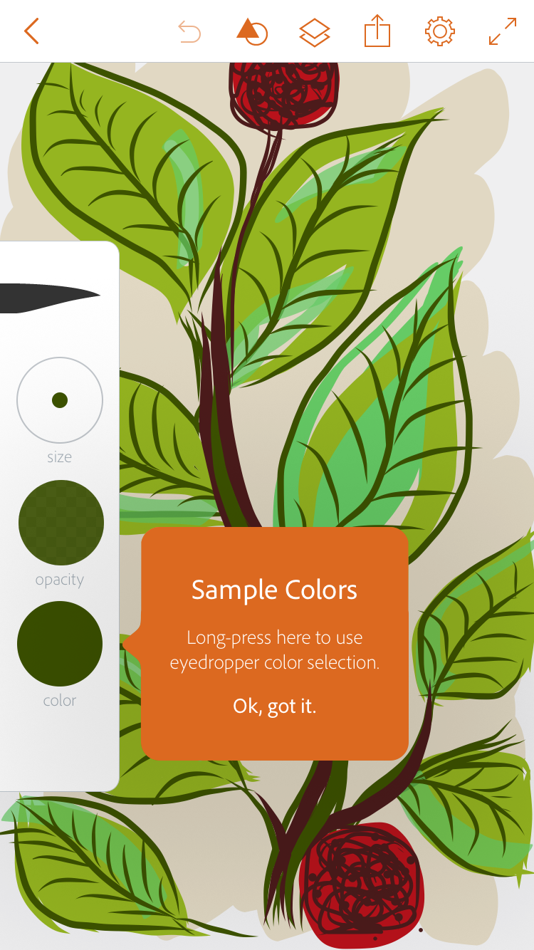
This app is clean, simple, and well designed, making it quite easy to use. Upon downloading Illustrator Draw, users receive instructions about the various tools and their uses from several pop-up prompts. While a user could likely determine how to use the app on their own, these prompts provide tips that enhance the app’s usability. The app’s navigation system is straightforward, as it is easy to switch between tools, save projects, and view and select past projects. Additionally, Illustrator Draw functions in a way that is intuitive to Apple users. Many of the app’s functions are controlled by actions that Apple users are accustomed to using on a daily basis, such as swiping, sliding, or tapping the fingers. The simple design means these features operate exactly as expected, no surprises. However, it is disappointing that the eraser is so inflexible, since users cannot change the shape in order to achieve different types of marks.
Pop-up windows offer advice to enhance the app's usability; additionally, the app's features are simple and easy to navigate.
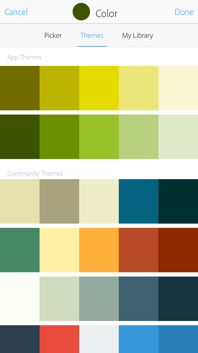
In terms of variety of features and functions, again, simplicity is key with this app. It does not contain many special features, but instead sticks to the basics: brushes and colors. There are 4 brush shapes to choose from, which can then be adjusted by size and opacity. Users can also select virtually any color, picking from a color wheel, or choose from various preselected themes – which is pretty nice. One feature that really stood out is the app’s use of layers, which is similar to Photoshop. This lets users switch between layers to add something on top of or underneath a drawing, while also providing the option to turn layers off and work on one at a time.
Added features include a "layers" function and preselected color themes; furthermore, toggling back and forth between projects is simple and straightforward.
In comparison to a traditional 2D drawing experience, Adobe Illustrator feels like a different medium. On one hand, the simplicity of the app mimics the traditional sketching experience (which is really as simple as putting pen to paper), rather than attempting to embellish it with too many bells and whistles. On the other hand, it is difficult to draw fine details, and techniques like shading require a more experienced hand. However, the drawing experience itself is enjoyable. Sometimes it is difficult to create smooth lines using digital drawing tools, but Illustrator Draw anticipates users’ movements and creates lines that are elegant.
While I imagine that some people are very talented at this type of drawing (I’ve seen some really stunning examples), for average users like myself it is more of a preliminary drawing tool. One extremely useful feature is that each project can be exported as a vector file to Adobe Illustrator or Photoshop, so users can continue to work from the drawing later on. This makes it a handy tool for digitally-based creative work, such as logo design. Projects can also be shared via email or text, which is an important consideration for interactive displays in museums since it allows visitors to take their drawing home as a memento from the museum.
Autodesk SketchBook
Autodesk SketchBook, like Adobe Illustrator Draw, offers a variety of tools and colors that allow users to make a range of marks on a blank workbook. However, its interface design is confusing at times and not entirely intuitive, making it difficult to navigate or perform simple functions like changing the size, opacity, and color of the tools without seeking help. The most challenging aspect is the undo feature: in order to get rid of previous marks, users must double tap the bottom left corner in one particular spot – which means it’s pretty easy to miss, ultimately creating twice as much work for the user. Since digital drawing tools can be slightly awkward to use in the first place, having a streamlined undo function is fundamental.
The app offers a variety of features and tools. However certain functions, like changing the size or opacity of the brushes, are not user-friendly.
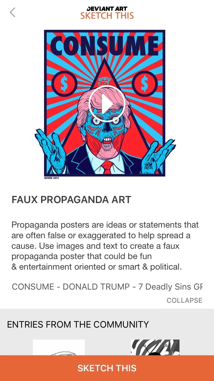
That said, what SketchBook lacks in functionality and intuition it makes up for in variety. This app has an incredible selection of tools and extra features, including multiple pens and brushes, shape, symmetry, and text tools, and layers. As such, SketchBook primarily functions as a drawing tool (as opposed to watercolor or painting, which some drawing apps offer), but it is extremely versatile in the types of marks it offers. This versatility offers more flexibility in the ability to create a finished product, which users then have the option to share via email or text. My favorite added feature is the “Sketch This” function: users select a challenge, such as “Faux Propaganda Art”, then submit their drawing to a community “gallery”. As an interactive tool, this would be a great way for museum visitors to engage with one another and see how others are interacting with the exhibit.
The "Sketch This" feature allows users to engage with one another in a community gallery.
The drawing experience, while fun, was also slightly frustrating because of the design of the app. Attempting to toggle between different sizes, colors, and opacity levels was challenging; I often simply gave up and selected a different tool. For this reason, the overall experience is very different from traditional drawing. Whereas drawing on paper is perhaps the most simple and intuitive of art forms, attempting to produce a drawing using SketchBook is, at times, unnecessarily complex. This detracts from the drawing experience, since it is difficult to execute an idea. Furthermore, the actual quality of the marks lacks refinement, causing the overall aesthetic to look slightly unpolished. While this is in part due to my lack of expertise, it also makes the app less inviting to new users.
The Verdict
While digital drawing is similar to 2D drawing in concept, in many ways it is a unique creative experience that has its own assets and challenges (summarized in the chart below). I was impressed with the versatility of both Adobe Illustrator Draw and Autodesk SketchBook, and in the end was pleasantly surprised by how much I enjoyed creating something on my phone. I particularly enjoyed working with Adobe Illustrator Draw because of the simplicity of the design and the intuitive nature.
Personal preferences aside, both apps allow users to create digital content in a way that is customizable, engaging, and fun. As such, digital drawing apps as a whole represent a creative opportunity for museums to incorporate digital interactive activities into exhibits in order to promote audience engagement on a deeper level. For example, museums could use digital drawing apps to encourage visitors to make associations between pieces in an exhibit, and then synthesize these connections into a one-of-a-kind digital drawing. Furthermore, features such as “Sketch This” in Autodesk SketchBook present a fantastic opportunity for community engagement, since they allow users to view and interact with other users’ drawings throughout the course of an exhibit.
Finally, since digital drawing apps often market themselves as a replacement for sketching, it is crucial to have similarities between the two experiences. This is an especially important consideration for museums in determining whether a particular app would be applicable as an audience engagement activity: most visitors intuitively know how to draw, but if the app requires learners to be familiar with the software, it will discourage engagement and possibly even lead to frustrated users. An app that caters to a wide variety of experience levels and requires little explanation, such Illustrator Draw, would be most applicable. In all, digital drawing is a delightful experience that allows users to engage on multiple levels; used in the right context, it could make for a great audience engagement activity in museums.
Banner image by Charles W. Bailey, Jr., licensed under Creative Commons. No changes were made to the image.


