


The Metropolitan Museum of Art's New Logo
On the eve of unveiling The Met Breuer, The Metropolitan Museum of Art held an event announcing a dramatic redesign of its branding and iconic logo. An initial backlash to any such transformational change is inevitable, but The Met received a real lashing. Used since 1971, the previous logo, an iconic “M,” has been replaced with the museum’s longtime nickname, “THE MET,” with each letter sitting upon each other in bright red fashion.
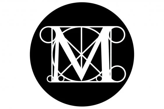
The former Met logo
In overhauling its graphic identity, The Met’s updated visuals are meant to make the collection, buildings, and image more navigable and consistent. With this more streamlined style, which The Met was previously lacking, their identity on all signage, digital platforms, and informational materials will now be one in the same. Wolff Olins, an international brand consultancy, spent two years rejuvenating the museum’s image, and aimed for a modern, clean-cut look that drove a connection between The Met Fifth Avenue, The Met Cloisters, and The Met Breuer.
Susan Sellers, the museum’s head of design, was recently interviewed by Wired’s Margaret Rhodes and took the chance to discuss her reasoning behind the 146-year-old museum’s new identity. “The way we spoke to the public was very fractured,” said Sellers. “There was no single way The Met represented itself. There were just a lot of legacy systems that were overlapping and oftentimes contradictory.”
Rebranding a museum’s identity is not something to be judged quickly. It takes time to ingrain a new identity into the the journey between a collection and a viewer’s insight. The Met has brought their patrons into this design, calling for feedback and opinions, and has succeeded in being transparent as their website, app, and other digital platforms have received a much needed overhaul bringing them into this technological age.
Rebranding can be a slippery slope. Your passionate fans can easily rip you to shreds or praise you with one click of a button, but this should not deter you or your organization. If anything, it should compel you to push harder for an identity that truly evokes your brand and makes a connection with your patrons. Streamlining your appeal and revitalizing your look can help your audience better understand why your organization resonates with them.
What Do I Think About The Met’s New Identity?
I, for one, am all for a solid rebranding strategy that follows the mission of an organization and does not compromise the brand’s relevancy in the arts market. When I first saw The Met’s new logo, I was appalled and absolutely shocked that they had changed it. After seeing it for the fourth or fifth time in its new vibrant red color, the logo was…growing on me. I understood its merits and how the museum needed a strategy to link their three locations.
Moving on to the redesign of their digital platforms, their website, and mobile app, The Met surprised me. I appreciate the new interface design and larger fonts, but they do have their work cut out for them in perfecting this design. As a “refresh, not a relaunch,” Sree Sreenivasan, The Met’s Chief Digital Officer, includes a Beta tab at the top of the website. This then transparently illustrates to viewers that changes will be made in the months ahead and that their opinions will be taken into consideration.
Their goals focus on: placing The Met’s three venues on equal digital footing, making their digital platform more responsive, and embodying the institution’s new identity. With these goals in mind, The Met has embarked on an uphill battle to update more than 500,000 pages on their website. This is a battle I will follow, as I am enamored with the transparency of this campaign, the data used behind its design, and how they are keeping the importance of art paramount. The Met has succeeded in captivating those it previously had not before, as this digital change has received international press; disdain and acclaim from viewers who many not even have visited The Met’s platforms before. I for one am excited to see where this “typographic bus crash” takes them.
In a statement to the public, The Met eloquently writes, “Our new look reflects a driving principle of our institution, and was chosen because it represents something simple, bold, and indisputable: The Met is here for everyone.”